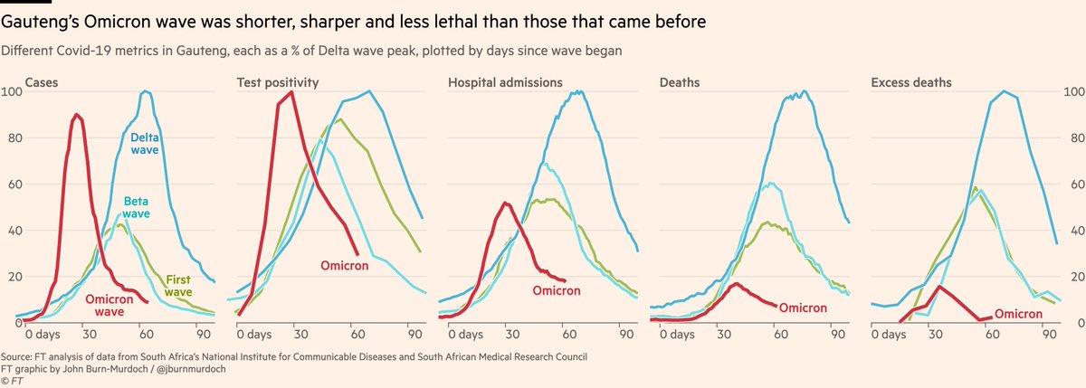
The steepness of Omicron’s rise and fall in South Africa really is something to behold.
Here’s Gauteng first, where it all began.
Cases, test positivity, admissions, deaths and excess deaths too all down almost as steeply as they rose, and in much less time than past waves.
Here’s Gauteng first, where it all began.
Cases, test positivity, admissions, deaths and excess deaths too all down almost as steeply as they rose, and in much less time than past waves.
We’ve all got used to comparing the height of "new daily x" charts over the last couple of years, but at the end of the day it’s not just wave height but also wave duration that determines the ultimate toll on public health, so it’s worth looking at each wave cumulatively...
And here we are:
*Daily* cases peaked close to Delta, but shorter wave means total cases much lower
With more acute outcomes it’s striking:
• Less than 40% as many hospitalisations
• 10% as many deaths, and excess deaths lower still
These numbers will rise, but not by much
*Daily* cases peaked close to Delta, but shorter wave means total cases much lower
With more acute outcomes it’s striking:
• Less than 40% as many hospitalisations
• 10% as many deaths, and excess deaths lower still
These numbers will rise, but not by much

Here are the same charts for the country as a whole.
Remarkably symmetrical meteoric rise and fall in cases and test positivity, with admissions, deaths and excess deaths also now all falling.
Remarkably symmetrical meteoric rise and fall in cases and test positivity, with admissions, deaths and excess deaths also now all falling.

The cumulative numbers for Omicron will all keep climbing for some time yet, especially deaths, but it’s already very clear that the Omicron wave will end up being South Africa’s least lethal, possibly by a large margin.

It’s also clear that infections have passed the peak in all English regions, not just based on case numbers but also the ONS’s gold-standard random sample infection survey

Scotland, Wales and Northern Ireland too show declines in both source datasets, though the two series don’t track one-another quite as neatly outside of England.

And that’s backed up in the data from hospitals, where admissions are now falling in every UK nation and region

But... while early UK data mirrors South Africa, it may not necessarily stay that way.
Today’s English data show the rate of decline in cases has slowed, virtually to a standstill:
• Cases rising in children
• No longer falling in 35-59s (their parents’ cohort)
Today’s English data show the rate of decline in cases has slowed, virtually to a standstill:
• Cases rising in children
• No longer falling in 35-59s (their parents’ cohort)

That pattern is what we expected, as schools drive transmission among children, and that spreads to their parents.
Question is whether this is a temporary blip in a downward trajectory, or whether it sends us back to a bona-fide second peak.
Our story: ft.com/content/8d6bdc…
Question is whether this is a temporary blip in a downward trajectory, or whether it sends us back to a bona-fide second peak.
Our story: ft.com/content/8d6bdc…
One more note from England:
I’ve seen suggestions the recent rise in Covid deaths may be due to ‘incidentals’ where someone tested positive but died for other reasons.
Nope: reported Covid deaths in London still track the ONS cause-of-death series. Good news is, rise is slowing
I’ve seen suggestions the recent rise in Covid deaths may be due to ‘incidentals’ where someone tested positive but died for other reasons.
Nope: reported Covid deaths in London still track the ONS cause-of-death series. Good news is, rise is slowing

(that last one possibly of interest to fellow nerds @PaulMainwood @JamesWard73 and of course the actuaries @ActuaryByDay @john_actuary)
ONS series is adjusted upwards in accordance with historical upward revisions for the same week last year.
ONS series is adjusted upwards in accordance with historical upward revisions for the same week last year.
• • •
Missing some Tweet in this thread? You can try to
force a refresh