This is a long video - much longer than the @skynews explainers I usually make.
But it's about a very big and consequential question - one that deserves consideration:
Is Net Zero and environmental policy responsible for the current energy crisis?
This is my attempt at an answer:
But it's about a very big and consequential question - one that deserves consideration:
Is Net Zero and environmental policy responsible for the current energy crisis?
This is my attempt at an answer:
Predictably there are quite a lot of people out there insisting the current rise in prices has nothing to do with net zero policy.
Predictably there are a lot of people out there insisting it’s all or mostly to do with net zero policy.
Predictably, they’re both wrong.
🧵
Predictably there are a lot of people out there insisting it’s all or mostly to do with net zero policy.
Predictably, they’re both wrong.
🧵
Let's begin with the big picture, and for the time being let's just look at where we get our electricity from (this being only a fraction of total ENERGY use). In the UK we've reduced our reliance on coal to v low levels. This is an impact of environmental policy. 

And it is excellent news.
Yes: gas is still a fossil fuel which emits a lot of carbon (and methane escape is a big issue too).
But it emits 44% less carbon than coal. Moving from coal to gas will help reduce carbon emissions a LOT. This was phase 1 of the UK's net zero roadmap
Yes: gas is still a fossil fuel which emits a lot of carbon (and methane escape is a big issue too).
But it emits 44% less carbon than coal. Moving from coal to gas will help reduce carbon emissions a LOT. This was phase 1 of the UK's net zero roadmap

The thing to note is that across the world other countries are now doing likewise, shifting from coal to gas. Most obviously China. Just look at how their imports of coal have now been overtaken by imports of liquefied natural gas. This is a seismic shift...

If China shifted all its coal power stations to gas we'd instantly be on track to keep global warming below 2 degrees C. So this is a big deal.
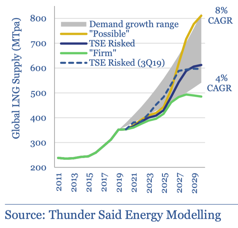
But the upshot is a LOT of demand for natural gas across the world. But supply hasn't necessarily kept up (chart from @energy_said):
But the upshot is a LOT of demand for natural gas across the world. But supply hasn't necessarily kept up (chart from @energy_said):
Now there's a LOT going on with gas prices, not least Russia/Ukraine & covid (which also helps explain lower supply).
But still: the switch from coal to gas as a major energy source - itself linked to net zero policy - is one of the explanations. It's naive to pretend otherwise.
But still: the switch from coal to gas as a major energy source - itself linked to net zero policy - is one of the explanations. It's naive to pretend otherwise.
So yes: net zero is part of the explanation for higher energy prices.
But teasing out how much of a part it's playing is impossible. My hunch: less of a factor than eg Russia/Covid.
Btw this isn't a fringe view. Here's the @bankofengland governor on it:
But teasing out how much of a part it's playing is impossible. My hunch: less of a factor than eg Russia/Covid.
Btw this isn't a fringe view. Here's the @bankofengland governor on it:
High gas prices will be a big issue for the UK until we've worked out a secure, sustainable form of energy storage, since it helps power the network when the wind isn't blowing hard.
This matters.
Just look at where our power came from over two days in a single week in jan:
This matters.
Just look at where our power came from over two days in a single week in jan:
High gas prices matter because we are very reliant on gas to heat our homes. And those high international gas prices are the main thing pushing up our bills this year. Look: wholesale prices are by far the biggest cost post the increase in the energy cap:
How about the bit of the bill explicitly linked to "environmental and social" costs: "policy costs"?
It's not big but nor is it trivial, about 8% of bills.
Is this linked to net zero?
Yes and no. Some is used for other purposes. But yes some is used to fund renewables. However...
It's not big but nor is it trivial, about 8% of bills.
Is this linked to net zero?
Yes and no. Some is used for other purposes. But yes some is used to fund renewables. However...

There's a twist to this tale too, which is that most of the environmental costs in our bills are going not towards NEW wind turbines etc but to pay off the legacy costs of renewables from years gone by.
This gives me an excuse to reproduce one of my favourite ever charts...
This gives me an excuse to reproduce one of my favourite ever charts...
This chart shows you how expensive coal/gas/wind/solar are per MWh over their lifetimes. Subsidy-free.
The higher the bars, the more expensive.
Just LOOK at how much the cost of renewables has come down 2009-2021!
The higher the bars, the more expensive.
Just LOOK at how much the cost of renewables has come down 2009-2021!
The environmental costs in our bills reflect the fact that renewables USED to be very expensive. They're not any more, looked at through this prism.
But there are two important provisos:
1. this doesn't take account of the cost of backup for intermittency (back to that gas issue)
But there are two important provisos:
1. this doesn't take account of the cost of backup for intermittency (back to that gas issue)
2. These charts, striking as they are, are good at illustrating the LONG-TERM cost of these energy sources. What they don't show v well is that the cost of wind/solar is nearly all UP FRONT.
Cost of gas/coal is spread out as it's fuel as well as building the power station.
Cost of gas/coal is spread out as it's fuel as well as building the power station.

In some sense that doesn't matter, provided those building renewables can get the finance they need to build their wind turbines. But it brings us to another issue, one I think more profound than anything we've yet covered.
We are reducing our reliance on fossil fuels. In order to replace that energy with green energy we will have to build a LOT of new stuff.
Consider: a dollar invested in oil/gas/coal adds roughly 25-35 TWh of annual new energy supplies.
A dollar invested in wind/solar: 1 TWh
Consider: a dollar invested in oil/gas/coal adds roughly 25-35 TWh of annual new energy supplies.
A dollar invested in wind/solar: 1 TWh
Here's another way of looking at it. Here rather than spreading out the cost of different energy sources over their lifetime we're JUST looking at the initial Capex costs to provide an equivalent amount of energy for a year. Suddenly renewables look v expensive vs fossil fuels.

You see the issue here. Both of these are valid prisms to consider the cost differentials. The lifetime cost gives you a sense of long term cost. But it's sometimes worth pondering the UP-FRONT cost too. In part because this matters pragmatically to companies/countries.
If we are really SERIOUS about net zero then all of the above would imply that we should be spending some serious $$$.
Staggering sums.
For a taste of what this means, consider these numbers from the @IEA's pathway to net zero.
This is beyond FDR/the New Deal. It's truly massive.
Staggering sums.
For a taste of what this means, consider these numbers from the @IEA's pathway to net zero.
This is beyond FDR/the New Deal. It's truly massive.

But here's the thing. Look at our investment in primary energy, which includes both fossil fuel and green energy, and if anything we're going backwards. It's stagnated since 2015. Far from ramping up, it's ramping down vs the previous trend. This is disquieting.

Put this all together and one is left with a slightly worrying question: what if the current energy crisis is just a glimpse of what happens when you make BIG promises about changing the energy supply without actually backing up those promises with investment?
This is a question more than an answer. But there are some hints in the data that what we're going through might not just be a post-Covid blip. And might be a deeper crisis. A crisis of words vs actions. For an illustration of the issue, consider two more charts...
This is a useful illustration of how we might get to net zero.
Imagine the bar is global carbon emissions.
The segments show how we remove them.
7% via behavioural change
46% by deploying tech we already have (eg solar/wind)
But 47% is STUFF WE HAVEN'T MADE YET
Imagine the bar is global carbon emissions.
The segments show how we remove them.
7% via behavioural change
46% by deploying tech we already have (eg solar/wind)
But 47% is STUFF WE HAVEN'T MADE YET

In which case you'd really hope govts & companies around the world were spending big-time on R&D to invent the stuff to get rid of that red chunk of carbon. Except... they're not.
This is just govt R&D on energy (much harder to track private spend). But the trend is... depressing
This is just govt R&D on energy (much harder to track private spend). But the trend is... depressing

Is net zero responsible for higher energy prices? A bit, but maybe not in the way you might think.
If anything, the lesson from the data is that if we're really serious about eliminating carbon emissions we're not spending anywhere near enough yet.
Video:
If anything, the lesson from the data is that if we're really serious about eliminating carbon emissions we're not spending anywhere near enough yet.
Video:
For those who prefer their news & analysis in textual form (I believe there are still some of those out there), here’s a long read on this topic: Has net zero/environmental policy contributed to the current energy crisis? news.sky.com/story/energy-c…
• • •
Missing some Tweet in this thread? You can try to
force a refresh