Alright so here's the scoop!
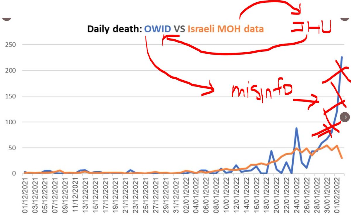
I published a chart earlier today that was a response to misinformation that has been spreading within antivaxx websites. This chart was summarized by the official Israeli Pandemic Info Center @PandemicInfoIL here. (flow of error drawn by me)
/1
I published a chart earlier today that was a response to misinformation that has been spreading within antivaxx websites. This chart was summarized by the official Israeli Pandemic Info Center @PandemicInfoIL here. (flow of error drawn by me)
/1
https://twitter.com/tylerblack32/status/1493330378504880128

The OWID (Our World In Data) team imports from the JHU data repository, which connects to the Israeli MOH repository.
As of now, the information is correct, showing far less of a spike as the graph that is making the rounds.
/2
As of now, the information is correct, showing far less of a spike as the graph that is making the rounds.
/2

My understanding from the github provided by the JHU authors is that that the MOH in Israel had a duplication error, that led to days being "recounted" at the date of report, rather than the date of death. This type of duplication *was* not intentional.
/3
/3

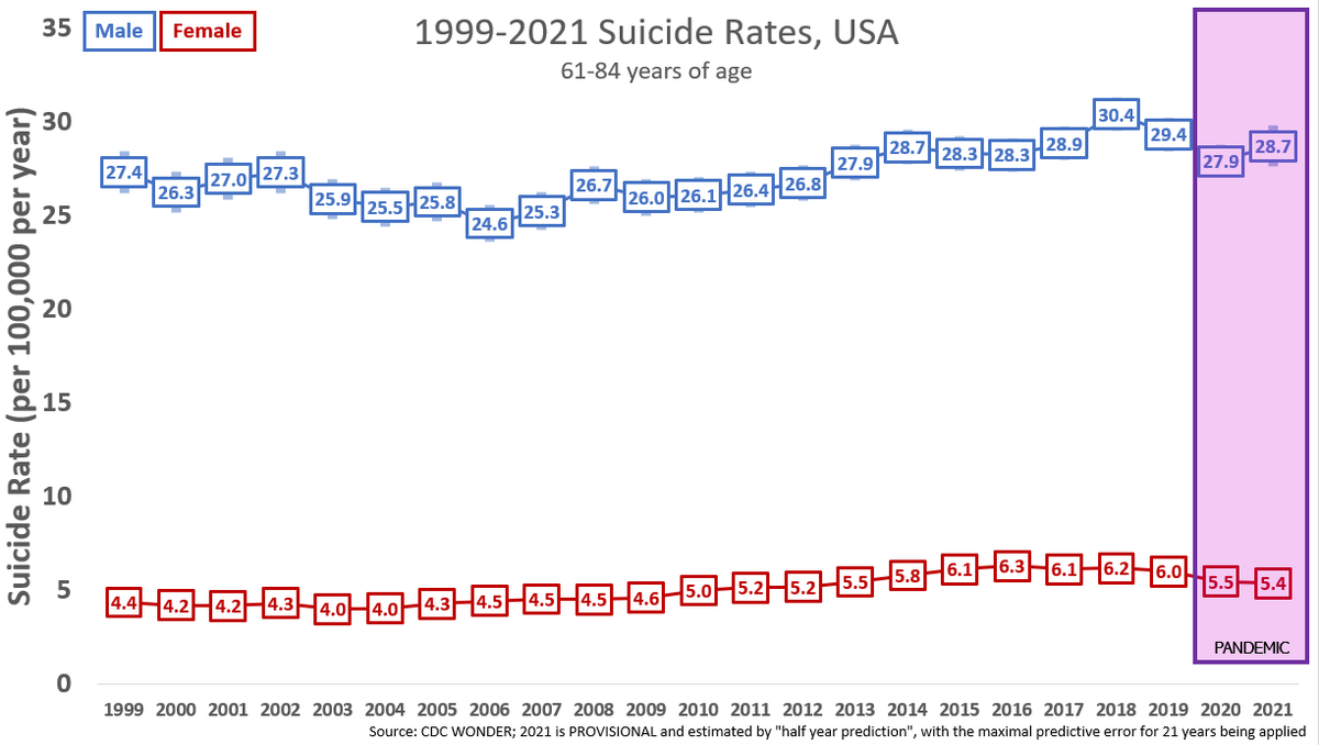
The net result was *misinformation*. Remember, misinformation need not be intentional. People remain misinformed that suicides have increased in 2020 despite having no intent to lie, it's just wrong.
OWID imports faithfully, as did google and other places, from JHU.
/4
OWID imports faithfully, as did google and other places, from JHU.
/4
In my original tweet, I was angry about the careless representation of data, primarily because the inflated numbers were being cited by a number of antivaxxers, citing OWID data. When I saw Israeli's MOH's clarification, I pointed the finger at OWID.
/5
/5
Was that fair? probably not, they are posting data as JHU gets it. Yet still, OWID was propagating misinformation. JHU didn't error-check a discoverable duplication but JHU is volunteers doing the best they can. Still, JHU propagated misinformation.
/6
/6
And the Israeli MOH didn't have the duplication on their own dashboard their data export had a duplication in it which was the spark of the misinformation that was propagated by JHU and OWID, so they were the source of the misinformation to begin with.
/7
/7
Regardless, it caught hold. In Israel and outside, antivaxxers seized on the information to claim that it was proof that vaccines don't work, because hundreds new were dying.
/8
/8
I still feel it was fair to call the *spread OWID data* as misinformation but it was not fair to call them careless. I think I would like to challenge that JHU should have better data integrity checking , but I've been reminded they're volunteers.
/9
/9
I have no apology about calling OWID data "significantly errored", though I could have said "OWID, JHU, and Israeli MOH data had significant errors in it".
This is not the first time JHU, OWID, or worldometers have made mistakes with reported death date or data dumps.
/10
This is not the first time JHU, OWID, or worldometers have made mistakes with reported death date or data dumps.
/10
This goes to a central point - we need more robust error checking and there was significant harm from the errors. Governments need to start doing the work of central reporting mechanisms though JHU has boldly gone where was needed.
/11
/11
I will remind all "dataologists" that our data is BEING SCRUTINIZED BY DISINFORMATION SPREADERS, so we have to be super duper duper duper careful. Can I call the chain of "israeli death reporting" from IMOH to OWID super duper duper duper careful? no.
/12
/12
I experienced significant defensiveness and passive aggressiveness from people who don't understand where my anger lies - i don't care who gets it wrong, one it's wrong it spreads quick.
I do believe "data geeks" sometimes forget the real world implications/impacts of works.
/10


I do believe "data geeks" sometimes forget the real world implications/impacts of works.
/10


I still don't know why JHU and OWID and worldometers don't contain explicit popups and labels talking about vaccination protection, the importance of vaccines. sometimes they live in this "silicon valley" idea that simply putting out data is "good."
/11
/11
data requires expertise to process. even if the error was innocent, an expert detected it, and an expert corrected it. "putting it out there" was of no benefit that I can tell, except to fuel misinformation stories.
/12
/12
data that is released should be sourced/released AND expertly disclaimed/described. We have had enough evidence over the decade bullshit spreads faster than truth.
This would let noble projects like OWID and JHU be part of fixing the pandemic, not being used to worsen it.
/13
This would let noble projects like OWID and JHU be part of fixing the pandemic, not being used to worsen it.
/13
So i do apologize to OWID for stating they were careless, they did their best yet still were part of a misinformation cycle.
And I still hope they, JHU, and governments that supply the information do better to prevent misinformation.
And I still hope they, JHU, and governments that supply the information do better to prevent misinformation.
And as a side note, people working with data should really know the difference between misinformation (incorrect information being spread) and disinformation (intentionally creating or disseminating misinformation).
• • •
Missing some Tweet in this thread? You can try to
force a refresh


