NEW: for the last few weeks I’ve been digging into how the huge pressures on the NHS — both immediate and longer-term — are increasingly forcing Britons to go private.
The result is this, the first edition of what will be my weekly data-driven @FT column: ft.com/content/dbf166…
The result is this, the first edition of what will be my weekly data-driven @FT column: ft.com/content/dbf166…
This was by far the most striking finding:
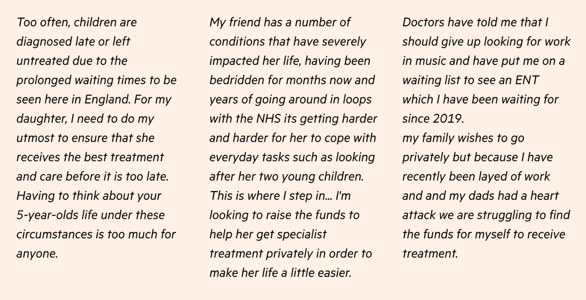
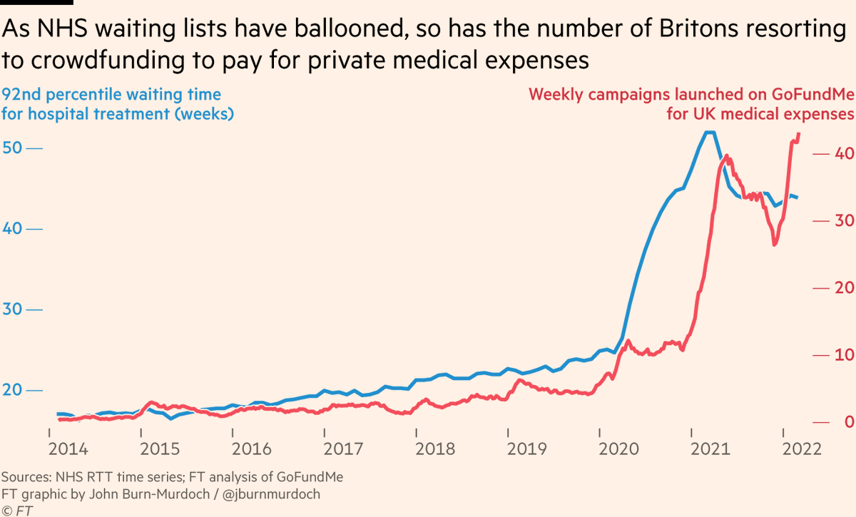
Hundreds of Britons are now using crowdfunding websites like GoFundMe to pay for private medical expenses.
Yes that’s the *UK*, not the US.
This is one of the most shocking charts I’ve made, even in the context of the last two years.
Hundreds of Britons are now using crowdfunding websites like GoFundMe to pay for private medical expenses.
Yes that’s the *UK*, not the US.
This is one of the most shocking charts I’ve made, even in the context of the last two years.

To be clear, many middle class Brits pay to go private to get treated faster, or in a less strained setting — the number going abroad for private treatment has been rising for years — but crowdfunding means hundreds on lower incomes are now going private out of desperation.

There are people with cancer, with debilitating hereditary conditions, with career-threatening injuries, all now feeling forced to raise money from strangers to circumvent a struggling healthcare system.
We’ve been used to hearing about this sort of thing in the US, but with each passing year the idea that the US healthcare experience is a capitalist dystopia, and the NHS is its socialist antithesis, moves further from the truth.
30 years ago, US out-of-pocket spending on healthcare — costs that cannot be reimbursed through insurance, but are borne by the individual — was more than double that of the UK.
Today, the two are virtually indistinguishable.
Today, the two are virtually indistinguishable.
Critically, it’s the Britons least able to afford private healthcare who are bearing the brunt.
The share of UK household spending going on hospital costs has risen 60% since 2010, but more than doubled among the poorest, who now spend as much as the richest in relative terms.
The share of UK household spending going on hospital costs has risen 60% since 2010, but more than doubled among the poorest, who now spend as much as the richest in relative terms.
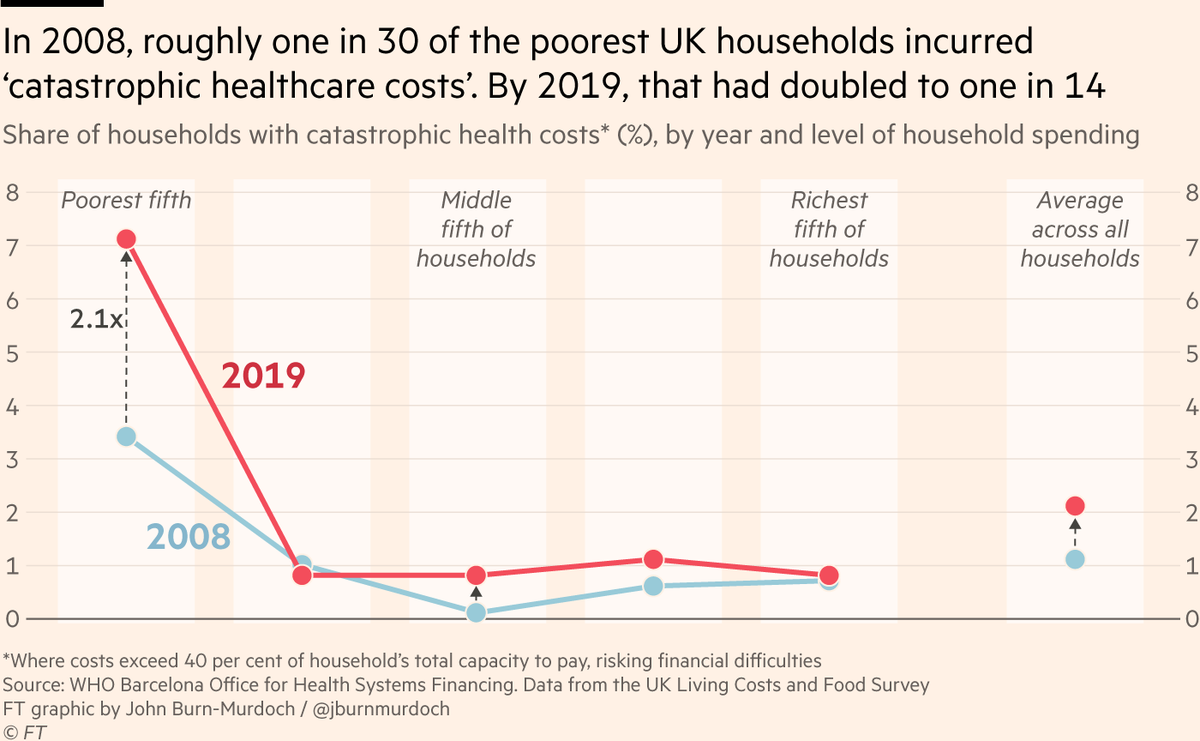
Another way of looking at this is the concept of "catastrophic health spending" — when a household’s out-of-pocket medical costs are so high that they amount to as much as 40% of total spending, threatening their financial security.
The brilliant @sarahmsthomson ran some numbers for me, finding that one-in-14 of the UK’s poorest households now find themselves facing such costs, up from one-in-30 a decade earlier.
That’s thousands of struggling British households whose medical costs now exact a huge toll.
That’s thousands of struggling British households whose medical costs now exact a huge toll.
And while waiting lists remain as long as they currently are, it’s entirely possible things will get worse before they get better.
Since the pandemic took hold, as waiting lists have climbed skyward, the number of new UK medical crowdfunding pages has followed.
Since the pandemic took hold, as waiting lists have climbed skyward, the number of new UK medical crowdfunding pages has followed.
And waiting lists are not created equal, either.
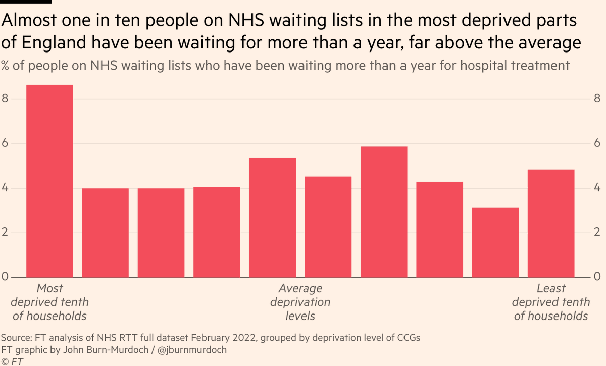
The share of people who have been waiting more than a year for treatment is twice as high in the most deprived areas as elsewhere.
Every day, this is tipping more already-struggling families towards costly private care.
The share of people who have been waiting more than a year for treatment is twice as high in the most deprived areas as elsewhere.
Every day, this is tipping more already-struggling families towards costly private care.
For years there have been fears that the Tories would sell the NHS, but frankly this narrative distracts from the real NHS privatisation story:
The slow forcing of ever more Britons into the private sector as they desperately seek treatment they’re struggling to get from the NHS
The slow forcing of ever more Britons into the private sector as they desperately seek treatment they’re struggling to get from the NHS
To be clear, this thread and my column are not an attack on the NHS, nor call for the NHS to be "tackled" in some way.
This is a call for more to be done to help the NHS, and in the coming weeks I’ll be digging into where the biggest and most transformative changes can be made.
This is a call for more to be done to help the NHS, and in the coming weeks I’ll be digging into where the biggest and most transformative changes can be made.
Here’s the column again. Please read it, this is really important. ft.com/content/dbf166…
Some thanks:
• First up, to @cthomasippr who was an invaluable guide for this piece on everything from policy to data
• Second, to @sarahmsthomson and team for doing that custom analysis of catastrophic health costs
• Third, to @JonathonHolmes4 and @jacoblant for more guidance
• First up, to @cthomasippr who was an invaluable guide for this piece on everything from policy to data
• Second, to @sarahmsthomson and team for doing that custom analysis of catastrophic health costs
• Third, to @JonathonHolmes4 and @jacoblant for more guidance
And fourth to @AliceFishburn, @theboysmithy and others at the @FT for giving me the opportunity and encouragement to get into the column-writing business.
• • •
Missing some Tweet in this thread? You can try to
force a refresh