@IAmSciComm - On a Break! Profile picture
May 31, 2022 20 tweets 6 min read Read on X
A thread about using color as a design tool in science presentations. Color is a great tool to separate different categories of information, to highlight information, or to establish an emotional tone. 🧵1/20 Scientific graphs showing how good color choices enhance com
Color is best when used deliberately. When color is used to decorate rather than to design, important information can be obscured, and slides and posters can look like a trip to the circus. 🧵2/20 Examples of good and bad use of color in slides
The most fundamental colors are pure hues: a color’s purest identity. 🧵3/20 Color hues: red, orange, yellow, green, blue, and purple
Shade is the amount of black added to a hue. Tint is the amount of white added to a hue. 🧵4/20 Shades and tints added to hues
Value (or intensity) refers to the inherent lightness or darkness of a color. The value of different colors can be compared relative to a black and white gradient. 🧵5/20 Values of hues can be discerned by converting hues to graysc
Saturation refers to the degree of hue in a color. A fully saturated color is a true hue, while colors with less saturation look more and more gray. When colors are converted to grayscale, they are completely de-saturated. 🧵6/20 Relative saturation (and desaturation) of a hue
A color wheel depicts the full color spectrum and helps show how different colors relate to each other. 🧵7/20 A traditional color wheel with hues, shades, and tints
Presentation applications feature their own versions of color wheels, but the overall concept is the same—to depict relationships between different hues. 🧵8/20 Color wheels used by Microsoft and Apple
When choosing colors for text, datasets, etc., pay attention to “warm” vs “cool” colors. Warm colors consist of magentas, reds, oranges, and yellows. Cool colors consist of greens, blues, and purples. 🧵9/20 Warm and cool colors as depicted on a color wheel
Humans are hard-wired to attend to warm colors. Furthermore, we perceive warm colors as being in the foreground and cool colors as being in the background. Therefore, warm colors are great to highlight elements you want to emphasize. 🧵10/20 Warm and cool colors on graphs--humans perceive warm colors
Warm colors are excellent for highlighting data in any kind of figure. For color to be effective in attracting an audience’s attention, it should ideally be used in isolation. 🧵11/20 Color used to highlight salient elements of different figure
In this diagram of cell signaling pathways, it is obvious that the “FOXO” element is the main subject, not only because it is biggest, but because it features a warm color relative to the cooler background colors. 🧵12/20 An example of a cell signaling diagram in which the main sub
When using different colors, especially for foreground/background colors, ensure colors have high contrast. Warmer colors are best in the foreground and cooler colors are best in the background. 🧵13/20 Color combinations showing contrast between foreground/backg
On slides, often the best color combinations are black foregrounds on white backgrounds or vice versa. If using color, backgrounds composed of warm, bright colors can be too intense and distracting. 🧵14/20 Examples of slide backgrounds with different warm or cool co
To make your presentations accessible in a colorless environment (for colorblind individuals or black and white printers), choose colors that have high contrast. 🧵15/20 Good color combinations for colorblind individuals or for co
Colors are not neutral—they have emotional associations that you can deliberately employ in presentations to affect your audience’s mood. 🧵16/20 Emotional associations of different colors
A presentation about thirst or water might employ blue colors, while a presentation about sugar/candy might employ more bright and playful pinks/reds. 🧵17/20 Examples of slides that use the emotional associations of co
For some presentations, it can be fun to assemble a unifying tone using a color palette. You can find thousands of color palettes online to use for just about any theme. 🧵18/20 Color palettes for different presentation themes
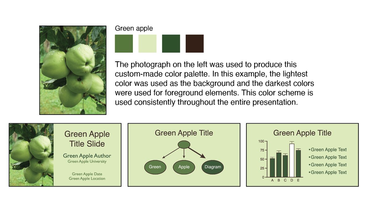
You can also design your own color palette using your own photographs or photographs you find online. Creating these palettes can be incredibly fun and, for the right presentations, be incredibly impactful. 🧵19/20 Example of creating your own color palette for a presentatio
The bottom line for color is to be deliberate. Have fun, and always in a way that serves the content of a presentation as opposed to adding decoration. I always love seeing great examples of thoughtful color use in figures, slides, and posters. 🧵20/20

• • •

Missing some Tweet in this thread? You can try to force a refresh
 

Keep Current with @IAmSciComm - On a Break!

@IAmSciComm - On a Break! Profile picture

Stay in touch and get notified when new unrolls are available from this author!

Read all threads

This Thread may be Removed Anytime!

PDF

Twitter may remove this content at anytime! Save it as PDF for later use!

Try unrolling a thread yourself!

how to unroll video
  1. Follow @ThreadReaderApp to mention us!

  2. From a Twitter thread mention us with a keyword "unroll"
@threadreaderapp unroll

Practice here first or read more on our help page!

More from @iamscicomm

Nov 2, 2022
I have 10+ years of university-level education.

But no lecture taught me how to create good visualizations.

These things are crucial for communication but are often not part of the training.

So, let's have a crash course on visualization guidelines anyone can implement. 🧵
1. Know your audience

You can't use the same visualization for every audience.

A plot that works in a scientific journal may bore (or confuse) non-scientists.
2. Know your takeaways

Forget the dream of putting ALL of your great insights into one powerful plot.

This. does. not. work.

If anything, this dream is a gateway to using too many chart types all at once.

Visualize only your most important insights (maybe in separate plots).
Read 17 tweets
Nov 1, 2022
There are hundreds of online resources for learning how to code.

But there are much fewer online resources for math.

Maybe that's because LaTeX (the premier math writing tool) isn't good at creating them.

#QuartoPub can do both. So, is it a worthy alternative?🧵 #mathematics
What is Quarto?

Short answer: It's a tool that can create many output formats all from one interface.

That means you can create classical PDF math papers as well as online math books with Quarto.
You may be sceptical about the online part. Maybe you have only seen math in PDF format.

But I assure you that it's a real thing. And it's powerful.

For example, every day hundreds of mathematicians on MathOverflow talk about research-level math online. mathoverflow.net
Read 16 tweets
Oct 31, 2022
Quarto becomes *really* cool when you see all the beautiful outputs it can create.

Let's have a look at some more #QuartoPub examples.

Let's start with good old fashioned PDF documents.

With Quarto, you can still do all the PDF stuff you used to do.

nmfs-opensci.github.io/quarto_titlepa… ImageImage
You can even add beautiful title pages to your PDFs.
nmfs-opensci.github.io/quarto_titlepa… Image
Read 9 tweets
Aug 30, 2022
Alright, another common misconception I encounter is the gene vs allele/variant mixup. Most often I see it phrased something like "She has the gene for breast cancer."
In this example, I think we all understand what the person means: she has a genetic variant that makes her more predisposed to breast cancer. For a lot of purposes, that's the only information we really need.
But in reality, we all have two copies or alleles of the BRCA2 gene, one from each parent. But some of us have versions of that gene that make us more prone to developing breast cancer.
Read 9 tweets
Aug 30, 2022
Alright, time to talk some DNA misconceptions and how we can try and break them down!

First up, myths about dominant and recessive traits.
This one hurts, because I thought a lot of these were true for a while!

Often when learning about genetics, we learn that things like tongue-rolling, attached earlobes, and PTC tasting are pure dominant/recessive traits. They're simple, easy traits to demonstrate in a classroom.
But unfortunately, many of them aren't really true dominant/recessive traits! There's a great website called "Myths of Human Genetics" by John H. McDonald at the University of Delaware that breaks down where many of these myths came from: udel.edu/~mcdonald/myth…
Read 12 tweets
Aug 30, 2022
Good morning, all! Today, we're gonna talk about the importance of SciComm in Genetics. Why genetics specifically?

Because that's what my PhD is in, so I'm biased towards it being the coolest science 😂.
BUT ALSO because I strongly believe we're all increasingly asked to make choices that involve genetics in our everyday lives, and I want to equip everyone with the vocabulary to feel comfortable making these choices, from getting a DNA test at the doctor to understanding GMOs.
And while I've believed this for a long time, it was thrown into an incredible spotlight over the past few years, as things like PCR and RNA became household words. Imagine my delight as I saw RNA trending, and then the sadness as I found threads full of misinformation.
Read 6 tweets

Did Thread Reader help you today?

Support us! We are indie developers!


This site is made by just two indie developers on a laptop doing marketing, support and development! Read more about the story.

Become a Premium Member ($3/month or $30/year) and get exclusive features!

Become Premium

Don't want to be a Premium member but still want to support us?

Make a small donation by buying us coffee ($5) or help with server cost ($10)

Donate via Paypal

Or Donate anonymously using crypto!

Ethereum

0xfe58350B80634f60Fa6Dc149a72b4DFbc17D341E copy

Bitcoin

3ATGMxNzCUFzxpMCHL5sWSt4DVtS8UqXpi copy

Thank you for your support!

Follow Us!

:(