A thread about using fonts/typography in presentations. Decisions about text matter. Just as you can speak the same word in many ways, the way you write text can affect communication, emotion, and attitude. 🧵1/19 

Some basics: Fonts are commonly characterized as serif fonts or sans serif fonts. Serifs are little projections that hang off the ends of letters. Sans serif fonts do not have these projections. 🧵2/19 

Serif fonts are great for printed words on a page. In fact, the purpose of the serifs are to guide the eye in reading text from left to right on a page. This is why most journals/books/magazines use serif fonts. 🧵3/19 

Sans serif fonts are easier to see and perceive from a distance. All billboards and theater marquees feature sans serif fonts. Sans serif fonts are best for slides and posters because text is easier to read from across a room. 🧵4/19 

In figures, sans serif fonts are always the best choice because they are easiest to perceive. Arial or Helvetica are always excellent and accepted by any printed journal. 🧵5/19 

Some sans serif fonts convey a bit more personality than others. They can make a slide or poster presentation seem less standard or routine without being too playful or unprofessional. 🧵6/19 

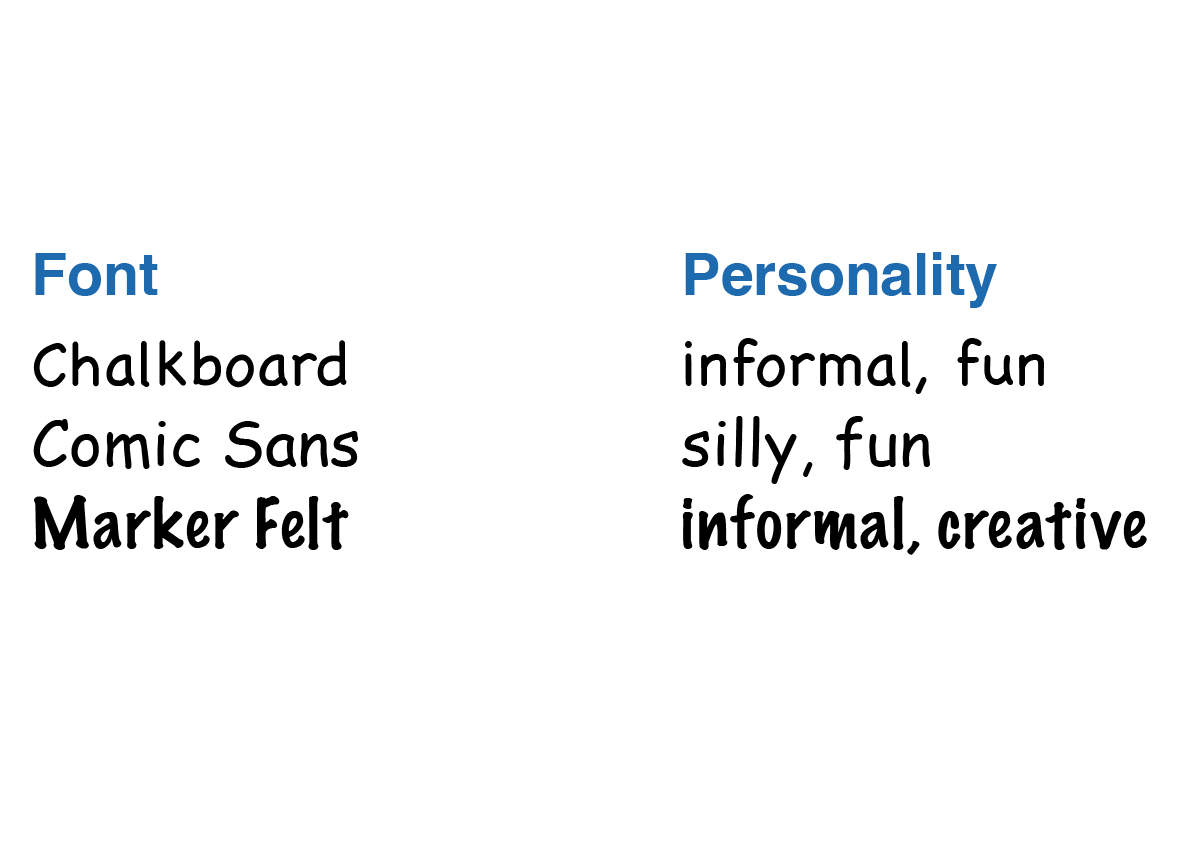
Some sans serif fonts are extremely playful. However, they may be conspicuously playful in a way that is distracting and draws attention from the content. They also might look like a presenter is trying too hard to be fun. 🧵7/19 

Non-proportional (also called “monospaced”) fonts are fonts in which each character has the same width. These fonts are terrific for writing letters in a sequence, such as sequences of DNA, amino acids, or computer code. 🧵8/19 

Specialty fonts convey a lot of personality and tone. They are ideal during moments when you may want to conspicuously capture an audience’s attention, but can easily be distracting. I use them sparingly. 🧵9/19 

Obviously, the ultimate goal of a font is to be legible. In written presentations, a standard serif font is usually best. For slide or poster presentations, casing, contrast, bolding, italicization, and color can all affect legibility. 🧵10/19 

A common misconception is that the size of a font is the distance from the bottom to top of a character. In reality, a font size is the height of an imaginary metal block, as it would exist in an old-fashioned typewriter! 🧵11/19 

Computers specify the size of a font in “points.” A point is defined as 1/12 of a pica, which itself is about 1/6 of an inch. 🧵12/19 

Because the point size is the height of an imaginary block in a typewriter and not the height of the character itself, the only way to know exactly how large a font will appear in a particular point size is to try it! 🧵13/19 

It is fun to be deliberate about typesetting, the way characters are arranged together in a word, in a sentence, or on a page. 🧵14/19 

Communication is also enhanced when words are grouped together in a pleasing manner on a slide or poster. 🧵15/19 

I have only seen one exception in which isolated words look good and unless you are the director of Star Wars, I wouldn’t advise it. 🧵16/19 

Bullets are a great way to group items into a list or sequence. Like any other visual element, their use should incorporate some simple design principles to increase clarity and communication. 🧵17/19 

Use numbers when you want to show an ordered sequence and a bullet when the sequence is arbitrary. 🧵18/19 

I’ll have more to say about fonts and typography in the coming days when talking about slides and posters! Fonts and typography enhance communication and attitude in all forms of presentations. 🧵19/19
• • •
Missing some Tweet in this thread? You can try to
force a refresh


