A thread on designing poster presentations. I love poster design because there are so many good ways to make a poster. But like any presentation, simple design strategies can optimize communication. Compiled by @__Matt_Carter__ . 🧵1/21 Examples of the exact same poster with different design choi
The advantage of posters over slide presentations or published papers is that they allow for direct communication with others about a focused project. I actually met both my Ph.D. advisor and postdoc advisor when presenting posters! 🧵2/21 A large poster session and a small poster session
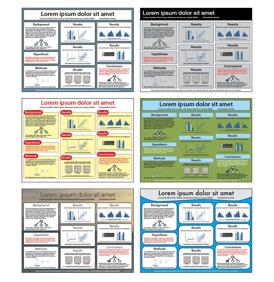
Scientific posters can be designed with multiple layouts and formats, yet all have sections similar to those in a scientific paper. 🧵3/21 The different sections of a poster
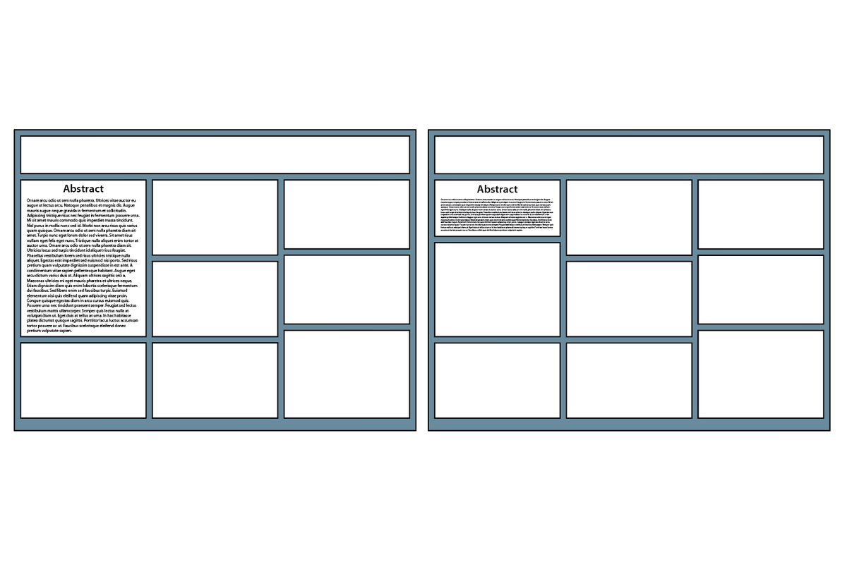
Unlike written papers, posters don’t need abstracts (even if you wrote one for the conference program). On posters, abstracts are wordy and take up space, even if written in a smaller font size. 🧵4/21 Examples of abstracts on a poster taking up too much space
The best poster titles are declarative conclusions. Because poster titles are the one statement that all passersby will read, they are the ultimate way to communicate your take-home point. 🧵5/21 Before and after examples of slide titles
Highlight your research goal/hypothesis that is the rationale for your project. Consider placing it in its own section or highlighting it at the end of your background section. I actually use a different colored font so it stands out. 🧵6/21 Example of a conspicuously placed hypothesis/goal
Use results sections to declare major conclusions. Each section should be titled with a declarative conclusion, and then the data within that section should provide evidence for that conclusion. 🧵7/21 Before and after example of a results section on a poster
Highlight the major conclusions at the end of your poster. I actually use the same colored font used to highlight my goal/hypothesis so the reader visually connects these statements. 🧵8/21 Example of matching hypothesis and conclusions sections
De-emphasize acknowledgements and references. While these sections are important, they are not as visually appealing relative to your actual content. Shrink the font size and place them at the bottom of your poster. 🧵9/21 Before and after example of posters in which references/ackn
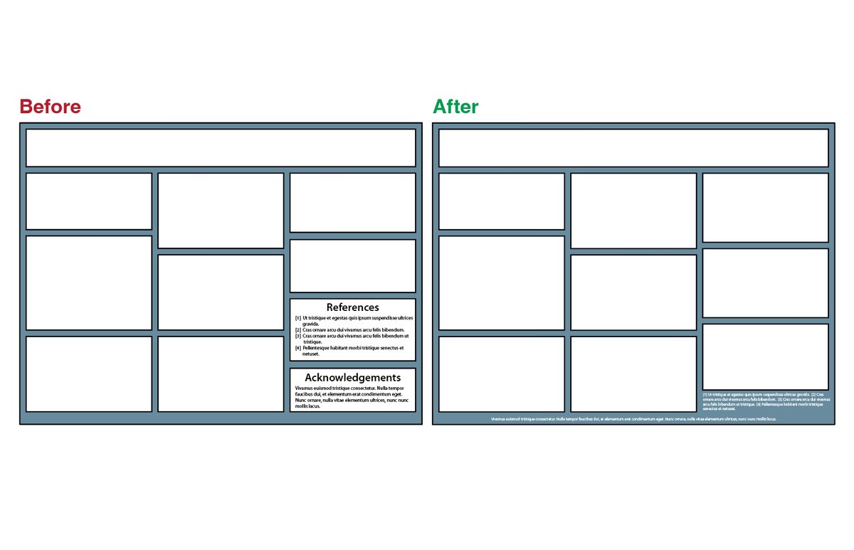
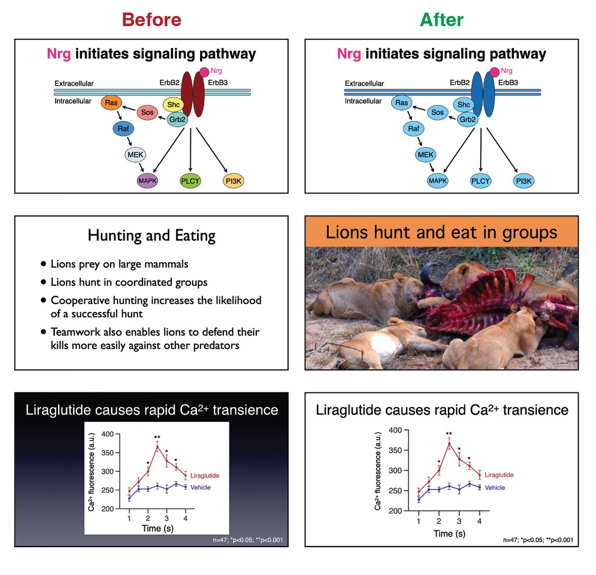
Try to reduce the amount of text as much as possible. There is an inverse correlation between the amount of text on your poster and the probability that someone will want to read it. 🧵10/21 Before and after examples of posters in which text is minimi
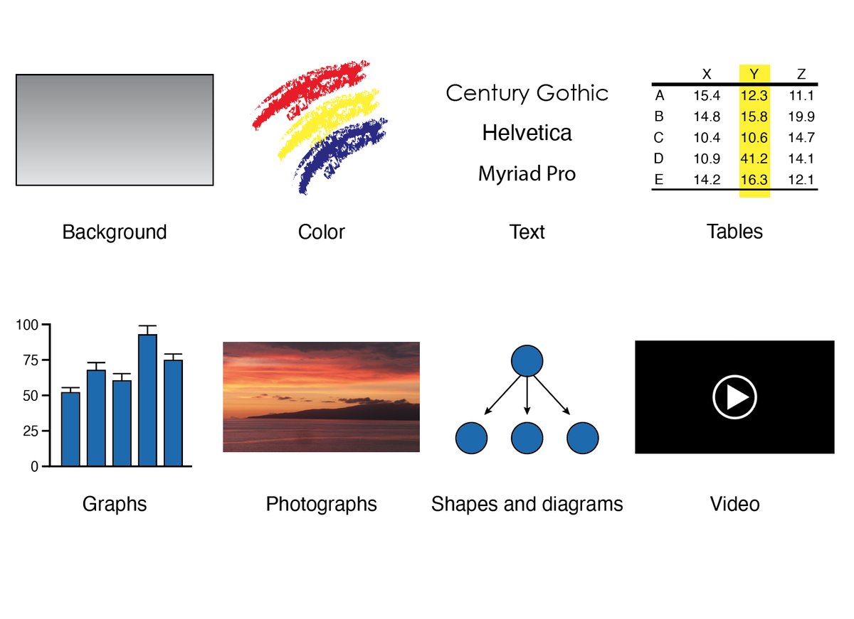
Choose backgrounds that aren’t distracting. Backgrounds should be just that—backgrounds that don’t overwhelm what is placed in front. 🧵11/21 Before and after examples of posters illustrating good backg
To help your audience focus on one poster section at a time, visually unite the content within each section its own box or under a visually striking heading. 🧵12/21 Before and after examples of posters that try to visually co
Choose fonts that are easy to read. On posters (as well as other media that are read from a distance) sans serif fonts are best. For example, Helvetica, Arial, Calibri, or Myriad Pro. 🧵13/21 Example of using sans serif fonts on posters because they ar
To see how large text appears before your poster is printed, it can be helpful to print text with various font sizes on a standard piece of paper. Tape it to a wall and refer to it when making your poster. 🧵14/21 Examples of printing out fonts of various sizes on paper to
Poster titles (and the titles of individual sections) are easiest to read in “sentence case.” 🧵15/21 Example of writing out titles in sentence case as opposed to
Eliminate extraneous visual elements or decorations for maximal clarity. I avoid using distracting color choices, unnecessary numbering of individual sections, and… dare I say it… institutional logos. 🧵16/21 Before and after examples of posters showing the effectivene
Let your text and figures breathe with plenty of surrounding white space. Rather than making your poster look desolate, the right amount of spacing between items increases their impact. 🧵17/21 Before and after examples of posters showing the importance
At a poster session, display your poster in a way that is professional and aesthetically pleasing. Sloppy poster display can make a great poster look sloppy itself. 🧵18/21 Before and after examples of good choices in displaying a po
Consider the possibility of providing supplementary information to visitors that are impossible to present on a printed poster. For example, a tablet/computer to show movies or play audio recordings. 🧵19/21 Example of bringing a tablet to show supplementary movie or
I have traditionally used PowerPoint or Illustrator to make posters—but there are newer, amazing tools to make posters, including BioRender’s new poster making software. 🧵20/21

biorender.com/poster-builder
Would love to hear your own ideas about designing posters. Feel free to also contact me on my personal twitter account, @__Matt_Carter__ . These ideas were selectively taken from Designing Science Presentations. 🧵21/21

amazon.com/Designing-Scie…

• • •

Missing some Tweet in this thread? You can try to force a refresh
 

Keep Current with IAmSciComm - Hosted this week by Matt Carter

IAmSciComm - Hosted this week by Matt Carter Profile picture

Stay in touch and get notified when new unrolls are available from this author!

Read all threads

This Thread may be Removed Anytime!

PDF

Twitter may remove this content at anytime! Save it as PDF for later use!

Try unrolling a thread yourself!

how to unroll video
  1. Follow @ThreadReaderApp to mention us!

  2. From a Twitter thread mention us with a keyword "unroll"
@threadreaderapp unroll

Practice here first or read more on our help page!

More from @iamscicomm

Jun 4
I have loved hosting @iamscicomm this week! Here is a summary thread with links to all of my other threads on presentation design. Feel free to contact me after this week at my personal account @__Matt_Carter__ . Would love to hear from you!
General design skills as they apply to science communication:

Read 10 tweets
Jun 4
About “Better Posters,” also called “Billboard Posters” or “Posters 2.0.” I’m sure others will disagree with me (which is fine!), but while I admire the innovation and creativity, I greatly dislike this idea. Let me explain why….
The ultimate goal of science posters is to communicate complex information and to have meaningful conversations with others. If you design with that definition in mind, “Better Posters” is not the better option.
The idea behind “Better Posters” is to replace most of your poster with a large, declarative statement about your science and a QR code with a link to figures/data if visitors want more. Example of a Billboard poster
Read 10 tweets
Jun 3
A thread on designing visually appealing slides. There are lots of great books/websites/videos about making slide presentations—this thread will focus on quick visual design tips that are easy to employ. Compiled by @__Matt_Carter__ . 🧵1/25 "Before and After" examples of slide design
The power of slides as presentation tools is that they allow you to show your audience whatever you want them to see whenever you want them to see it. This is a powerful advantage over a paper, poster, or handout. 🧵2/25 Examples of adding visual information in the form of text, i
Because there are only a modest number of elements that constitute a slide, the design choices you make about each can greatly affect the clarity of your information and tone of your presentation. 🧵3/25 Visual information in a slide presentation: background, colo
Read 25 tweets
Jun 1
A thread about using photographs and images in academic/science presentations (written by @__Matt_Carter__ ). Even if you have never taken a photography class, there are simple tips you can employ to improve the pictures you use/choose. 🧵1/19 Example of a fluorescent histological image
We typically use photographs for one of three reasons. First, photos are great for showing examples of research subjects and experimental paradigms that convey information difficult to express in words. 🧵2/19 Example of photographs of experimental specimens
Second, photographs present qualitative data. For example, histological images show data about tissue specimens. Photographs of gels and blots from molecular experiments show evidence about gene and protein expression. 🧵3/19 Examples of images representing qualitative data
Read 19 tweets
May 31
A thread about using fonts/typography in presentations. Decisions about text matter. Just as you can speak the same word in many ways, the way you write text can affect communication, emotion, and attitude. 🧵1/19 Before and after examples of text/typography choices in pres
Some basics: Fonts are commonly characterized as serif fonts or sans serif fonts. Serifs are little projections that hang off the ends of letters. Sans serif fonts do not have these projections. 🧵2/19 Serif vs sans serif fonts
Serif fonts are great for printed words on a page. In fact, the purpose of the serifs are to guide the eye in reading text from left to right on a page. This is why most journals/books/magazines use serif fonts. 🧵3/19 The serif fonts Garamond, Georgia, and Times New Roman
Read 19 tweets
May 31
A thread about using color as a design tool in science presentations. Color is a great tool to separate different categories of information, to highlight information, or to establish an emotional tone. 🧵1/20 Scientific graphs showing how good color choices enhance com
Color is best when used deliberately. When color is used to decorate rather than to design, important information can be obscured, and slides and posters can look like a trip to the circus. 🧵2/20 Examples of good and bad use of color in slides
The most fundamental colors are pure hues: a color’s purest identity. 🧵3/20 Color hues: red, orange, yellow, green, blue, and purple
Read 20 tweets

Did Thread Reader help you today?

Support us! We are indie developers!


This site is made by just two indie developers on a laptop doing marketing, support and development! Read more about the story.

Become a Premium Member ($3/month or $30/year) and get exclusive features!

Become Premium

Don't want to be a Premium member but still want to support us?

Make a small donation by buying us coffee ($5) or help with server cost ($10)

Donate via Paypal

Or Donate anonymously using crypto!

Ethereum

0xfe58350B80634f60Fa6Dc149a72b4DFbc17D341E copy

Bitcoin

3ATGMxNzCUFzxpMCHL5sWSt4DVtS8UqXpi copy

Thank you for your support!

Follow Us on Twitter!

:(