There is still a persistent myth out there that you can achieve photo realism in art without the use of photo reference. If your goal is realism, here's a thread to remind you that the best artists used reference so you can, too. 


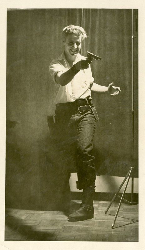
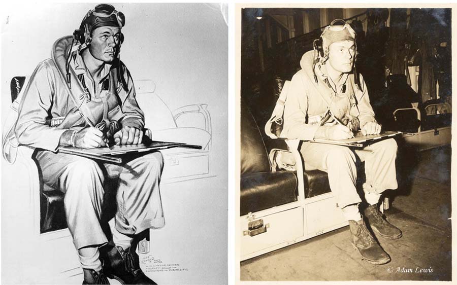
Let's start with comics. Here's the creator of the Rocketeer, Dave Stevens posing for Cliff Secord himself. Fellow comics artist Doug Wildey was Dave's model for Peavey.


Richard Corben used a lot of models (fellow creator Bruce Jones is recognizable in some of Corben's work) but he also went the extra mile and sculpted stylized heads for realistic lighting ref.


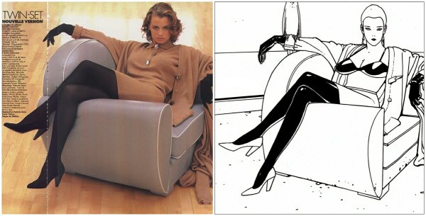
The great Moebius
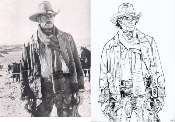
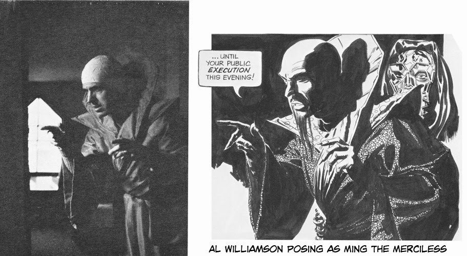
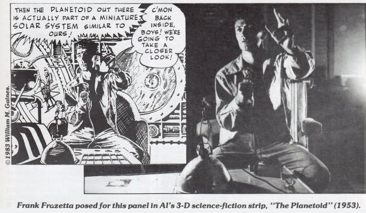
Al Williamson would pose for photos but he would sometimes use his friend, Frank Frazetta, too.
Speaking of Frazetta, Arnie Fenner wrote a great piece for Muddy Colors on the subject of photo reference that discusses the stigma around reference/tracing and Frank's use of it.
muddycolors.com/2014/04/cheati…
muddycolors.com/2014/04/cheati…
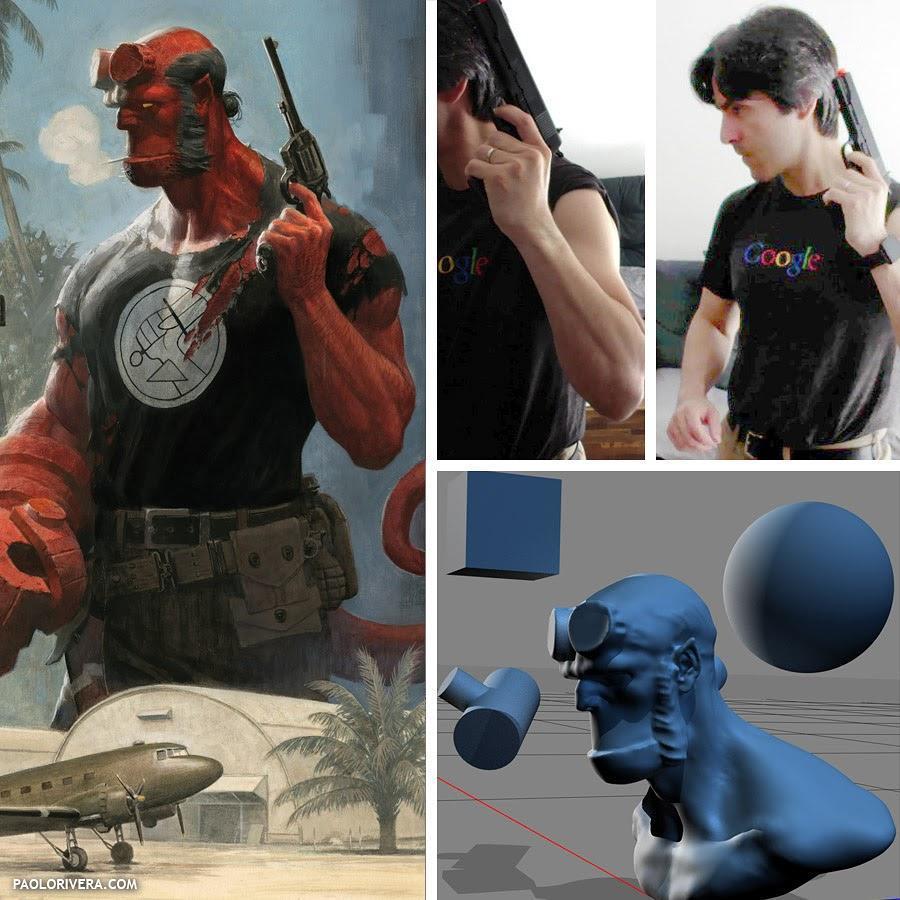
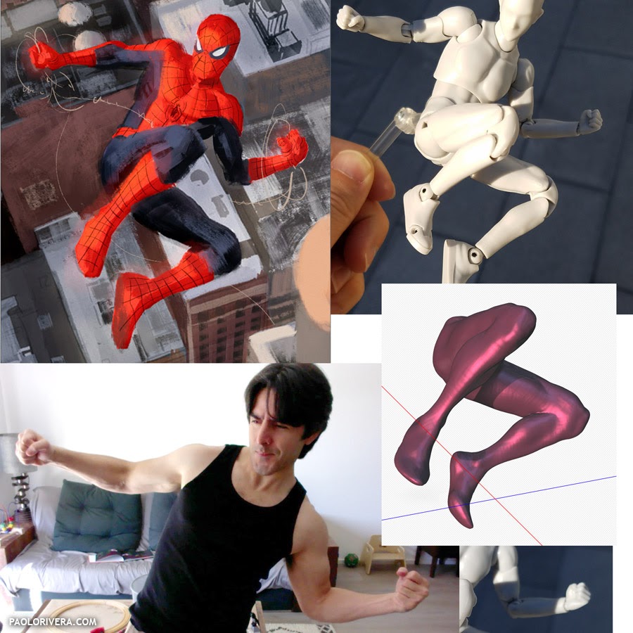
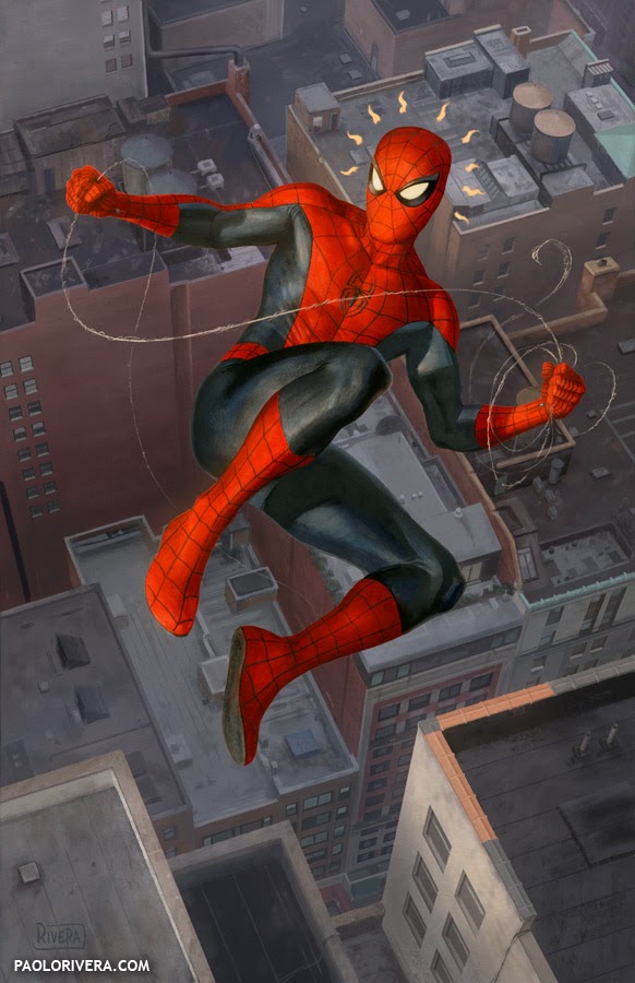
Paolo Rivera is wonderfully open about all of the reference material he uses. I've learned a lot from the information he's generously shared over the years.
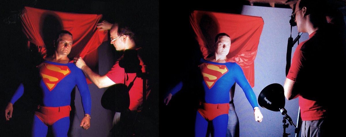
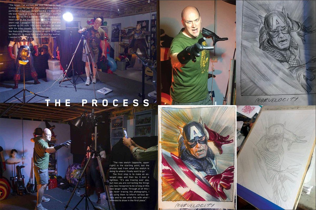
Alex Ross's two big art books, Mythology and Marvelocity, have a lot of great process pics.
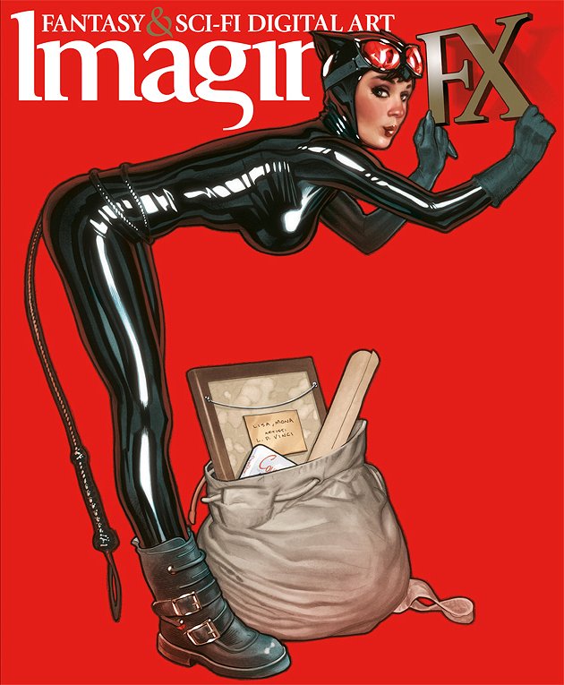
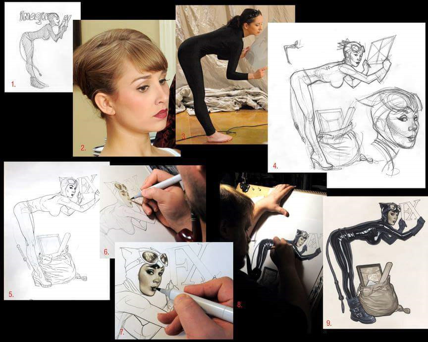
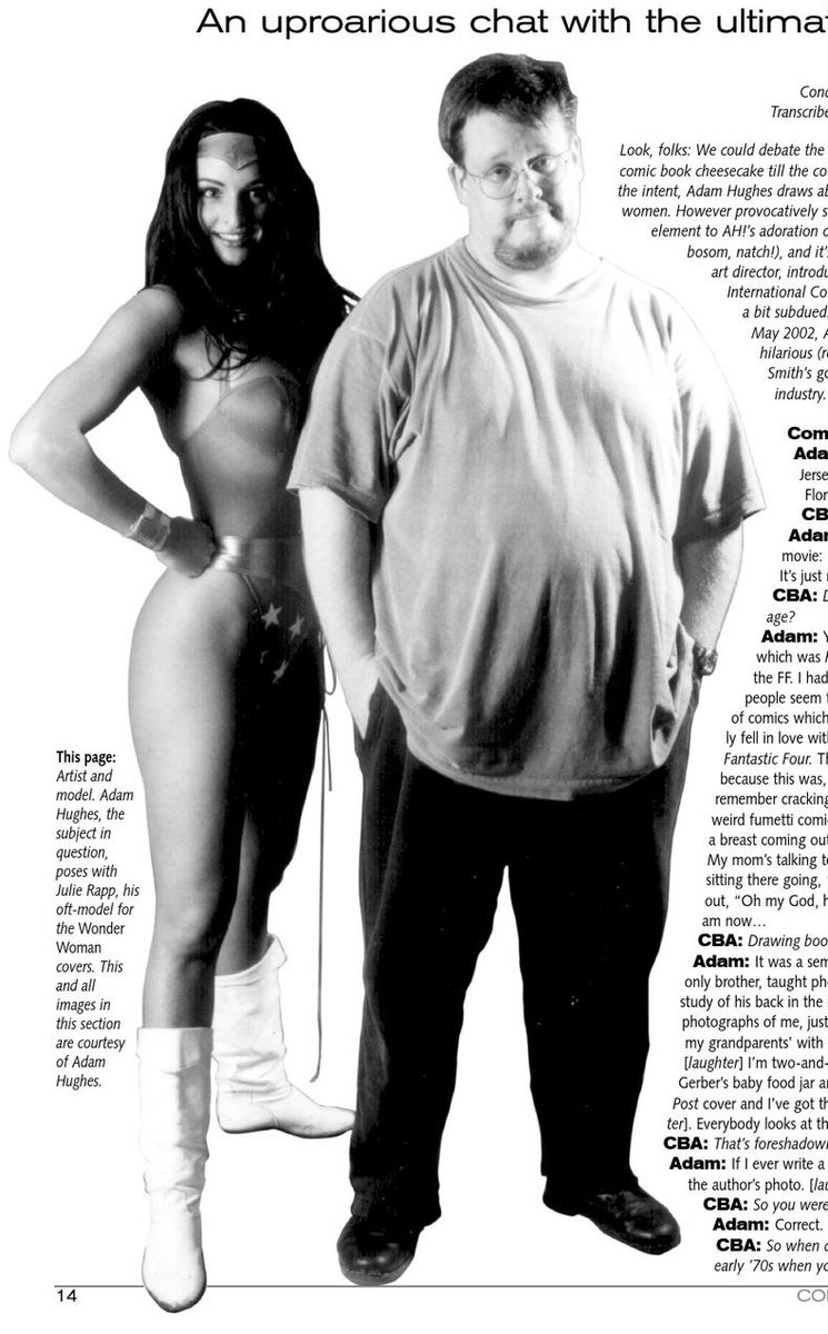
Adam Hughes did a fantastic piece for ImagineFX that went over his process, including some of his photo reference. TwoMorrows also ran a great photo of Adam with his WW model, Julie Rapp, in issue 21 of Comic Book Artist magazine.
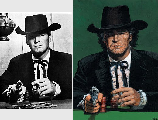
Alex Raymond
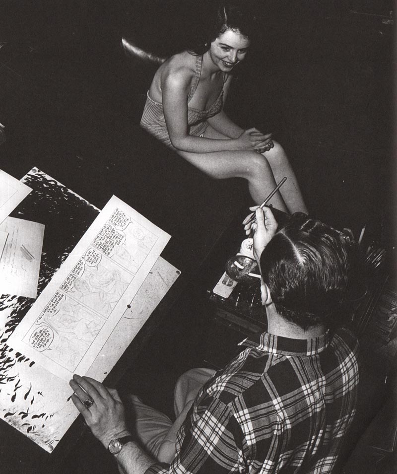
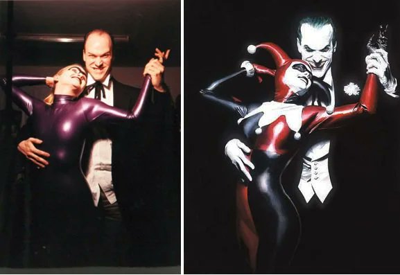
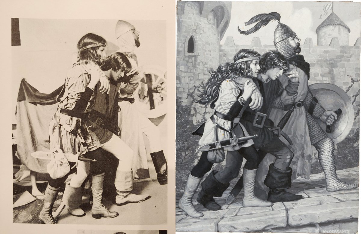
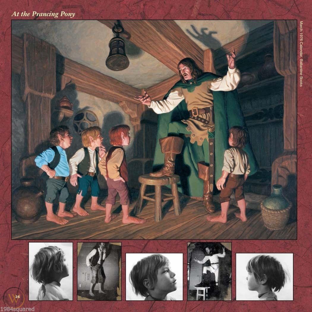
The Hildebrandt Brothers seemed to have a lot of fun shooting photo reference.
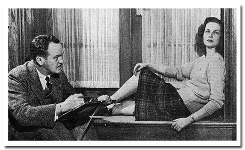
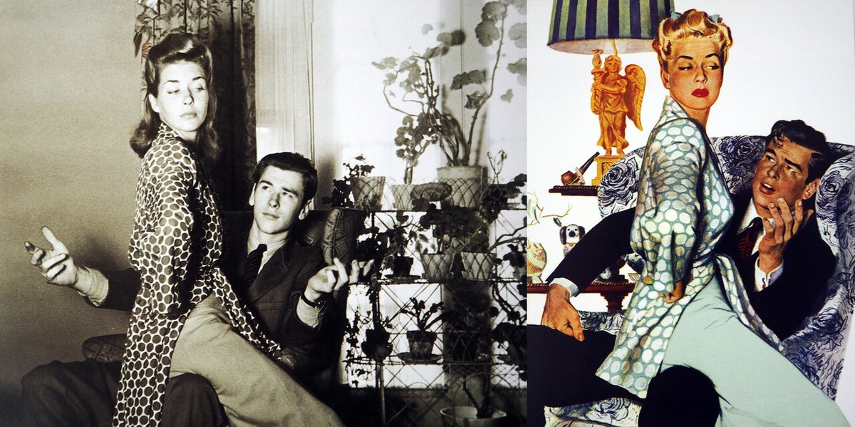
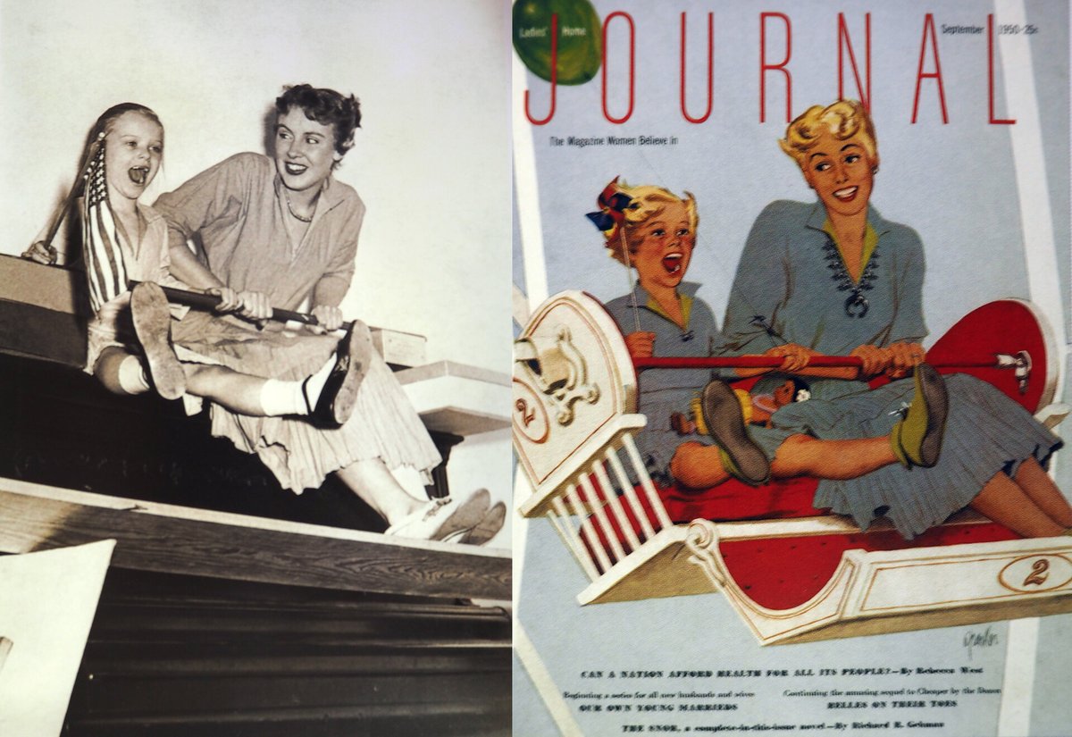
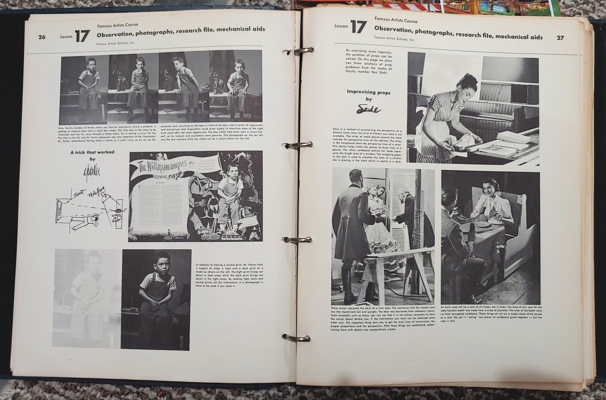
Segueing away from comics, here's Al Parker:
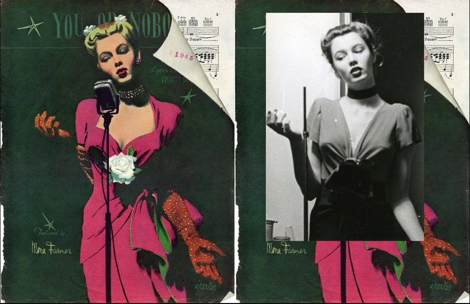
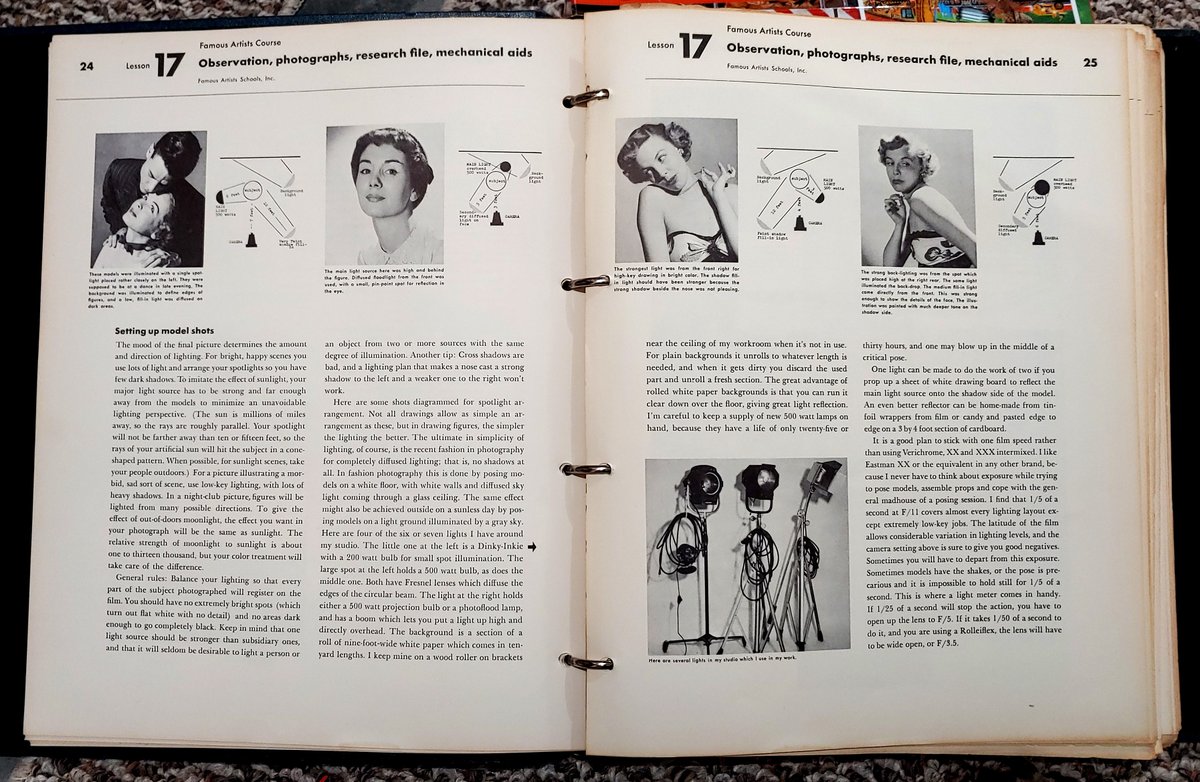
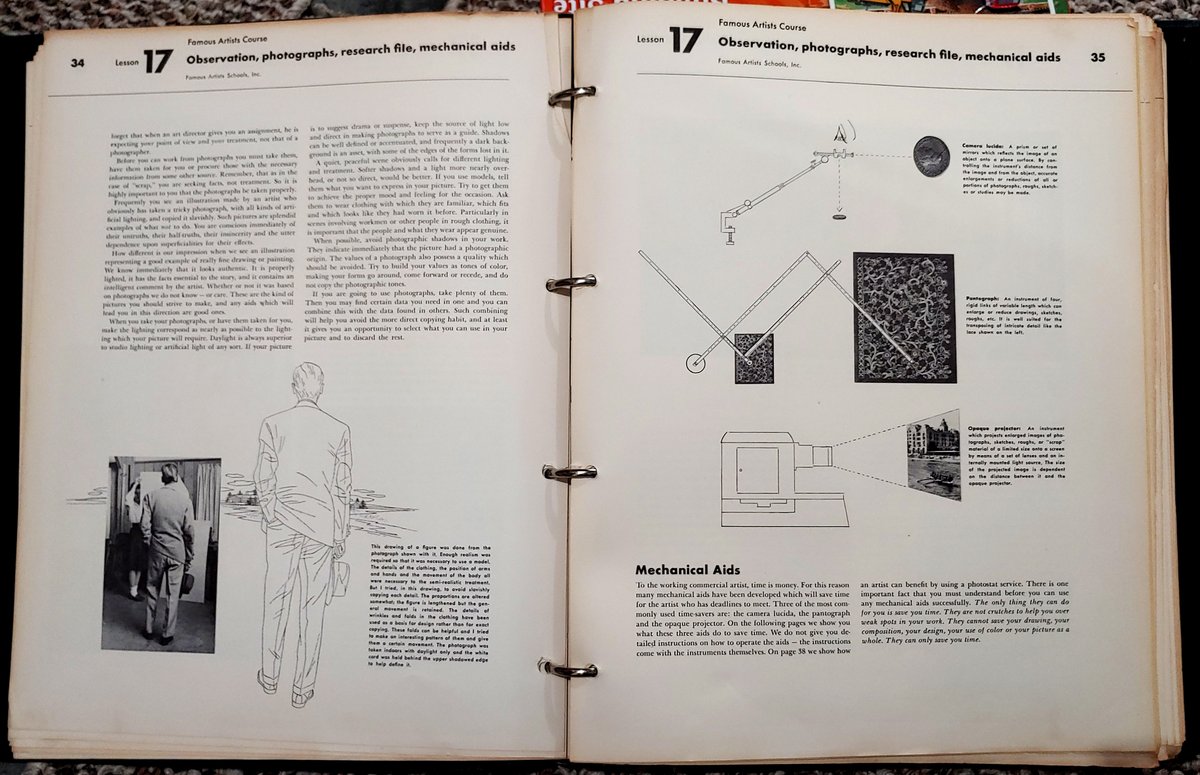
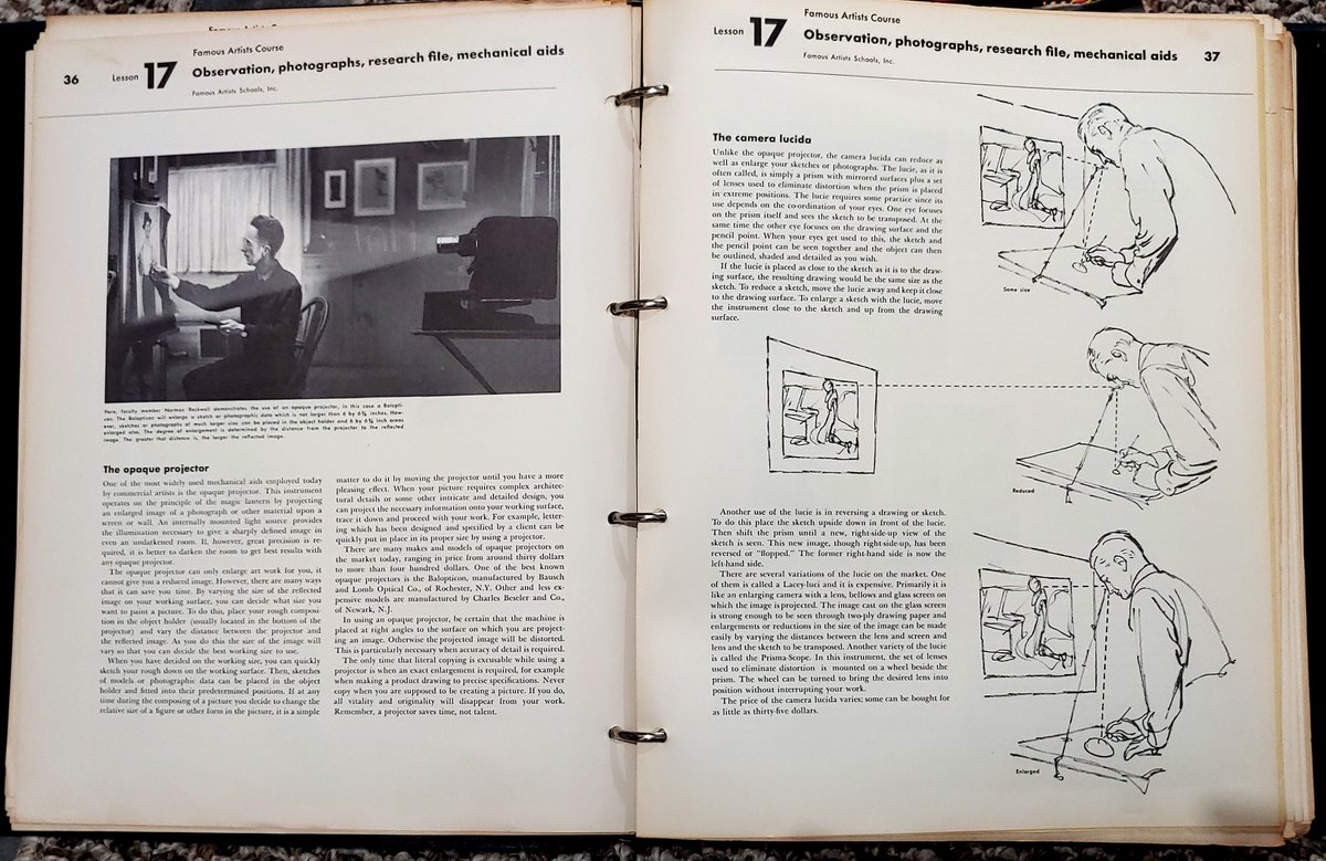
Speaking of, Parker was part of the Famous Artist School and there's a whole lesson on research and reference. Even a section on how to shoot photo reference.
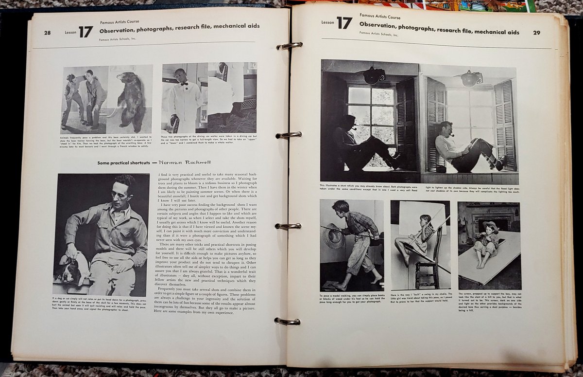
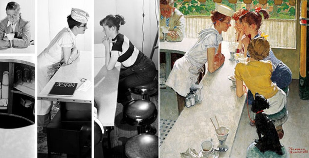
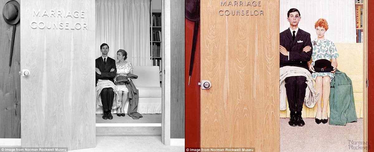
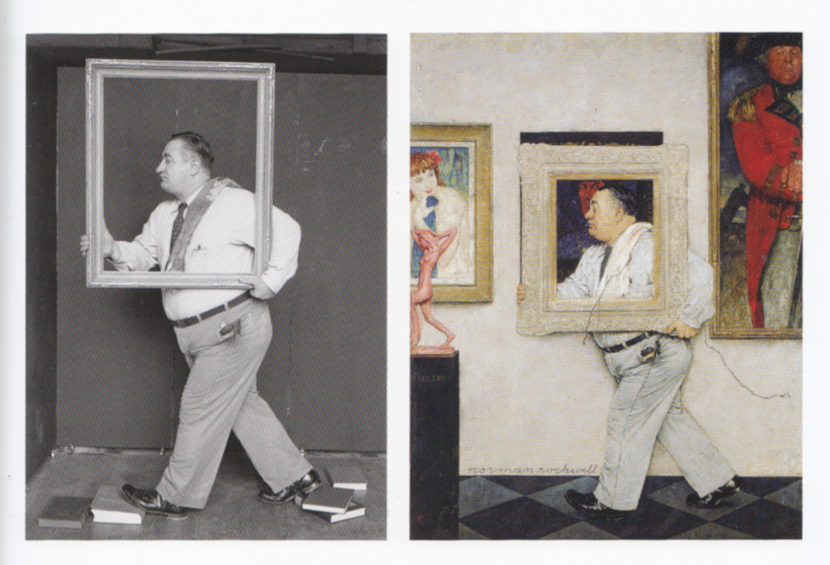
Norman Rockwell on how he uses photos for reference and a little bit on machines that help you trace.
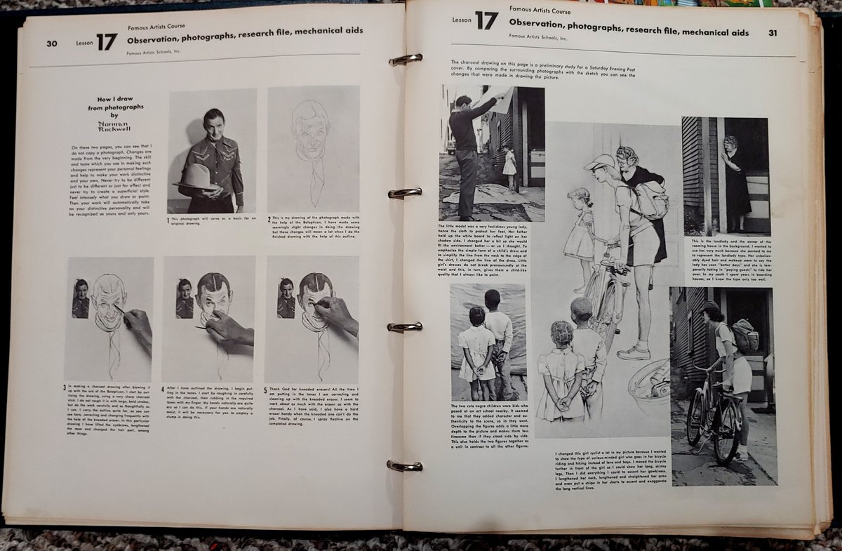
Here's more Rockwell photo reference
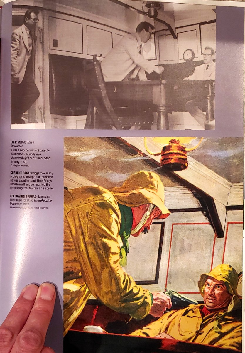
Austin Briggs
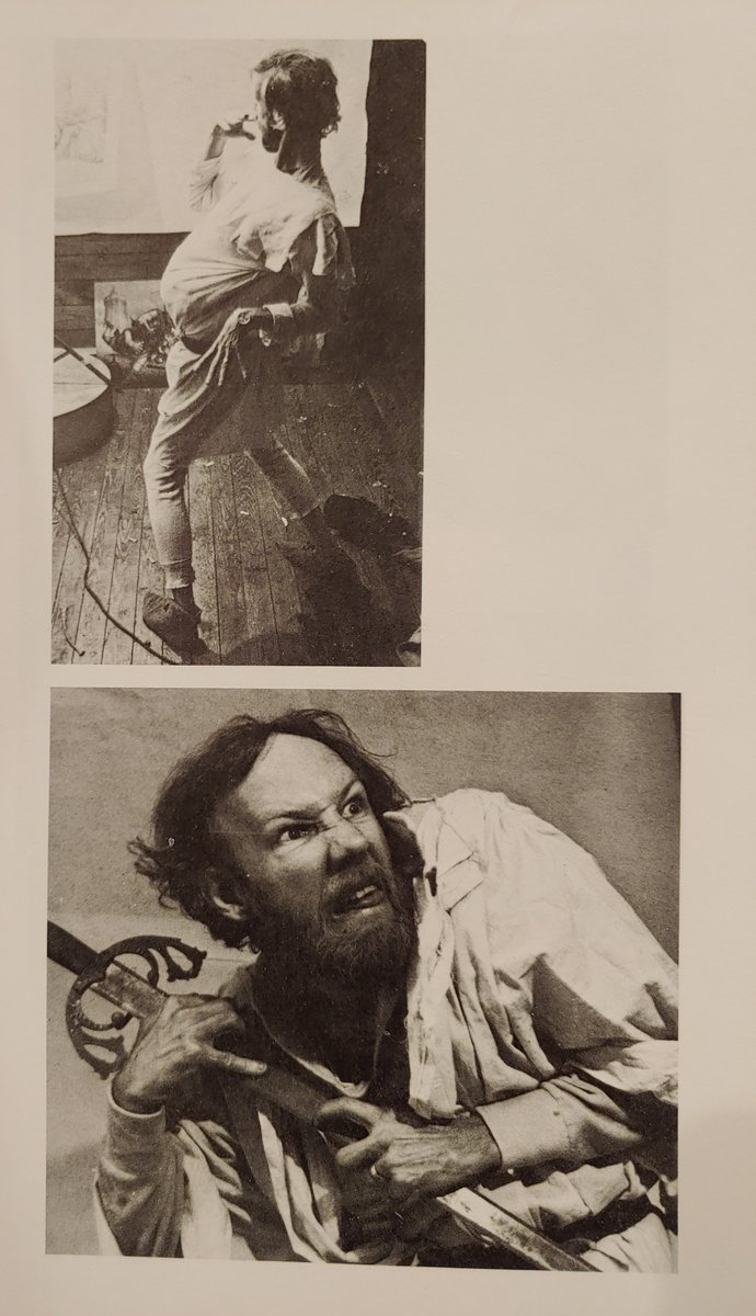
I found this little gem with the great Robert Fawcett

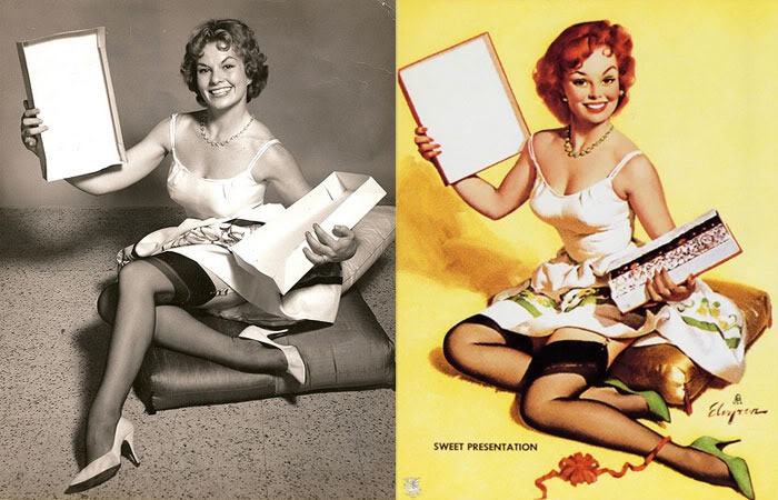
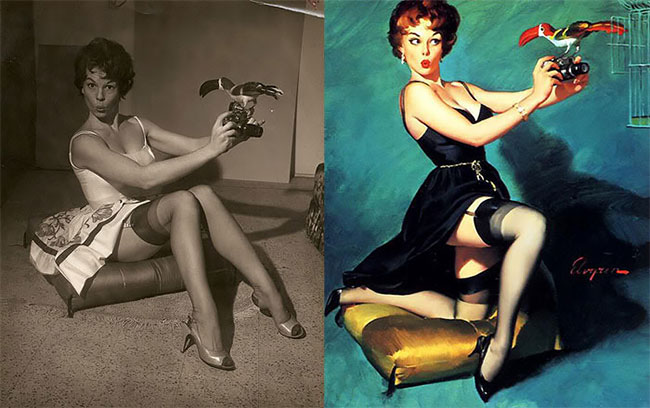
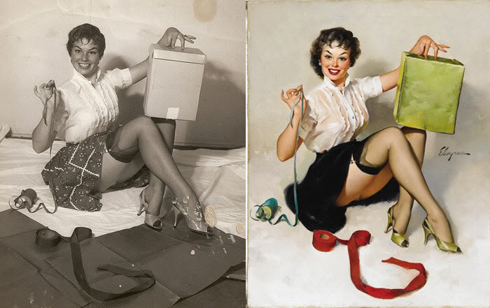
Gil Elvgren
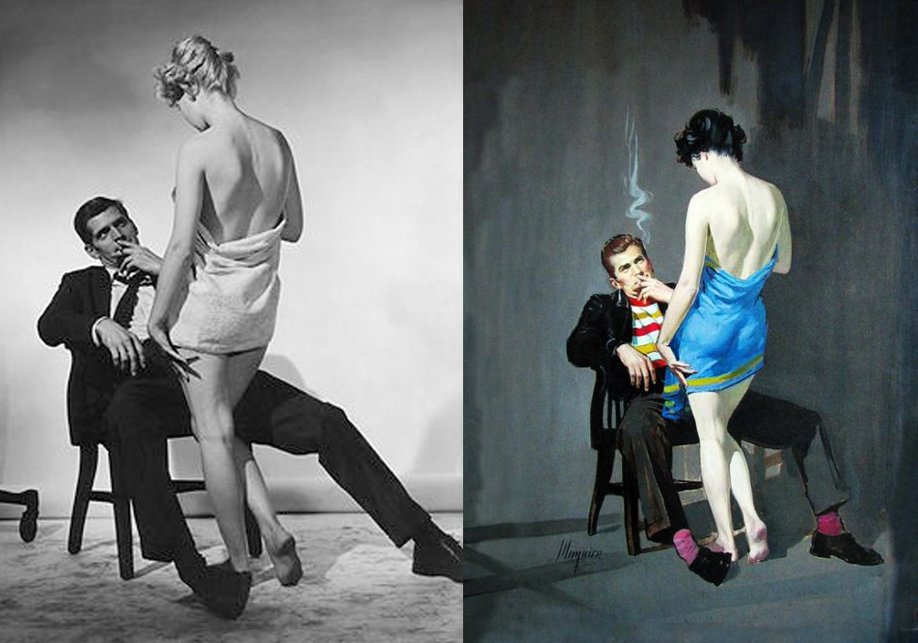
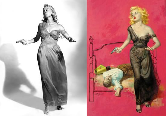
Robert Maguire
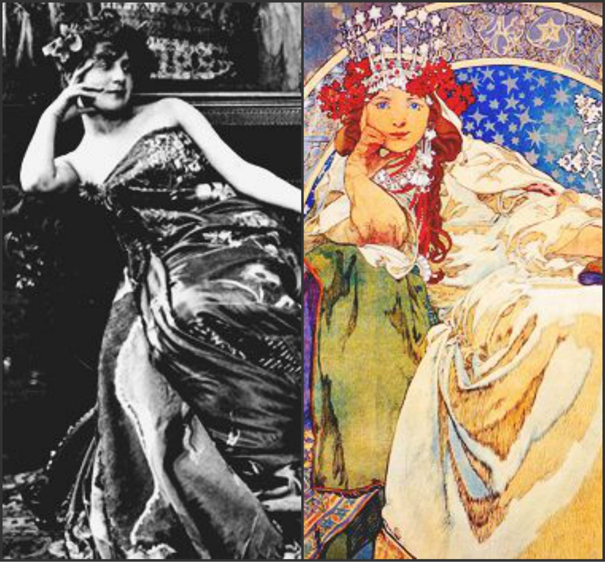
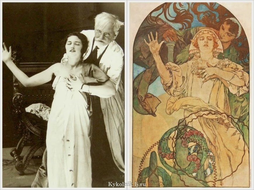
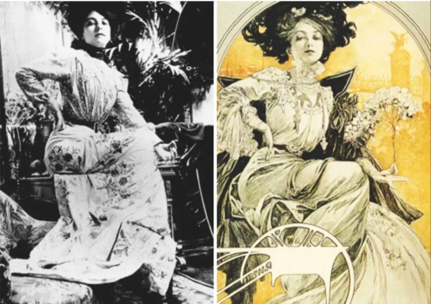
Alphonse Mucha
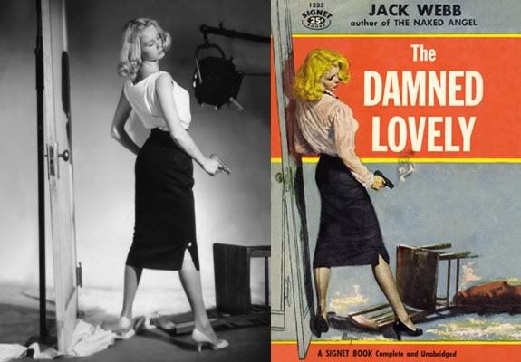
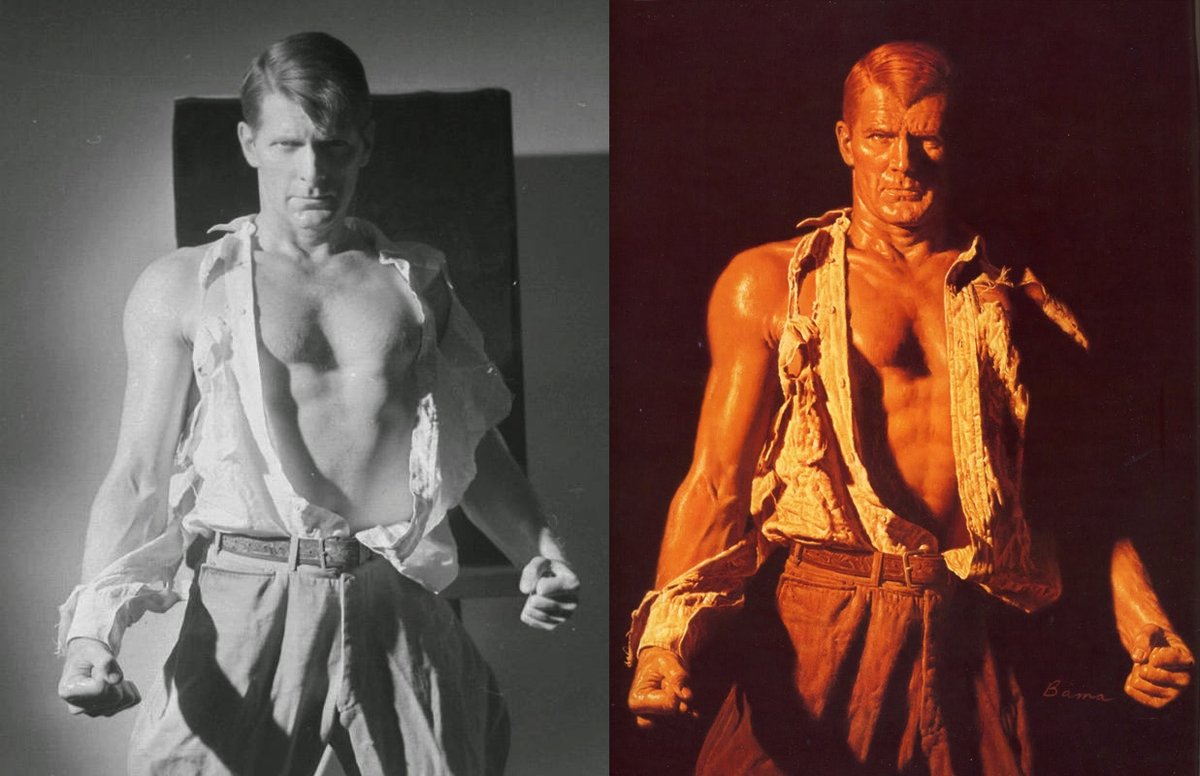
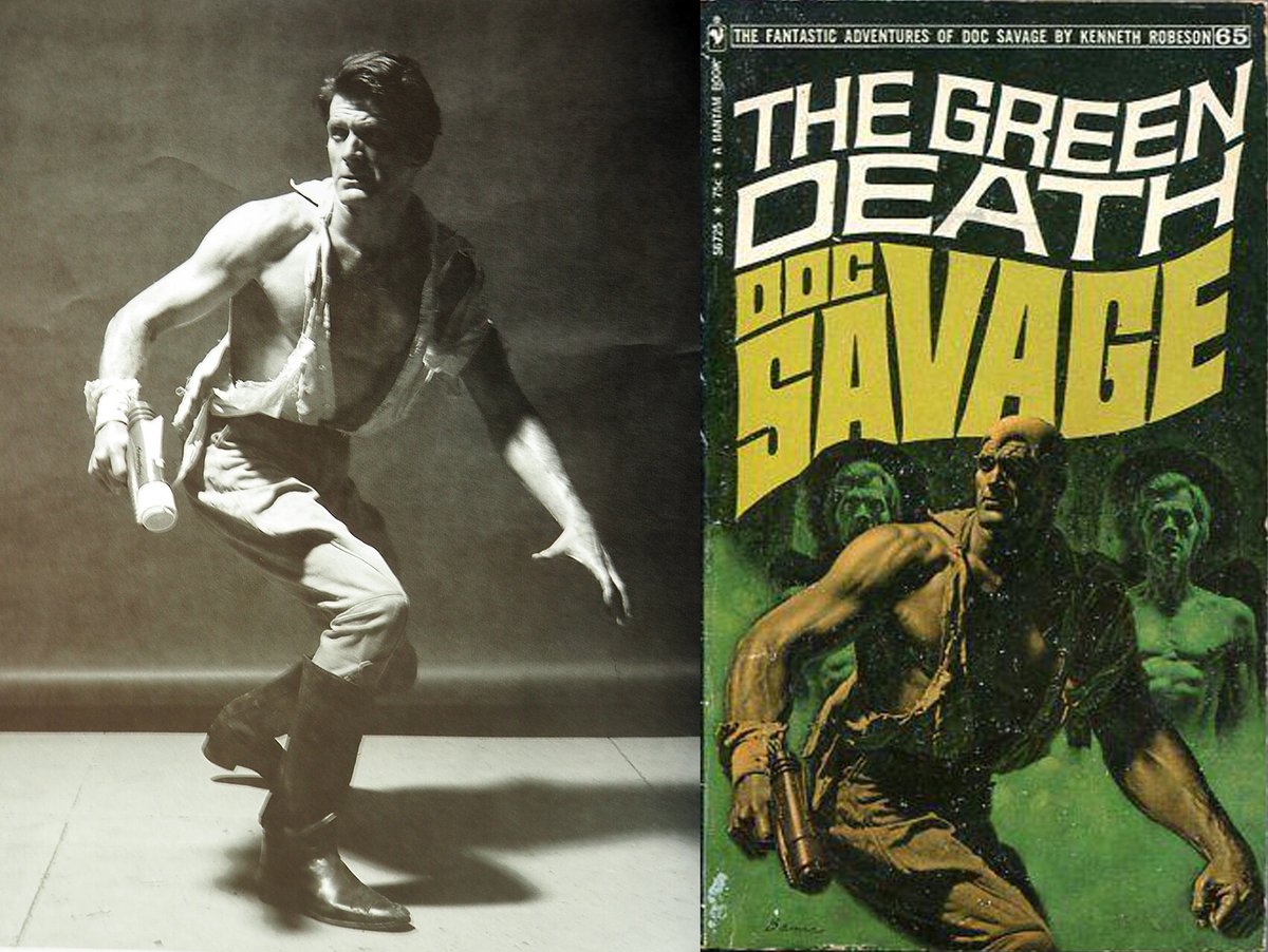
James Bama used model Steve Holland for his Doc Savage books.
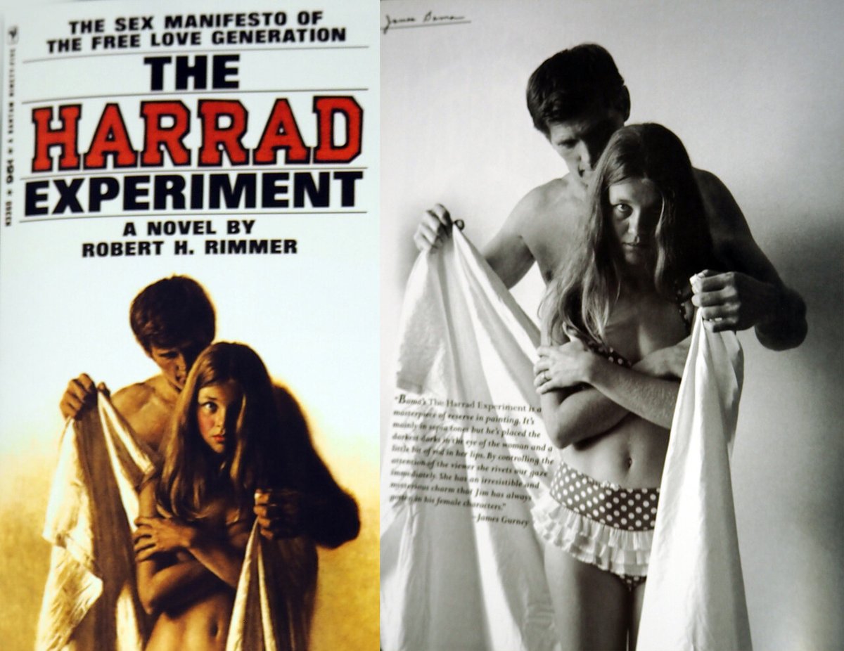
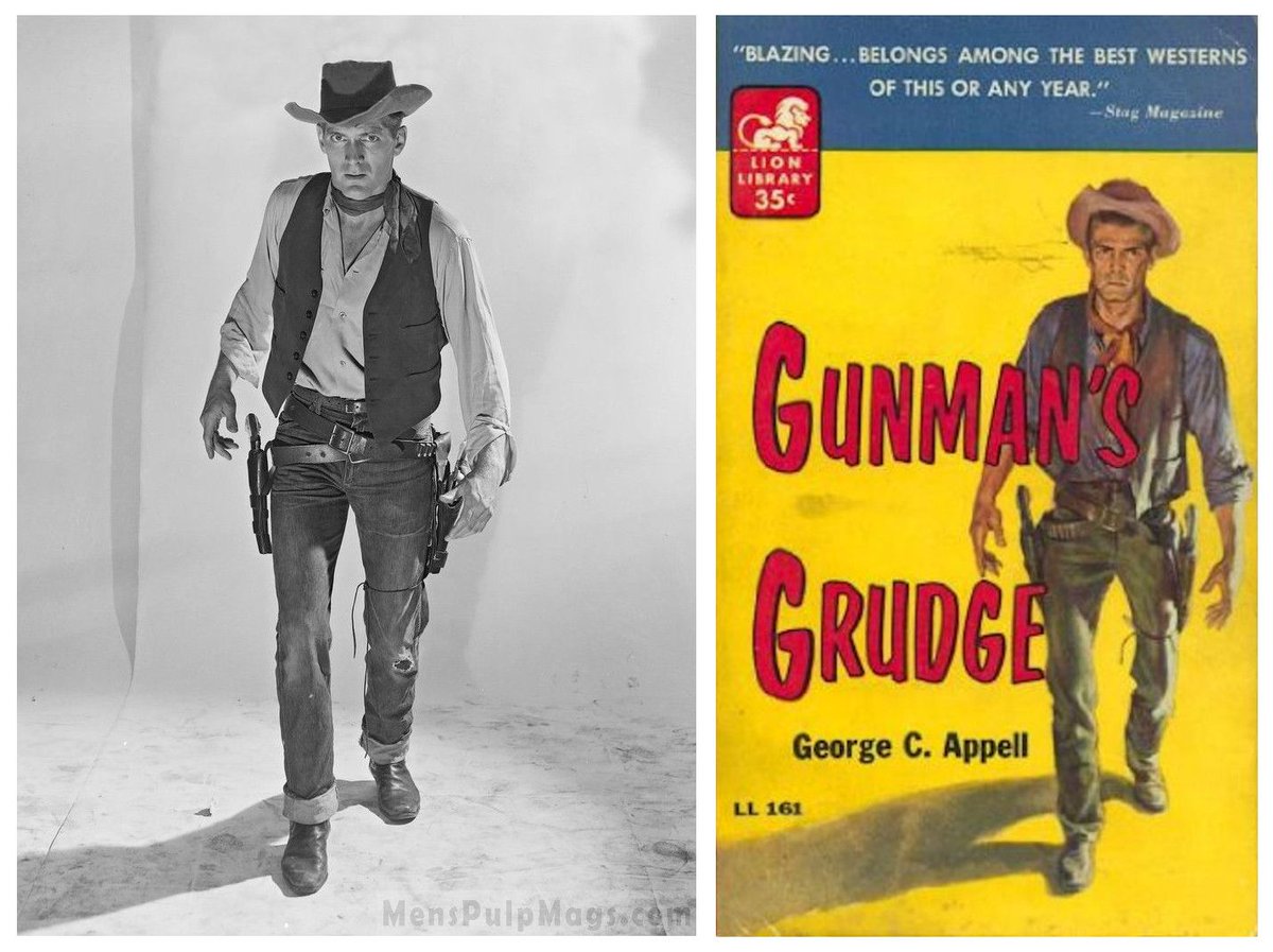
Steve Holland was a favorite among paperback cover artists so you can find his visage everywhere on vintage books.
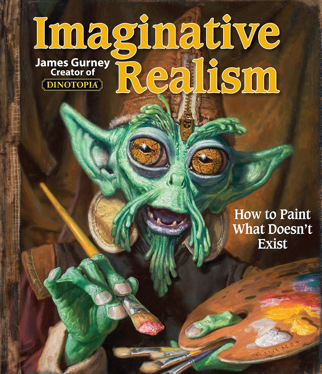
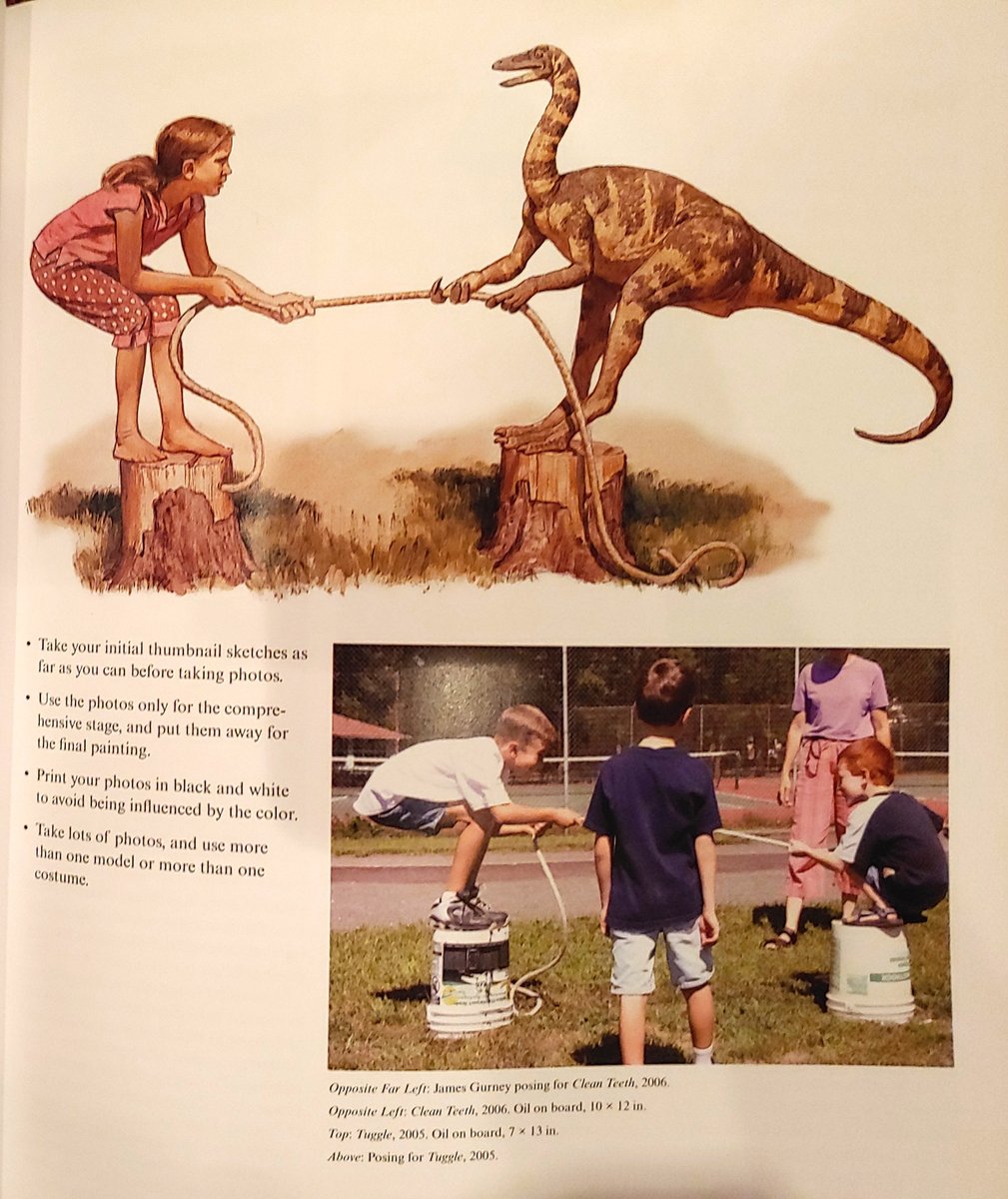
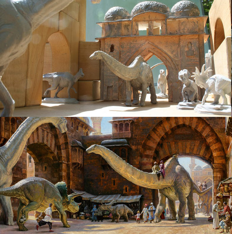
James Gurney wrote a whole book on the subject of creating realistic fantasy art and the process of creating reference for it. Highly recommended!
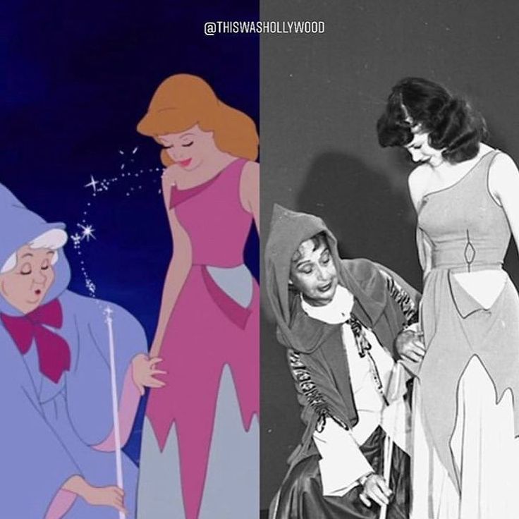
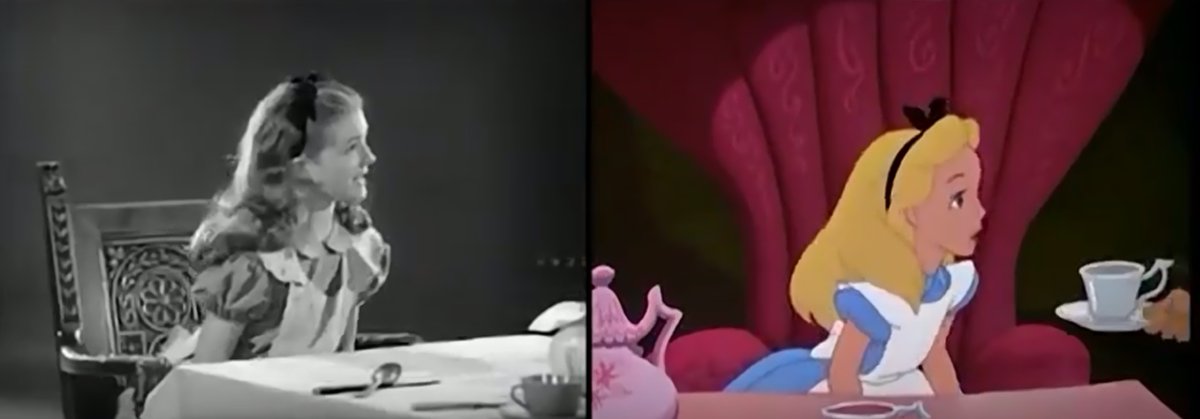
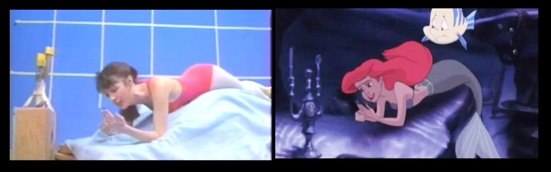
And don't forget Disney animation. Even when they didn't employ rotoscoping they still shot reference footage for the animators.
I hope this thread helps clear up any weird thinking that realism in art is achieved purely through imagination and practice.
And just as a disclaimer, this doesn't mean ALL artists should use reference. Your style dictates your tools. If your work is hyper-stylized, photo ref would be mostly worthless to you. I doubt Jack Kirby needed or used much photo ref by the time he was on FF.
Mostly, you should try to find a process that best suits you. I find it difficult to picture things in my mind clearly and I work a lot better when I'm looking at something. I also naturally gravitate towards realism so photo ref makes sense for me.
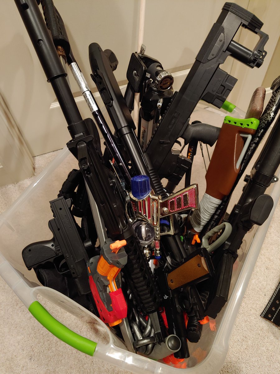
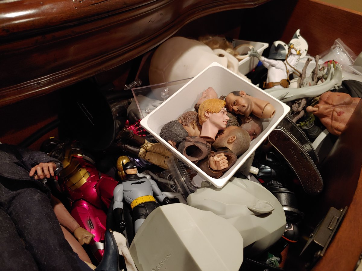
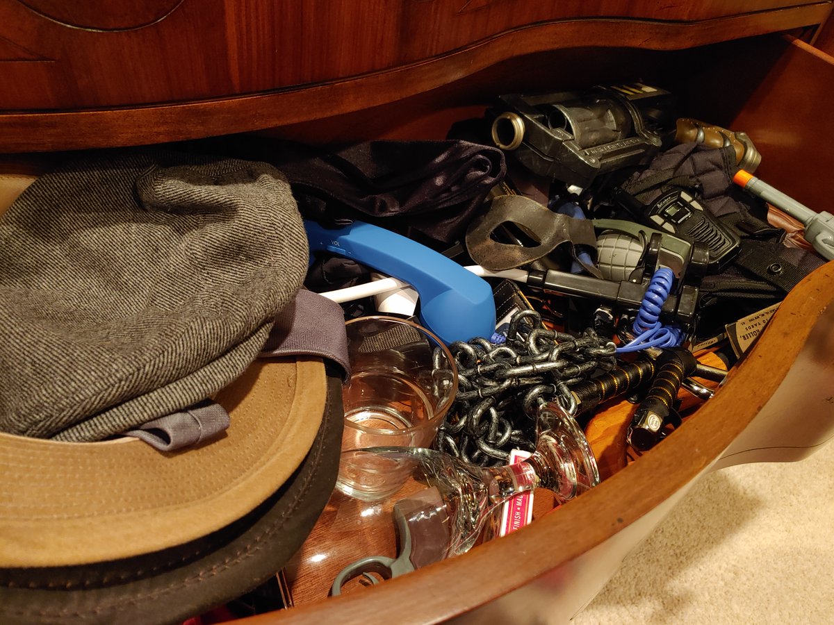
I have drawers full of figures, models, airsoft guns, and other various props that I use as reference, too.
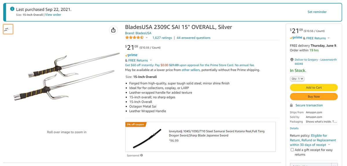
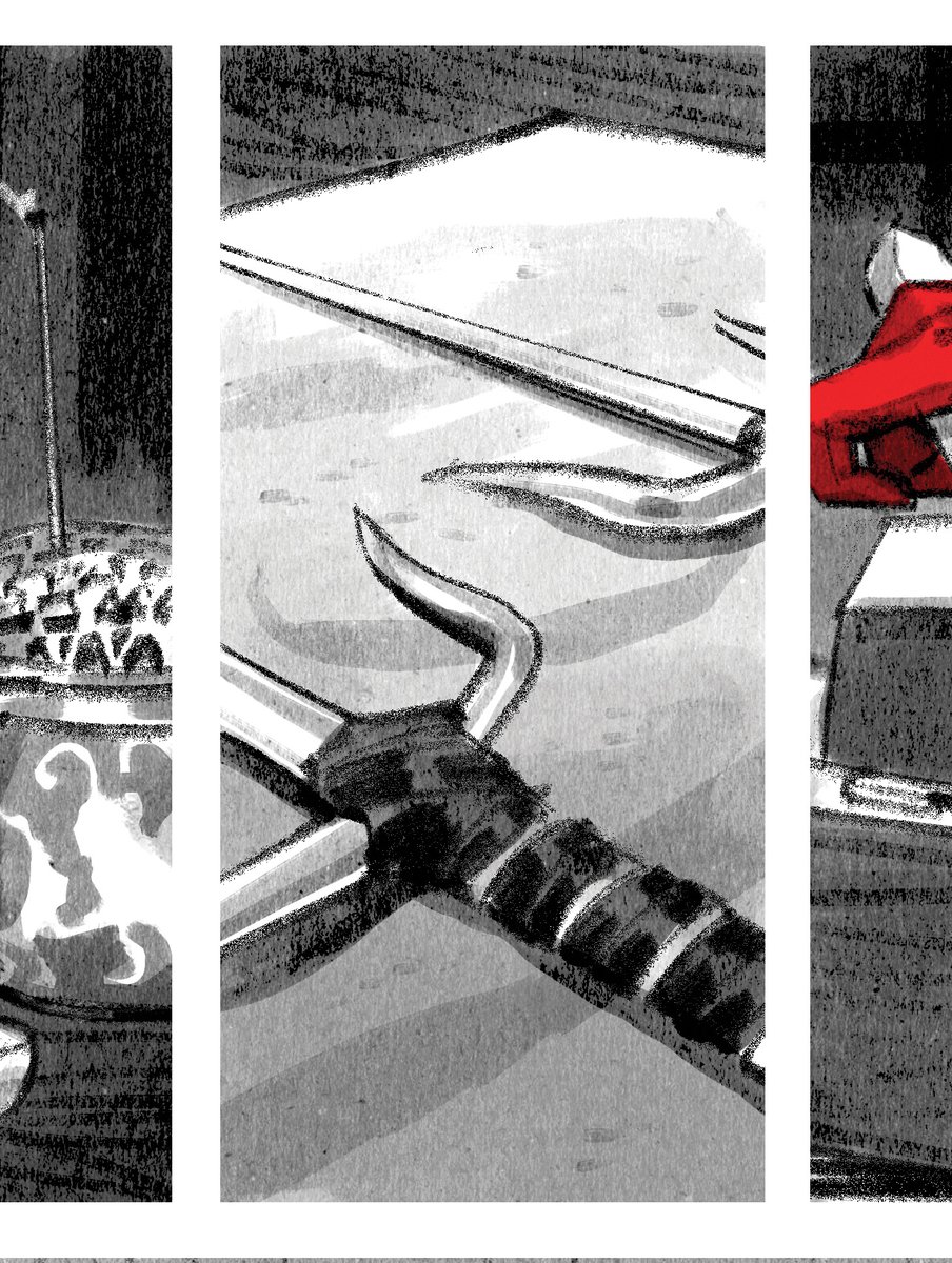
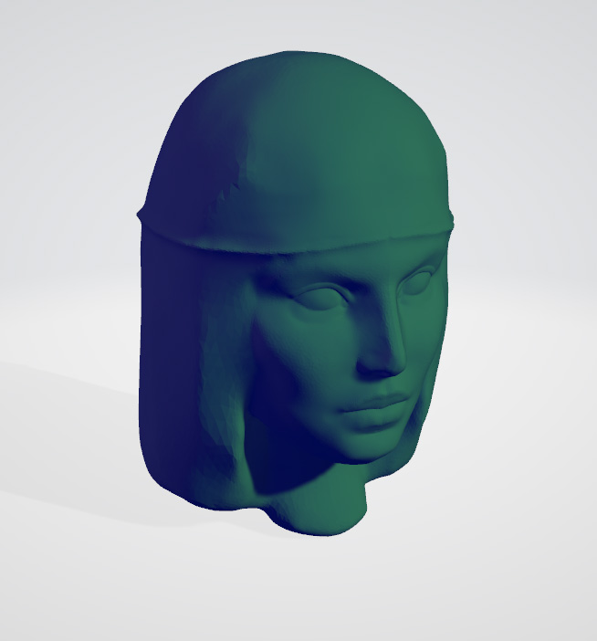
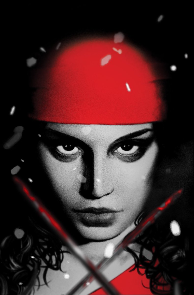
As soon as I took the Elektra gig, I went on Amazon and bought some cheap sai because I knew I was going to draw them a lot. Also sculpted a quick Elektra model so I wouldn't have to worry about consistency when drawing her over & over. I just traced the model over & over instead
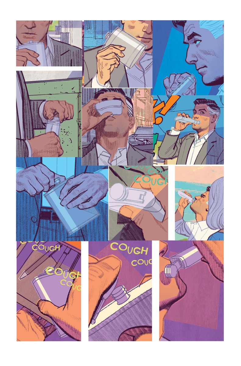
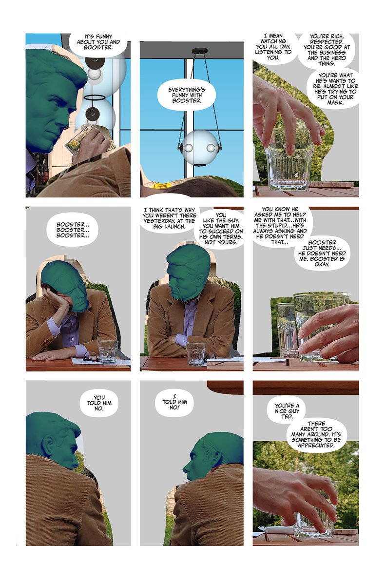
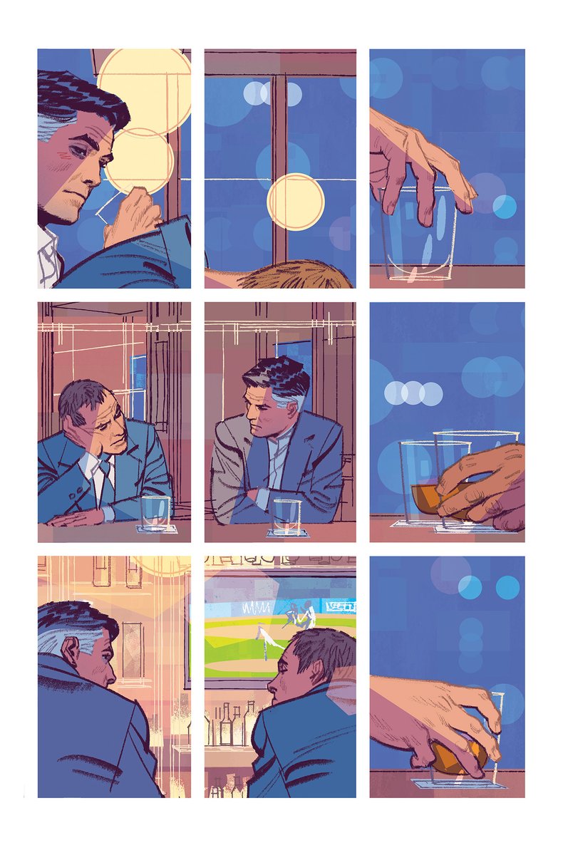
I have a cheap flask that I use for Human Target. Why? Because if you add up the amount of time I've saved just tracing a photo of it, it's paid for itself 10x over. If you're going for photo-realism and you're on a deadline, you've got to cut every corner you're able to.

Can photo reference and 3D models be relied on too heavily and produce work that is lifeless? Absolutely! But I've also seen plenty of stiff, lifeless art produced without the use of photo reference, too. Like any art tool, it's about how you use it.
So stop holding yourself to some impossible standard and break out the camera if you think it'll help. Go buy that prop if it'll help you make your deadline (or come close). And if it saves time, TRACE THE PHOTO.
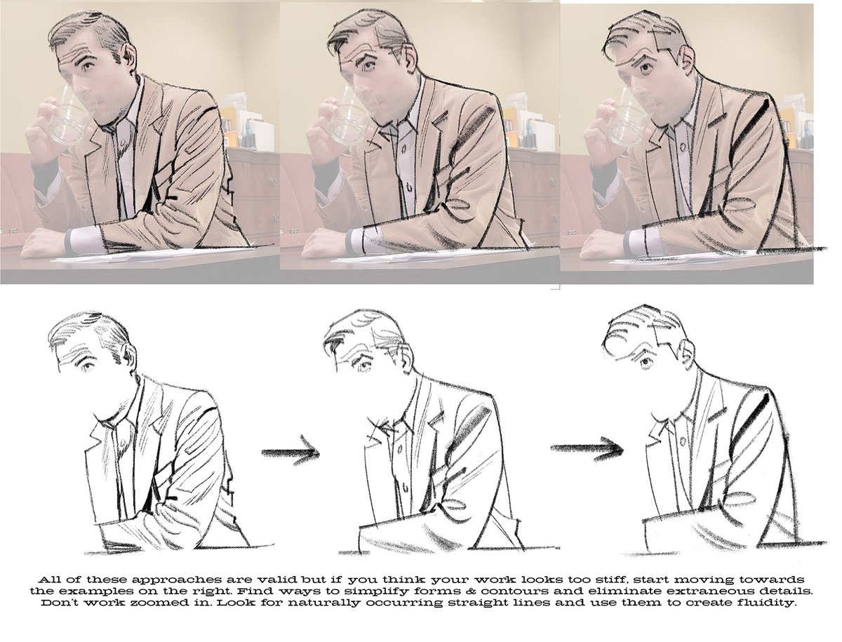
And if tracing photos makes your work look stiff, get better at tracing photos. Don't get bogged down in details and instead train yourself to see the broad strokes and forms. Focus on body language and not the intricate clothing folds.
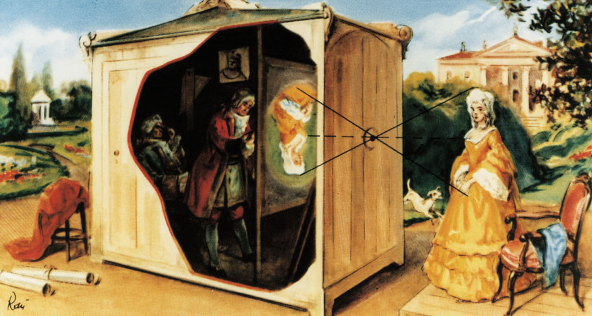
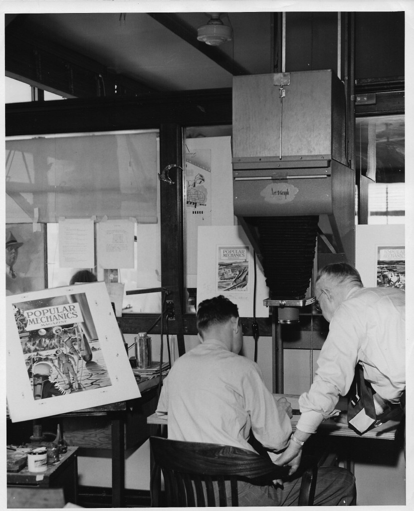
Also, instead of feeling guilty for doing what most professional artists have done throughout history, just be grateful you don't have to set up an elaborate camera obscura or a clunky artograph to do your tracing. You can just open up Photoshop. Or buy a cheap lightbox on Amazon
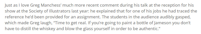
I'll end this thread with a great Gregory Manchess quote from that Arnie Fenner piece on Muddy Colors.
• • •
Missing some Tweet in this thread? You can try to
force a refresh