The problem with modern architecture.
(It isn't what you think)
A short thread...
(It isn't what you think)
A short thread...
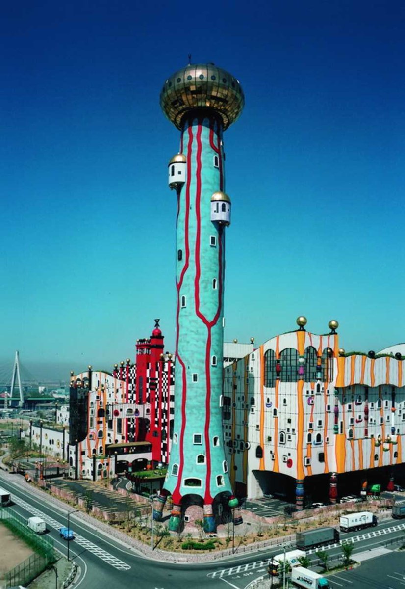
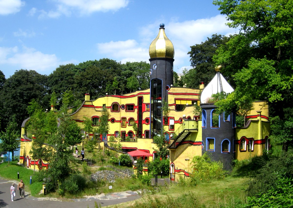
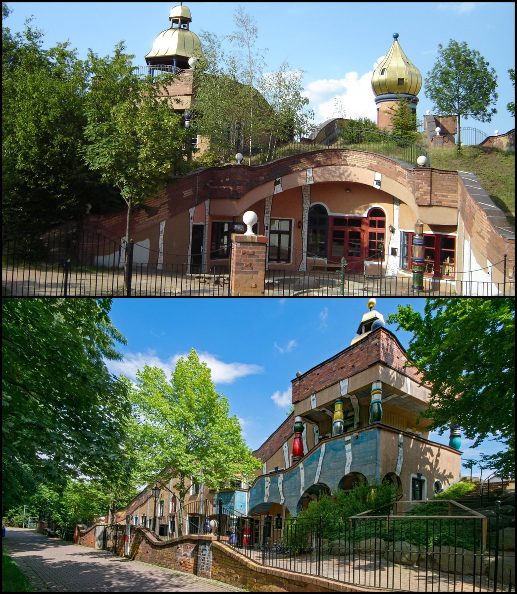
I'm not going to criticise these alien-looking vanity projects today.
Rather, before we get to the real problem, I'm going to (sort of) briefly defend them.
Rather, before we get to the real problem, I'm going to (sort of) briefly defend them.

However irredeemable their divergence from the architectural principles of Vitruvius (and every design principle of Antiquity & the Middle Ages...), and however far from the charm, usability, & longevity of vernacular architecture...
they aren't the real problem.
they aren't the real problem.

Because, at least, they're saying something.
Even if you don't like what they stand for, there is an aspirational quality about these buildings.
There is a concerted effort - even an abstract, anti-human one - to *create* something which is in some (convoluted) way, meaningful.
Even if you don't like what they stand for, there is an aspirational quality about these buildings.
There is a concerted effort - even an abstract, anti-human one - to *create* something which is in some (convoluted) way, meaningful.

The same could be said of Brutalism.
Whatever you think of its style or what it represents politically/artistically/culturally, you can't deny that it does have both of those things:
A style, and a message.
Whatever you think of its style or what it represents politically/artistically/culturally, you can't deny that it does have both of those things:
A style, and a message.

The real problem isn't the prize-winning, headline-grabbing, discussion-provoking, abstract, theoretical-architecture edifices.
Rather, it's the plain details of ordinary buildings, the ones that don't win prizes or generate discussion.
There is a negligence toward beauty.
Rather, it's the plain details of ordinary buildings, the ones that don't win prizes or generate discussion.
There is a negligence toward beauty.
Here are some examples:
1. Ceiling Tiles
They're EVERYWHERE. And they are ugly, easily broken, unnatural, peculiar, claustrophobic.
But they ARE functional: cheap & allow access to electrics.
This will become a theme...
1. Ceiling Tiles
They're EVERYWHERE. And they are ugly, easily broken, unnatural, peculiar, claustrophobic.
But they ARE functional: cheap & allow access to electrics.
This will become a theme...

2. Whitewashed Walls & Grey Carpets
Why does every office look like this?
Grey carpets & whitewashed walls. No colour. No design. No attempt to make it a pleasant environment.
Minimalism? Cost-efficiency?
Why does every office look like this?
Grey carpets & whitewashed walls. No colour. No design. No attempt to make it a pleasant environment.
Minimalism? Cost-efficiency?

3. Purely Functional Design
This bus shelter gets the job done, sure. You can wait inside to get away from the rain or wind.
But that's all. No flair. Nothing inviting.
No attempt to create even the slightest bit of beauty in the ordinary.
This bus shelter gets the job done, sure. You can wait inside to get away from the rain or wind.
But that's all. No flair. Nothing inviting.
No attempt to create even the slightest bit of beauty in the ordinary.

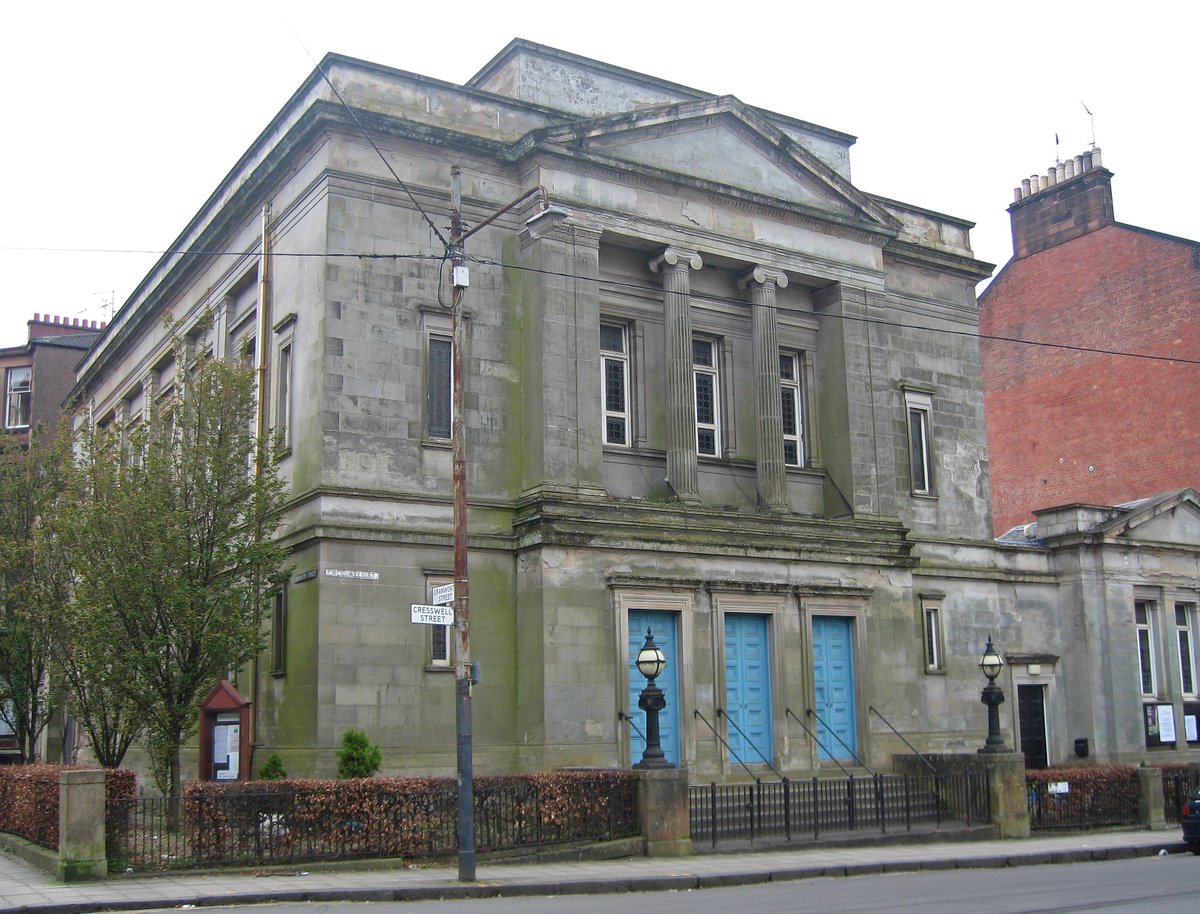
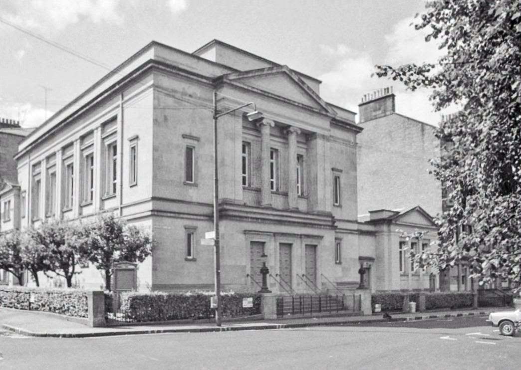
4. Apathetic Choices
Compare these two university lecture halls. Which one would you rather study in?
There is on obvious reason why they look so different.
Only that the second, newer one, required no effort to design & build. A (cheap) tick-box exercise.
Compare these two university lecture halls. Which one would you rather study in?
There is on obvious reason why they look so different.
Only that the second, newer one, required no effort to design & build. A (cheap) tick-box exercise.


5. Painfully Bright Lighting
In the words of Junichiro Tanizaki:
"The progressive Westerner is determined always to better his lot... his quest for a brighter light never ceases, he spares no pains to eradicate even the minutest shadow."
In the words of Junichiro Tanizaki:
"The progressive Westerner is determined always to better his lot... his quest for a brighter light never ceases, he spares no pains to eradicate even the minutest shadow."

And this is a problem because it is incredibly hard to fight against.
There is no identifiable cultural movement behind it, no specific architect or school of thought.
It's a deep-set, general, social problem.
There is no identifiable cultural movement behind it, no specific architect or school of thought.
It's a deep-set, general, social problem.
Who decided that street-lights should no longer look like this?

But should instead look like this?

Nobody *decided*.
It happened because of a drift towards utility & cost being prioritised over beauty, longevity, or character.
Even bins have been affected!
It happened because of a drift towards utility & cost being prioritised over beauty, longevity, or character.
Even bins have been affected!


See, this isn't about those large-scale, multi-million dollar projects.
(Though there ARE issues with them, that's not the crux of it.)
The every day things are what is most concerning.
(Though there ARE issues with them, that's not the crux of it.)
The every day things are what is most concerning.
There is no "vision" or "statement" to take issue with.
It is a silent, creeping creed of apathy.
Worse, it is a silent creed of ugliness.
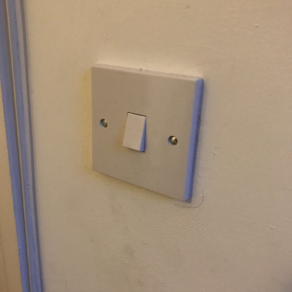
For example, compare these light-switches.
It is a silent, creeping creed of apathy.
Worse, it is a silent creed of ugliness.
For example, compare these light-switches.


There is only one Kunsthaus Graz, and a few thousand similar buildings.
But there are hundreds of millions of polystyrene ceiling tiles, grey carpets, whitewashed walls, functional streetlamps, painfully bright LED lights, poorly proportioned windows, and tarmacked streets.
But there are hundreds of millions of polystyrene ceiling tiles, grey carpets, whitewashed walls, functional streetlamps, painfully bright LED lights, poorly proportioned windows, and tarmacked streets.


How do we change this?
Anyway, I'm going to listen to Edvard Grieg's Piano Concert in A Minor and sulk...
Anyway, I'm going to listen to Edvard Grieg's Piano Concert in A Minor and sulk...
I'm really enjoying the discussion this thread has provoked - will endeavour to respond to you all!
Meanwhile, if you liked this thread then you may like my free weekly newsletter, Areopagus.
Seven short lessons every Friday (including architecture!)
getrevue.co/profile/cultur…
Meanwhile, if you liked this thread then you may like my free weekly newsletter, Areopagus.
Seven short lessons every Friday (including architecture!)
getrevue.co/profile/cultur…
• • •
Missing some Tweet in this thread? You can try to
force a refresh