The Cultural Tutor Profile picture
Jul 6, 2022 14 tweets 4 min read Read on X
If you study these 13 maps for just a couple of minutes each, you'll understand history much better.

Starting with... the migrations of prehistoric humanity. Image
Ancient Mesopotamia

The cradle of human civilisation. Writing, the wheel, and cities are just a few of the inventions we owe to the people of Sumer, Assyria, and Akkad. Image
The Bronze Age Collapse

A pivotal and mysterious moment in history, when much of the known world order imploded. Image
Ancient Greece

It wasn't a country - it was a collection of culturally aligned (but highly differing!) city-states with varying political structures. Image
The Conquests of Alexander the Great

From Macedonia to the Indus River Valley, history's greatest conqueror left a blazing trail across the known world. Image
Where were the books of the Bible written?

In many different places, centuries apart. This gives you some idea of the true scale of the Bible. Image
The Provinces of the Roman Empire

If you know the ancient names by which modern places were known, it will make reading Roman history much more enjoyable and understandable. Image
Ancient Rome itself. Image
Ancient India

A sorely unappreciated historical era. Image
The Crusades

You've heard about them, but now you can see where they came from, where they went, and how they got there. Image
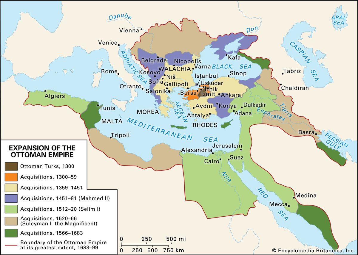
The expansion of the Ottoman Empire

The growth of one of the first truly pluralistic empires, spanning three continents and lasting for over six centuries.
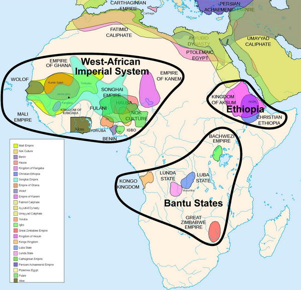
 Image
Pre-Colonial Africa

A vitally important map which isn't studied enough. Image
Europe on the eve of the First World War

Before the Old World tore itself to pieces. Nothing would ever be the same again. Image
These maps are far from a definitive list.

Rather, they're aimed at providing some general context of time and place.

Once you've got a basic framework of date and location in mind, history starts to make much more sense.

• • •

Missing some Tweet in this thread? You can try to force a refresh
 

Keep Current with The Cultural Tutor

The Cultural Tutor Profile picture

Stay in touch and get notified when new unrolls are available from this author!

Read all threads

This Thread may be Removed Anytime!

PDF

Twitter may remove this content at anytime! Save it as PDF for later use!

Try unrolling a thread yourself!

how to unroll video
  1. Follow @ThreadReaderApp to mention us!

  2. From a Twitter thread mention us with a keyword "unroll"
@threadreaderapp unroll

Practice here first or read more on our help page!

More from @culturaltutor

Jun 10
Who's to blame for boring architecture? Image
Politics and architecture don't map onto one another very well; trying to understand what leads to good architecture through political "isms" doesn't really get us anywhere.

While the USSR was building a baroque metro system, the USA was building modernist skyscrapers: Image
So the architecture debate is very strange, because opposing "sides" feel obliged to defend things that don't match their other views.

Some people want more "traditional" architecture, and others defend "modern" architecture.

These are, broadly speaking, the supposed "sides". Image
Read 25 tweets
Jun 8
Taking decoration away from buildings is like creating a world where trees never have any leaves: Image
The biggest difference between how we build now and how we used to build (in terms of appearance) is that we no longer decorate anything.

There are thousands of other changes (regulations, materials, size) but this is the one that people notice. Image
And this was, partly, a conscious aesthetic choice.

If you look at the early modernists like Adolf Loos and Le Corbusier, they are very open about their belief that decoration was no longer necessary.

As Loos said, famously: Image
Read 25 tweets
Jun 3
The truth about minimalism: Image
"Minimalism" is badly misunderstood, but that's not really anybody's fault, because we're living in a time where it feels like minimalism is the dominant aesthetic.

Everything from buildings to bollards are designed the same way: simple, no details, little variety or colour. Image
And so, because they're simple, we call it "minimalism".

But minimalism was never just about keeping things simple.

The point of minimalism is using beautiful materials to make useful things (like this chair), not making things as bland and greyscale as possible. Image
Read 25 tweets
Mar 3
Friedensreich Regentag Dunkelbunt Hundertwasser is the best modern architect you've never heard of.

His philosophy was simple. As he said:

"The straight line is godless and immoral."

If there's any building you can think of, he made it look like something from a dream... Image
Accommodation at a children's hospital in Essen, Germany, from 2005: Image
A kindergarten in Frankfurt, opened in 1995: Image
Read 23 tweets
Aug 31, 2025
We spend more than 90% of our time inside, so why do we design so many of our interiors like this?

Grey carpets, white walls, harsh lighting.

It's generic, boring, and genuinely bad for our physical and psychological health... Image
Not all interiors look like this, but too many do, and more all the time.

Grey carpets, white walls, harsh lighting, neutral colours for details, everything plastic, shiny, and rectangular.

This has become the standard for new buildings (and refurbishments) around the world. Image
A common response is that some people like it, or at least don't mind it.

Maybe, but that's the problem.

The sum of all tastes is no taste at all, and if our aim is simply to make things that people "don't mind" then we end up with blandness. Image
Read 22 tweets
Aug 21, 2025
The world's most famous neoclassical buildings are kind of boring and generic when you actually look at them.

It's even hard to tell them apart: which one below is Versailles, or Buckingham Palace?

So here's why neoclassical architecture (although it's nice) is overrated: Image
Buckingham Palace, despite being one of the world's most famous and visited buildings, is essentially quite boring and uninspiring from the outside.

There's a certain stateliness to it, but (like most big neoclassical buildings) it's really just a box wrapped in pilasters. Image
The same is true of Versailles.

Again, it's evidently pretty (largely thanks to the colour of its stone) but there's something weirdly plain about it, almost standardised.

Plus the emphasis on its horizontal lines makes it feel very low-lying, undramatic, and flat. Image
Read 26 tweets

Did Thread Reader help you today?

Support us! We are indie developers!


This site is made by just two indie developers on a laptop doing marketing, support and development! Read more about the story.

Become a Premium Member ($3/month or $30/year) and get exclusive features!

Become Premium

Don't want to be a Premium member but still want to support us?

Make a small donation by buying us coffee ($5) or help with server cost ($10)

Donate via Paypal

Or Donate anonymously using crypto!

Ethereum

0xfe58350B80634f60Fa6Dc149a72b4DFbc17D341E copy

Bitcoin

3ATGMxNzCUFzxpMCHL5sWSt4DVtS8UqXpi copy

Thank you for your support!

Follow Us!

:(