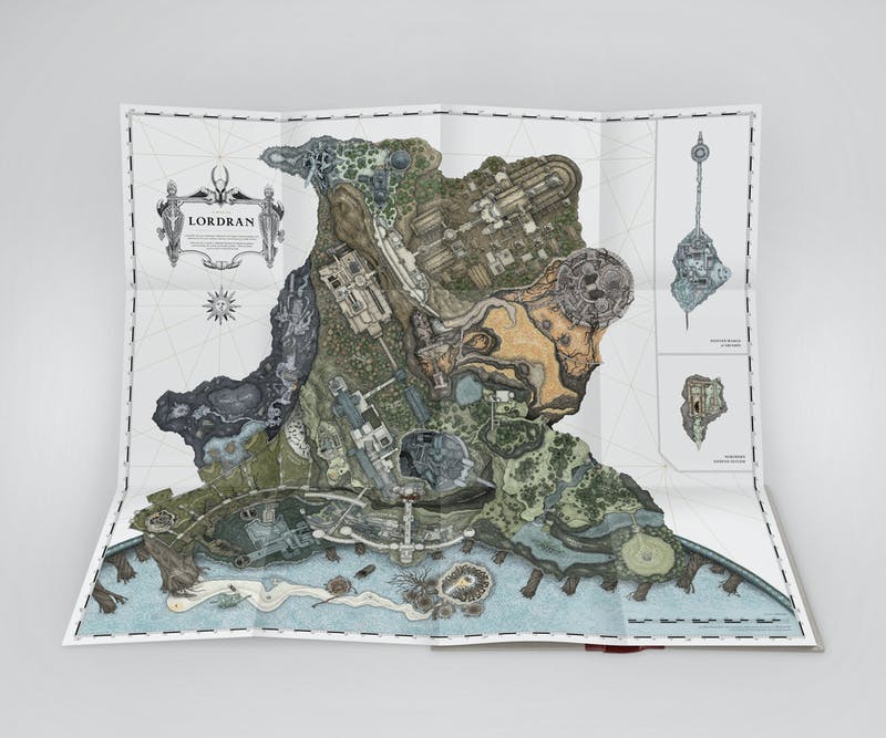
I'd like to tell you about how I made an extremely detailed and map of Lordran (a second time) for @tuneandfair 's #abyssalarchive.
#darksouls #fanart
#darksouls #fanart

@jkillingsw0rth originally approached me about because of my work on Laudate Solis. I guess I have a reputation as being the guy to go to for maps of Lordran.
fangamer.com/products/lauda…
fangamer.com/products/lauda…
The original scope of the ask was smaller. They were looking for some maps to put in the end papers of the book. But I get excited. I immediately had it in my mind that I would do this enormous Elden-Ring-Esque map of the entire game that I could repurpose for poster sales.
My initial exploration was thinking about how I'd execute this. I knew I wanted to step away from the flat style of Laudate Solis and that I wanted to work with a physical medium. I did some doodling and planning on how I would approach it. 


I then wanted to create a sort of 'proof of concept' to show the team at T&F the degree of detail and fidelity I could manage before I set off creating the entire thing. I started with Firelink, obviously. Working in pen on paper and then scanning to colour in Procreate. 


Everybody was pretty with the general direction, so I set about mapping the whole thing out. Initially I had been literally playing the game on Switch to do live surveying, accompanied by collision data from the Map Viewer.
sketchfab.com/3d-models/dark…
sketchfab.com/3d-models/dark…
But it quickly became apparent that stitching the whole thing together and making it all work just working from eye would be an incredibly laborious process. Plus, if I continued at the current scale I was drawing, the finished piece would literally be 10x10ft. Not manageable.
So I decided the best solution would be to plot out the entire map in detail ahead of rendering the sections. I just took screenshots of the different areas in the map viewer and figured out how I could slot them all together in ways that made sense and were accurate-ish to game. 

You can see here, for comparison, how the world is actually arrange compared to the artistic liberties I took to make it work in a condensed space. Note that perspective is throwing the scale of areas off in the map viewer (ie Duke's archive is close to camera, not actually huge) 


It meant shifting Izalith over a tad, scaling down darkroot a bit, rotating the angle of ash lake about 90°, scaling some things up and down a bit for it all to fit together nicely. But generally it all represents an accurate picture of the world.
The one big exception is the Catacombs/Tomb of Giants, both of which are just buried directly under everything else. I wanted to include, them, though, so I just scooted them over near where they really are. 

Then I took all the screenshots and did a really rough trace on them in illustrator at final scale, printed that out and tiled it together and used that template to trace the outlines of all segments so I could ensure uniform sizing and that everything would fit together. 

I would literally trace the rough outline using my window as a light table, then take the section and draw in the detail with pencil first, then go over in pen. 


It's worth noting that at this point I needed a better tool for viewing the maps to get the details accurately and luckly @beccenstein_ pointed me to NoClip, which is an absolute godsend and saved me countless hours.
noclip.website
noclip.website
This process took about 150 hours over about a month and used 18 A3 sheets of paper in total. It was fun to watch each section come to life. Some looked really solid, some were amorphous blobs without much to focus on. 


I didn't think I could learn any more about Dark Souls' world given the effort I put into Laudate Solis, but alas I ran into things that surprised me. Like how concentric Lost Izalith is and how it actually sits directly under the bell you see from Demon Ruins. 

In thinking about how this map sits on a page, I was originally exploring graphics that felt in line with the rest of the Abyssal Archive, using modern graphic elements. 

But I was also dead obsessed with old maps. Like nautical maps from the renaissance and how they used enormous decorative crests with elaborate text: 


I thought for a bit about hand-drawing absolutely every element of the map, including the keys and typography. 

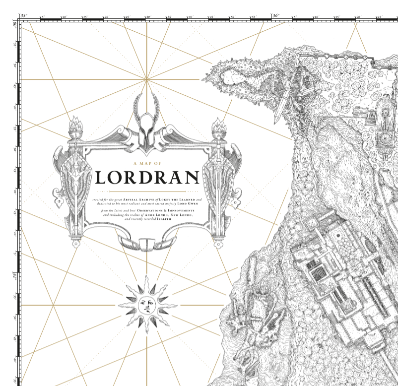
But ultimately I landed on a mixture. Hand-drawn crest and compass, mechanical accuracy for grid lines/graphs/keys etc. 

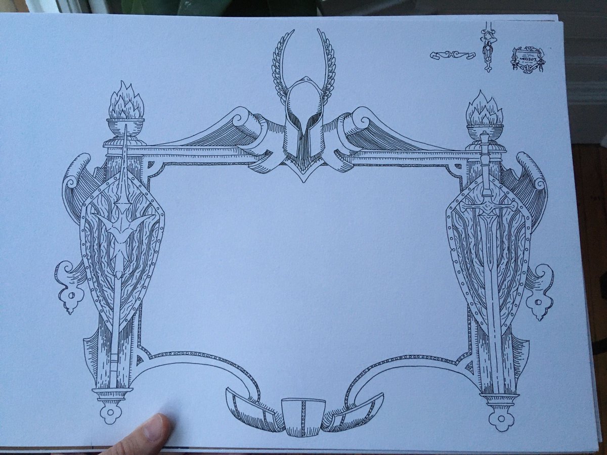
I tried to make the crest logical in the lore, as well. If someone was to commission a map of Lordran, it would be the lord - Gwyn. So I used the armor and weaponry of his knights to craft the crest, as well as fire imagery. 

That's the Silver knight helmet up top, spear on the left, straight sword on the right, and shields underneath on either side. Plus a lord-vessel-esque cauldron at the top left and right.
With all of the line art done - including two of the remote sections - it was time to start colouring. And immediately ran into a problem... as well as the max number of tweets I can add to a thread. Stick with me! 

Okay, onward we go. Anyway, the problem was this:
the image was enormous, and procreate couldn't handle it.
Working outside of procreate would DRASTICALLY increase production time, it's just so much more efficient.

the image was enormous, and procreate couldn't handle it.
Working outside of procreate would DRASTICALLY increase production time, it's just so much more efficient.


My solution was to convert to half-resolution, do all the colouring, then bring back onto desktop, up-res/add noise/slightly blur, and then replace the line art with the original full-resolution. And this worked pretty well. The crisp line art masked any fuziness of the colour. 

So then it was time to look at how it all came to life. At this point, T&F were so pleased with the map they wanted to lace it throughout the book, highlighting different areas that were relevant to that section. 

We decided grayscale would work best for this (here you can see the finals in place). So I needed to preserve a B&W version of the artwork in addition to the full colour version. So I STARTED in grayscale to get the values right first. 


Working with the original outlines, I first did some basic edge constrast work across the entire map, then I added some depth shading, then flat grey tones and brought it all together. Here's some WIPS: 


This was probably the slowest part of the process, and the least fun. It's necessary stuff but it was just a grind trying to get it all done. Especially the flat tones. But eventually I had this: 

But we had always wanted to drop in a few monsters in the style of the sea monsters in the oceans of old maps. We decided the ones that were "permanent" parts of the map made sense to include: hydras, firedrake, and the raven. 


Alas the Ash Lake hyrda is in the wrong spot, but it just worked a lot better compositionally - forgive me! 

With grayscale done, colour was easy. I already had surfaces blocked in I could just use the paint tool to fill so I could test rapidly and move swiftly. 

Lot's of experimenting in this stages, lots of changins entire areas a bit to make the whole thing work better. 


Eventually I wound up here. It's still in progress, to be honest, I need to polish up some rough edges that aren't visible at a distance and get the degree of saturation correct, etc. 

But at the end of the day, I'm pretty proud of what I accomplished. Even if I have pigeon-holed myself as the "guy who draws dark souls maps". 


If YOU would like a copy of this map, head over to abyssalarchive.com for details! It's an all-around incredible project from folks that care just as deeply about the game as I do. It's been an honour, and thanks for reading this far!
"details and map" nice. Really smashing my new pinned tweet.
• • •
Missing some Tweet in this thread? You can try to
force a refresh


