A case study in graphs that crush my soul, and why appropriate axes (and axis labels) are the lifeblood of data visualization.
Thank you to @K_Sheldrick and @DGlaucomflecken for addressing and highlighting this issue.
Thank you to @K_Sheldrick and @DGlaucomflecken for addressing and highlighting this issue.

Recently a study was published assessing the effectiveness of the Pfizer COVID vaccine in kids (age 5-11) against omicron. It analyzed data from 255,936 kids in Singapore from Jan-Apr 2022 to see who was vaccinated, who got COVID, and who was hospitalized. nejm.org/doi/full/10.10…
Vaccination for this age group started in Singapore right before the study started (Dec 2021), so many kids were vaccinated during the study period (Jan-Apr '22). They tracked timing of vaccination and infections to calculate effectiveness for partially and fully vaccinated kids.
The study found that the vaccine effectiveness against hospitalization from omicron remains quite strong: 83% effectiveness in fully vaccinated kids.
(As a side note, if 83% effectiveness seems "not that great" to you, read this:)
youcanknowthings.com/2022/05/21/how…
(As a side note, if 83% effectiveness seems "not that great" to you, read this:)
youcanknowthings.com/2022/05/21/how…
In response to this study, a commenter with a fairly large platform decided to reframe these results with this graph:

You can't even see the data (which seems to be the intended point.) This graph misleadingly suggests that the risk of hospitalization by COVID for kids is *so small* that getting vaccinated or not doesn't matter. It's basically 0!
This graph, while perhaps visually persuasive, makes some very basic errors that mislead and misrepresent the data. Let's go through them.
First, the y-axis is distorted by setting the max value too high. This is one of the oldest tricks in the book of how to mislead with graphs: if you would like your data to seem small, just set the axis to an inappropriately large number, and it will look tiny!
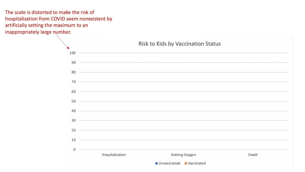
By plotting pediatric COVID hospitalizations on a graph that extends to 100% risk, it suggests that hospitalizations from COVID only *really* matter if the risk is high enough to show up on this graph.
But risk of what? Hospitalization each day? Over the course of the whole study? For those who tested positive? For all kids in the study?
The calculated risk (and thus where it shows up on the graph) will vary dramatically depending on the answers to these questions. And there is no axis label to tell us which risk the graph is referencing.
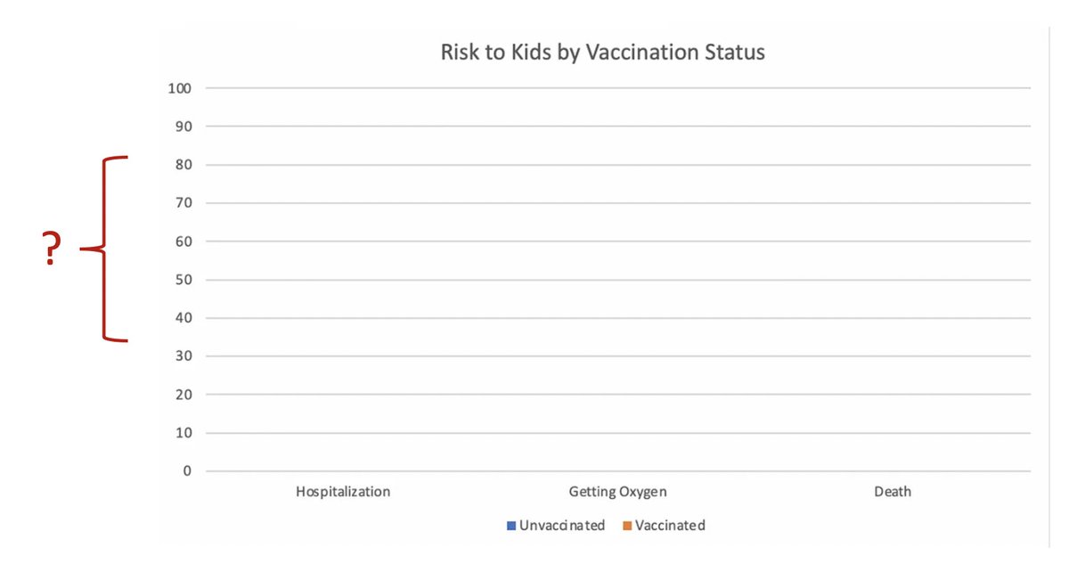
Which illustrates a key point: when you're assessing risk, you can't just say "oh that percentage is less than 1%, the risk is super low!" -- you have to know what population and time period you're talking about.
The "zoomed up" version of the graph is also missing the axis label. To figure out what risk this graph is referencing, I tried to match the data presented here with the results reported in the NEJM study, and the only analysis that seemed to fit this graph came from dividing...

total hospitalizations in each group by the total number of vaxxed and unvaxxed kids at the end of the study. This is not the correct way to analyze the data (and not the way the study did it) because it fails to account for the many kids who got vaccinated *during* the study.
If I'm correct, then this graph doesn't faithfully represent anything meaningful in the paper. But I don't know for sure, because, again, we have no axis label to tell us what data we're looking at.
Let's say for a second that this graph truly represented the risk of hospitalization from COVID over the course of the study period (about 2.5 months). Is a quarter of a percent risk so small that we should not worry about it?
To answer this question, you need context. You can make the risk of practically anything "seem" small or big depending on how you slice and dice the data.
For example, the average risk of all cause death for everyone in the US over the same time period (2.5 mo) is about 0.2%. That's hundreds of thousands of deaths, but the percentage "seems" small because we're looking across the entire population.
To assess if a quarter of a percent of kids getting hospitalized with COVID over 2.5 months is a "big deal", you have to compare to other risks to kids over the same time period. You can't just look at a single number and say "that's super small!" and decide it's insignificant.
This plays into a theme that has circulated widely in COVID times: the idea that if a risk isn't attached to a "big number", then it doesn't really matter.
For example, a common refrain circulating in 2020 was "The risk of death from COVID is small, 98% survive!"
For example, a common refrain circulating in 2020 was "The risk of death from COVID is small, 98% survive!"
I understand why people gravitate towards these interpretations. Assessing risk is complex, and deciding if the percentage seems "big" or "small" makes the job easier.
But this often inaccurate, because a small percentage of a very very big number can still be a very big number.
But this often inaccurate, because a small percentage of a very very big number can still be a very big number.
This thread is already too long to do a deep dive into the risk of COVID for kids compared to other childhood illnesses, but here's one article that does a good job of putting pediatric COVID into context:
insidemedicine.bulletin.com/pediatric-covi…
insidemedicine.bulletin.com/pediatric-covi…
In conclusion, inappropriate axis scales are misleading, unlabeled data is largely useless, risk depends on the population and time period, and determining if risk is significant requires putting it into context, not just deciding if the percentage seems like a small number.
As a final aside, remember that hospitalization/death are not the only bad outcomes from COVID, and that long COVID can debilitate adults and kids. Here's a recent article by @donofrio_sarah looking at the impact of COVID on the brain.
youcanknowthings.com/2022/06/23/how…
youcanknowthings.com/2022/06/23/how…
• • •
Missing some Tweet in this thread? You can try to
force a refresh