The Cultural Tutor Profile picture
Jul 26, 2022 14 tweets 5 min read Read on X
Has the world become less colourful?

(This graph shows the colour of objects over time) Colour of objects over time...
If you feel like the world seems increasingly colourless, you're not just imagining it.

Take cars, for example.

Greyscale colours now make up three quarters of cars produced globally, compared to less than 50% in the past. Image
Just look at a parking lot from the 1980s compared to one today. ImageImage
And the change has happened to interior design.

These were the most popular colours of the paint brand Dulux in 2020: Image
And here are the most popular kitchen paint colours in the UK, from 2019-20. Image
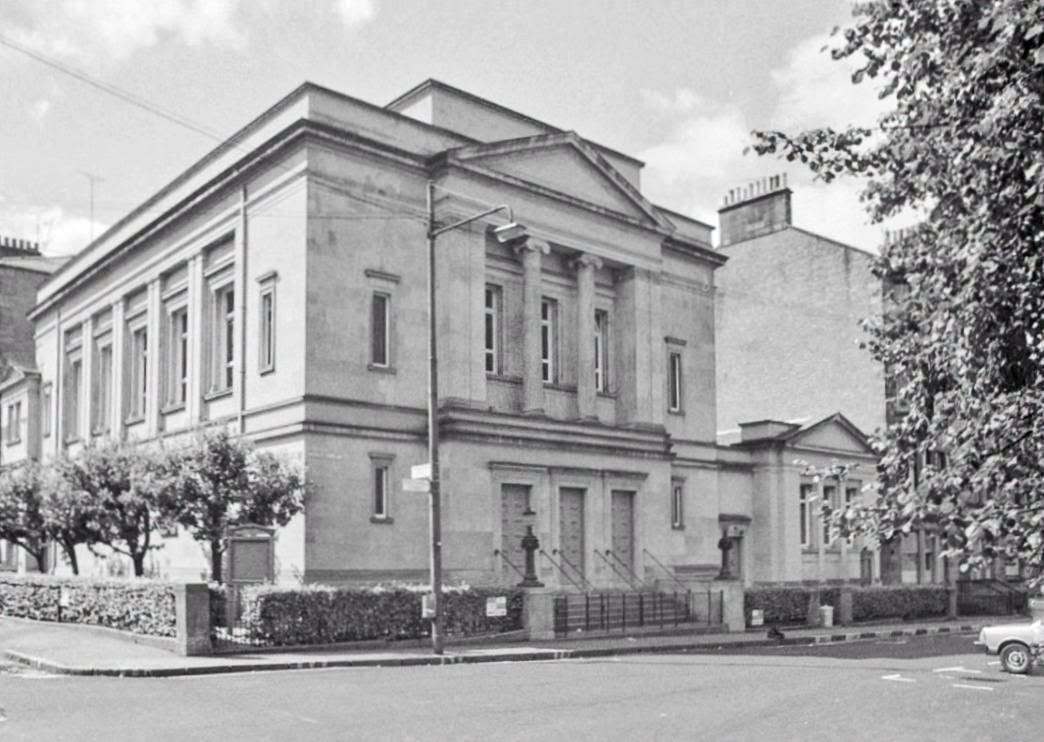
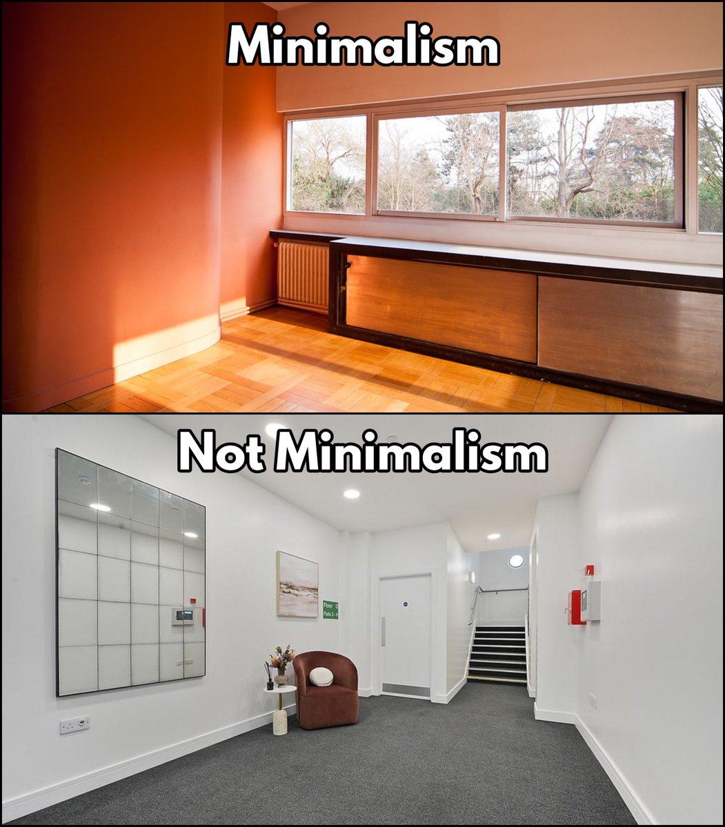
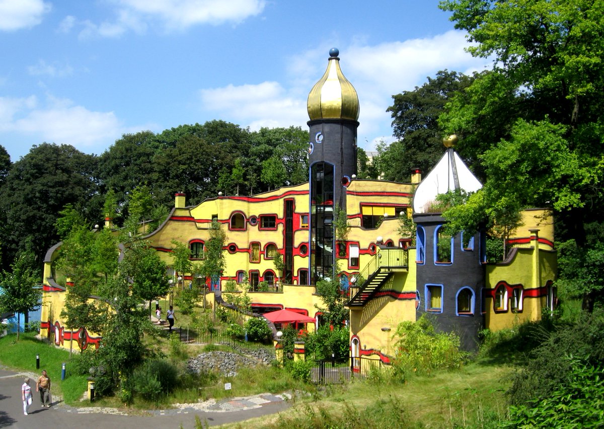
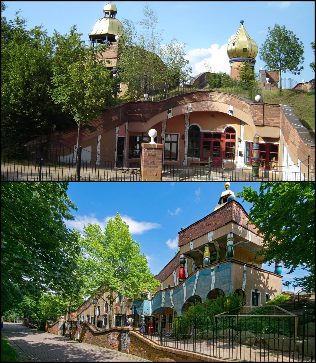
Just compare a typical 1970s home to a modern designer home.

While it is completely understandable if you don't miss the garish colours of bygone eras, it is interesting to note the change. ImageImage
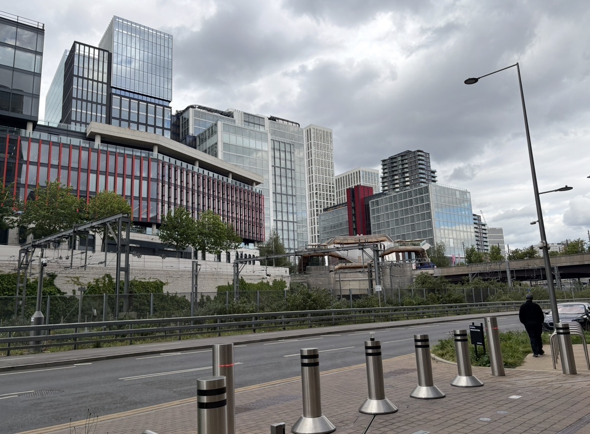
Similarly, there is a trend of whitewashing everything - be it made of wood, brick, plaster, or whatever. Image
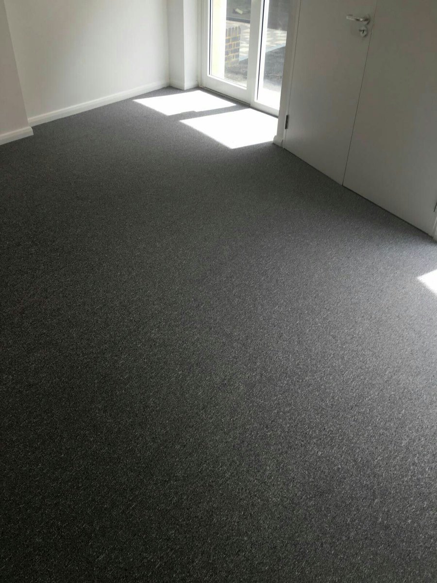
While grey is now the most common carpet colour: ImageImage
Neutral colours are by far the most popular when it comes to clothing: Image
Even McDonald's is less vibrant than it used to be! ImageImage
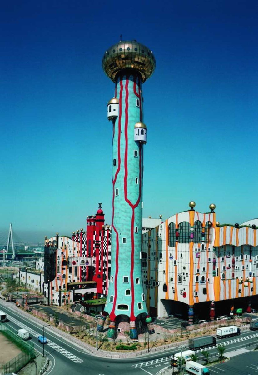
This trend includes just about everything.

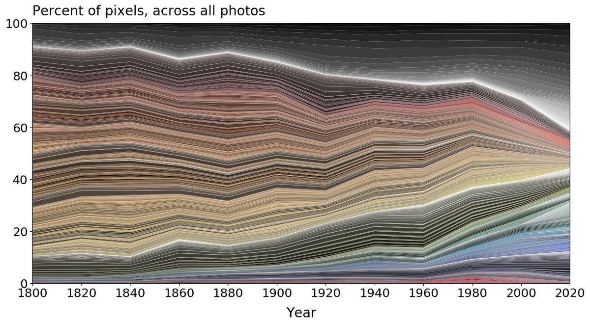
Consider this study, which analysed the colour of everyday objects over time.

Its conclusion is clear: neutral and greyscale colours *are* more common than ever. From Cath Sleeman, Colour &...
What has caused this change?

And do you think it's for better or worse?
If you found this thought-provoking then you'll like my free weekly newsletter, Areopagus.

Seven short lessons every Friday to make your week more interesting, useful, and beautiful.

culturaltutor.com/areopagus
And here is a link to the fascinating study referenced in this thread.

lab.sciencemuseum.org.uk/colour-shape-u…

• • •

Missing some Tweet in this thread? You can try to force a refresh
 

Keep Current with The Cultural Tutor

The Cultural Tutor Profile picture

Stay in touch and get notified when new unrolls are available from this author!

Read all threads

This Thread may be Removed Anytime!

PDF

Twitter may remove this content at anytime! Save it as PDF for later use!

Try unrolling a thread yourself!

how to unroll video
  1. Follow @ThreadReaderApp to mention us!

  2. From a Twitter thread mention us with a keyword "unroll"
@threadreaderapp unroll

Practice here first or read more on our help page!

More from @culturaltutor

Aug 21
The world's most famous neoclassical buildings are kind of boring and generic when you actually look at them.

It's even hard to tell them apart: which one below is Versailles, or Buckingham Palace?

So here's why neoclassical architecture (although it's nice) is overrated: Image
Buckingham Palace, despite being one of the world's most famous and visited buildings, is essentially quite boring and uninspiring from the outside.

There's a certain stateliness to it, but (like most big neoclassical buildings) it's really just a box wrapped in pilasters. Image
The same is true of Versailles.

Again, it's evidently pretty (largely thanks to the colour of its stone) but there's something weirdly plain about it, almost standardised.

Plus the emphasis on its horizontal lines makes it feel very low-lying, undramatic, and flat. Image
Read 13 tweets
Aug 17
These aren't castles, palaces, or cathedrals.

They're all water towers, literally just bits of infrastructure relating to water management.

Is it worth the additional cost and resources to make things look like this... or is it a waste? Image
These old water towers are an architectural subgenre of their own.

There are hundreds, mostly Neo-Gothic, and all add something wonderful to the skylines of their cities.

Like the one below in Bydgoszcz, Poland, from 1900.

But, most importantly, they're just infrastructure. Image
We don't think of infrastructure as something that can improve how a town looks and feels.

Infrastructure is necessary to make life convenient; but also, we believe, definitionally boring.

These water towers prove that doesn't have to, and shouldn't be, the case. Image
Read 24 tweets
Aug 8
If one thing sums up the 21st century it's got to be all these default profile pictures.

You've seen them literally thousands of times, but they're completely generic and interchangeable.

Future historians will use them to symbolise our current era, and here's why... Image
To understand what any society truly believed, and how they felt about humankind, you need to look at what they created rather than what they said.

Just as actions instead of words reveal who a person really is, art always tells you what a society was actually like.
And this is particularly true of how they depicted human beings — how we portray ourselves.

That the Pharaohs were of supreme power, and were worshipped as gods far above ordinary people, is made obvious by the sheer size and abundance of the statues made in their name: Image
Read 23 tweets
Aug 6
This is St. Anne's Church in Vilnius, Lithuania.

It's over 500 years old and the perfect example of a strange architectural style known as "Brick Gothic".

But, more importantly, it's a lesson in how imagination can transform the way our world looks... Image
Vilnius has one of the world's best-preserved Medieval old towns.

It's a UNESCO World Heritage Site, filled with winding streets and architectural gems from across the ages.

A testament to the wealth, grandeur, and sophistication of the Polish-Lithuanian Commonwealth. Image
Among its many treasures is the Church of St Anne, built from 1495 to 1500 under the Duke of Lithuania and (later) King of Poland, Alexander I Jagiellon.

It's not particularly big — a single nave without aisles — but St Anne's makes up for size with its fantastical brickwork. Image
Read 18 tweets
Jul 31
Tell your friends! Your enemies! Your lovers!

The Spanish edition of my new book, El Tutor Cultural, is now available for pre-order.

It'll be released on 22 October — and you can get it at the link in my bio.

To celebrate, here are the 10 best things I've written about Spain: from why Barcelona looks the way it does to one of the world's most underrated modern architects, from the truth about Pablo Picasso to the origins of the Spanish football badge...Image
What makes Barcelona such a beautiful city? It wasn't an accident — this is the story of how the modern, beloved Barcelona was consciously created:

Image
And, speaking of Barcelona, here's why the renovation of the Camp Nou is — although necessary — a shame:

Image
Read 11 tweets
May 21
When Vincent van Gogh started painting he didn't use any bright colours — so what happened?

It isn't just about art.

This is a story about how we're all changed by the things we consume, the places we go, and the people we choose to spend time with... Image
The year is 1881.

A 27 year old former teacher and missionary from the Netherlands called Vincent van Gogh decides to try and become a full-time artist, after being encouraged by his brother Theo.

What does he paint? The peasants of the countryside where his parents lived. Scheveningen Woman Sewing (1881)
Vincent van Gogh's early work is unrecognisably different from the vibrant painter now beloved around the world.

Why?

Many reasons, though one of the most important is that he had been influenced by his cousin, the Realist painter Anton Mauve, who painted like this: Fishing Boat and Draught Horses on the Beach by Anton Mauve
Read 23 tweets

Did Thread Reader help you today?

Support us! We are indie developers!


This site is made by just two indie developers on a laptop doing marketing, support and development! Read more about the story.

Become a Premium Member ($3/month or $30/year) and get exclusive features!

Become Premium

Don't want to be a Premium member but still want to support us?

Make a small donation by buying us coffee ($5) or help with server cost ($10)

Donate via Paypal

Or Donate anonymously using crypto!

Ethereum

0xfe58350B80634f60Fa6Dc149a72b4DFbc17D341E copy

Bitcoin

3ATGMxNzCUFzxpMCHL5sWSt4DVtS8UqXpi copy

Thank you for your support!

Follow Us!

:(