
The most powerful CSS one-liners:
1/ Drop shadow
When you work with transparent images you can use `drop-shadow()` filter function to create a shadow on the image's content, instead of `box-shadow` property which creates a rectangular shadow behind an element's entire box:
filter: drop-shadow(2px 4px 8px #000);
When you work with transparent images you can use `drop-shadow()` filter function to create a shadow on the image's content, instead of `box-shadow` property which creates a rectangular shadow behind an element's entire box:
filter: drop-shadow(2px 4px 8px #000);

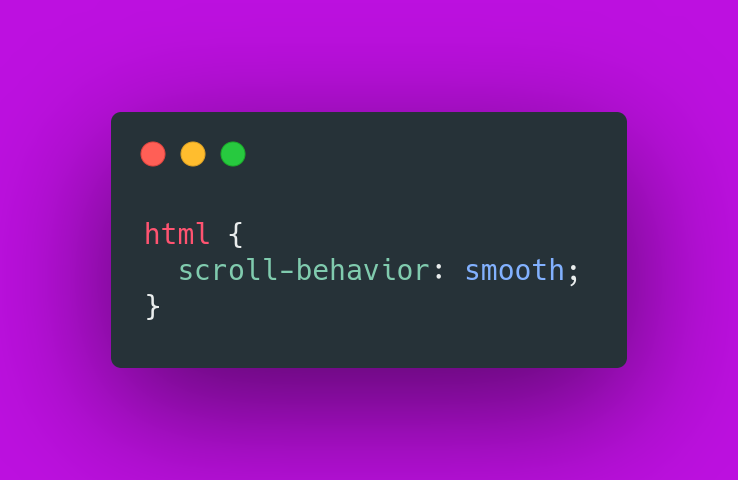
2/ Smooth scroll
Smooth scrolling with zero JavaScript, with just one line of CSS.
Smooth scrolling with zero JavaScript, with just one line of CSS.
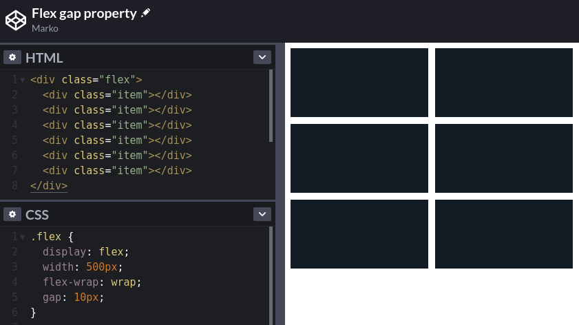
3/ Gap
Use the `gap` CSS property to set the gaps (gutters) between rows and columns.
Use the `gap` CSS property to set the gaps (gutters) between rows and columns.
4/ CSS Scroll Snap
You can use the CSS Scroll Snap feature to create well-controlled scroll experiences:
You can use the CSS Scroll Snap feature to create well-controlled scroll experiences:
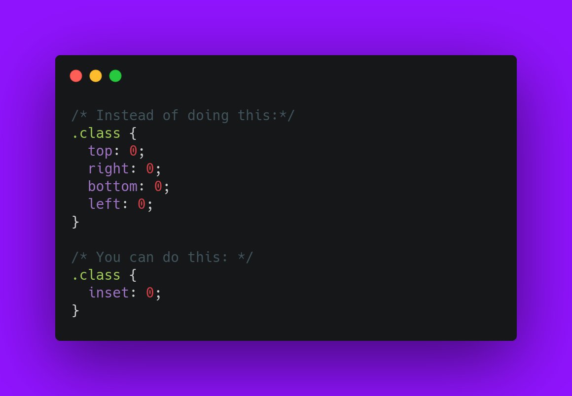
5/ Inset
Use the `inset` CSS property as a shorthand for `top`, `right`, `bottom`, `left`:
Use the `inset` CSS property as a shorthand for `top`, `right`, `bottom`, `left`:
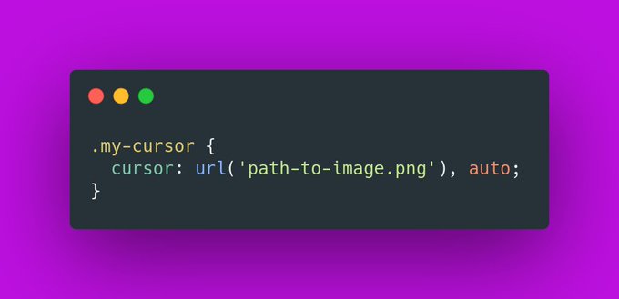
6/ Custom cursors
Did you know that you can use your own image, or even emoji as a cursor?
Did you know that you can use your own image, or even emoji as a cursor?
7/ Truncate text
You can use the `-webkit-line-clamp` property to truncate the text to a specific number of lines.
Super useful.
You can use the `-webkit-line-clamp` property to truncate the text to a specific number of lines.
Super useful.

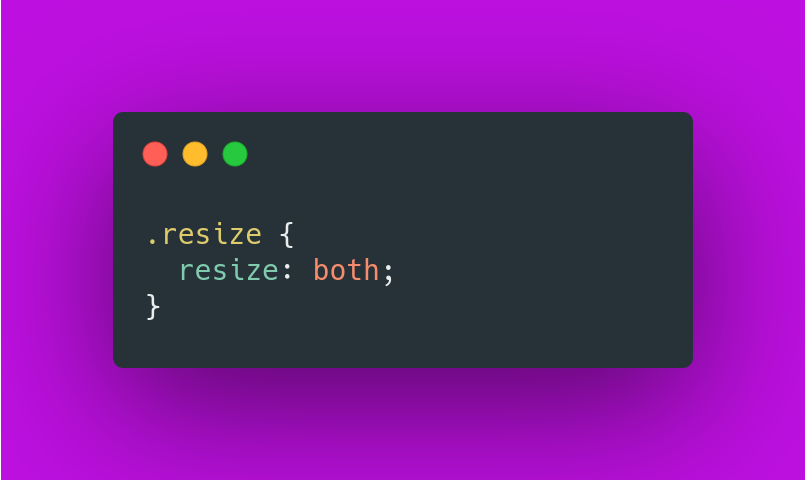
8/ Resize
Did you know that you can make any element resizable, just like `<textarea>`?
Did you know that you can make any element resizable, just like `<textarea>`?
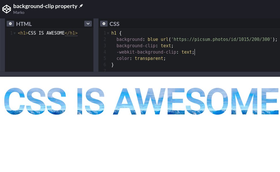
9/ background-clip
Use the `background-clip` property to create beautiful headlines.
Use the `background-clip` property to create beautiful headlines.
If you liked this thread, share it with your friends:
https://twitter.com/denicmarko/status/1559117844205473794
• • •
Missing some Tweet in this thread? You can try to
force a refresh


