
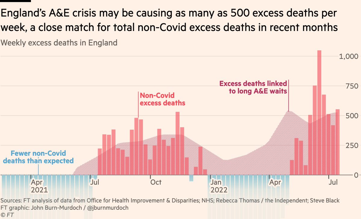
NEW: the collapse of emergency healthcare in England may be costing 500 lives every week, a close match for non-Covid excess deaths
Let’s look at how we reach that conclusion, by taking a deep-dive into non-Covid excess mortality and its possible causes
ft.com/content/f36c5d…
Let’s look at how we reach that conclusion, by taking a deep-dive into non-Covid excess mortality and its possible causes
ft.com/content/f36c5d…
First, the international picture
While excess deaths everywhere are far below Covid peaks, many countries are still seeing a sustained excess this summer, suggesting a common factor is causing unexpected deaths in dozens of countries.
But all may not be as it seems...
While excess deaths everywhere are far below Covid peaks, many countries are still seeing a sustained excess this summer, suggesting a common factor is causing unexpected deaths in dozens of countries.
But all may not be as it seems...

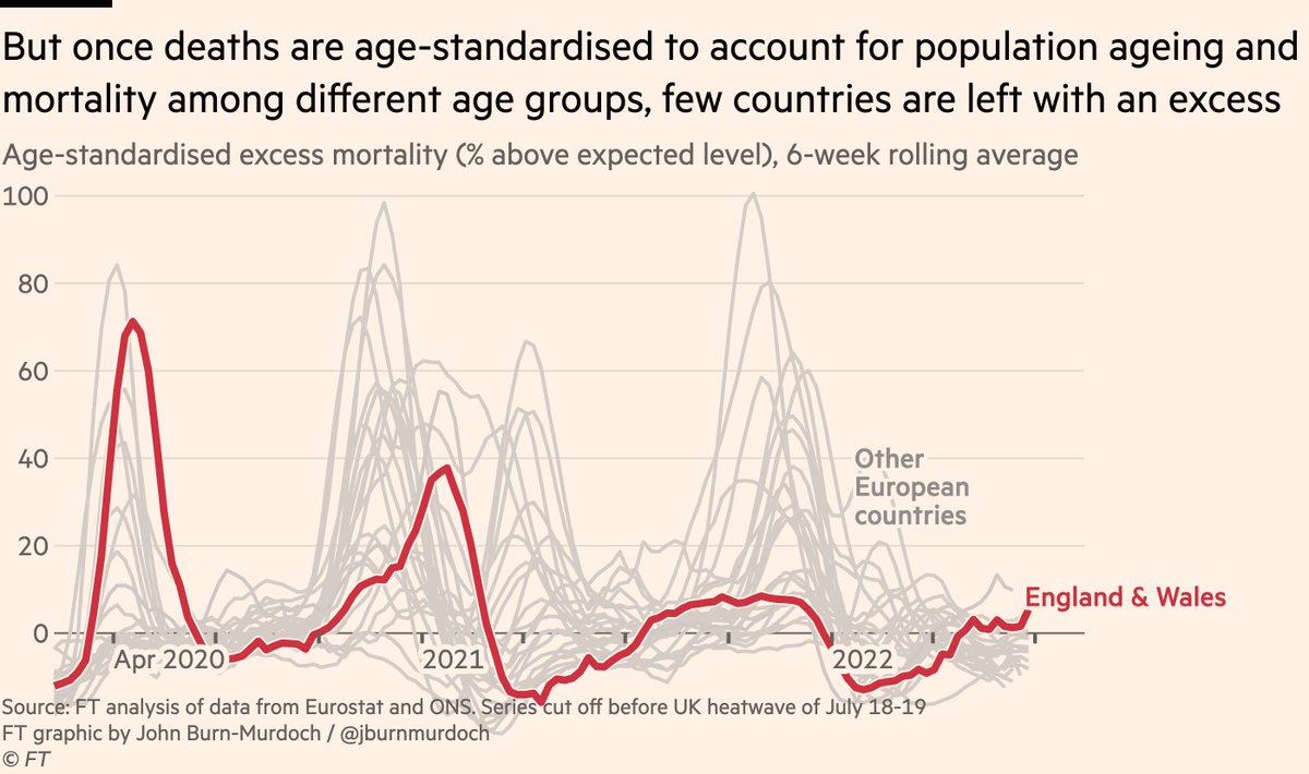
As the likes of @ActuaryByDay, @john_actuary and @ONS have demonstrated, we can do better than raw, unadjusted excess mortality.
We can use age-standardisation to adjust for the changing age structures of populations, and for which age groups our excess deaths are found in.
We can use age-standardisation to adjust for the changing age structures of populations, and for which age groups our excess deaths are found in.
Once we standardise mortality rates over time, we see that shifts in population age structures since 2015 explain a large amount of the observed excess.
The corrected data show only a handful of countries now recording an excess, where before the majority were above zero.
The corrected data show only a handful of countries now recording an excess, where before the majority were above zero.
This is good news! 🎉
What we thought was months-long unexplained excess mortality in dozens of countries can be explained in most cases by population growth and demographic churn.
But let’s look closer. England is still recording an age-standardised excess, and it’s not alone.
What we thought was months-long unexplained excess mortality in dozens of countries can be explained in most cases by population growth and demographic churn.
But let’s look closer. England is still recording an age-standardised excess, and it’s not alone.
Zooming in on recent months, comparing raw to age-standardised mortality, a handful of countries have a sustained excess from late spring thru summer.
England & Wales are joined by Spain & Portugal. Given negative excess elsewhere, this is worrying, so what could be driving it?
England & Wales are joined by Spain & Portugal. Given negative excess elsewhere, this is worrying, so what could be driving it?

Some of you may be wondering: could it be the heatwave?
Well, yes and no. I’ve deliberately cut off the time series before the record-breaking English heatwave of July 18-19th, so heat can’t explain the English excess.
But what about Portugal and Spain?
Well, yes and no. I’ve deliberately cut off the time series before the record-breaking English heatwave of July 18-19th, so heat can’t explain the English excess.
But what about Portugal and Spain?
It’s highly likely that the Iberian peninsula’s prolonged period of extreme heat has played a major role.
All focus in England was on the record-breaking July 18-19th heatwave, but Portugal & Spain saw temperatures at or above 40ºC for extensive periods earlier in the summer.
All focus in England was on the record-breaking July 18-19th heatwave, but Portugal & Spain saw temperatures at or above 40ºC for extensive periods earlier in the summer.

So with extreme heat likely to be playing a major role in Iberian excess mortality, that leaves England & Wales as the only part of Europe that has recorded sustained and rising excess mortality over the last few months with no obvious natural explanation.

This suggests we’re dealing with English exceptionalism 🙃, and is arguably sufficient to refute the original idea, hinted at by raw non-standardised excess deaths, that a common factor was causing unexpected deaths in dozens of countries.
So what’s causing the English excess?
So what’s causing the English excess?
To answer that question, we turn to data published by @OHID, which breaks down English mortality by cause of death, allowing us to split out Covid from non-Covid deaths for the first time in this analysis gov.uk/government/sta…
For the first year of the pandemic, Covid deaths and excess deaths were one and the same (very early in the pandemic, some Covid deaths were missed by coroners), but in summer 2021 and 2022 we’ve seen sustained excess deaths over and above those where Covid played a direct role.

Here’s the same data but subtracting Covid deaths from total excess deaths, leaving non-Covid excess
During the last two winters we actually saw far fewer non-Covid deaths than usual, with flu largely at bay, but summers have seen more people dying than usual, and not from Covid
During the last two winters we actually saw far fewer non-Covid deaths than usual, with flu largely at bay, but summers have seen more people dying than usual, and not from Covid

So what’s going on?
One theory is that it still *is* Covid, just not acute Covid. Elevated risk of heart problems in the months following a Covid infection have been posited as one explanation, for example nature.com/articles/d4158…
What can the @OHID cause of death data tell us?
One theory is that it still *is* Covid, just not acute Covid. Elevated risk of heart problems in the months following a Covid infection have been posited as one explanation, for example nature.com/articles/d4158…
What can the @OHID cause of death data tell us?
Here are non-Covid excess deaths by cause of death mentioned on the death certificate.
At first glance, the indirect-Covid theory is borne out, with a much larger rise in the number of additional deaths from heart and circulatory diseases than from other conditions.
But...
At first glance, the indirect-Covid theory is borne out, with a much larger rise in the number of additional deaths from heart and circulatory diseases than from other conditions.
But...

That fails to take account of what people usually die from, and once we switch from nominal to relative excess, i.e expressing increased deaths as a % of typical levels, the cardio-vascular dominance disappears, instead leaving a broad-based increase across many conditions.

Multiple key patterns here:
1) We know there was significant disruption to cancer treatment and screenings during pandemic, but given the relatively slow progression of cancer, that is not yet feeding through into increased cancer mortality. Unfortunately it may well do later.
1) We know there was significant disruption to cancer treatment and screenings during pandemic, but given the relatively slow progression of cancer, that is not yet feeding through into increased cancer mortality. Unfortunately it may well do later.
2) The increases in deaths across cardio-vascular, liver and urinary diseases, diabetes and beyond suggests that rather than a single specific condition being exacerbated by e.g prior Covid infection, we’re looking at a more broad-based mechanism here...
...the sort of mechanism that might be explained by the sudden collapse of emergency care, leaving people suffering from these conditions having to wait hours for urgent treatment, if they are treated at all.
And that brings me onto the direct evidence for the role of England’s current NHS emergency care crisis in the country’s sustained non-Covid excess mortality.
Last year, a team of healthcare researchers including @sib313 published a vitally important study showing the increased mortality risk resulting from exceptionally long waits in A&E before receiving treatment emj.bmj.com/content/emerme…
Patients who waited 8-12 hours had a 16% higher chance of dying in the subsequent 30 days than average.
This was after adjusting for a huge range of possible confounders, i.e this was not due to those patients’ characteristics, conditions etc, but due to the length of the wait.
This was after adjusting for a huge range of possible confounders, i.e this was not due to those patients’ characteristics, conditions etc, but due to the length of the wait.

Crucially, we can overlay that elevated risk gradient onto A&E waiting times data, and use it to estimate how many additional deaths may have been caused by exceptional A&E waits in recent months.
You may have heard almost 30,000 people waited 12 hours in English A&Es in July, but that figure actually only refers to the wait *after* initial assessment
Thanks to @Rebeccasmt’s reporting, we know that if you include all time spent waiting, 100,000 people waited 12+ hours ‼️
Thanks to @Rebeccasmt’s reporting, we know that if you include all time spent waiting, 100,000 people waited 12+ hours ‼️
So we can use that data to calculate the number of additional long A&E waits that we’re currently seeing over and above the pre-pandemic level, and multiply those by the increased mortality risk associated with such waits, which gives us...

Our estimate of as many as 500 non-Covid excess deaths every week in England, due to the dire situation in emergency departments.
These will be people with conditions including but not limited to heart problems, complications from diabetes or liver disease... sound familiar?
These will be people with conditions including but not limited to heart problems, complications from diabetes or liver disease... sound familiar?

The prior demonstration of a direct and precise association between A&E waiting times and mortality risk makes these data the best for estimating the mortality impact of the current NHS crisis, but other data show very similar patterns.
Take ambulance delays, for example: for emergency situations including suspected strokes and heart attacks, the *average* wait for an ambulance to arrive on the scene is now one hour, and 40,000 people with these sorts of emergencies waited 2 hours last month.
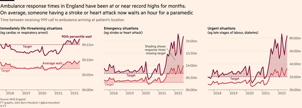
@tomhcalver has shown that these delays cause real harm to patients, in some cases directly contributing to loss of life thetimes.co.uk/article/6311fc…, and as with A&E waits we can use the data to get an idea of how much "excess ambulance-delay-related harm" is currently being caused

As before, the peaks in ambulance-related harms broadly coincide with peaks in England’s non-Covid excess mortality.
It’s a grim picture, and an increasingly conclusive one.
It’s a grim picture, and an increasingly conclusive one.

So if we can be increasingly confident that the crisis in emergency departments is the proximate cause of a substantial portion of England’s excess mortality, then what is the underlying cause?
Why are A&S so full? Why are ambulances so stretched?
Why are A&S so full? Why are ambulances so stretched?
One common theory is that more people must be getting sick, and those who are, must be getting sicker. English A&Es must simply be overrun, dealing with the fallout from the pandemic.
But the data don’t bear this out.
But the data don’t bear this out.
First, we can look at how many people are turning up to A&E. Numbers have just about recovered to the pre-pandemic trend, but they’re certainly no higher.

Second, we can look at the share of A&E attendees who end up being admitted to hospital, as a proxy for the severity of the conditions people are presenting with.
This is now below the pre-pandemic trend, suggesting no increase in acuity.
This is now below the pre-pandemic trend, suggesting no increase in acuity.

If the number of people needing urgent care is not abnormally high, and nor is the severity of their conditions, this underscores that the problem is what happens when people get to A&E / call an ambulance.
So why are delays and therefore outcomes so bad?
So why are delays and therefore outcomes so bad?
The answer is not found in A&E, it’s found in the rest of the hospital.
Specifically, in the acute shortage of available beds for emergency arrivals.
Just 7% of English hospital beds are currently unoccupied, the lowest figure since records began, and far short of safe levels.
Specifically, in the acute shortage of available beds for emergency arrivals.
Just 7% of English hospital beds are currently unoccupied, the lowest figure since records began, and far short of safe levels.

You can’t run hospitals like a "just in time" operation, keeping spare capacity to a minimum.
You might be able to plan and schedule elective appointments, but you can’t plan and schedule emergency arrivals. They require a healthy amount of spare capacity
You might be able to plan and schedule elective appointments, but you can’t plan and schedule emergency arrivals. They require a healthy amount of spare capacity
https://twitter.com/DevanSinha/status/1561640117911146498
So, the problem driving the A&E crisis is a lack of available beds elsewhere. Well, what’s causing that?
Delayed discharges of patients.
You’ll recall just 7% of beds are unoccupied. Well almost double that — 13% — are occupied by patients who are waiting to be discharged.
Delayed discharges of patients.
You’ll recall just 7% of beds are unoccupied. Well almost double that — 13% — are occupied by patients who are waiting to be discharged.

This is another record high, and amounts to more than 13,000 beds that are occupied by people who no longer need to be in hospital.
Why have they not been discharged yet? This one is a little more nuanced.
Why have they not been discharged yet? This one is a little more nuanced.
The most commonly cited reason is a shortage of social care resources, be it spaces in care homes, home care packages, support/funding etc, with these insufficiencies worsened by a decade of stagnant social care funding and the rapid growth in the population needing its services

But while social care is absolutely a major factor in delayed discharges, it’s far from the only one, and many others are arguably lower-hanging fruit.
Many patients are awaiting decisions from hospital staff, and the wider issue of patient flow is a long-running concern.
Many patients are awaiting decisions from hospital staff, and the wider issue of patient flow is a long-running concern.

Patient flow is hampered by factors including woefully outdated IT systems, whose impacts are both direct — on the speed of moving patients through the system — and indirect — keeping doctors from treating patients thetimes.co.uk/article/nhs-pa…

Outdated IT systems are just the tip of the iceberg when it comes to chronic under-investment in the long-term of the NHS
While UK spends a similar share of GDP on healthcare vs peer countries, this overwhelmingly goes on short-term, neglecting both preventive and social care...
While UK spends a similar share of GDP on healthcare vs peer countries, this overwhelmingly goes on short-term, neglecting both preventive and social care...

...and also under-investing in infrastructure, leaving British hospitals far more poorly-resourced than those of peer countries
(see my story from earlier this year here ft.com/content/2f1d62…)
(see my story from earlier this year here ft.com/content/2f1d62…)

And don’t just take my word for it on all of this:
A wealth of reports on past A&E pressures have concluded that the causes stem more from hospital capacity shortages and issues with social care and patient flow assets.publishing.service.gov.uk/government/upl…
A wealth of reports on past A&E pressures have concluded that the causes stem more from hospital capacity shortages and issues with social care and patient flow assets.publishing.service.gov.uk/government/upl…

Finally, one other area that will undoubtedly be having an impact, is the ongoing unseasonably high levels of NHS staff sickness absence, due in part to Covid.
Bed availability, patient flow and A&E staffing levels themselves all suffer when the staff are too ill to work.
Bed availability, patient flow and A&E staffing levels themselves all suffer when the staff are too ill to work.

So, to conclude a gargantuan thread:
(1/4)
• Excess deaths are currently over-stated in many countries due to a failure to age-standardise
• But in England there remains a significant non-Covid excess which cannot be explained by extreme heat, unlike other countries
(1/4)
• Excess deaths are currently over-stated in many countries due to a failure to age-standardise
• But in England there remains a significant non-Covid excess which cannot be explained by extreme heat, unlike other countries
(2/4)
• Delays in urgent & emergency care are almost certainly a large factor
• These stem from a shortage of capacity elsewhere in the hospital system
• Which in turn stems from under-investment in social care, IT and other infrastructure, plus other issues with patient flow
• Delays in urgent & emergency care are almost certainly a large factor
• These stem from a shortage of capacity elsewhere in the hospital system
• Which in turn stems from under-investment in social care, IT and other infrastructure, plus other issues with patient flow
(3/4)
• This is not an exhaustive list, either on the global excess death picture or on the pressures facing the NHS
• Please let me know if I’ve missed anything, or if there are other areas I should be digging into
• I’m now going to lie down for approximately a week
• This is not an exhaustive list, either on the global excess death picture or on the pressures facing the NHS
• Please let me know if I’ve missed anything, or if there are other areas I should be digging into
• I’m now going to lie down for approximately a week
(4/4)
• To state the obvious, in the weeks of work that went into this, I’ve not encountered any evidence for either vaccines or lockdowns playing any role in this excess mortality
• This is not to dismiss wider impact of lockdowns (cc @snj_1970), just saying no clear role here
• To state the obvious, in the weeks of work that went into this, I’ve not encountered any evidence for either vaccines or lockdowns playing any role in this excess mortality
• This is not to dismiss wider impact of lockdowns (cc @snj_1970), just saying no clear role here
Oh, and to pre-empt what I suspect may be an FAQ:
After searching high and low, I don’t believe US publishes sufficiently granular all-cause mort data to allow for full age-standardisation. I ideally need weekly deaths by 5-year age-group, 2015 to now. Any pointers appreciated!
After searching high and low, I don’t believe US publishes sufficiently granular all-cause mort data to allow for full age-standardisation. I ideally need weekly deaths by 5-year age-group, 2015 to now. Any pointers appreciated!
Shout-outs
• @sib313 for being an immensely patient sounding-board
• @ActuaryByDay for making sure I didn’t screw up the age-standardisation
• @rebeccasmt for being so helpful with A&E waits data
• @AnitaCTHF for vast amounts of help on several stories featured in this thread
• @sib313 for being an immensely patient sounding-board
• @ActuaryByDay for making sure I didn’t screw up the age-standardisation
• @rebeccasmt for being so helpful with A&E waits data
• @AnitaCTHF for vast amounts of help on several stories featured in this thread
• @NHSEngland & @NHSDigital, for putting out so much granular data on so many facets of the NHS. Just like with @UKHSA @ONS during pandemic, I’m astonished at how much NHS data is available to UK public. We may be in a crisis, but at least we can see what’s happening.
<ends>
Oh, and one aside:
Due to the nature of the job, I’m writing more pieces than ever, but I have a lot less time for tweeting them out, so please check here for the latest, including health, climate, immigration, obesity and most recently energy bills
👇
ft.com/jbm
Due to the nature of the job, I’m writing more pieces than ever, but I have a lot less time for tweeting them out, so please check here for the latest, including health, climate, immigration, obesity and most recently energy bills
👇
ft.com/jbm

What else should I write about over the coming weeks?
Health, climate, economics, you name it, what are the biggest under-reported stories today? Especially ones that extend beyond/outside UK?
Reply, DM or john.burn-murdoch@ft.com
Always immensely grateful for suggestions 🙏
Health, climate, economics, you name it, what are the biggest under-reported stories today? Especially ones that extend beyond/outside UK?
Reply, DM or john.burn-murdoch@ft.com
Always immensely grateful for suggestions 🙏
• • •
Missing some Tweet in this thread? You can try to
force a refresh


