
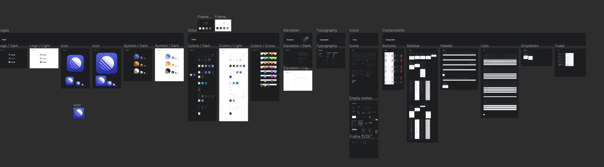
Been designing the last few weeks and realized how simple but effective the @linear design system is. There is no design system team, no councils, no meetings about what we should call it or if it’s “atomic" or not. We have a system which has colors, type, icons and components 

We have had the system from the beginning which helped to speed up both design and development, and even allow supporting dark, light and custom user themes in the app. We have one file in Figma which describes it and also built in to the code.
Colors. So we have basic groups like Bg, Label, Control. So when I’m designing I just draw a shape, then write "bg base" to get the default background color, and label base to get the default text color. Then there is variations like Shade, Muted, Faint etc.


Same for text. We have to groups Body and Title, which has Large, Regular, Small and Mini type with "+" variations which means it's heavier weight. Default text size is Regular, lot of attributes and secondary stuff is Small and titles are Large.

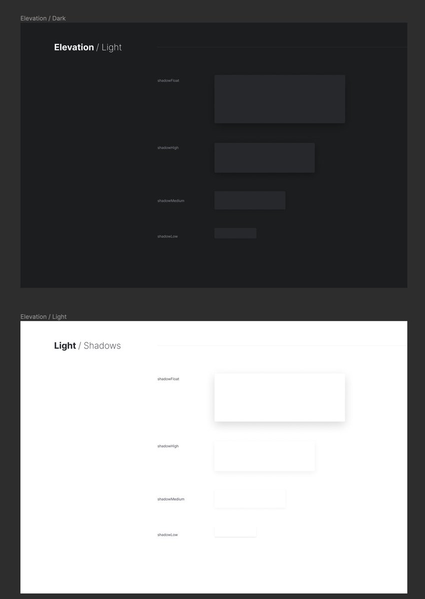
Then we have Elevation which set of standard shadows for dark and light modes. shadowLow is for small things like buttons, shadowMedium/High is for slightly larger boxes that are elevated and Float is for larger boxes that float over everything else.

Then we have Icons as components and they can be pulled in to the designs or components like buttons.

We don't have all the components Figma, but they exist in the code. We have common ones like Buttons or List items or Status things that you need often. We try to use existing components when can but it's usually faster to redraw the component than trying to maintain a library


It feels very simple and light but still useful. Like a good tool. There is no drama or complex ideas. Just the things we need. I don't feel constrained by it but feel like it speeds me up.
Like it should be but seems there is this tendency to complicate things uncessarily
Like it should be but seems there is this tendency to complicate things uncessarily
This kind of mirrors the philosophy we have for @linear and Linear Method:
Focus your efforts on the actual task on hand (building software), not on side quests (building process or management systems).
Focus your efforts on the actual task on hand (building software), not on side quests (building process or management systems).
While we don’t have a “design system team”, everyone contributes to the system. It’s a natural part of the tool chain and we improve as we go
https://twitter.com/jorilallo/status/1563641505289752576
• • •
Missing some Tweet in this thread? You can try to
force a refresh


