
Hi #datafam, here’s a radial bar chart I made using Excel. This viz summarizes the top 10 nations by annual nominal minimum wage in USD in 2022. This chart was made using data scraped from a Wikipedia table. Here's a thread with instructions on how to create this #viz in Excel
🧵
🧵

@saltypip @seyiflawless @malcom_okonkwo @JAEmmanuel9 @el_victoriaa @TheApollo47 @Haffiz_Anoze @BolajiO_ @Xionne_ @AndrewAjir @toohodtotrot @Aboki_Esq @fahiemad @FavourFae
Note: You need to have basic knowledge of Excel and making charts in Excel to follow this thread
1. The first step is to format our table exactly as shown below. Take note that the data in my table is ordered in ascending order by the annual minimum wage column. This is EXTREMELY IMPORTANT. Add the label and helper columns as well, but leave the second row blank.

2. Next, we enter the formula ‘=MAX(B3:B12) * 1.3’ into the first row of our helper column. We simply want to obtain the maximum value in our annual minimum wage column and then multiply it by 1.3.

3. Next, we want to subtract all the values in the annual minimum wage column from the value we calculated in the previous step. So we enter the formula '=$C$2 - B3' in the third row of our helper column. The $ sign is used to denote absolute referencing.


3 cont. That is, we want to keep that value in our formula regardless of which cell we copy it to. After choosing the cell you wish to absolutely reference, use the F4 key on your keyboard. You can now drag the cell down to duplicate the formula to the other rows.
4. We will now go to our label column. Excel's flash fill feature will be used for our label column. It's quite simple. Simply type the contents of the columns you want to use as labels, and Excel will recognize the pattern when you begin typing it in the next row.


4 cont. In my case, Excel detects the pattern and fills in the rest for me when I type 'Canada - $ 22,797.00' and then move to the next row to type 'Belgium - $ 24,005.00'.
5. If the flash fill method does not work for you, you can use the slightly more complex 'CONCATENATE' function. In my case, I used the following formula: '=CONCATENATE(A3, " ", "-", " ",TEXT(B3, "$ #,##0.00")) .


5 cont. I know it looks intimidating 🥲😅, but I'm only telling Excel to concatenate (join) cell A3, a space(" "), a hyphen("-"), and cell B3 formatted as text with the pattern' $ #,##0.00'. If this is too complex, then I suggest typing it manually.
6. Another step for the labels. Copy your labels to an empty column and then number them in descending order. We're doing this because we wish to flip the column. After numbering, select the two columns and then right-click, then click sort, then click smallest to largest.


7. Our data prep is done, now we make our radial bar chart! To do this you need to select the data in the country, annual minimum wage and helper columns, and then on the insert tab, insert a doughnut chart. You should see something similar to the graphic below

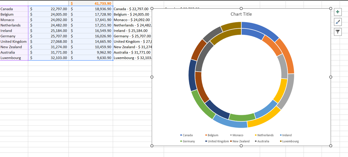
8. Next, we right-click on the chart, then click on ‘select data’, and on the next popup window, click on ‘Switch row/column’, and boom! Our radial bar chart is taking shape.


9. The next steps include aesthetically formatting the chart. First, we double-click any of the arcs on the chart, then adjust the 'Doughnut Hole Size' in the 'Format Data Series Pane.' Depending on the number of rows in your data, I recommend anywhere between 20 and 30%.

10. The next thing you need to do is ‘remove’ the orange-coloured bars/arcs. This can be done by triple-clicking on an arc and then on the ‘fill’ tab of the Format Data Series Pane, select ‘ No Fill’.

10 cont. Sometimes you might end up formatting the blue arc, don’t sweat, ctrl + z is your friend. When you’re done you should end up with the following graphic;

11. And finally! All that remains is coloring and labeling. Select any color by clicking three times on each radial bar. I recommend choosing a divergent color scheme, such as Red to Blue or Blue to Yellow.

11 cont. Then, for the labels, create a text box, copy the sorted labels from step 6, and paste them into the text box. Adjust the labels to line up as closely as possible with the radial bars, then remove the border and fill from the text box.

12. Finally, I recommend copying your chart to PowerPoint for further flexibility in design and additional layout possibilities for your #viz. If you have any questions, please leave them in the comments section and I'll do my best to answer them.
IMPORTANT 📢📢
First I want to thank @no_games12 for pointing this out. While radial bar charts are very pleasing to look at, they can be quite misleading, especially at the extreme values. You can clearly see this when you compare the same data visualized as a bar chart.
First I want to thank @no_games12 for pointing this out. While radial bar charts are very pleasing to look at, they can be quite misleading, especially at the extreme values. You can clearly see this when you compare the same data visualized as a bar chart.

• • •
Missing some Tweet in this thread? You can try to
force a refresh


