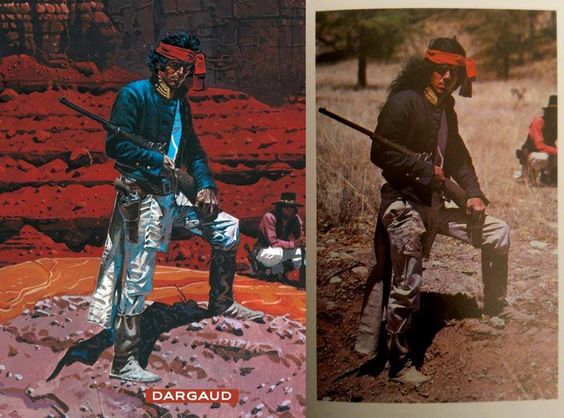
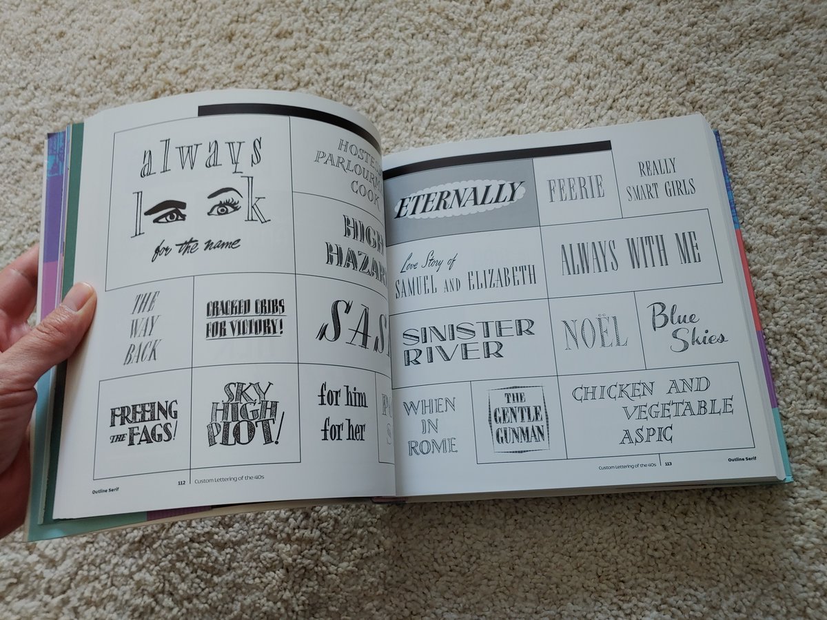
With the new issue of Human Target hitting stands next week, I thought it would be a good time for another process thread. This one concerns what I consider the most important element of my work on HT - contrast. 

I've experimented a lot with the traditional forms of contrast - color, shape, texture, etc but after really studying mid century illustration, I realized that there was a very powerful contrast technique that I wasn't taking advantage of - style contrast. 


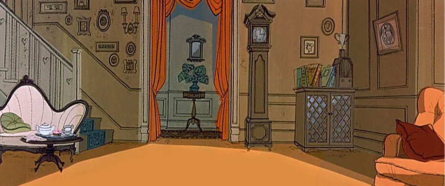
Since I've discussed it before, let's start with 101 Dalmations. Notice the precision of these line drawings for the backgrounds of the film? If we were tasked with coloring them, our first instinct would probably be to match that precision and detail. 


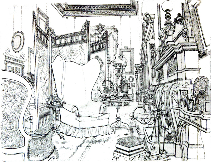
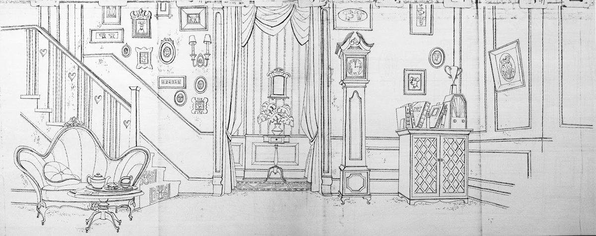
But that's not what the folks at Disney did. They contrasted that precision with loose, blocky, and seemingly haphazard coloring. The juxtaposition of two contrasting approaches is instantly appealing. 



It's the same reason this Mitchell Hooks cover is so pleasing to the eye. Hooks rendered the faces with precision but the clothes and fabric are defined with loose and carefree strokes. 

This Hooks cover employs the same type of contrast but uses it to pull your focus to the figures, specifically their upper bodies and faces. 

I attempted to emulate that with my Gotham City Year One cover. Pull focus to the faces (and gun) by tightly rendering them and pulling focus away from the rest of the cover by loosely rendering it. 

Mitch Gerads draws your focus in a similar way with this striking Mister Miracle cover. Fully painted figure, loosely drawn cameras and hands. The cameras & hands aren't important but Scott & the camera screens are and Mitch communicates that with contrast. 

This contrast of style has been used to great effect in comic book interiors, too. JH Williams is a master at this. His shifting styles keep your eyeballs engaged and serve to break up compositions that might otherwise overwhelm. 

Alex Ross explores this same approach beautifully in his new Fantastic Four OGN as well (go buy it NOW) 

I think the contrast between precision and chaos is what makes Sienkiewicz so compelling. His disciplined mastery is felt but his rendering suggests the youthful and manic energy of a rock star. 

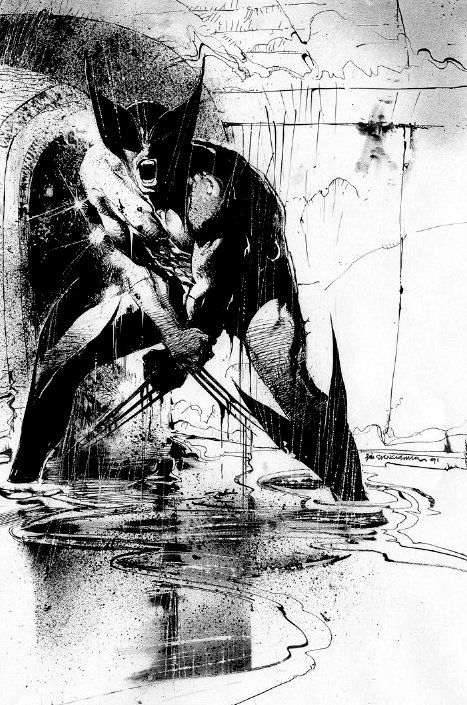

Austin Briggs explored this kind of contrast in his later career. You can see the solid foundation in his work...he was a master at anatomy, faces, composition...but he completely layers that mastery w/ rendering that could be mistaken for a sketch or the scribblings of a child. 


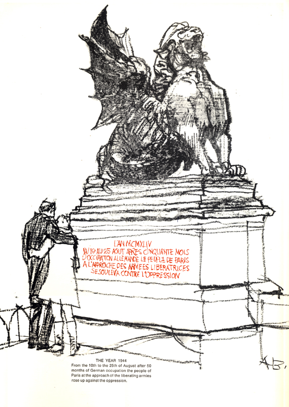

In this way, the contrast is almost invisible. Your brain still notices it, though. The contrast is actually between his drawing proficiency and his chosen rendering style. It's hidden but felt. 


You might have overlooked his mastery of the craft when he rendered everything perfectly. But, like many illustrators of his day, Briggs eventually realized that contrast was more interesting. His loose rendering draws attention to his mastery by contrasting it. 

An alt approach is utilizing the tried & true comic book inking techniques to their fullest. Varying line weights, alternating between nibs & brushes, using different rendering techniques for different textures - this can all be pushed pretty far (like this Yanick Paquette piece) 

Our eyes like variety and that's why contrast is so appealing. I like to keep Alex Raymond art nearby because it's a good reminder of just how far you can push that stylistic contrast without the art breaking. 

So, how do I use stylistic contrast in Human Target? To make things easy for me, I baked it into the line art AND coloring so that I wouldn't have to figure it out page by page or panel by panel. 

Line art for Human Target uses three distinct styles. Soft & highly rendered inking/penciling for faces & skin, loose & simplified brush strokes for clothing, and blotty dead lines for backgrounds. When combined, they subtly contrast each other. 

To contrast the tight rendering on faces, I don't render the colors but apply hard angular cuts for the shading. And like the blocky coloring on 101 Dalmatians, I keep things loose and frequently color outside the lines. 

But unlike Dalmatians, I try as often as I can to keep the underlying hues of shadow and light in any given panel complimentary. Or at the very least, I push the light as warm as I can and the shadows as cool as I can. 
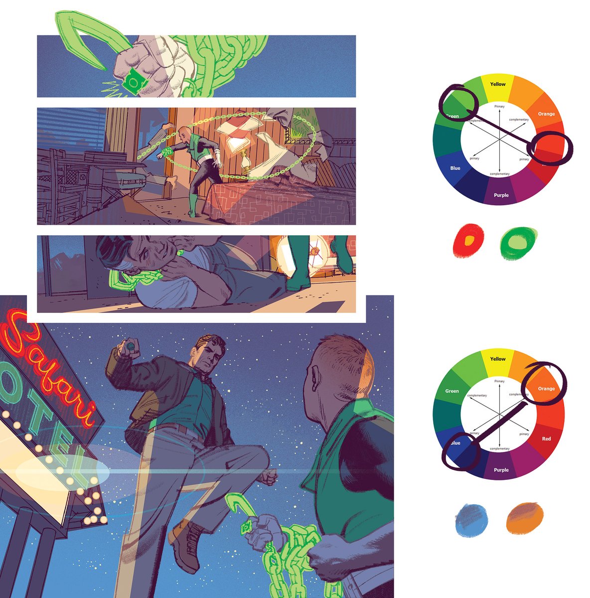
I also try to push the contrast between stylization & realism as much as I can, as often as I can. I could have rendered the grass or the flame more realistically but it wouldn't pop. It's also a lot easier to let a K. Webster brush do the work (Winter Stix for the grass, btw) 


The type of contrast I developed for HT does require a little bit of experimentation because some styles are simply jarring and not at all complimentary. But I think it's well worth the work if you're looking for an extra pop in your art.
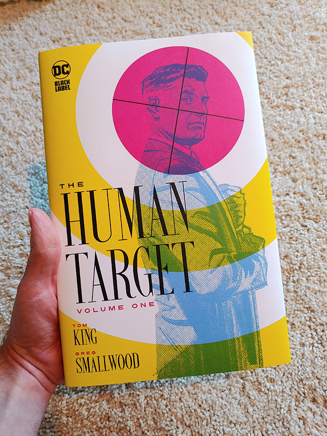
Well, that's it for me. If you missed the first six issues of HT, you can pick up the volume one hardcover collection next week, too. Big thanks to @ComicMama for giving me the opportunity to help with the design of the book. Had a blast with it! 




• • •
Missing some Tweet in this thread? You can try to
force a refresh


