🧵RISING INTEREST RATES ARE A BIGGER DEAL THAN YOU MIGHT THINK🧵
This is important (hence the caps).
I’m a bit worried people are being WAY too complacent about rising interest rates.
They assume that because they’re so low now vs the 1990s, this’ll be a walk in the park.
NO.
This is important (hence the caps).
I’m a bit worried people are being WAY too complacent about rising interest rates.
They assume that because they’re so low now vs the 1990s, this’ll be a walk in the park.
NO.
Let’s start with this chart. Outlook for interest rates has changed enormously in the past few months. Back at the start of the year they weren’t expected to get much above 1.5%.
By Aug they were expected to peak at 2.75%.
Now the expected peak is 4.75%.
BIG shift in a short time
By Aug they were expected to peak at 2.75%.
Now the expected peak is 4.75%.
BIG shift in a short time

Now the conventional wisdom about this is that while a rise in rates might be tough for some households, it’ll be nothing like what we experienced in the ‘70s, ‘80s or ‘90s.
After all, rates back then were in double digits.
Look at this chart:
After all, rates back then were in double digits.
Look at this chart:

In other words, the implication is that anyone who gets worried about 4.75% interest rates is an utter snowflake.
“When I were a lad interest rates were 15%” etc etc.
Right. But here’s the thing: interest rates are only one (quite misleading) part of the picture…
“When I were a lad interest rates were 15%” etc etc.
Right. But here’s the thing: interest rates are only one (quite misleading) part of the picture…
Because what’s really relevant here is how AFFORDABLE those interest rates are for mortgage holders.
What matters is not just the RATE but how much you’re borrowing and (equally important) how high your disposable income is vs those payments.
What matters is not just the RATE but how much you’re borrowing and (equally important) how high your disposable income is vs those payments.
Add all those things to the equation - debt burdens, incomes, mortgage terms and mortgage rates - you end up with a very different picture.
Here’s data from @resi_analyst who’s worked out the “equivalent” interest rate - eg the actual BURDEN of interest rates over time.
Here’s data from @resi_analyst who’s worked out the “equivalent” interest rate - eg the actual BURDEN of interest rates over time.

So for instance, take 1980. Back then, official BoE interest rates were on average 14.2%.
But because people were much less heavily indebted, because their incomes were much higher vs their repayments, that was, in affordability terms, EQUIVALENT to 3% in today’s interest rates.
But because people were much less heavily indebted, because their incomes were much higher vs their repayments, that was, in affordability terms, EQUIVALENT to 3% in today’s interest rates.
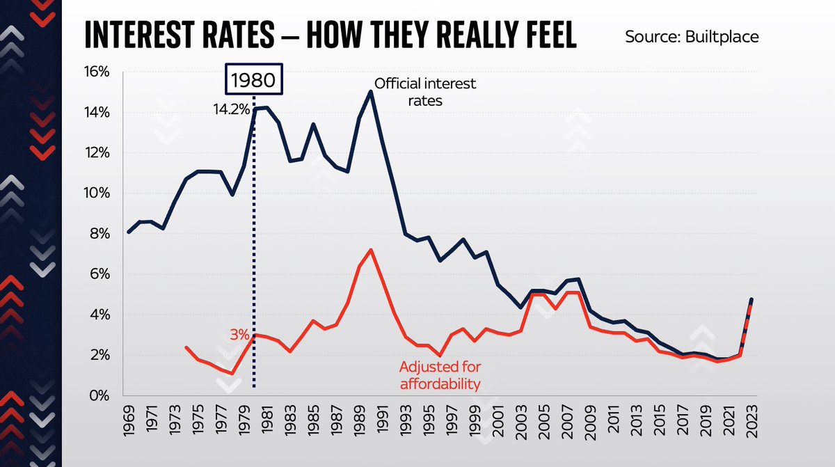
Look solely at those “equivalent” interest rates, adjusted for affordability.
V different picture, right?
Actually interest rates aren’t way lower than in the 1970s - they’re v similar.
An increase to 4.75% would take us up to levels similar to just before the financial crisis.
V different picture, right?
Actually interest rates aren’t way lower than in the 1970s - they’re v similar.
An increase to 4.75% would take us up to levels similar to just before the financial crisis.

If rates went up to 6% (not currently forecast but these days who knows?!) it would be horrendous.
The mortgage burden would be very similar to the early 1990s - which precipitated the worst housing crash in modern history.
Prob even worse cos this data doesn’t adjust for MIRAS.
The mortgage burden would be very similar to the early 1990s - which precipitated the worst housing crash in modern history.
Prob even worse cos this data doesn’t adjust for MIRAS.

This is not a super complex lesson. It’s widely understood among housing specialists.
But I don’t think it’s fully appreciated in Westminster.
This matters because the impact of writing blank cheques and borrowing many billions is to put pressure on BoE to raise rates.
But I don’t think it’s fully appreciated in Westminster.
This matters because the impact of writing blank cheques and borrowing many billions is to put pressure on BoE to raise rates.
If you take interest rates at face value it’s easy to assume 4% is still a comparatively low level.
It’s easy to assume we can probably stomach 6% without too much pain, like we did in the early 2000s. It’s “nothing” compared to the 1980s.
But this is the wrong lesson.
It’s easy to assume we can probably stomach 6% without too much pain, like we did in the early 2000s. It’s “nothing” compared to the 1980s.
But this is the wrong lesson.
More on this here. It’s a big deal.
The interest rates we’re currently heading for will be considerably more painful than the headline numbers might suggest.
NB not every household has a mortgage. But those who do may be in for a shock when they refix. news.sky.com/story/interest…
The interest rates we’re currently heading for will be considerably more painful than the headline numbers might suggest.
NB not every household has a mortgage. But those who do may be in for a shock when they refix. news.sky.com/story/interest…
Traders are now pricing in UK interest rates to rise above 5.75%. This would be very VERY painful. More on why in this thread 👆 

Blimey. Investors are now better on UK interest rates topping 6 per cent by the first half of next year. You can see the expectations rising literally by the minute… 
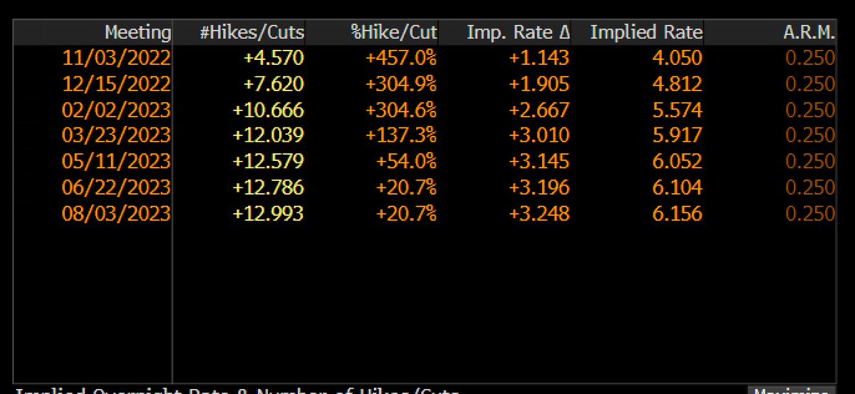
Ugh. The number of households due to re-fix their mortgages will peak at the very moment when, if market curves are to be believed, BoE interest rates will rise to 6% or possibly beyond.
I know I keep repeating this but still: this is a very big deal.
I know I keep repeating this but still: this is a very big deal.
https://twitter.com/resi_analyst/status/1574334746037047297
Back when I began this thread (only last Thurs which already feels like a world away) 6% interest rates next yr seemed slightly far-fetched.
And no bad thing, because 6% would be hideously painful for many families (see 👆).
Today traders were betting on 6% rates next year.
Look:
And no bad thing, because 6% would be hideously painful for many families (see 👆).
Today traders were betting on 6% rates next year.
Look:

NEW:
Moneyfacts says:
- avg 2yr fixed rate mortgage is now up to 6.07% (was 2.25% a year ago)
- avg 5yr rate up to 5.97% (was 2.55% a year ago)
Highest mortgage rates since 2008.
But that’s understating how painful these rates will feel for people (for all the reasons above👆)
Moneyfacts says:
- avg 2yr fixed rate mortgage is now up to 6.07% (was 2.25% a year ago)
- avg 5yr rate up to 5.97% (was 2.55% a year ago)
Highest mortgage rates since 2008.
But that’s understating how painful these rates will feel for people (for all the reasons above👆)
Let’s put this into perspective.
This chart shows you the avg monthly cost of repaying a mortgages (as a % of income)
With mortgage rates at 6%, they go up from 18% to 27%.
Highest mortgage burden since 1989.
This is not a projection: for those fixing mortgages now it’s a reality
This chart shows you the avg monthly cost of repaying a mortgages (as a % of income)
With mortgage rates at 6%, they go up from 18% to 27%.
Highest mortgage burden since 1989.
This is not a projection: for those fixing mortgages now it’s a reality

Worth saying: this is not a “new” concern that’s cropped up after the mini Budget.
Many in the housing industry (inc @resi_analyst who did lots of the sums for the charts above) have been warning about the disproportionate impact of even slightly higher rates for a long time.
Many in the housing industry (inc @resi_analyst who did lots of the sums for the charts above) have been warning about the disproportionate impact of even slightly higher rates for a long time.
• • •
Missing some Tweet in this thread? You can try to
force a refresh


