
New NBER working paper with @jwswallace and @jasonlschwartz on Covid mortality: “Excess death rates for Republicans and Democrats during the COVID-19 pandemic” nber.org/papers/w30512
Ungated on arxiv here: arxiv.org/abs/2209.10751
Thread 🧵1/
Ungated on arxiv here: arxiv.org/abs/2209.10751
Thread 🧵1/


2/ A popular commentary on the Covid crisis has been how much higher the Covid death toll has been in Republican vs. Democratic counties in the U.S.
nytimes.com/2021/11/08/bri…
nytimes.com/2021/11/08/bri…

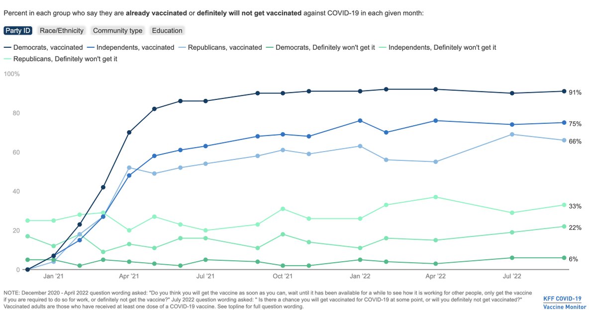
3/ There are natural reasons to believe that there are strong differences by Republicans vs. Democrats: survey data suggests that there are big differences by party ID on Covid-19 vaccination: kff.org/coronavirus-co…
4/ The challenge, of course, is whether it’s really about Republicans vs. Democrats living in these areas, or just the areas where individuals sort into are different.
5/ This statistical analysis runs into a serious challenge, driven by the fact that publicly available data on Covid deaths, and measures of political party, are typically only available at the county level.
6/ The focus on Covid deaths and counties has lead researchers to try to account for these locational differences (by controlling for features at the county level), but are still limited by the aggregated nature of the data:
healthaffairs.org/doi/full/10.13…
healthaffairs.org/doi/full/10.13…

7/ The other issue with this approach is that it focuses on reported Covid deaths as an aggregate measure. This measure may not fully capture the “counterfactual” deaths in the absence of the pandemic. Our world in data does an excellent discussion: ourworldindata.org/excess-mortali…

8/ Intuitively, calculating excess death rates requires a prediction of death rates in 2020 and 2021 based on previous years for the group of interest: namely Democrats and Republicans. Fortunately, we have mortality data with party affiliation, age, and location in this paper!
9/ We construct data using *individual-level* voter registration in 2017, linked to death records from 2018 to 2021, for Ohio and Florida. We then construct excess death rates that control for differences in mortality rates (pre-Covid) at the age-by-party-by-county-by-month level
10/
This lets us ask and answer three questions:
This lets us ask and answer three questions:
11/
Q1: Does excess death in 2020 and 2021 differ by political party, how much and when does this occur?
A1: Yes, the excess death rate for Republicans was 5.4 p.p., or 76%, higher than for Democrats. The gap was exclusively in the post-vaccine period (10.4 pp or 153%).
Q1: Does excess death in 2020 and 2021 differ by political party, how much and when does this occur?
A1: Yes, the excess death rate for Republicans was 5.4 p.p., or 76%, higher than for Democrats. The gap was exclusively in the post-vaccine period (10.4 pp or 153%).

12/
Q2:
Is this difference explained by geographic or age differences in political party affiliation?
A tiny share of the difference is explained by differential impacts of age-by-county *during Covid* (recall that excess deaths already controls for pre-Covid differences):
Q2:
Is this difference explained by geographic or age differences in political party affiliation?
A tiny share of the difference is explained by differential impacts of age-by-county *during Covid* (recall that excess deaths already controls for pre-Covid differences):

13/
Q3: How much can we point to vaccines?
A3: This is harder, since we don't have individual-level data on vaccines. However, two facts emerge:
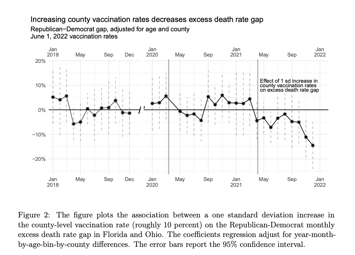
A. The association between the Rep.-Dem. gap and county-level vaccination rates grows significantly after they become available:
Q3: How much can we point to vaccines?
A3: This is harder, since we don't have individual-level data on vaccines. However, two facts emerge:
A. The association between the Rep.-Dem. gap and county-level vaccination rates grows significantly after they become available:
14/
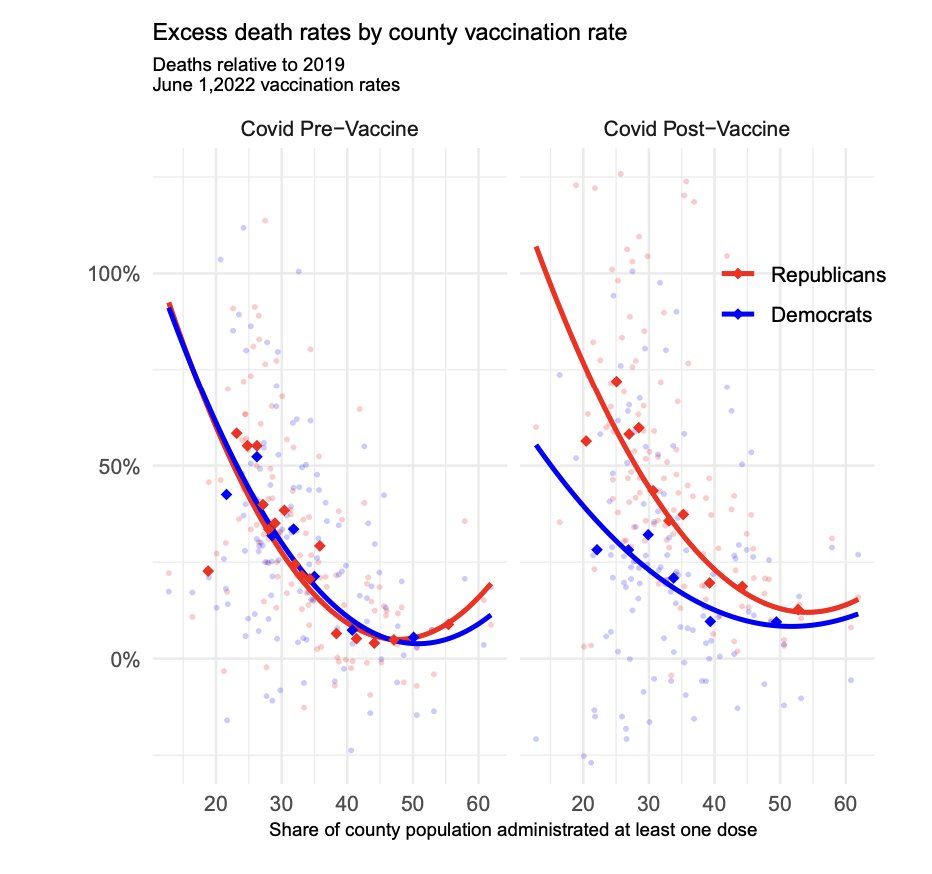
B. Moreover, *pre-vaccine*, the relationship across counties between realized vax rates and excess deaths was identical for both groups.
Post-vaccine, the Democrat rate fell and Republican rate climbed; and the gap between the two was near zero in high-vax counties.
B. Moreover, *pre-vaccine*, the relationship across counties between realized vax rates and excess deaths was identical for both groups.
Post-vaccine, the Democrat rate fell and Republican rate climbed; and the gap between the two was near zero in high-vax counties.
16/ If this is really a story about vaccines, the continued story of low take-up of vaccines + boosters among Republicans may perpetuate some of these differences: kff.org/coronavirus-co…


17/ We’re working on expanding this out now to contrast our results with the existing literature a bit and highlight some more points, but would welcome any comments or suggestions.
fin/ It is important to reiterate that our results hold fixed differences in mortality by age, location, and party pre-Covid, and can account for location-by-age differences post-Covid. Hence these are within-age-and-location differences in mortality outcomes by political party.
• • •
Missing some Tweet in this thread? You can try to
force a refresh


