A brief history of your favourite fonts: 
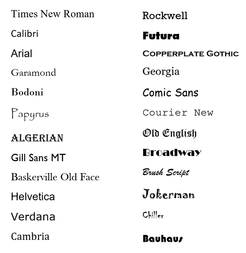
1. Times New Roman
Commissioned by The Times newspaper in Britain in 1931, as an update to the "spindly" 19th century typeface they used at the time.
This more solid design actually harked back to Italian typefaces of the 1500s. Used to be the standard computer font.
Commissioned by The Times newspaper in Britain in 1931, as an update to the "spindly" 19th century typeface they used at the time.
This more solid design actually harked back to Italian typefaces of the 1500s. Used to be the standard computer font.

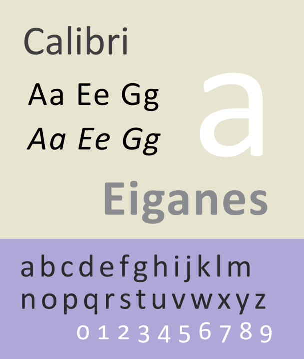
2. Calibri
A real baby in the world of fonts, Calibri was only developed in the early 2000s. But, after being made the default font for all Microsoft programmes in 2007, has fast become a force to be reckoned with.
A modern, simplified, "warm", sterile, sans-serif staple.
A real baby in the world of fonts, Calibri was only developed in the early 2000s. But, after being made the default font for all Microsoft programmes in 2007, has fast become a force to be reckoned with.
A modern, simplified, "warm", sterile, sans-serif staple.
3. Arial
An old but trustworthy veteran of the digital typeface game, Arial was designed in 1982 specifically for the consumer electronics industry. The go-to digital sans-serif font for many years.
Arial has many delightful subvariants, such as rounded, condensed, and bold.
An old but trustworthy veteran of the digital typeface game, Arial was designed in 1982 specifically for the consumer electronics industry. The go-to digital sans-serif font for many years.
Arial has many delightful subvariants, such as rounded, condensed, and bold.

4. Garamond
A classic book font named after the 16th century engraver Claude Garamond. One of the oldest fonts still in regular use; it was originally based on a typeface from 1495.
It has been reinterpreted many times, but still retains an elegant, almost hand-written look.
A classic book font named after the 16th century engraver Claude Garamond. One of the oldest fonts still in regular use; it was originally based on a typeface from 1495.
It has been reinterpreted many times, but still retains an elegant, almost hand-written look.

5. Bodoni
Designed by Giambattista Bodoni in the late 1700s, this font - with its extreme contrast between thick and thin strokes - takes us back to a different era of typefaces.
Though rather sophisticated, you can tell it wasn't designed for digital display.
Designed by Giambattista Bodoni in the late 1700s, this font - with its extreme contrast between thick and thin strokes - takes us back to a different era of typefaces.
Though rather sophisticated, you can tell it wasn't designed for digital display.

6. Papyrus
An infamous font with humble origins. Graphic designer Chris Costello created Papyrus over six months in 1982; he wanted to imagine what English letters would have looked like on 2,000 year old Egyptian papyrus.
Unusual, distinctive, legendary, controversial.
An infamous font with humble origins. Graphic designer Chris Costello created Papyrus over six months in 1982; he wanted to imagine what English letters would have looked like on 2,000 year old Egyptian papyrus.
Unusual, distinctive, legendary, controversial.

7. Algerian
This font, a favourite among kids in the glory days of WordArt, is older than you might think.
Its had many versions and reissues, but the original design was actually made by an English firm in 1907.
This font, a favourite among kids in the glory days of WordArt, is older than you might think.
Its had many versions and reissues, but the original design was actually made by an English firm in 1907.

8. Gill Sans
The legendary font of Penguin Books and of much British design. It was created in 1926 by Eric Gill, based on the 1916 "Underground Alphabet", which had been put together for the signs on the London Underground.
Stylish, easy to read, & simple but sophisticated.
The legendary font of Penguin Books and of much British design. It was created in 1926 by Eric Gill, based on the 1916 "Underground Alphabet", which had been put together for the signs on the London Underground.
Stylish, easy to read, & simple but sophisticated.

9. Baskerville
Designed by John Baskerville in the 1750s. A big influence on Bodoni with its contrast between thick and thin strokes.
Made during the transition from old to modern fonts; it has the distinctive verticality of typefaces from that era, compared to, say, Garamond.
Designed by John Baskerville in the 1750s. A big influence on Bodoni with its contrast between thick and thin strokes.
Made during the transition from old to modern fonts; it has the distinctive verticality of typefaces from that era, compared to, say, Garamond.

10. Helvetica
The ultimate modernist font. Created by Swiss designers in 1957 who wanted to produce a neutral, "meaningless" typeface devoid of historical connotations.
Compact and stylish, Helvetica is one of the most used and famous fonts of all time, especially in print.
The ultimate modernist font. Created by Swiss designers in 1957 who wanted to produce a neutral, "meaningless" typeface devoid of historical connotations.
Compact and stylish, Helvetica is one of the most used and famous fonts of all time, especially in print.

11. Verdana
Another famous digital typeface, produced by Microsoft in 1996.
Notice the wider spaces between letters and overall larger proportions; Verdana was designed to be easily readable on computer screens, at low resolution, and in small size.
It does the job.
Another famous digital typeface, produced by Microsoft in 1996.
Notice the wider spaces between letters and overall larger proportions; Verdana was designed to be easily readable on computer screens, at low resolution, and in small size.
It does the job.

12. Cambria
Surprisingly new for a Serif font. It was designed in 2004 and released in 2007 alongside Calibri.
The idea, as ever with digital typefacts, was to be readable even when very small, and also on computer screens.
Works, but lacks the charm of older serif fonts.
Surprisingly new for a Serif font. It was designed in 2004 and released in 2007 alongside Calibri.
The idea, as ever with digital typefacts, was to be readable even when very small, and also on computer screens.
Works, but lacks the charm of older serif fonts.

13. Rockwell
The most famous of the once-popular "slab serif" fonts, where the serifs are big and heavy, like slabs.
And Rockwell is older than you might think, having been created in 1934.
It's bold and exciting, and that big slab serif on the capital A is something else.
The most famous of the once-popular "slab serif" fonts, where the serifs are big and heavy, like slabs.
And Rockwell is older than you might think, having been created in 1934.
It's bold and exciting, and that big slab serif on the capital A is something else.

14. Futura
The auteur film-maker's favourite font.
Designed in ultramodernist Frankfurt in 1927 as a typeface of efficiency and futurism, it has since been used by directors like Stanley Kubrick, Gaspar Noe, and Wes Anderson.
The auteur film-maker's favourite font.
Designed in ultramodernist Frankfurt in 1927 as a typeface of efficiency and futurism, it has since been used by directors like Stanley Kubrick, Gaspar Noe, and Wes Anderson.

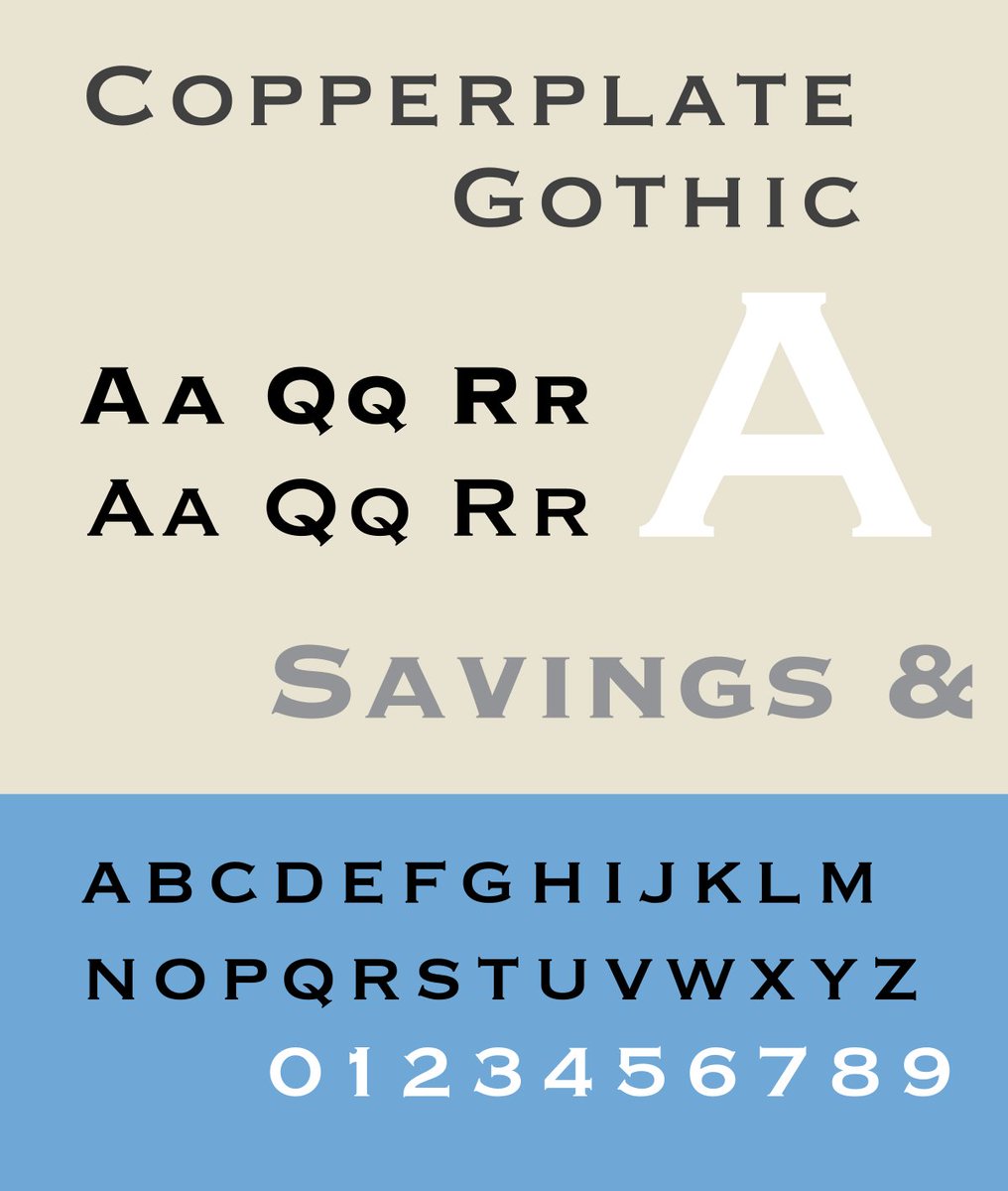
15. Copperplate Gothic
A smorgasbord of typefaces which drew influence from the copper engravings (where part of its name comes from) and Victorian fonts.
Designed in 1925 by Frederic Goudy, it was once popular among doctors and lawyers for its "professional" appearance.
A smorgasbord of typefaces which drew influence from the copper engravings (where part of its name comes from) and Victorian fonts.
Designed in 1925 by Frederic Goudy, it was once popular among doctors and lawyers for its "professional" appearance.
16. Georgia
A surprisingly new typeface, designed in 1993. Like Cambria, it was supposed to be legible both in small print and on a low-resolution computer screen.
It drew influence from the "Scotch Roman" fonts of the 19th century; more elegant than Cambria.
A surprisingly new typeface, designed in 1993. Like Cambria, it was supposed to be legible both in small print and on a low-resolution computer screen.
It drew influence from the "Scotch Roman" fonts of the 19th century; more elegant than Cambria.

17. Comic Sans
Another infamous font, like Papyrus, for its almost unbelievable ubiquity.
It was designed 1994, inspired by the typeface used in comic books (hence the name), and intended either for "casual" use or for children's materials.
Another infamous font, like Papyrus, for its almost unbelievable ubiquity.
It was designed 1994, inspired by the typeface used in comic books (hence the name), and intended either for "casual" use or for children's materials.

18. Courier
Originally designed for IBM's typewriters and thus associated with old, typed documents.
But Courier has enjoyed a surprising renaissance with the rise of coding, in part thanks to its big punctuation marks and clearly distinguished letters and symbols.
Originally designed for IBM's typewriters and thus associated with old, typed documents.
But Courier has enjoyed a surprising renaissance with the rise of coding, in part thanks to its big punctuation marks and clearly distinguished letters and symbols.

19. Old English
Despite its name, the so-called Old English typeface is really a modern reinterpration of the "Blackletter" fonts first used when the printing press was invented in the 1400s, itself based on the hand-written calligraphic manuscripts of Gothic monks.
Despite its name, the so-called Old English typeface is really a modern reinterpration of the "Blackletter" fonts first used when the printing press was invented in the 1400s, itself based on the hand-written calligraphic manuscripts of Gothic monks.

20. Broadway
This font is typically used to evoke the atmosphere and art of the 1920s. And its Art Deco vibe is authentic - the highly-stylised and ever-popular Broadway typeface was actually designed in the 1920s.
This font is typically used to evoke the atmosphere and art of the 1920s. And its Art Deco vibe is authentic - the highly-stylised and ever-popular Broadway typeface was actually designed in the 1920s.

21. Brush Script
Perhaps, after Comic Sans, the best-known "casual" typeface. Brush Script was designed in 1942 with the obvious intention of imitating hand-written letters.
It fell out of favour during the modernist 1950s (think: Helvetica), but remains a popular choice.
Perhaps, after Comic Sans, the best-known "casual" typeface. Brush Script was designed in 1942 with the obvious intention of imitating hand-written letters.
It fell out of favour during the modernist 1950s (think: Helvetica), but remains a popular choice.

22. Jokerman
One of those bizarre fonts which is somehow still present in Microsoft Word. It was designed in 1995 and named after a Bob Dylan song.
Whether intentional or not, Jokerman has proven enduringly popular with kids.
One of those bizarre fonts which is somehow still present in Microsoft Word. It was designed in 1995 and named after a Bob Dylan song.
Whether intentional or not, Jokerman has proven enduringly popular with kids.

23. Chiller
Created by the same person as Jokerman, a British designer called Andrew Smith, in 1995.
It is the ultimate "scary" font and has been used in everything from film posters to video games.
Created by the same person as Jokerman, a British designer called Andrew Smith, in 1995.
It is the ultimate "scary" font and has been used in everything from film posters to video games.

24. Bauhaus
Developed by the eponymous Bauhaus Art School in the 1920s, this was supposed to be a "universal" font which combined aesthetics and functions. Perhaps it fell short of those grandiose ambitions.
The digitised Microsoft version is called Bauhaus 93.
Developed by the eponymous Bauhaus Art School in the 1920s, this was supposed to be a "universal" font which combined aesthetics and functions. Perhaps it fell short of those grandiose ambitions.
The digitised Microsoft version is called Bauhaus 93.

If you enjoy reading about things that are interesting, useful, and beautiful, then you may like my free newsletter, Areopagus.
It features seven short lessons every Friday, including art, architecture, rhetoric, and history.
Consider subscribing here:
culturaltutor.com/areopagus
It features seven short lessons every Friday, including art, architecture, rhetoric, and history.
Consider subscribing here:
culturaltutor.com/areopagus
• • •
Missing some Tweet in this thread? You can try to
force a refresh