Ever needed a few more colours than the standard colour cycle for your plot? Ever wanted a categorical colour palette based around your own custom colours? With glasbey you can create and extend custom categorical colour palettes with ease.🧵
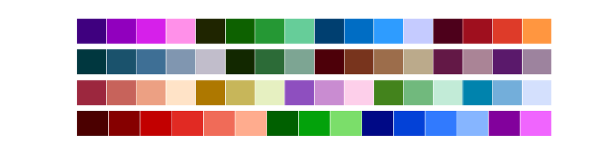
Create a categorical colour palette with control over the hue, chroma and lightness of colours to include in the palette. Do you need a muted palette? A Pastel palette? Or a palette of only cool colours?
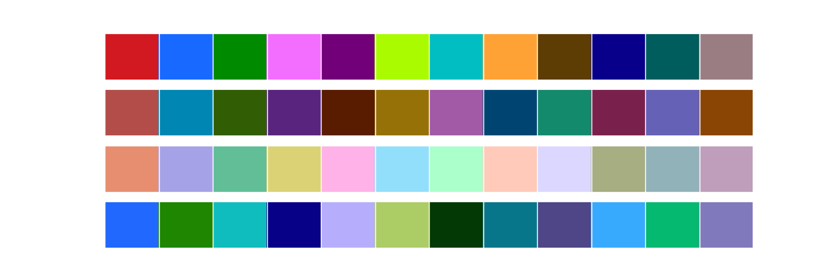
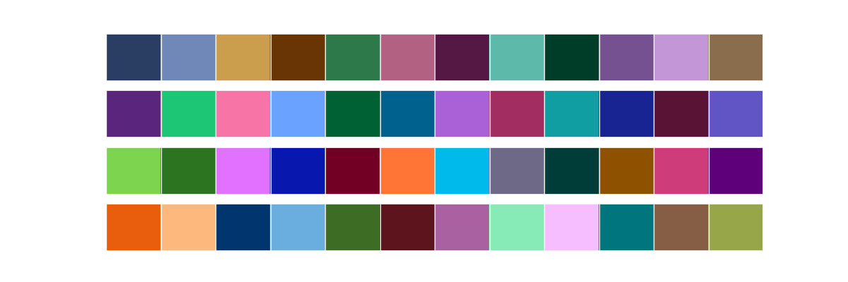
Have a palette you like, but need a few extra distinct colours for your plot? Extend existing categorical colour palettes! Want a few extra colours for the default matplotlib palette? Or ColorBrewer Set1? Or a longer Pastel palette?
Want to build a categorical colour palette around your company/institution colours? You can seed palette creation and still control the hue, chroma and lightness of the palette you create.
Do you have hierarchical groups of categories, and you need a categorical colour palette that can show that? You can create block palettes, with varying sized blocks so each group of categories can be distinguished.
Glasbey uses techniques from the paper “Colour Displays for Categorical Images” by Glasbey et al to create colour palettes that maximize the visual distinctiveness of the colours. This library was based on the great work of Sergey Alexandrov (github.com/taketwo/glasbey).
By optimizing with @numba_jit and cutting a few corners glasbey can generate colour palettes fast enough for interactive use, making it easy to generate palettes on the fly, or experiment with parameters to get the palette you want.
• • •
Missing some Tweet in this thread? You can try to
force a refresh
Explore Wikipedia through a data map. Pages are grouped by semantic similarity, for topic clusters.
Hover to see details, zoom to explore fine-grained topics, click to go to a page. Search page names to find interesting starting points for exploration.🧵
All of this is really just a tech-demo for the tools backing it: Toponymy for creating topics and topic labels, and DataMapPlot for creating the interactive visualizations.
Datamapplot 0.4 is out now, and has far more powerful and effective interactive plots.
Here is an example of a Data Map of 2.4 million papers on ArXiv, ready to be explored.
Performance on large datasets got a major overhaul, supporting million scale datasets with ease.
Datamapplot 0.4 also introduces new filtering and selection tools that integrate with existing search functionality.
Histogram filtering along a variable has been added, allowing interactive plots to be filtered by time, or even by categorical values.
A major update for DataMapPlot adds interactive plots.
See for an example.
Let's dig in to what you can do with DatMapPlot 0.2 ... 🧵 lmcinnes.github.io/datamapplot_ex…
Given a data map and labels making rich interactive plots is easy. The ArXiv example above can be generated as follows:
The latest version of umap-learn is now out. Version 0.5 includes some major new features, including ParametricUMAP, DensMAP, AlignedUMAP, model composition, and model updating. Thank you to everyone who contributed! 1/14
ParametricUMAP uses a neural network to learn a UMAP embedding. This allows for a number of significant advantages. 2/14
ParametricUMAP provides extremely fast new data embedding (comparable to PCA if you use a GPU), UMAP based autoencoders, and powerful semi-supervised learning, particularly in low label regimes. 3/14
Pynndescent, an approximate nearest neighbor search library, got a major update recently. Index construction is now multicore by default. Querying is now much faster -- competitive with some of the fastest ANN libraries around.
(1/4)
Performance in particularly strong for higher accuracy (>90%) queries.
(2/4)
The library also comes equipped with a Transformer class fitting in with the new KNeighborsTransformer in scikit-learn (scikit-learn.org/stable/modules…) to allow you to speed up various sklearn models and pipelines.
(3/4)