This trend is well-known to football (or soccer) fans.
For their teams to hire a consultancy, spend a fortune, and change their beloved crest, almost always in the form of simplificiation.
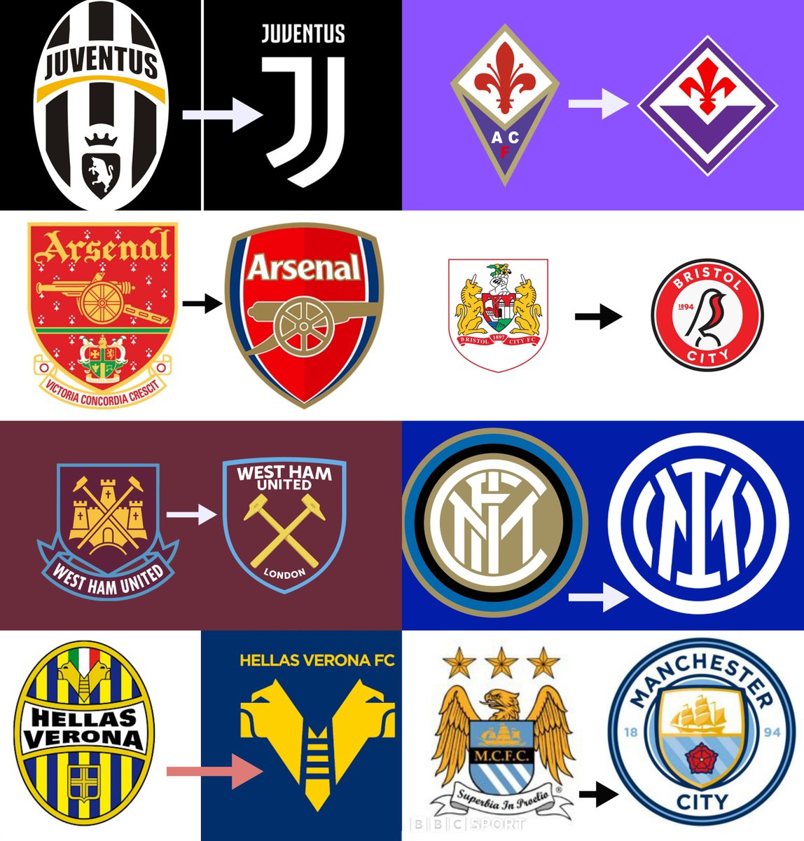
The most egregious recent case is Italian club Juventus, who changed their crest in 2017:
For their teams to hire a consultancy, spend a fortune, and change their beloved crest, almost always in the form of simplificiation.
The most egregious recent case is Italian club Juventus, who changed their crest in 2017:

Other examples include Inter Milan, another Italian club, whose duochrome simplification was met with almost unanimous disdain in 2021.
The interesting thing is that it isn't just the fans of the club in question, but football fans more generally, who dislike such changes.
The interesting thing is that it isn't just the fans of the club in question, but football fans more generally, who dislike such changes.

This culture of redesign has several common themes.
First, as in the case of Manchester City in 2016, for a more complex shape to be given a much simpler profile - usually as straightforward geometry, such as a circle.
First, as in the case of Manchester City in 2016, for a more complex shape to be given a much simpler profile - usually as straightforward geometry, such as a circle.

While some redesigns, such as of those Hellas Verona in 2020, have seemed rather drastic.
Here, a single element becomes the entire crest itself.
Here, a single element becomes the entire crest itself.

Even the logo of the UK's Premier League has been - to an extent - simplified.
A more straightforward, text-centred profile was introduced (not to mention a change from lightly serifed to fully sans-serif font) with the lion reduced to a sort of essential symbol.
A more straightforward, text-centred profile was introduced (not to mention a change from lightly serifed to fully sans-serif font) with the lion reduced to a sort of essential symbol.

This trend of simplification isn't limited to football, of course.
For years companies have been slowly but surely shifting towards simpler logos.
Varied colours toned down, details removed, complex profiles simplified, text removed where possible, and so on and so forth.
For years companies have been slowly but surely shifting towards simpler logos.
Varied colours toned down, details removed, complex profiles simplified, text removed where possible, and so on and so forth.

This comparison with corporate logos isn't just aesthetic.
Football clubs have become more commercially self-aware than ever, viewing themselves as brands rather than local communities.
Hence their crest has become - in many cases - a fashion logo more than anything else.
Football clubs have become more commercially self-aware than ever, viewing themselves as brands rather than local communities.
Hence their crest has become - in many cases - a fashion logo more than anything else.

But this is also the catch.
Football badges may be following a corporate simplification trend, but they've always followed trends.
Crest redesigns are frightfully common in football, and simple designs aren't unusual.
Consider how Real Madrid's crest looked in the 1910s:
Football badges may be following a corporate simplification trend, but they've always followed trends.
Crest redesigns are frightfully common in football, and simple designs aren't unusual.
Consider how Real Madrid's crest looked in the 1910s:

And so the attachment fans have formed with their club's "traditional" crest is - in some sense - misplaced.
For example, Arsenal's current crest is in many ways closer to its earliest incarnations, with the single cannon taking centre stage and minimal lettering around it.
For example, Arsenal's current crest is in many ways closer to its earliest incarnations, with the single cannon taking centre stage and minimal lettering around it.

While Arsenal's rivals, Tottenham Hotspur, have had widly varying crests down the years.
Their most recent version is really a return to the much simpler design of the 1960s, when postwar Modernism encouraged a global trend of casting off ornamentation.
Their most recent version is really a return to the much simpler design of the 1960s, when postwar Modernism encouraged a global trend of casting off ornamentation.

While again with Bayern Munich - as we saw with Real Madrid - the trends of Art Nouveau and Art Deco in the opening decades of the 20th century led first to rather floral and then to angular, purely letter-based designs.
Designs which in 2022 might be called corporate.
Designs which in 2022 might be called corporate.

And so we can see that Fiorentina's redesign, for example, is no less "detailed" than many that have come before.
It strikes us as simplified, because it *is* simpler than what immediately preceded it. But a fuller history tells a different story.
It strikes us as simplified, because it *is* simpler than what immediately preceded it. But a fuller history tells a different story.

And though Juventus' current crest certainly stands out from the rest as a radical diversion, their previous crest was itself a simplification of other, older crests.
Not to mention the digitized dancing horse logo of the 1980s.
Not to mention the digitized dancing horse logo of the 1980s.

Manchester City, meanwhile, actually returned to the most common iteration of their crest with their 2016 redesign; its simple circular profile harks back to the 1960s.
A corporate simplification, then, or a return to tradition over the kitschy nostalgia of the 1990s?
A corporate simplification, then, or a return to tradition over the kitschy nostalgia of the 1990s?

As might also be the case with Hellas Verona, whose radical redesign turns out to recall a forty year-old version of the crest.
The cycles of design are clearer here than perhaps with any other crest, as colours, shapes, and motifs disappear and reappear over time.
The cycles of design are clearer here than perhaps with any other crest, as colours, shapes, and motifs disappear and reappear over time.

While Leeds United in England once had (during the 1970s) a thoroughly abstract crest. Their current design looks positively Baroque by comparison. 

What's the deeper point here? That things aren't always what they seem, and that design - of architecture, of football crests, of corporate logos - is a constant cycle of change and reaction.
The current trend of simplification will change soon enough...
The current trend of simplification will change soon enough...
And that was is old was also once new.
For example, while Paris Saint-Germain is now a football club and fashion brand in equal measure, their original crest was radically different.
No doubt the introduction of the current form was a shock; but one now accepted as iconic...
For example, while Paris Saint-Germain is now a football club and fashion brand in equal measure, their original crest was radically different.
No doubt the introduction of the current form was a shock; but one now accepted as iconic...

None of this changes the fact that many clubs have created emblems for purely commercial reasons at the expense of tradition. And that, rightfully, fans are disappointed.
But, as many of these redesigns show, "tradition" is not always what it seems, nor as old as we might think.
But, as many of these redesigns show, "tradition" is not always what it seems, nor as old as we might think.
• • •
Missing some Tweet in this thread? You can try to
force a refresh


