Why isn't your keyboard in alphabetical order?
The story begins in 1868 with a malfunctioning typewriter and three inventors called Sholes, Glidden, and Soulé...
The story begins in 1868 with a malfunctioning typewriter and three inventors called Sholes, Glidden, and Soulé...

Keyboard layouts are strange. We take them for granted because they are just... there, always there.
But they had to be *invented* at some point. And, as ever, the specific context surrounding an invention continues to shape its use long after that context has passed.
But they had to be *invented* at some point. And, as ever, the specific context surrounding an invention continues to shape its use long after that context has passed.
When was the "keyboard" invented, then?
Even though writing has been around for millennia, for the vast majority of this time things were hand written. So no need for a keyboard, of course.
Even though writing has been around for millennia, for the vast majority of this time things were hand written. So no need for a keyboard, of course.

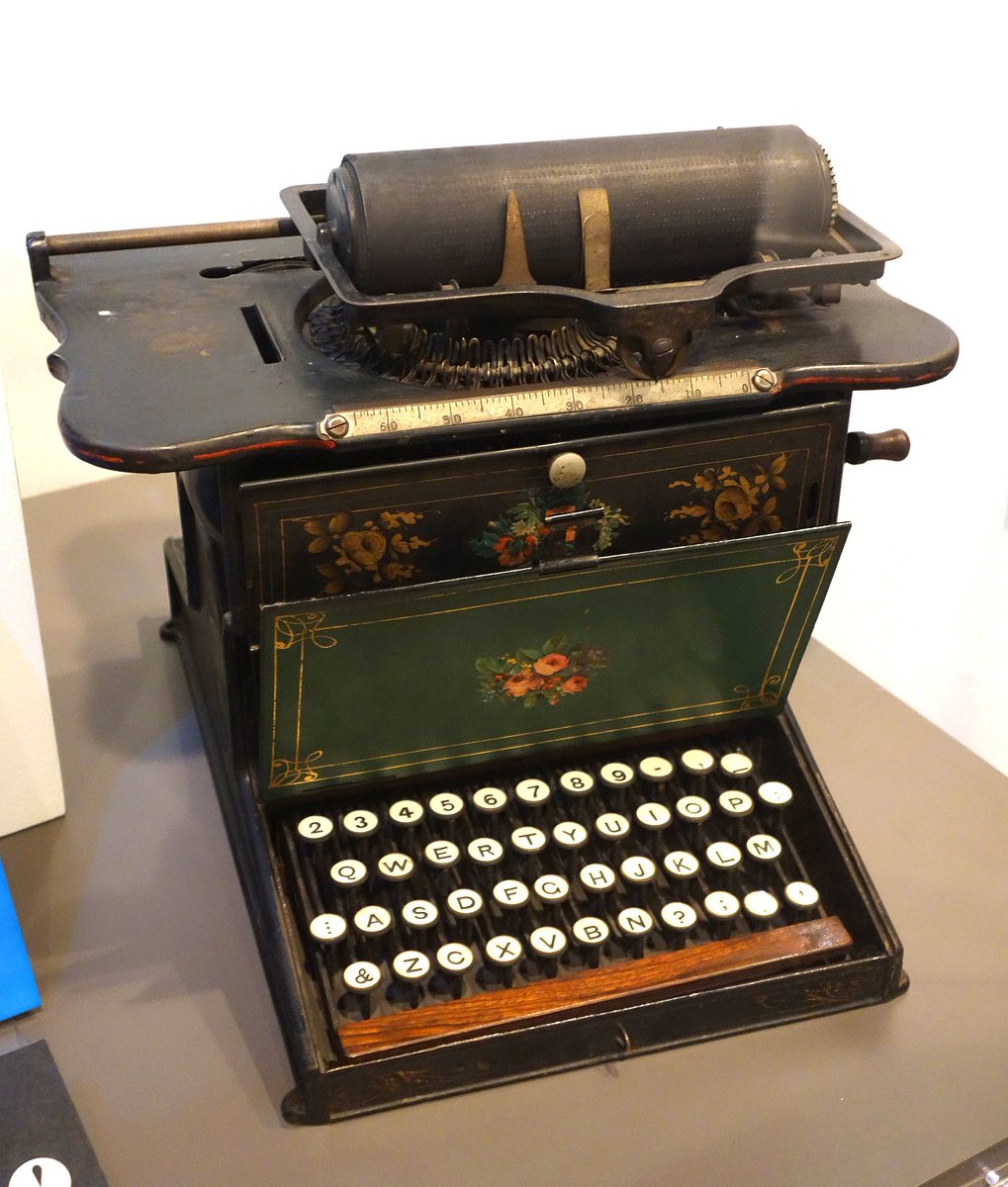
Attempts to create writing machines are old, dating to the 1500s at the earliest and becoming more common in the 19th century.
But they were more of a curiosity than anything else. The first commercially manufactured was the Hansen Writing Ball, but it wasn't widely adopted.
But they were more of a curiosity than anything else. The first commercially manufactured was the Hansen Writing Ball, but it wasn't widely adopted.

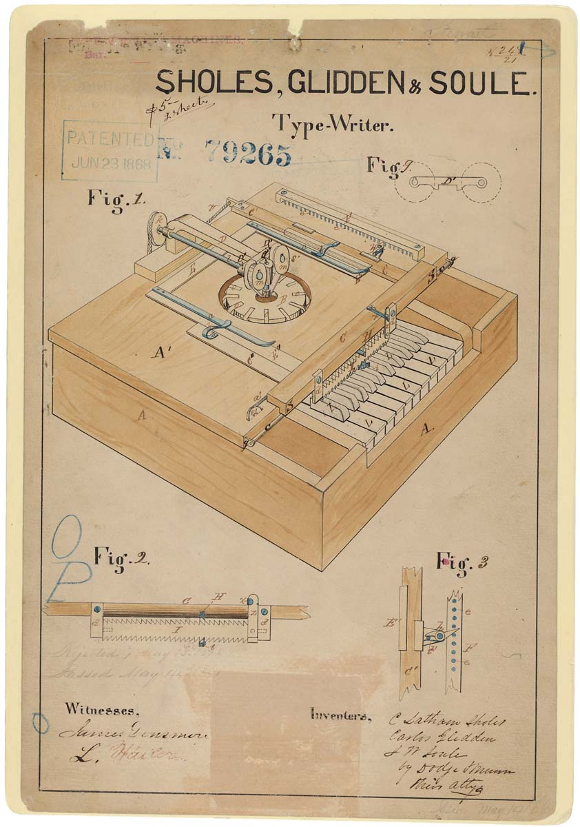
During the 1860s an American newspaper editor and inventor called Christopher Latham Sholes had been working on a writing machine with two friends, called Carlos Glidden and Samuel Soulé.
In 1868 they filed a patent for this machine. It looks like a strange piano.
In 1868 they filed a patent for this machine. It looks like a strange piano.
By 1873 they had created a new design and sold the production rights to arms manufacturer E. Remington and Sons.
It would become the Remington 1, the first commercially successfully typewriter. In 1878 the Remington 2 was created, which would be even more popular.
It would become the Remington 1, the first commercially successfully typewriter. In 1878 the Remington 2 was created, which would be even more popular.


Typewriters took several years to catch on, for the usual reasons of high initial costs, no pre-existing market, and lack of operational expertise.
But their rise was inevitable - with their huge advantages of speed and legibility - and by the late 1880s they were everywhere.
But their rise was inevitable - with their huge advantages of speed and legibility - and by the late 1880s they were everywhere.

For over a century typewriters would be found in every office and household around the world, then to be replaced by computers and digital word processors.
But even as the typewriter as a machine became obsolete, its standard keyboard layout would live on.
But even as the typewriter as a machine became obsolete, its standard keyboard layout would live on.
Where did that standard layout come from?
At first Sholes and co simply opted for two rows of letters in alphabetical order; that was part of the 1868 patent.
But they realised early on that this alphabetical order just wouldn't work...
At first Sholes and co simply opted for two rows of letters in alphabetical order; that was part of the 1868 patent.
But they realised early on that this alphabetical order just wouldn't work...
Why not? A few reasons.
The first was to do with typing optimisation. See, the order of the alphabet has little to do with how often each letter is used.
In this sense an alphabetical order is essentially random - it has nothing to do with the practicalities of typing itself.
The first was to do with typing optimisation. See, the order of the alphabet has little to do with how often each letter is used.
In this sense an alphabetical order is essentially random - it has nothing to do with the practicalities of typing itself.

Sholes, Glidden, and Soule realised that typing was easier and more efficient when letters were spaced out according to the frequency of their use, such that the typist's hands could comfortably move from letter to letter rather than being bunched up in one place.
Spreading the typing workload between hands was important; if the most-used letters were on one side only, that hand would do all the typing.
Here a visual map of letter frequency shows how the usage is (relatively) evenly spread between hands on a QWERTY keyboard.
Here a visual map of letter frequency shows how the usage is (relatively) evenly spread between hands on a QWERTY keyboard.

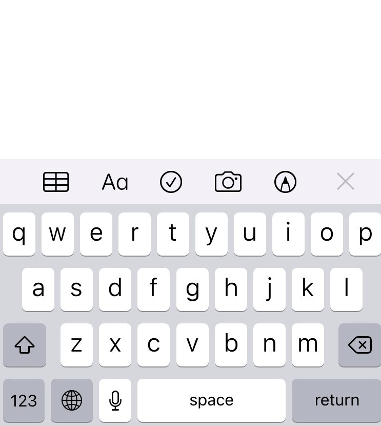
When they submitted the design for the Sholes & Glidden Type-writer, which would become the Remington 1, it had (more or less) the QWERTY layout.
But part of the original alphabetical order remains, even to this day, with the letters DFGHJKL in the centre row.
But part of the original alphabetical order remains, even to this day, with the letters DFGHJKL in the centre row.
Equally important, Sholes realised, was the frequency of letter combinations.
Not all letters are equally related; some appear together often, others not at all.
And so, even regardless of general frequency, it was important not to place common letter combinations together.
Not all letters are equally related; some appear together often, others not at all.
And so, even regardless of general frequency, it was important not to place common letter combinations together.

Write a few lines on your phone or computer - notice how rarely you press two keys next to one another.
That isn't accidental. It's a piece of incredibly effective, intuitive design. Sholes and co made sure the keyboard was, even invisibly to us, easier to use.
That isn't accidental. It's a piece of incredibly effective, intuitive design. Sholes and co made sure the keyboard was, even invisibly to us, easier to use.
The second major issue was technical, because typewriters had up to thirty or forty separate mechanical levers.
Jamming was a problem when adjacent keys were pressed in succession. Hence the need to make that as unlikely as possible.
Jamming was a problem when adjacent keys were pressed in succession. Hence the need to make that as unlikely as possible.
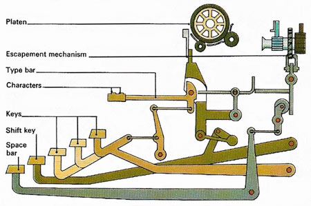
Another design choice made to avoid jamming was for keys to be offset from one another.
Notice that, on typewriters, the keys are in diagonal rather than vertical columns.
Notice that, on typewriters, the keys are in diagonal rather than vertical columns.
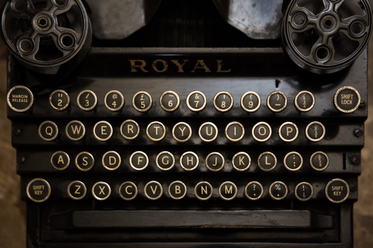
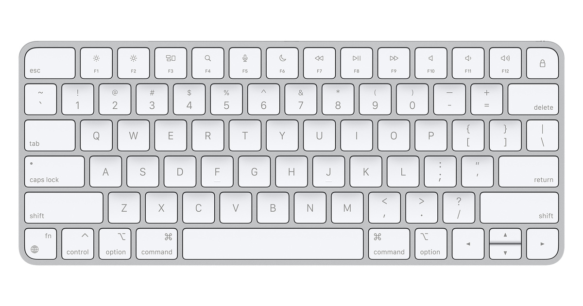
What's remarkable is that this has continued into the era of computer keyboards, even when jamming is no longer a problem.
So the arrangement of letters on your phone isn't just for general typing optimisation; it was designed for the specific context of a mechanical typewriter.
So the arrangement of letters on your phone isn't just for general typing optimisation; it was designed for the specific context of a mechanical typewriter.

And so QWERTY , designed primarily by Sholes for the first commercially successful typewriter, became the default layout.
Even if it wasn't the best, it worked well enough. And, crucially, it was the first. So a century and a half later it's still dominant.
Even if it wasn't the best, it worked well enough. And, crucially, it was the first. So a century and a half later it's still dominant.
There have been several attempts to create keyboard layouts superior to QWERTY, such as Dvorak in 1936 and Colemak in 2006.
They pay attention not only to letter frequency but to human biology - how the hand actually moves. And both are statistically more efficienct than QWERTY.
They pay attention not only to letter frequency but to human biology - how the hand actually moves. And both are statistically more efficienct than QWERTY.

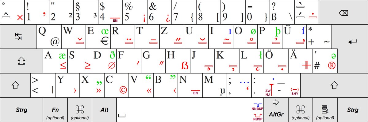
It's also worth remembering that there are different keyboard layouts around the world to account for languages differences.
There are other Latin alphabet layouts like QWERTZ, used in Germany and Central Europe. It accounts for differences in letter combination frequencies.
There are other Latin alphabet layouts like QWERTZ, used in Germany and Central Europe. It accounts for differences in letter combination frequencies.
And, of course, there are countless non-Latin alphabets around the world, many of which have more letters or totally divergent linguistic structures and have thus been designed differently.

And yet Sholes' original QWERTY design has even shaped the layout of non-Latin keyboards, largely because of its dominance and ease-of-use when typists are familiar with the QWERTY layout.
Such as the typical Bulgarian Cyrillic keyboard layout:
Such as the typical Bulgarian Cyrillic keyboard layout:

So that's why your keyboard isn't in alphabetical order; a mixture of careful design to optimise the typing experience and of long-gone practical constraints.
Strange, how jammed typewriters from the 19th century still shape the way we use our smart phones in the 21st century...
Strange, how jammed typewriters from the 19th century still shape the way we use our smart phones in the 21st century...
• • •
Missing some Tweet in this thread? You can try to
force a refresh