This 1928 self-portrait is probably the ultimate Art Deco painting.
And it's by Tamara de Lempicka, the ultimate Art Deco artist.
She was a unique, futuristic painter with a wild life whose work captured the spirit of the 1920s...
And it's by Tamara de Lempicka, the ultimate Art Deco artist.
She was a unique, futuristic painter with a wild life whose work captured the spirit of the 1920s...

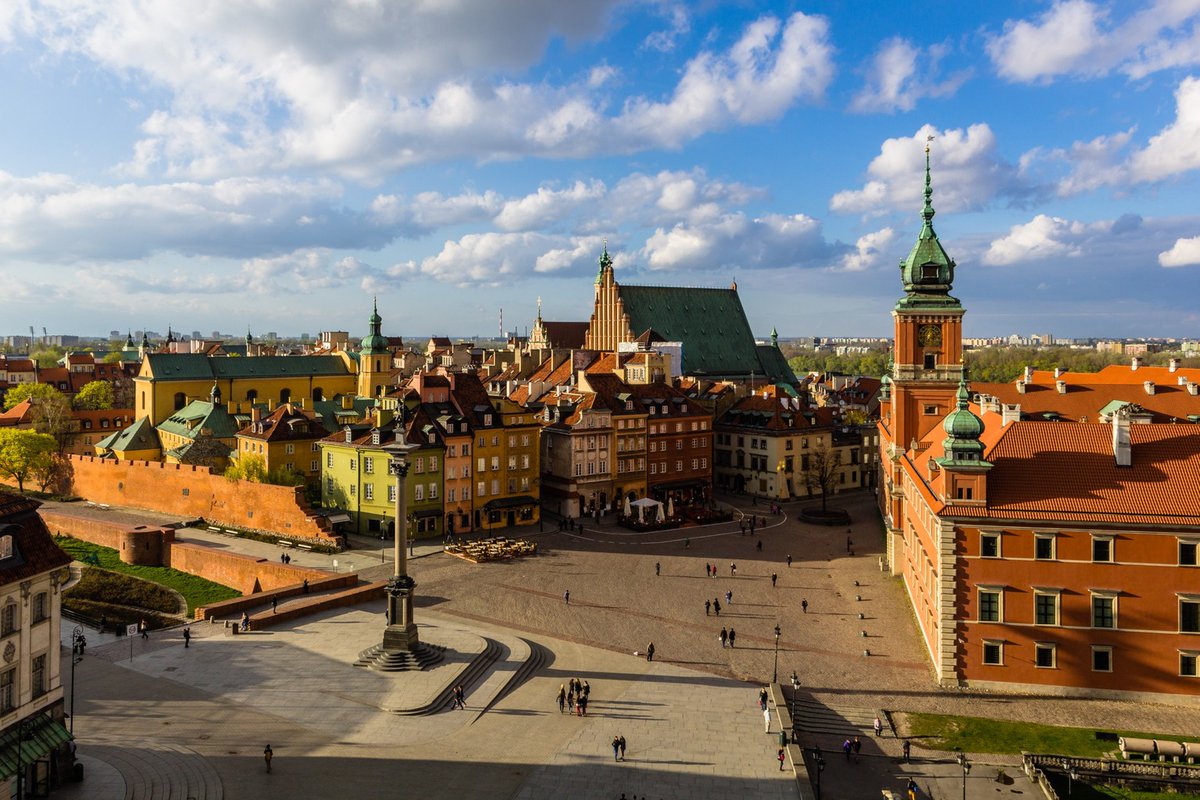
Tamara Gurwik-Górska was born in Poland in 1898 and raised in Warsaw by her father - a lawyer - and her mother - a socialite.
Her rebellious, artistic nature was clear from the start; at the age of ten, dissatisified with the work of a family portraitist, she redid it herself.
Her rebellious, artistic nature was clear from the start; at the age of ten, dissatisified with the work of a family portraitist, she redid it herself.
After dropping out of her Swiss boarding school she travelled to St Petersburg and married a lawyer, Tadeusz Łempicki.
But everything changed with the Russian Revolution of 1917. She got Tadeusz (arrested by the secret police) out of prison and the family fled to Paris.
But everything changed with the Russian Revolution of 1917. She got Tadeusz (arrested by the secret police) out of prison and the family fled to Paris.
Lempicka was just twenty, the mother of a young child, and her husband was jobless. But she wanted to paint - and so she studied at the Académie de la Grande Chaumière.
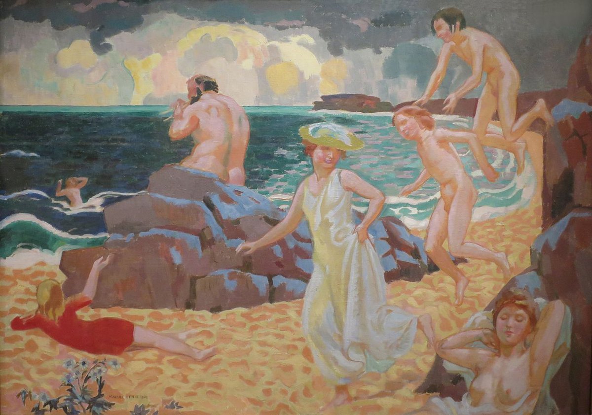
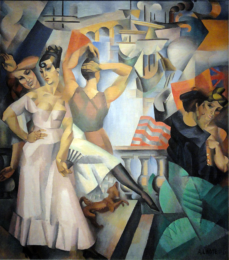
There she came under the influence of progressive artists like Maurice Denis and Andre Lhote.
There she came under the influence of progressive artists like Maurice Denis and Andre Lhote.
Lempicka flourished in the cultural circles of 1920s Paris, and engaged in numerous scandalous affairs with both men and women.
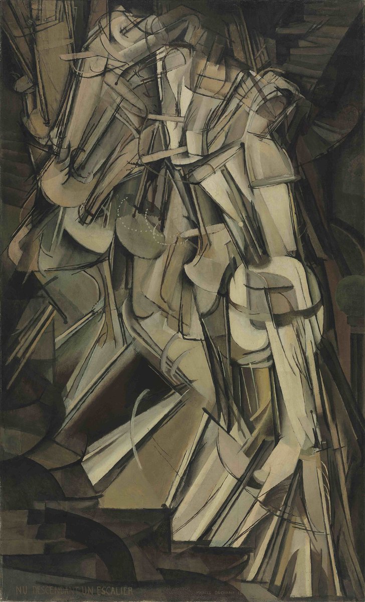
It was an artistic whirlpool of the avant-garde, Cubism, and Futurism, all framed by disillusionment in the shadow of the First World War.
It was an artistic whirlpool of the avant-garde, Cubism, and Futurism, all framed by disillusionment in the shadow of the First World War.
Lempicka's early work, influenced primarily by Lhote, was exhibited in several of Paris' art salons.
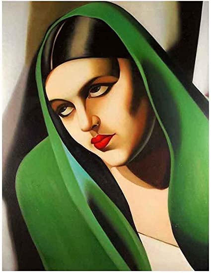
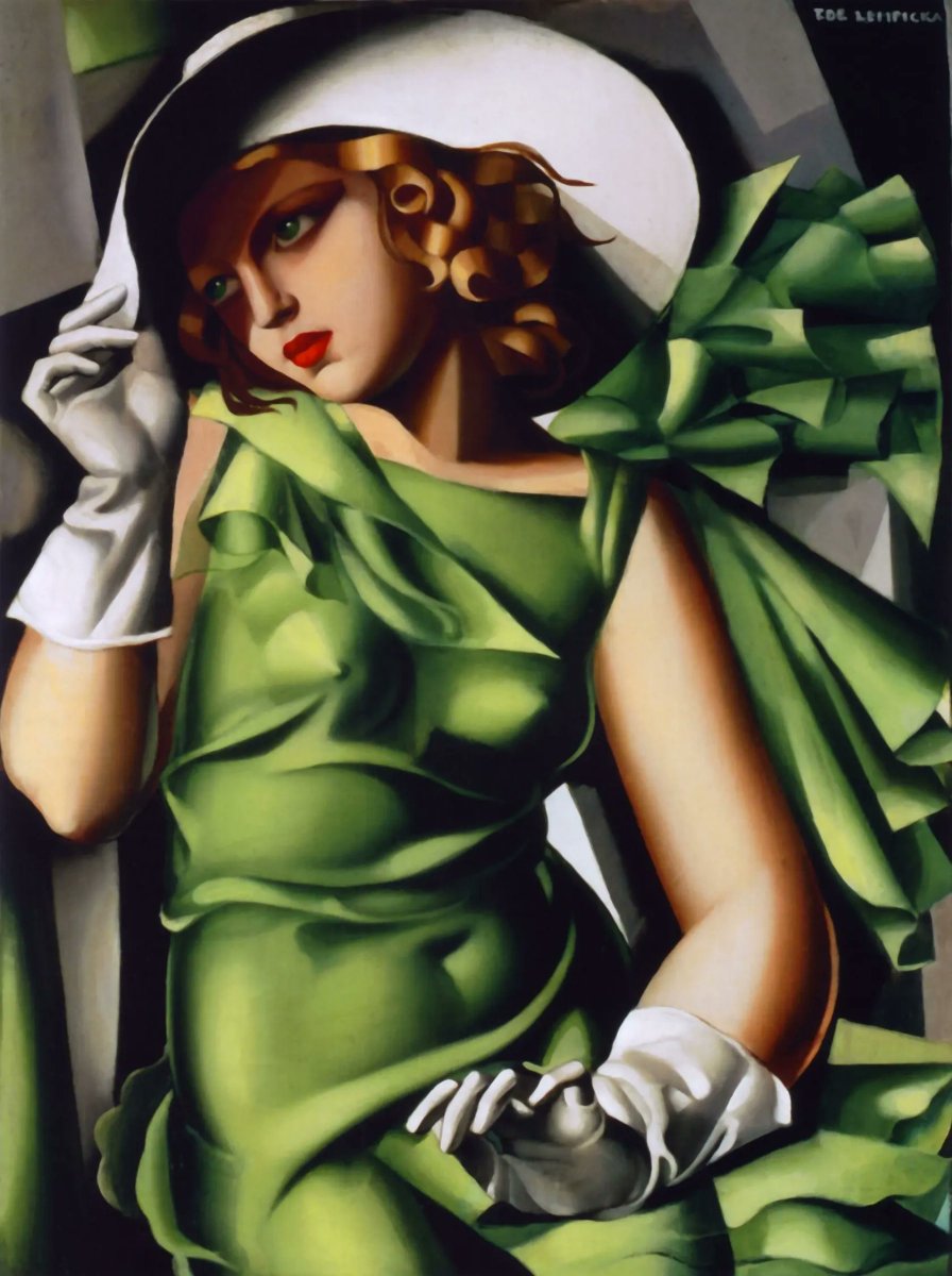
From the Kiss (left, 1922) to the Green Veil (right, 1924) we can see her style maturing; from loose brushwork to smooth forms and from darker tones to vivid, metallic colours.
From the Kiss (left, 1922) to the Green Veil (right, 1924) we can see her style maturing; from loose brushwork to smooth forms and from darker tones to vivid, metallic colours.

Suitably, it was at the 1925 "Exposition internationale des arts décoratifs" in Paris - which gave Art Deco its name - that Lempicka first found serious success and gained a reputation.
She forged her own, distinctive style - one which captured the prevailing spirit of the 20s.
She forged her own, distinctive style - one which captured the prevailing spirit of the 20s.
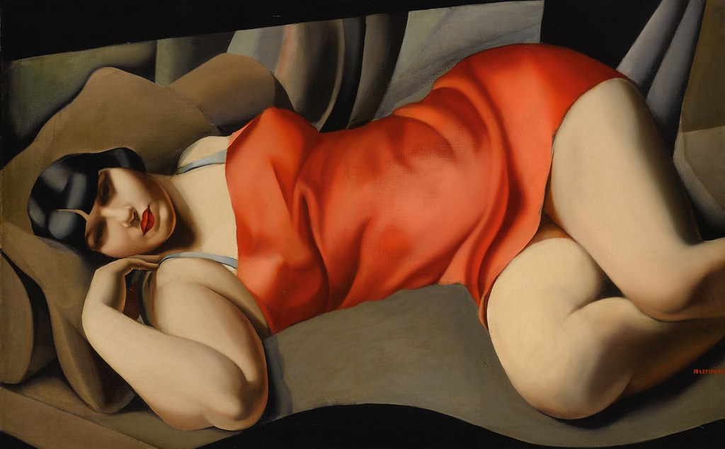
The striking thing about Lempicka's personal brand of Cubism was its classical influence.
Many Post-Impressionist, Cubist, and proto-modernist artists had done away with linear perspective; their paintings increasingly lacked depth and utilised flat planes of colour.
Many Post-Impressionist, Cubist, and proto-modernist artists had done away with linear perspective; their paintings increasingly lacked depth and utilised flat planes of colour.
Not Lempicka.
Although she employed the quasi-abstract shapes of the Cubists and the unnaturally vivid colours of the Expressionists, she used them to create real depth and weight.
It's Cubism come to life, as if Lempicka had reassembled a work by Picasso.
Although she employed the quasi-abstract shapes of the Cubists and the unnaturally vivid colours of the Expressionists, she used them to create real depth and weight.
It's Cubism come to life, as if Lempicka had reassembled a work by Picasso.
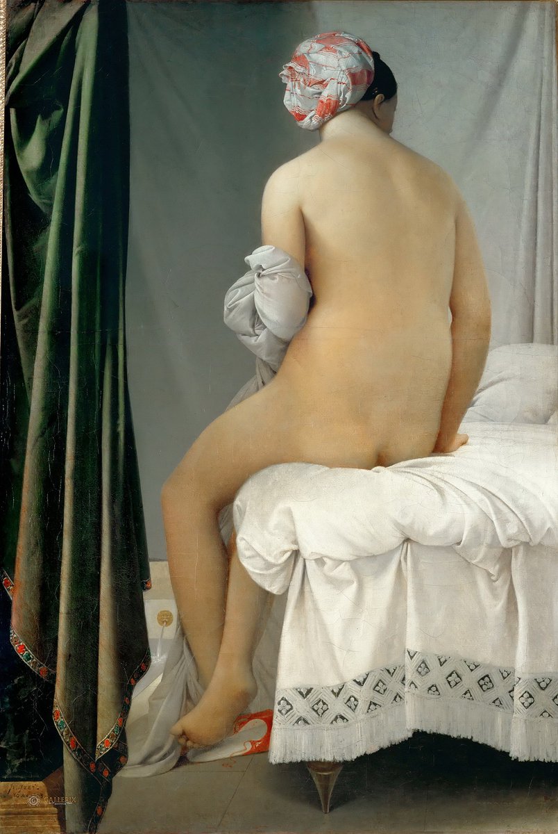
Indeed, one of Lempicka's favourite painters was the 19th century French neoclassical artist Jean-Auguste-Dominique Ingres, who like Lempicka favoured a smooth, absolute clarity of form.
Like Ingres, her work features striking, clean compositions - with hints of Caravaggio, too.
Like Ingres, her work features striking, clean compositions - with hints of Caravaggio, too.
Indeed, it was in her portraits that Lempicka's fusion of the modern and the traditional - like Art Deco itself - is revealed.
They are, collectively, a remarkable artistic achievement, one which conveys the cultural ideals of an era in an immediately recognisable style.
They are, collectively, a remarkable artistic achievement, one which conveys the cultural ideals of an era in an immediately recognisable style.
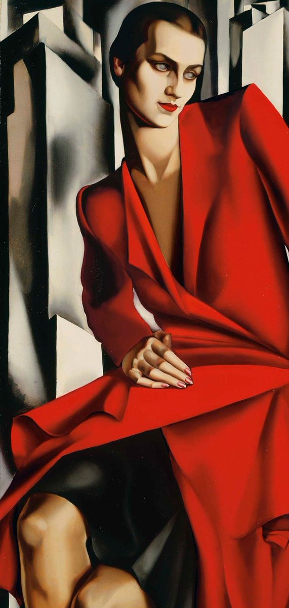
Lempicka's portraits are also startlingly futuristic, mixing Art Deco's lavish design with the technological fears of the age.
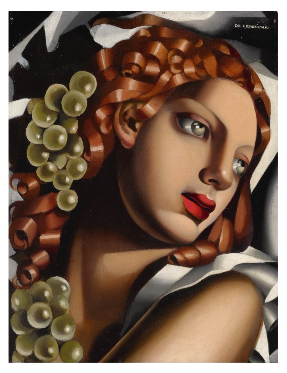
Her humans and their clothes have a smooth, metallic texture; they remind us of robots, captivating but lifeless.
(With some Botticelli curls, too)
Her humans and their clothes have a smooth, metallic texture; they remind us of robots, captivating but lifeless.
(With some Botticelli curls, too)
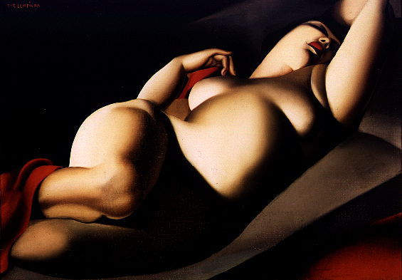
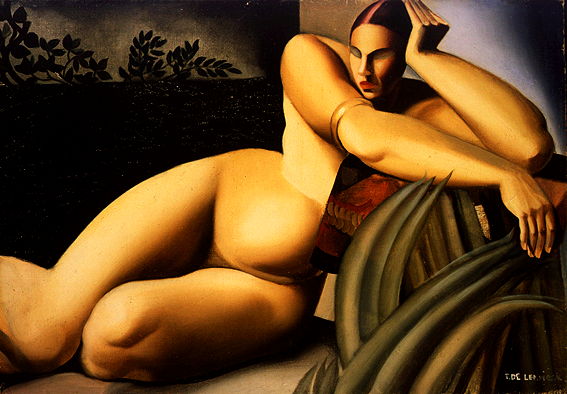
Lempicka also painted female nudes throughout her career, drawing together her many influences to paint them in ways that had never quite been seen before, mixing traditional realism with the avant-garde and - somehow - finding a balance between the two.
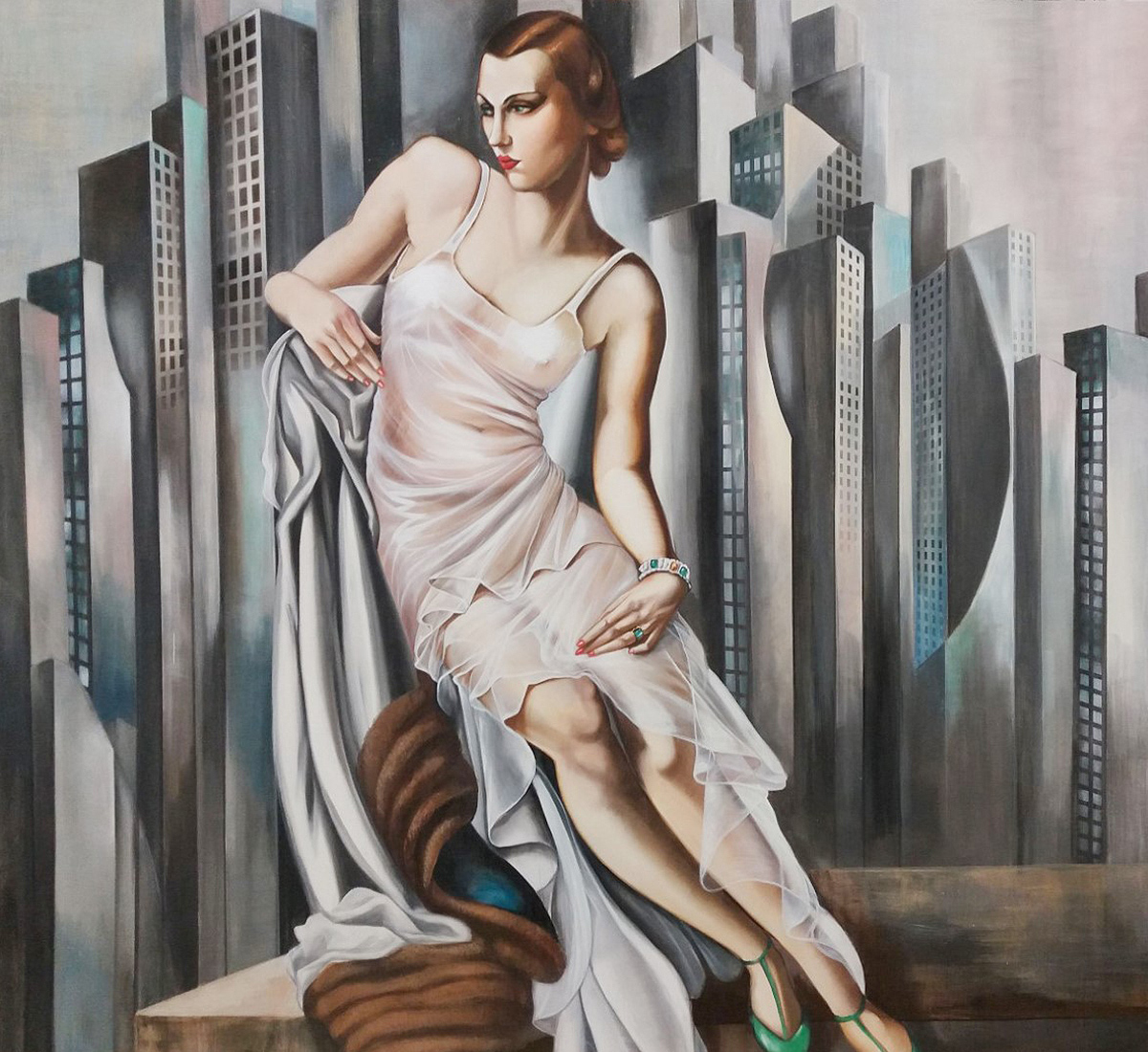
While the cityscapes that haunt the backgrounds of all Lempicka's portraits are reminiscent of Fritz Lang's 1927 Art Deco-science fiction masterpiece, Metropolis, with those soaring skyscrapers almost terrifying in their distant monumentality; the looming future.

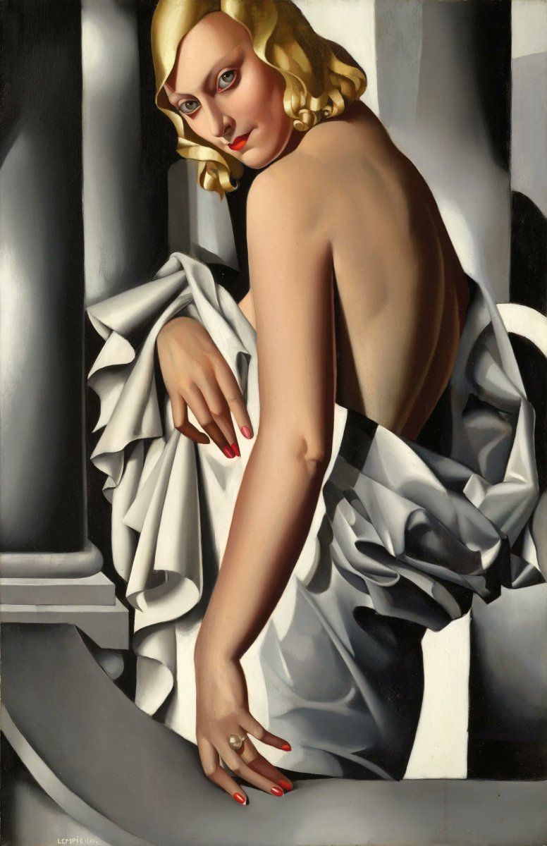
Few paintings quite capture the spirit of the age like Lempicka's portrait of Marjorie Ferry.
The glamour and decadence we associate with the 1920s, the hyper-stylised art and the mixture of disillusionment with optimism, extravagance with looming catastrophe... it's all there.
The glamour and decadence we associate with the 1920s, the hyper-stylised art and the mixture of disillusionment with optimism, extravagance with looming catastrophe... it's all there.
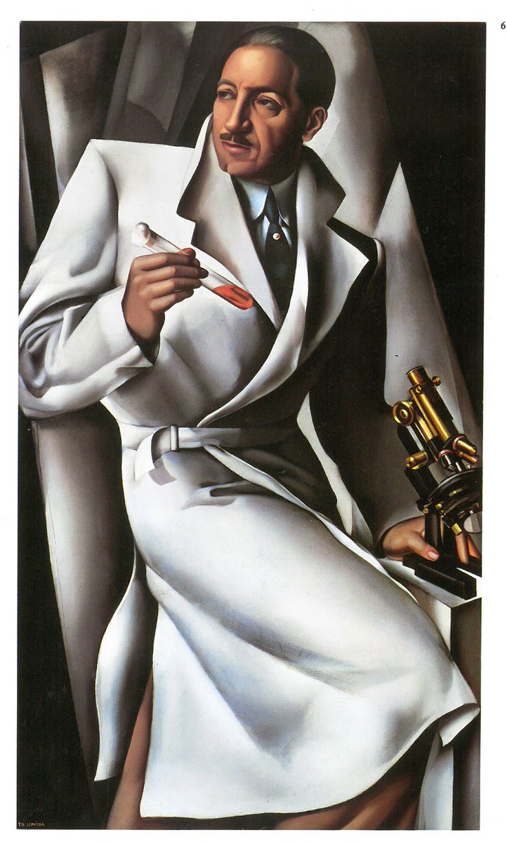
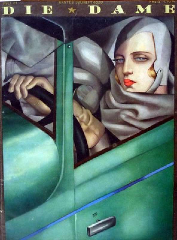
The famous "Autoportrait", commissioned by the German magazine Die Dame in 1928, was but one of many paintings by Lempicka featured in print.
By 1930 she had become an internationally famous artist with exhibitions all around Europe and America.
By 1930 she had become an internationally famous artist with exhibitions all around Europe and America.
But Lempicka's fame was, like Art Deco itself, short-lived.
By 1934 she had married Baron Raoul Kuffner (after his wife died she had divorced Tadeusz) and all seemed well. But the Great Depression and the rise of political tension in Europe had fundamentally changed art.
By 1934 she had married Baron Raoul Kuffner (after his wife died she had divorced Tadeusz) and all seemed well. But the Great Depression and the rise of political tension in Europe had fundamentally changed art.
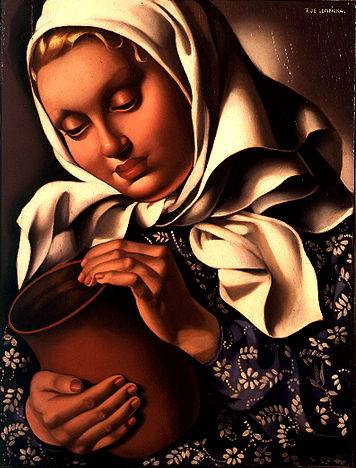
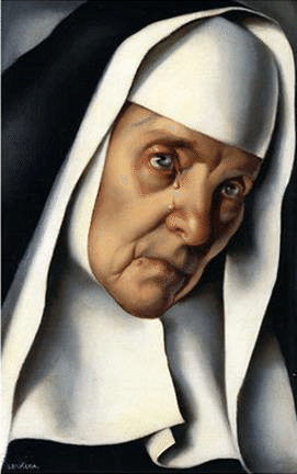
And as the 1930s went on Lempicka seemed to experience something of a spiritual crisis, perhaps disillusionment, as her fame started to wane and the cultural winds shifted.
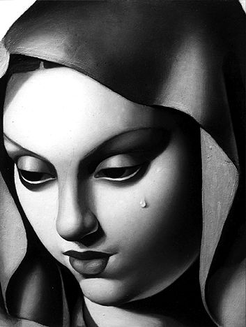
Religious themes dominate her work in this period, as in The Madonna With A Tear from 1935:
Religious themes dominate her work in this period, as in The Madonna With A Tear from 1935:
Gone was the latent luxury of Art Deco, the decadence and the glamour of the Roaring Twenties.
Lempicka had turned her hand to much more sober subject matters. And yet, more than ever before, her art has real emotional expressiveness.
Lempicka had turned her hand to much more sober subject matters. And yet, more than ever before, her art has real emotional expressiveness.
In 1939, after the outbreak of the Second World War, Lempicka and her husband moved to America. She had been there before and was well-known; a career surely awaited...
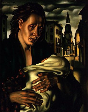
Her most striking painting from this time is Escape (1939), which needs no explanation.
Her most striking painting from this time is Escape (1939), which needs no explanation.
Things did not go as planned. Lempicka's style had become old-fashioned. With exhibitions unsuccessful and portrait commisions declining, she struggled to find direction.
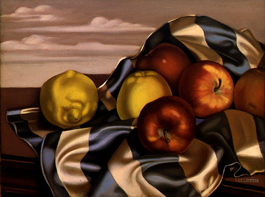
And so Lempicka painted still lifes for the first time, still retaining much of her distinctive style:
And so Lempicka painted still lifes for the first time, still retaining much of her distinctive style:
In the 1950s and 60s, perhaps inspired by the "abstract expressionism" of postwar New York, embodied in the work of painters like Jackson Pollock, Lempicka dived headlong into abstract art.
She had cast off her beloved style in an effort to keep up with the times.
She had cast off her beloved style in an effort to keep up with the times.

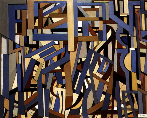
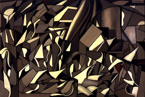
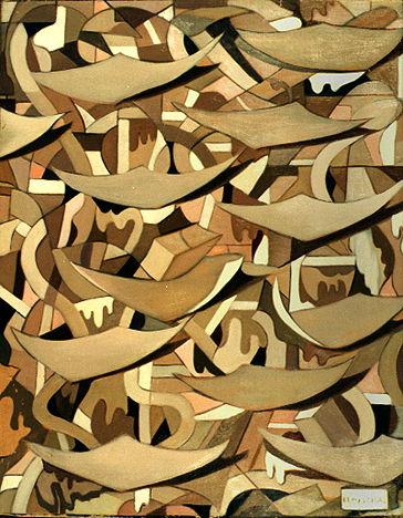
But by the late 1960s it was clear her career had stalled, with the luxurious futurism of Art Deco long-buried by more austere modernism. She couldn't find a place in this new artistic world.
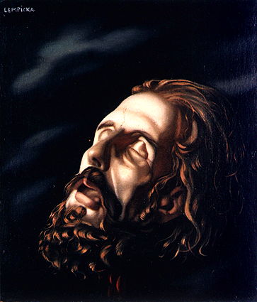
Lempicka turned back to religious work; her last painting, in 1974, was of St Anthony:
Lempicka turned back to religious work; her last painting, in 1974, was of St Anthony:

In 1972 a Paris exhibition saw the "rediscovery" of Art Deco and a renewed interest in Lempicka's work.
But she had retired by then. And in 1974 she moved to Mexico, where she died six years later, her ashes scattered over Popocatépetl.
The end of a long, wild, colourful life.
But she had retired by then. And in 1974 she moved to Mexico, where she died six years later, her ashes scattered over Popocatépetl.
The end of a long, wild, colourful life.

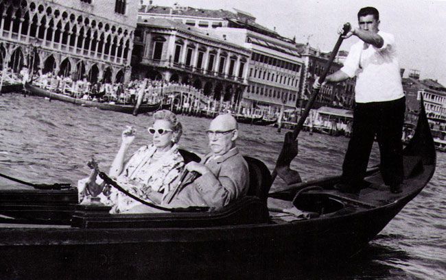
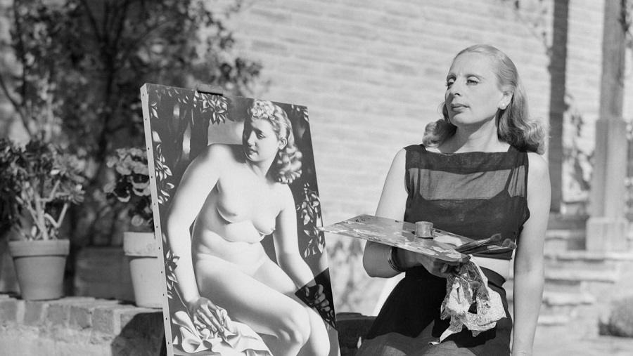
And here is Tamara de Lempicka herself, alongside one of her instantly recognisable portraits.
Few painters have ever quite captured the *feeling* of their age like Lempicka, whose art seems to embody the Art Deco.
And yet, in all their brilliance, they remain truly timeless.
Few painters have ever quite captured the *feeling* of their age like Lempicka, whose art seems to embody the Art Deco.
And yet, in all their brilliance, they remain truly timeless.
• • •
Missing some Tweet in this thread? You can try to
force a refresh