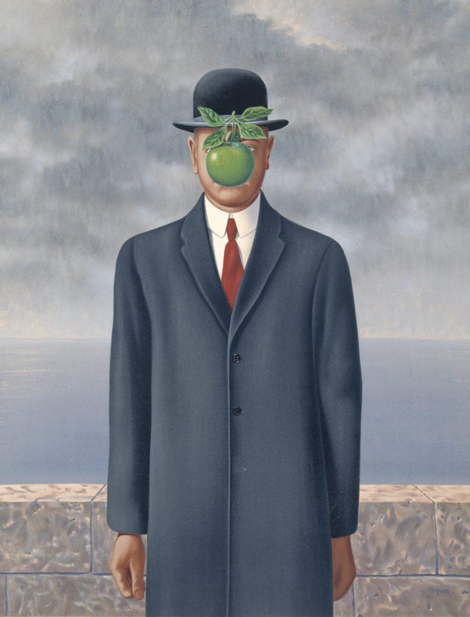
Why did René Magritte paint a man with his face hidden by an apple in 1946?
And why did he call it The Son of Man?
Welcome to the uncanny world of Surrealism...
And why did he call it The Son of Man?
Welcome to the uncanny world of Surrealism...
René Magritte (1898-1967) was born in Belgium, part of that generation whose lives were shaped by the socio-cultural fallout of the First World War.
But it was profound personal tragedy that perhaps affected him most; his mother committed suicide when Magritte was just 13.
But it was profound personal tragedy that perhaps affected him most; his mother committed suicide when Magritte was just 13.
Magritte's brief, unfulfilling stint at the Royal Academy in Brussels was followed by service in the Belgian Army.
His early art was heavily influenced by Cubism, with its flat planes of colour, geometric shapes, and increasing abstraction, like that of Picasso and Metzinger:
His early art was heavily influenced by Cubism, with its flat planes of colour, geometric shapes, and increasing abstraction, like that of Picasso and Metzinger:


And so he painted things like this.
They aren't particularly remarkable. It's a sort of paint-by-numbers Cubism, far from the Magritte with which we are so familiar.
He was yet to find his personal style.
They aren't particularly remarkable. It's a sort of paint-by-numbers Cubism, far from the Magritte with which we are so familiar.
He was yet to find his personal style.


But in the early 1920s everything changed, when Magritte was first exposed to the art of Giorgio de Chirico.
He was an Italian painter whose "metaphysical" art was a vital influence on Surrealism.
He was an Italian painter whose "metaphysical" art was a vital influence on Surrealism.


It was de Chirico's Song of Love (1914) that so revolutionised Magritte's understanding of art.
It allegedly brought him to tears. And - crucially - he said that he had seen, for the first time, *thought* expressed in art.
It was art's intellectual capacity that interested him.
It allegedly brought him to tears. And - crucially - he said that he had seen, for the first time, *thought* expressed in art.
It was art's intellectual capacity that interested him.

Starting with The Lost Jockey and The Difficult Crossing in 1926, Magritte fully embraced this metaphysical art.
We can see how much Magritte's style had changed.
He held a solo exhibition in Brussels, but it was derided. Frustrated, Magritte moved to Paris in 1927...
We can see how much Magritte's style had changed.
He held a solo exhibition in Brussels, but it was derided. Frustrated, Magritte moved to Paris in 1927...


In Paris Magritte fell in with André Breton, the founder of Surrealism, and his circle of writers and painters.
Here Magritte flourished, doubling down on his nascent metaphysical art and fully embracing Surrealism, with its probing interrogation and refutation of reality.
Here Magritte flourished, doubling down on his nascent metaphysical art and fully embracing Surrealism, with its probing interrogation and refutation of reality.

He was prolific in the late 1920s and quickly arrived at a more mature style.
Whereas his early Surrealist works - like the Difficult Crossing - had been fairly noisy, with lots going on, Magritte started removing complexity, instead focussing on simple, strange, clear imagery.
Whereas his early Surrealist works - like the Difficult Crossing - had been fairly noisy, with lots going on, Magritte started removing complexity, instead focussing on simple, strange, clear imagery.

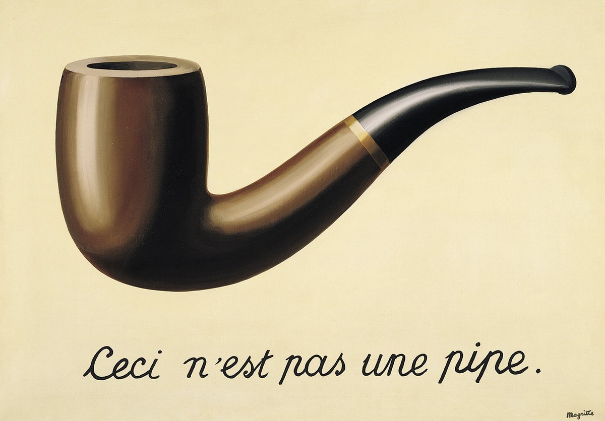
This phase culminated in 1929 with Magritte's most famous and enduringly controversial painting: The Treachery of Images.
A painting of a pipe with the words: "this is not a pipe." It caused an uproar, but this was like Magritte's personal manifesto - art as deception.
A painting of a pipe with the words: "this is not a pipe." It caused an uproar, but this was like Magritte's personal manifesto - art as deception.
Now, there are two interesting things about Magritte's Surrealism.
The first is... its realism. Whereas other modernist art movements were increasingly abstract, Magritte stuck to a traditional, "representative" style - art which depicts objects as we actually see them.
The first is... its realism. Whereas other modernist art movements were increasingly abstract, Magritte stuck to a traditional, "representative" style - art which depicts objects as we actually see them.

European art had been "representative" since the Renaissance, seeking to depict the world as we perceive it in reality.
Much modern art was reacting against this centuries-old trend, finding new forms for art.
Magritte kept the form; he just changed the content:
Much modern art was reacting against this centuries-old trend, finding new forms for art.
Magritte kept the form; he just changed the content:

Of course, Magritte wasn't the only artist to refrain from abstraction.
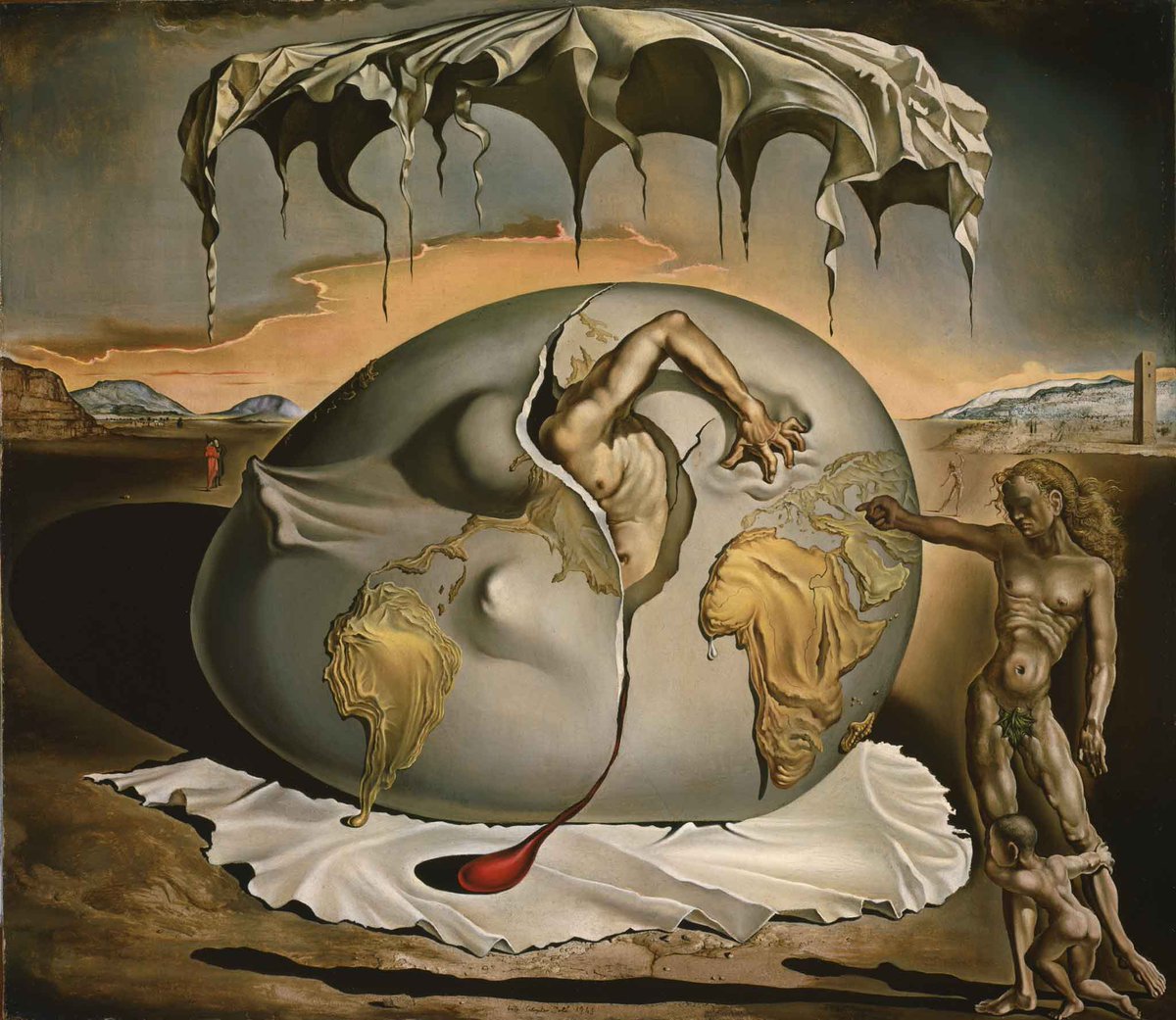
Salvador Dalí was a master of perspective and modelling, no less great than the masters of old. But he used these methods to create fantastical, phantasmagorical, mind-bending landscapes and scenes:
Salvador Dalí was a master of perspective and modelling, no less great than the masters of old. But he used these methods to create fantastical, phantasmagorical, mind-bending landscapes and scenes:
Whereas Magritte preferred to use ordinary objects and familiar scenes.
His art rests in the uncanny valley - where something resembles reality but is just different enough that it confuses our brains.
It is a subtle, deeply impactful strangeness; Magritte makes us think.
His art rests in the uncanny valley - where something resembles reality but is just different enough that it confuses our brains.
It is a subtle, deeply impactful strangeness; Magritte makes us think.

And once he had found this simple, conceptual style, Magritte stayed with it for the rest of his career.
It was a perfect vehicle for the expression of his thoughts and observations, for his desire to question, probe, and reframe.
It was intellectual rather than emotional art.
It was a perfect vehicle for the expression of his thoughts and observations, for his desire to question, probe, and reframe.
It was intellectual rather than emotional art.


Magritte's titles can be misleading, as with Golconda (1953).
Golconda is the name of a ruined fortress in India; what that has to do with these raining men (Magritte's favourite bowler hat men) is unclear.
Perhaps it was to deceive us, as Magritte believed all art must.
Golconda is the name of a ruined fortress in India; what that has to do with these raining men (Magritte's favourite bowler hat men) is unclear.
Perhaps it was to deceive us, as Magritte believed all art must.

At times his work is not so strange.
Clairvoyance (1936) feels like classic Magritte, but there's hardly anything surreal about it.
To see an egg and visualise the bird - a ringing endorsement of an artist's vision, or a mockery of it?
Clairvoyance (1936) feels like classic Magritte, but there's hardly anything surreal about it.
To see an egg and visualise the bird - a ringing endorsement of an artist's vision, or a mockery of it?
Most of Magritte's art was about art itself. Like The Human Condition, a series of paintings made between 1933 and 1955.
We imagine that behind the canvas lies the view it is depicting, but in truth they are both part of the same painting - there's nothing behind it.
We imagine that behind the canvas lies the view it is depicting, but in truth they are both part of the same painting - there's nothing behind it.

Similar ideas are explored in The Telescope (1963).
Again, Magritte takes something utterly mundane and familiar, portrays it in a representional manner, and then slightly alters this reality.
It is unsettling and compelling in equal measure, mysterious and unknowable.
Again, Magritte takes something utterly mundane and familiar, portrays it in a representional manner, and then slightly alters this reality.
It is unsettling and compelling in equal measure, mysterious and unknowable.

Indeed, Magritte was - true to his Surrealism - fascinated by mystery and its inscrutability.
Time Transfixed (1938) is incredibly striking, with that clear and simple imagery so well mastered by Magritte. What does it mean? You'll have to decide for yourself.
Time Transfixed (1938) is incredibly striking, with that clear and simple imagery so well mastered by Magritte. What does it mean? You'll have to decide for yourself.

Magritte was a sort of proto-conceptual artist; his modus operandi was to take a thought and present it visually.
Art has always been a method of questioning, but this had usually been implicit; Magritte's works were a direct interrogation both of reality and of art itself.
Art has always been a method of questioning, but this had usually been implicit; Magritte's works were a direct interrogation both of reality and of art itself.

And this is what distinguishes Magritte from other Surrealists and from his Symbolist precursors, like William de Nuncques in the late 19th century - who influenced him.
Their poetic art had been spiritually expressive, while Magritte's was intellectual.
Their poetic art had been spiritually expressive, while Magritte's was intellectual.

His greatest talent was to find the essence of an idea and convey it us, stripped of everything extraneous until it becomes an uncomplicated, captivating, unforgettable image.
A sort of conceptual iconography, epitomised in Not To Be Reproduced (1937):
A sort of conceptual iconography, epitomised in Not To Be Reproduced (1937):

Now we can see why Magritte was such a colossal influence on Pop Art, Minimalist Art, and Conceptual Art.
Because Magritte's work was intellectual rather than emotional, conceptual rather than spiritual, unknowable rather than expressive.
This was his last painting:
Because Magritte's work was intellectual rather than emotional, conceptual rather than spiritual, unknowable rather than expressive.
This was his last painting:

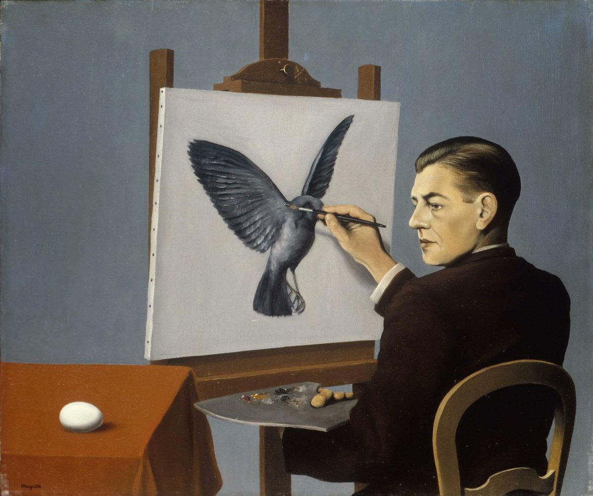
And here is René Magritte himself, pictured in a wonderfully self-aware and typically witty way.
Much modern art has been inspired by Magritte's intellectual, conceptual style, but few have managed to make us question reality quite like Magritte and his uncanny visions.
Much modern art has been inspired by Magritte's intellectual, conceptual style, but few have managed to make us question reality quite like Magritte and his uncanny visions.

If you enjoyed reading about Magritte then you may be interested in my free weekly newsletter, Areopagus.
It features seven short lessons every Friday, including art, architecture, history, & rhetoric.
Consider joining 50k+ other readers here:
culturaltutor.com/areopagus
It features seven short lessons every Friday, including art, architecture, history, & rhetoric.
Consider joining 50k+ other readers here:
culturaltutor.com/areopagus
• • •
Missing some Tweet in this thread? You can try to
force a refresh