Why did Medieval people draw such strange doodles? 
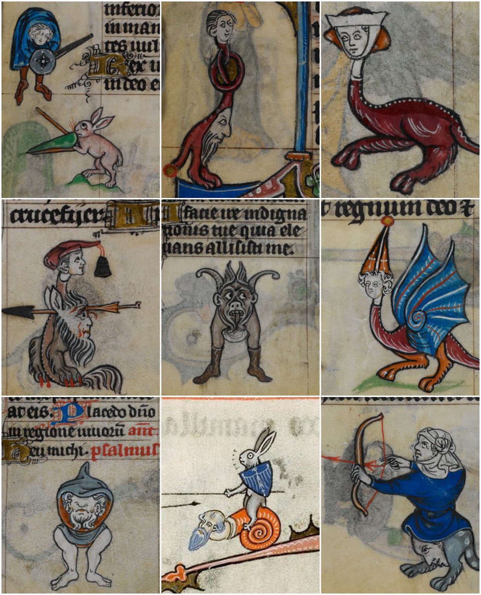
These famous Medieval pictures - of half-human creatures, of odd cats, of implausible scenarios like jousting rabbits - have given rise to much laughter.
But what are they? What is this vein of Medieval humour rising through the centuries?
Their technical name is "drollery".
But what are they? What is this vein of Medieval humour rising through the centuries?
Their technical name is "drollery".
The drollery is a subgenre of "marginalia", an overarching term for drawings and patterns placed in the margins (hence the name) of illuminated manuscripts.
They ranged from patterns and coloured letters to whole pictures; and their purpose from instructive to merely aesthetic.
They ranged from patterns and coloured letters to whole pictures; and their purpose from instructive to merely aesthetic.
An illuminated manuscript is, essentially, an illustrated Medieval book, whether printed or hand-written.
The "illumination" was a way of making the text more interesting or more beautiful, or to tell its story more clearly.
It was literature and visual arts rolled into one.
The "illumination" was a way of making the text more interesting or more beautiful, or to tell its story more clearly.
It was literature and visual arts rolled into one.

And so illuminated manuscripts became an artistic genre of their own, wrapped in religious and social context.
Sometimes the illumination itself overtook the text. These "miniature" illustrations are some the most beautiful and interesting works of Medieval art.
Sometimes the illumination itself overtook the text. These "miniature" illustrations are some the most beautiful and interesting works of Medieval art.

Illuminated manuscripts had been around for centuries, originally hand-written and illustrated accordingly, usually to depict scenes from the text.
Though, with monks hunched over desks for hours on end, there was plenty of room for creativity.
Though, with monks hunched over desks for hours on end, there was plenty of room for creativity.


But it was during the Late Middle Ages - with the invention of the printing press in the 15th century - that things really took off.
There was a lengthy process of decoration after printing, including gold-leaf, painting, and additional drawings in those spacious margins.
There was a lengthy process of decoration after printing, including gold-leaf, painting, and additional drawings in those spacious margins.

And so the printing press, combined with the growth of a new, wealthy class, created demand for illuminated manuscripts.
It was no longer just the Church or Kings, but other nobility, merchants, and courtiers who wanted them - both as social status symbols and for their use.
It was no longer just the Church or Kings, but other nobility, merchants, and courtiers who wanted them - both as social status symbols and for their use.

The most common type was the Book of Hours, a guide to the liturgy of every single day, to which prayers should be said at any given hour.
One of best examples is the Très Riches Heures, illustrated by the Limbourg Brothers in the 15th century for the Duke of Berry in France:
One of best examples is the Très Riches Heures, illustrated by the Limbourg Brothers in the 15th century for the Duke of Berry in France:

Other types of illuminated manuscripts include antiphonaries - music for religious services.
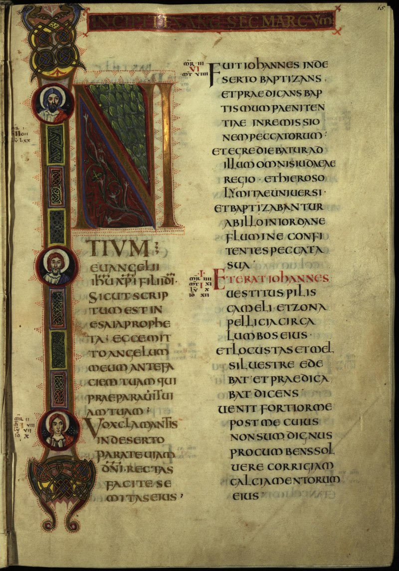
They often feature "historiated initials" - where the first letter of a text is enlarged, coloured, decorated, and includes an image.
They often feature "historiated initials" - where the first letter of a text is enlarged, coloured, decorated, and includes an image.

Then there were the alphabet books, themselves guides for the creators of illuminated manuscripts, complete with different possible designs for decorating and illustrating historiated initials.


And there were the bestiaries - among the most interesting of all - compendiums of animals (both real and imagined) with descriptions of their characteristics and illustrations of their appearances and behaviours.
Such as... beavers.
Such as... beavers.

And then there genealogical books, depicting the family tree of a particular individual, hagiographic manuscripts, depicting the lives of saints, guides to the use of medicinal herbs, or evocations of the apocalypse...


And so all of that is the context in which marginalia and drolleries were made, ranging from scholarly commentary to supplementary pictures to jokes.
We would be wrong to think that these funny pictures weren't also supposed to be funny when Medieval scholars first drew them.
We would be wrong to think that these funny pictures weren't also supposed to be funny when Medieval scholars first drew them.

Some of them are frankly terrifying - as surely they were supposed to be, serving as didactory images to tales with strong religious or moral messages.

And others are simply illustrative, presenting the action of the text in a visual form; thus making it more interesting, powerful, and memorable.

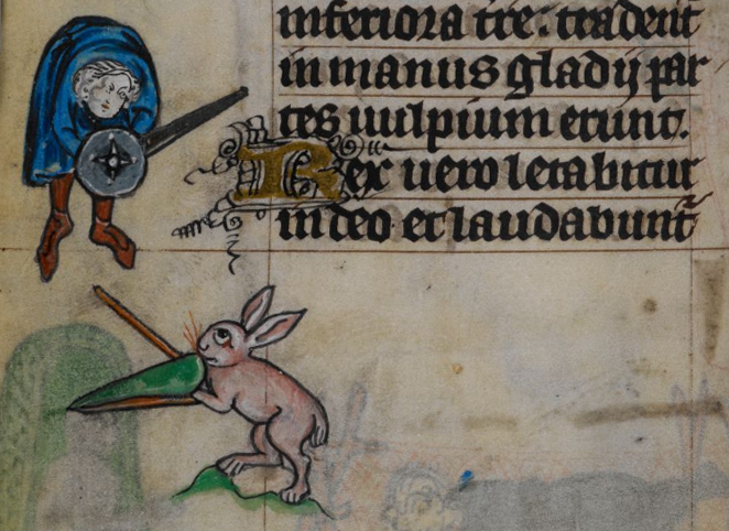
While others are rather funny, whether in the form of satire - perhaps displaying the revenge of rabbits on a hunter.

Or as simple scatology - toilet humour - one of humanity's most enduring fascinations...

And some are simply inexplicable.
There was a popular trend of drawing strange beasts to decorate the margins of manuscripts, part-human and part-animal.
Those margins were a place where the human imagination was allowed to run wild...
There was a popular trend of drawing strange beasts to decorate the margins of manuscripts, part-human and part-animal.
Those margins were a place where the human imagination was allowed to run wild...

But one of the funniest things about these drolleries and marginalia are their depictions of real animals.
Medieval art had never been about portraying reality as we truly perceive; it was intentionally stylistic.
Medieval art had never been about portraying reality as we truly perceive; it was intentionally stylistic.

But the results in marginalia are rather amusing.
As in this drawing of a scorpion and snake fighting from a mid-11th century Anglo-Saxon manuscript.
In which the snake seems to have the face of a mammal.
As in this drawing of a scorpion and snake fighting from a mid-11th century Anglo-Saxon manuscript.
In which the snake seems to have the face of a mammal.

And perhaps most famously in the form of Medieval cats, strangely anthropomorphic and lying somewhere between nightmare and comedy:

Many of these drolleries are not even related to the text - it seems that the scribes and monks and artists who created these manuscripts simply let their imaginations wander.
Surely the cause of no less laughter centuries ago than they are now.
Surely the cause of no less laughter centuries ago than they are now.

Drolleries are testament to the humour of the Middle Ages. The gulf of time and technology separating us from the past can make it seem distant; humour closes that gap like nothing else.
Perhaps people don't change so much... laughter has always been important.
Perhaps people don't change so much... laughter has always been important.

• • •
Missing some Tweet in this thread? You can try to
force a refresh