People's CDC Profile picture
Dec 12 14 tweets 3 min read
The US is in a surge. The CDC’s Community Levels map hides that fact. Use the Community Transmission Map instead.

Our CDC COVID Maps video explains the difference between the Community Transmission map.

Transcript in the comments.

Transcript:

Public Health for the People
Zoey Thill, MD, MPH, MPP

The CDCs pastel green map creates the false impression that the pandemic is over.

This is a Covid map from today. (12/10/2022)
This is also a Covid map from today. (12/10/22)
How does this happen? And which map is useful to you, a person who does not want to get or spread Covid.

This map – which is almost entirely red – represents COVID transmission per capita. The CDC creates this map by gathering COVID case numbers from local health departments.
It means that most of us are living amid high levels of COVID transmission, and that you may be likely to get and/or spread COVID especially if you’re not using any layers of protection.
But even the community transmission map *undercounts* current Covid transmission. When Congress failed to renew COVID funding this past March, they eliminated financial support for uninsured people to easily access free tests. and forced many community testing centers to close.
So fewer ppl are testing, and now, those who are testing, are frequently using at-home rapid tests, which are almost never reported to health departments.

This means, things are actually somehow *even* worse than this ALL RED MAP suggests.
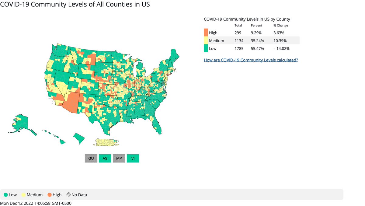
The CDC introduced *this* pastel “community levels” map in February. It’s the map they use on the CDC website and on CDC social media pages. This pastel map looks like we’re in the clear, and maybe the pandemic is over.

It’s not.
This community levels map is based on calculations that they claim will let us know when COVID is overwhelming our health systems. So Instead of telling you if you are likely to get or spread Covid, this map tells you whether you could access a hospital bed, should you need it.
The problem is, that by the time this map turns pastel orange, it’s already too late to prevent tragic and avoidable deaths, chronic illness and disability from Long COVID.

At The People’s CDC, we want you to know that the community levels map masks the state of the pandemic.
It pretends that COVID transmission doesn’t matter. It pretends that it’s ok for people to continue dying. And it pretends that it’s okay for people to keep getting sick - even though the CDC itself acknowledges 1 in 5 COVID cases leads to Long Covid.
We know that the impacts of COVID and the collective trauma it has caused has fallen disproportionately on certain communities: older, disabled, poor and working class, Black, Indigenous and POC and these communities will continue to suffer the greatest impacts of COVID19.
Find your community transmission map, and plan accordingly: Protect yourselves and your community by wearing an N95-grade mask, avoiding crowded indoor spaces, using a hepa filter, opening windows and taking activities outside, getting tested, vaccinated and boosted…
And demand COVID funding and a comprehensive public health approach to ending the COVID-19 pandemic.
A comparison of CDC Community Transmission Map and Community Levels Map from today, directly from the CDC website -

covid.cdc.gov/covid-data-tra… An image of the continental United States, Alaska, Hawaii, DAn image of the continental United States, Alaska, Hawaii, D

• • •

Missing some Tweet in this thread? You can try to force a refresh
 

Keep Current with People's CDC

People's CDC Profile picture

Stay in touch and get notified when new unrolls are available from this author!

Read all threads

This Thread may be Removed Anytime!

PDF

Twitter may remove this content at anytime! Save it as PDF for later use!

Try unrolling a thread yourself!

how to unroll video
  1. Follow @ThreadReaderApp to mention us!

  2. From a Twitter thread mention us with a keyword "unroll"
@threadreaderapp unroll

Practice here first or read more on our help page!

More from @PeoplesCDC

Dec 12
This is the @PeoplesCDC weekly update for December 12, 2022! The Weather Report from the People’s CDC sheds light on the COVID situation in the US. peoplescdc.org/2022/12/12/peo…
The Weather: Transmission levels have risen again, with nearly the entire population (98.38 percent) currently living in areas with substantial or higher transmission - compared to 93.3 percent last week. These are extremely high levels before winter officially arrives next week.
Map and table show COVID transmission levels by US county as
Read 29 tweets
Nov 28
This is the @PeoplesCDC weekly update for November 28, 2022! This Weather Report from the People’s CDC sheds light on the COVID situation in the US. peoplescdc.org/2022/11/28/peo…
The Weather: Transmission levels continue to remain high, with close to 85% of the population living in areas with substantial or higher COVID transmission, an almost 2% increase from last week. Map and table show COVID tr...
With PCR testing infrastructure dismantled in Spring 2022 (bit.ly/3F7tG9m), this map represents an undercount. We applaud the National Institute of Health for finally releasing an anonymous self-reporting portal (bit.ly/3iixQSM)for rapid antigen tests.
Read 27 tweets
Oct 17
This is the @PeoplesCDC weekly update for October 17, 2022! The Weather Report from the People’s CDC sheds light on the COVID situation in the US. peoplescdc.org/weatherreports/ peoplescdc.org/2022/10/17/peo…
The Weather: Although transmission levels have calmed since the recent surge, 82.6% of the population continues to live in areas of substantial or higher transmission. Layers of protection remain necessary to reduce the likelihood and severity of a winter surge.
Image
Read 32 tweets
Sep 24
According to the CDC’s own transmission map, which was updated yesterday afternoon, 90.38% of counties in the US are experiencing substantial or high community transmission of COVID.

This, of course, is not the map the CDC chooses to share on their own social accounts. An image of the continental...Table labeled, “Community T...
Instead, they share a “community levels” map, which does not provide an accurate picture of current transmission.

If we’re supposed to be doing our own “individual” and personal risk assessments, don’t we deserve to know what that risk actually is?
Here is a direct link to the CDC’s Community Transmission map -

covid.cdc.gov/covid-data-tra…
Read 5 tweets
Sep 22
Continue to urge @MTA to reinstate the mask mandate!

Call the office of the MTA Chair & let them know you want the mask mandate reinstated on public transit!
Call: 212-878-7200

and/or message MTA Board - contact.mta.info/s/forms/mta-bo…

#MaskTransit #MandateMasksNY
If you’d like a starting point, here’s a message sent from one of our members -

“Dear MTA: Throughout the pandemic--which is still ongoing, despite popular messaging otherwise--people have masked inconsistently in one of the world's most crowded train systems…”
“We know that COVID is airborne and can be transmitted through breathing, sneezing, coughing, and microscopic droplets. Unless medically contraindicated, masking--especially with a KN95 or N95--is an extremely important prevention tool in the fight against COVID.”
Read 5 tweets
Aug 15
This is the @PeoplesCDC weekly update for August 15, 2022! The Weather Report from the People’s CDC sheds light on the COVID situation in the US.
The Weather: As we’re figuring out how to display COVID transmission in an accurate and accessible way, please know that about 98% of the US population lives in an area with substantial or high transmission, according to the CDC transmission map.
On Variants: BA.4/5 currently makes up 94% of cases nationally. BA.4.6, another Omicron variant, has been slightly increasing throughout the past few weeks since early July. It is not yet clear whether it will surge. A bar chart shows data for ...
Read 29 tweets

Did Thread Reader help you today?

Support us! We are indie developers!


This site is made by just two indie developers on a laptop doing marketing, support and development! Read more about the story.

Become a Premium Member ($3/month or $30/year) and get exclusive features!

Become Premium

Don't want to be a Premium member but still want to support us?

Make a small donation by buying us coffee ($5) or help with server cost ($10)

Donate via Paypal

Or Donate anonymously using crypto!

Ethereum

0xfe58350B80634f60Fa6Dc149a72b4DFbc17D341E copy

Bitcoin

3ATGMxNzCUFzxpMCHL5sWSt4DVtS8UqXpi copy

Thank you for your support!

Follow Us on Twitter!

:(