Why is the Imperial System of measurements so complicated? 
Imperial units are famously baffling.
For while most of the world operates with the metric system and its easily understandable measurements based on the number ten, the USA, Liberia, Myanmar, and (partially) the United Kingdom still use an older, more confusing system.
For while most of the world operates with the metric system and its easily understandable measurements based on the number ten, the USA, Liberia, Myanmar, and (partially) the United Kingdom still use an older, more confusing system.

The Imperial System, so called because it was established by the British Empire in 1824, and the US Customary System, which was standardised in 1832, both originate in English Units, which developed throughout the Middle Ages as a mixture of Anglo-Saxon and Roman measurements.
The pound, for example, which is a measurement of mass equivalent to 0.45kg, comes from the Roman liber. Hence its abbreviation lb.
The Roman system itself was descended from Greek, Egyptian, and Mesopotamian systems of measurement, stretching back thousands of years.
The Roman system itself was descended from Greek, Egyptian, and Mesopotamian systems of measurement, stretching back thousands of years.

So what explains the Imperial System and its predecessor, the English Units?
Look at what they're called - their names all relate to human body parts and agriculture.
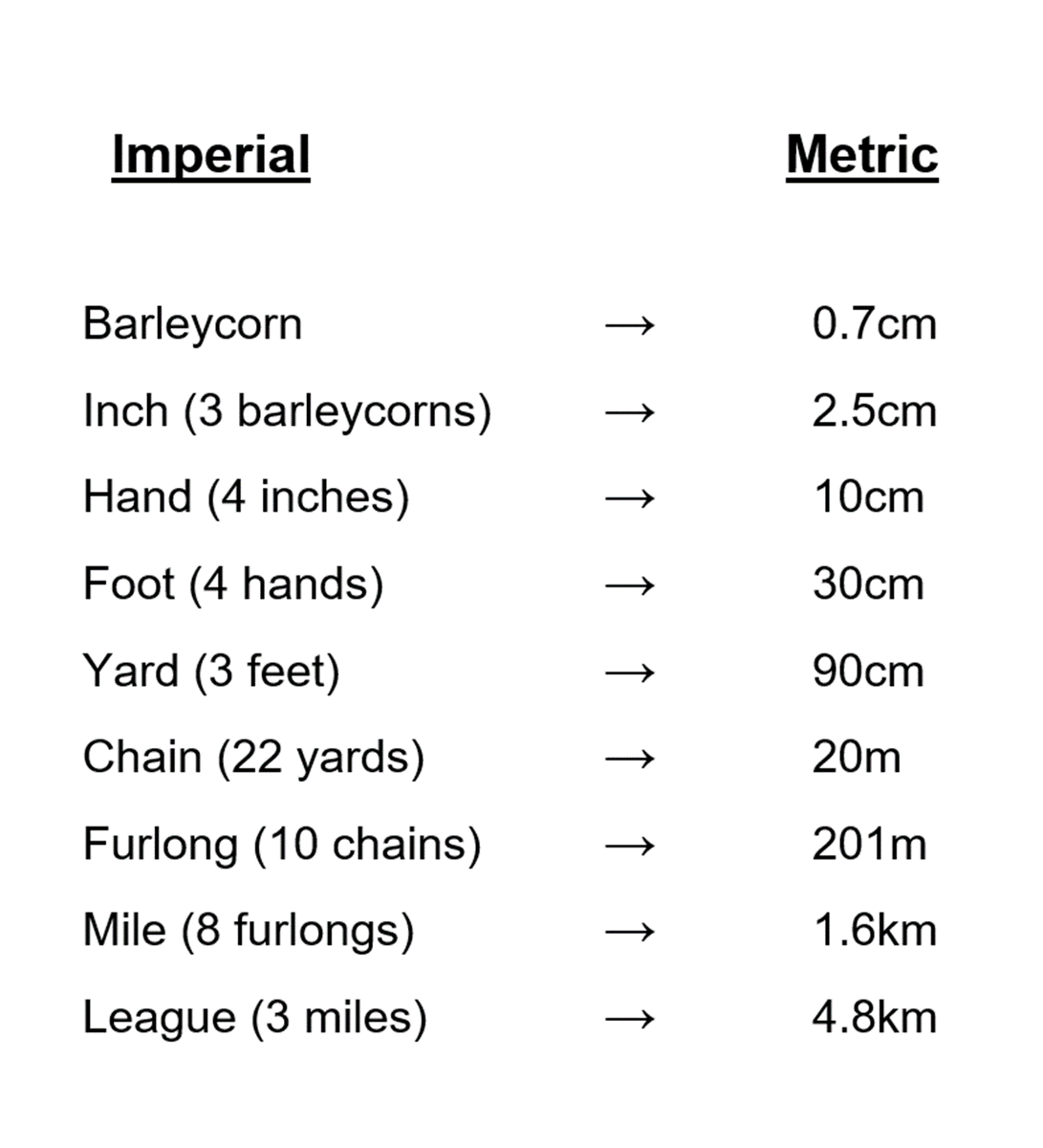
In England in the year 1300 AD a law was passed which made "3 dry barleycorns" the base unit of length.
Look at what they're called - their names all relate to human body parts and agriculture.
In England in the year 1300 AD a law was passed which made "3 dry barleycorns" the base unit of length.

While the furlong was defined as the distance a plough team could go without rest, and the acre originated in Saxon times as the total area that could be ploughed in a single day.
This makes sense, as the vast majority of people throughout history lived on and worked the land:
This makes sense, as the vast majority of people throughout history lived on and worked the land:

Others were military, such as the league, which was the distance an army could march in an hour.
While units based on the body have a practical benefit - they're universally available and (unlike metric units) don't need tools to be measured. A little consistent, but useful.
While units based on the body have a practical benefit - they're universally available and (unlike metric units) don't need tools to be measured. A little consistent, but useful.

So, though out of context they might seem strange, such measurements once made perfect sense.
Still, they developed over the course of centuries in a world far less connected or centralised than ours.
And so the way those units stacked up was maddeningly complex:
Still, they developed over the course of centuries in a world far less connected or centralised than ours.
And so the way those units stacked up was maddeningly complex:

The British Empire had imposed its system - concocted from the old English Units - around the world, but most countries used an inconsistent mixture of international, national, and even local measurements.
Minutely differing conversion charts were needed:
Minutely differing conversion charts were needed:

In an industrialising, globalising, and increasingly scientific world, it's not hard to see why many people wanted to change this.
The metric system as know it today originated during the French Revolution in the 1790s, when the chance came to finally solve this problem...
The metric system as know it today originated during the French Revolution in the 1790s, when the chance came to finally solve this problem...
The idea was to create a rational, coherent, readily understandable system based on universal constants that could be replicated anywhere in the world.
Previous systems, based on the human body and agriculture, couldn't do this. A more scientific approach was needed.
Previous systems, based on the human body and agriculture, couldn't do this. A more scientific approach was needed.
The original metre was based on one ten-millionth of the distance from the North Pole to the Equator.
From which physical versions could be made to act as an absolute standard:
From which physical versions could be made to act as an absolute standard:

Or for the kilogram, which was based on the weight of one litre of water.
This "international prototype" - the name for a physical manifestation of the physical standard measurement - dates from 1899. It was used right up until 2019:
This "international prototype" - the name for a physical manifestation of the physical standard measurement - dates from 1899. It was used right up until 2019:

Over the next two hundred years almost every nation in the world underwent "metrication" - the process of converting to the metric system.
It could take years, even decades, to make the switch, because changing the system of measurements used by an entire population isn't easy.
It could take years, even decades, to make the switch, because changing the system of measurements used by an entire population isn't easy.

But, by 2022, all that has changed.
The International System of Units has been created and over the years methods for standardising measurements have improved, from bars of metal to gas lamps to laser beams to universal physical constants:
The International System of Units has been created and over the years methods for standardising measurements have improved, from bars of metal to gas lamps to laser beams to universal physical constants:


Here is how the various methods of measurement are now defined.
They seem like a long way from barleycorns, but both systems are based on the natural world - whether body parts or the speed of light - and both say something about the societies that created them.
They seem like a long way from barleycorns, but both systems are based on the natural world - whether body parts or the speed of light - and both say something about the societies that created them.

• • •
Missing some Tweet in this thread? You can try to
force a refresh