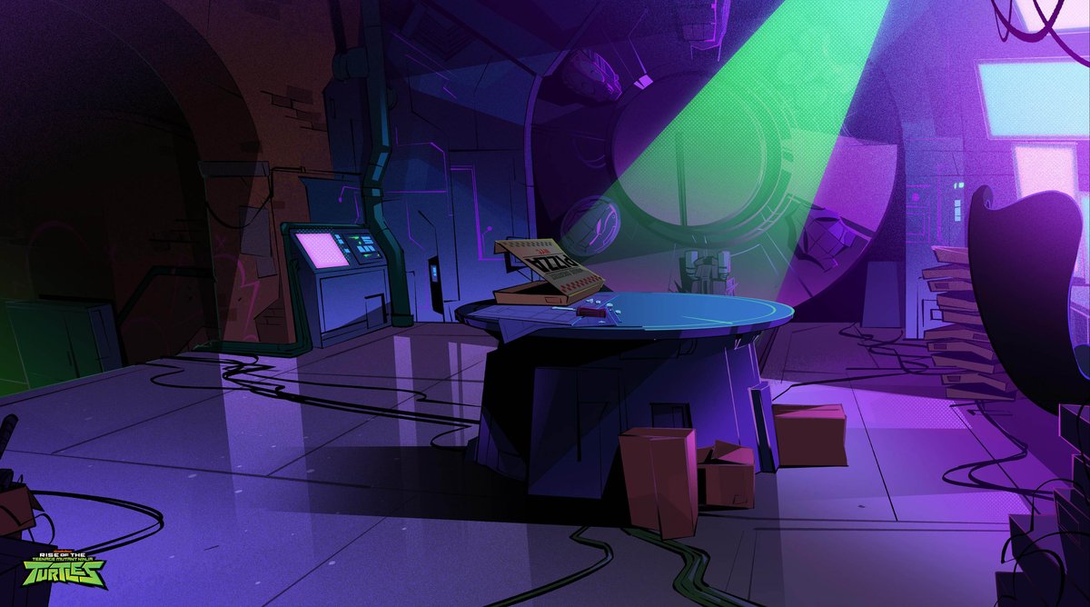
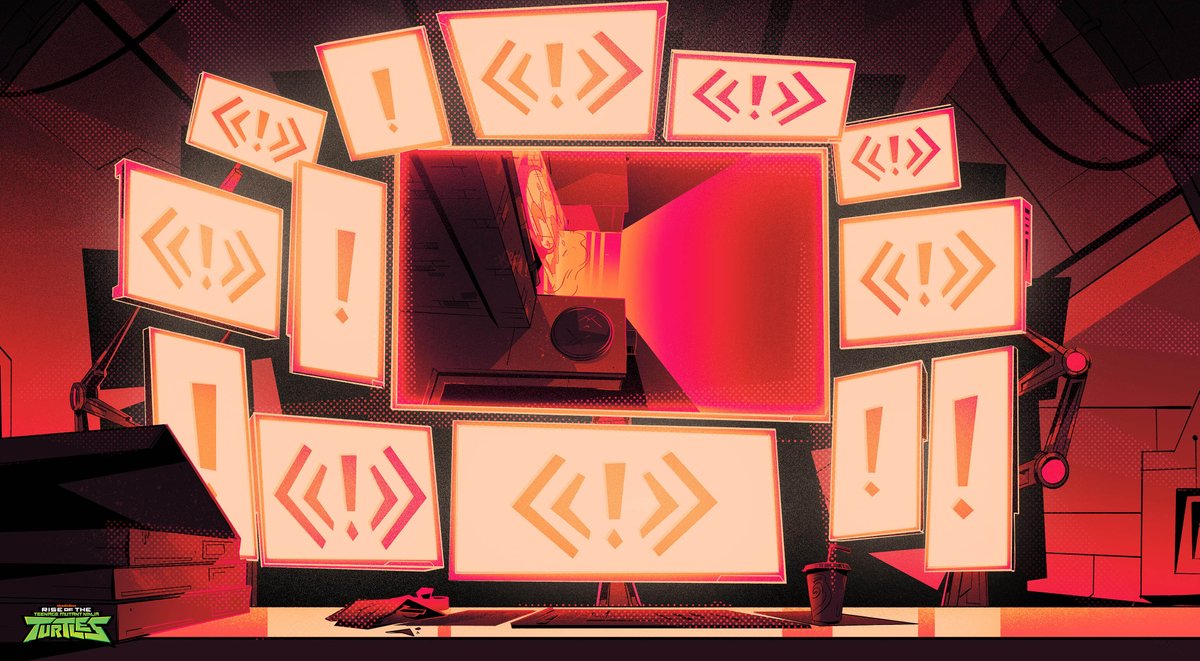
#CONSUME2CREATE
Here's a 🧵of art food to chew on:
This one's about legendary production designer Maurice Noble whose style became synonymous with some of Looney Tunes' most memorable works:
- Duck Dodgers in the 24½th Century
- What's Opera Doc
- Road Runner Shorts


Here's a 🧵of art food to chew on:
This one's about legendary production designer Maurice Noble whose style became synonymous with some of Looney Tunes' most memorable works:
- Duck Dodgers in the 24½th Century
- What's Opera Doc
- Road Runner Shorts


Here's a great video discussing why the backgrounds were so intriguing.
Key Points:
- BGs as liminal spaces
- Influenced by art history
- Distilled, pushed, wonky vs realistic
- Story and Character shaping the art
- The ARTISTS!
Key Points:
- BGs as liminal spaces
- Influenced by art history
- Distilled, pushed, wonky vs realistic
- Story and Character shaping the art
- The ARTISTS!
Also, here's a great breakdown of the book, The Noble Approach by Tod Polson:
It's out of print, but you can still get the ebook.
Highly recommend if you want to understand Noble's ideas and processes for Animation Design, many of which I use today.
It's out of print, but you can still get the ebook.
Highly recommend if you want to understand Noble's ideas and processes for Animation Design, many of which I use today.
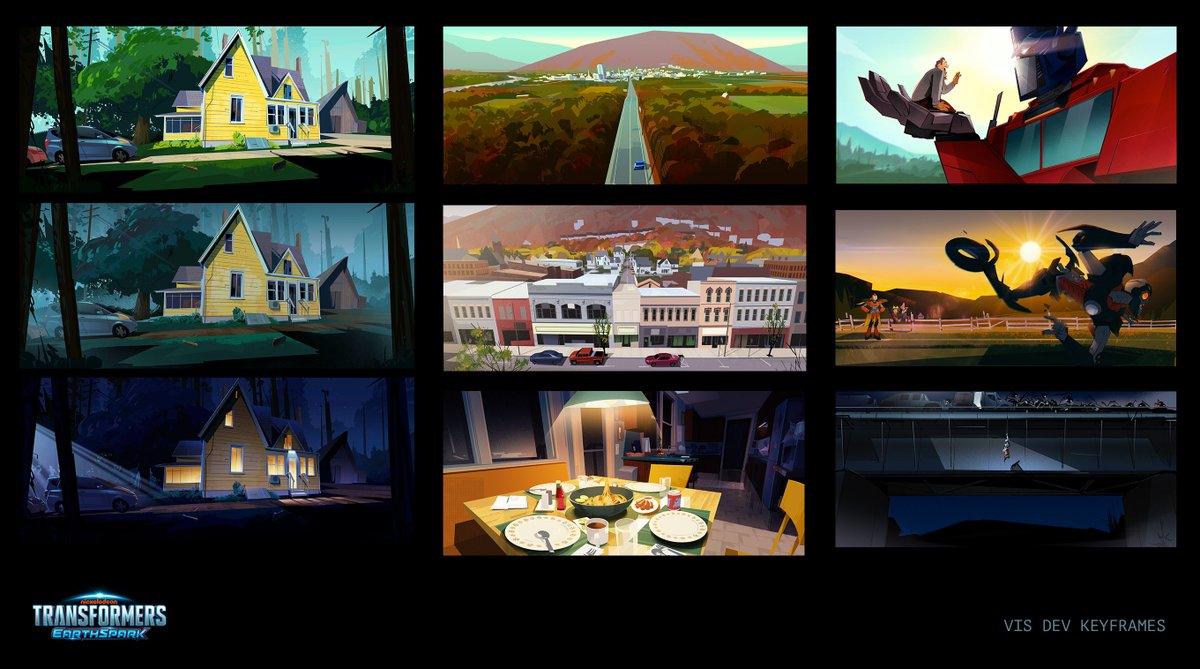
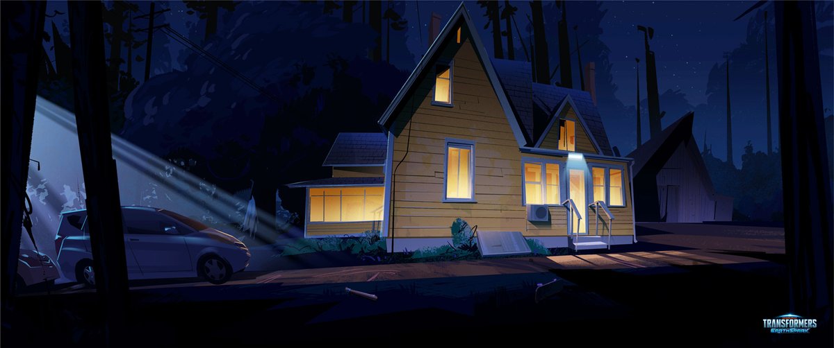
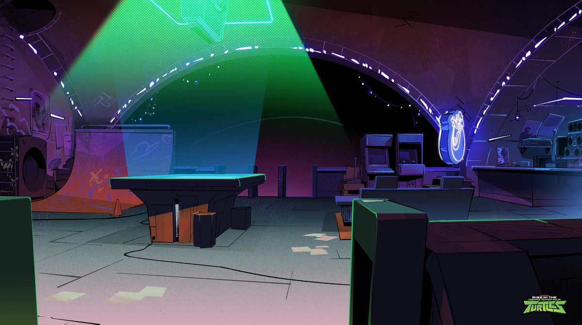
I picked up the book in early 2019 when I was starting the 2nd Season of #RiseoftheTMNT.
It helped me create a clear process to:
- What to focus on and when
- How to gather and pull from reference
- Design/color methods shaped by story
- etc.
Here's a great quote from the book:
It helped me create a clear process to:
- What to focus on and when
- How to gather and pull from reference
- Design/color methods shaped by story
- etc.
Here's a great quote from the book:
"...Maurice found ways to make a snow-peaked mountain or the landscape of the American Southwest feel more like those places than they really do in person... 


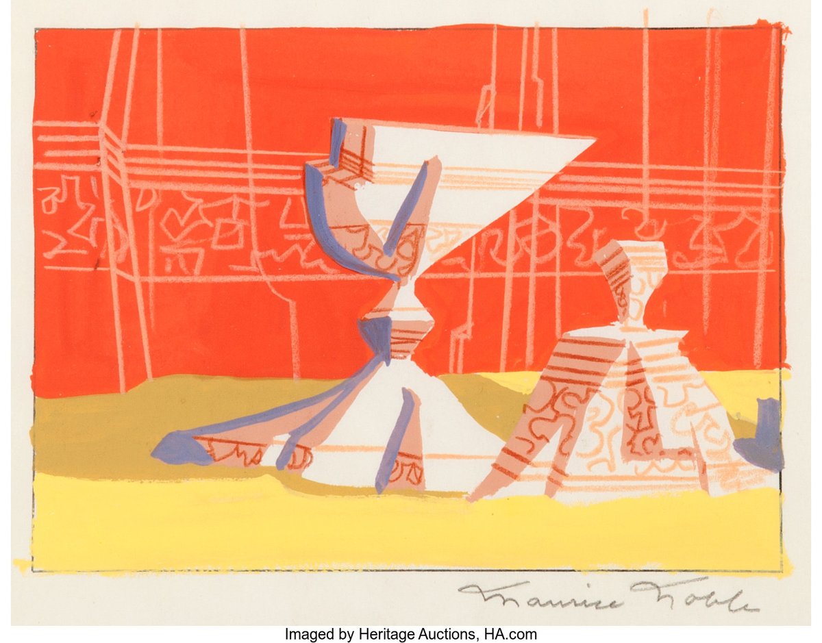
...That's what we really want from animation: a distillation of the truth, with all the irrelevant parts removed; a kind of visual reduction sauce. It's the strength of animation as a medium, and it's what Maurice Noble did so well.... 


...Animation at its best, delivers a visceral, emotional experience, tapping into our senses and imagination. Allowing our senses to discover the truth." 


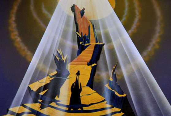
Noble once said: "When working in animation you cannot take credit, you can only say you participated."
He was surrounded by incredible artists that helped cement the classic WB look including:
- Phil DeGuard
- Hawley Pratt
- Richard Thomas
- Bob Givens
and many more!
He was surrounded by incredible artists that helped cement the classic WB look including:
- Phil DeGuard
- Hawley Pratt
- Richard Thomas
- Bob Givens
and many more!

Animation is a collaborative medium, so process is key.
If you have a clear, proven process, that means you have a way to the finishing line no matter what.
And that clarity creates flow for the next part of the pipeline.
That's what I felt I needed to work on.
If you have a clear, proven process, that means you have a way to the finishing line no matter what.
And that clarity creates flow for the next part of the pipeline.
That's what I felt I needed to work on.

Anyway hope that was tasty and gives you some fuel to make something cool.
P.S. Here's how you can help me out:
1. Follow me @nowayjermaine for more on Animation Design process
2. RT the tweet below to share this thread with your peeps
🙏
P.S. Here's how you can help me out:
1. Follow me @nowayjermaine for more on Animation Design process
2. RT the tweet below to share this thread with your peeps
🙏
https://twitter.com/34552847/status/1618006553818284033
• • •
Missing some Tweet in this thread? You can try to
force a refresh

