
Tried generating themes based on APCA contrast and OKLCH color model. Well, it's not as easy as I thought, but I'm pretty happy with the first results.
You can play with it here color-playground.ardov.me
You can play with it here color-playground.ardov.me
Light theme is relatively easy to make. But when it comes to dark the real challenge arises. Most of my methods just failed.
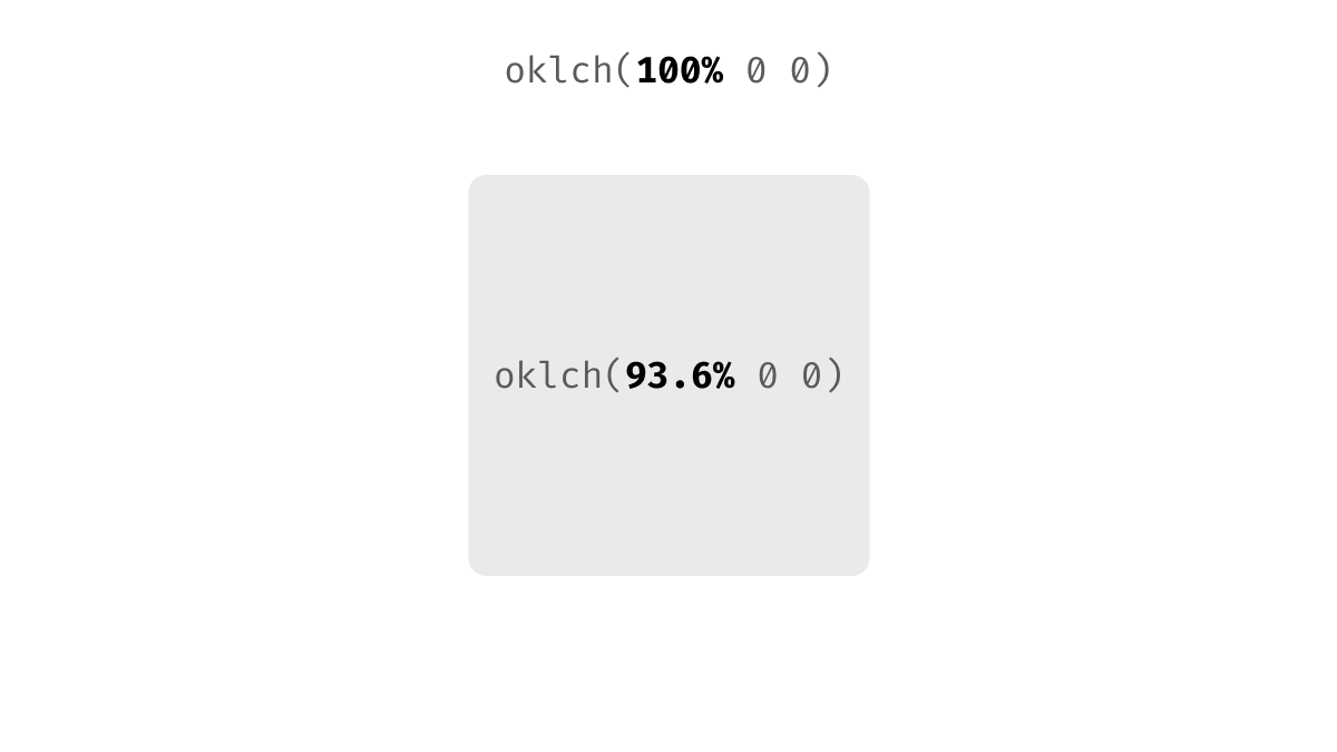
Let’s explore a dead simple example: white background + gray card.
How to convert it to the dark theme and keep that subtle contrast?
Let’s explore a dead simple example: white background + gray card.
How to convert it to the dark theme and keep that subtle contrast?

Let’s start with the familiar HSL.
The lightness of white is 100%, and of gray is 92% (8% of difference)
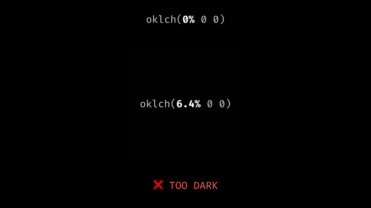
So in the dark theme, it should be 0% and 8% (same 8%)
Well, the result seems a little too dark for me
The lightness of white is 100%, and of gray is 92% (8% of difference)
So in the dark theme, it should be 0% and 8% (same 8%)
Well, the result seems a little too dark for me


But we have that shiny perceptual color space OKLCH. Let’s do the same trick with its luminance!
Aaaand it fails completely much worse than HSL.
Aaaand it fails completely much worse than HSL.
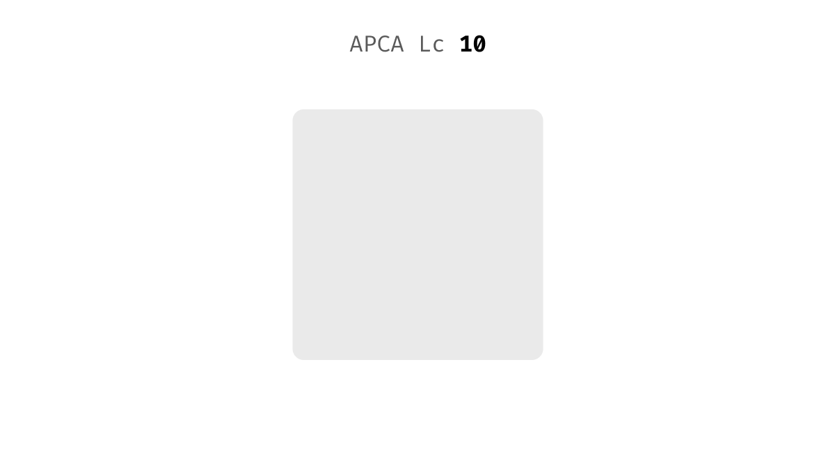
What if we use a contrast ratio?
Knowing the contrast between the background and the card we can recreate it in the dark theme.
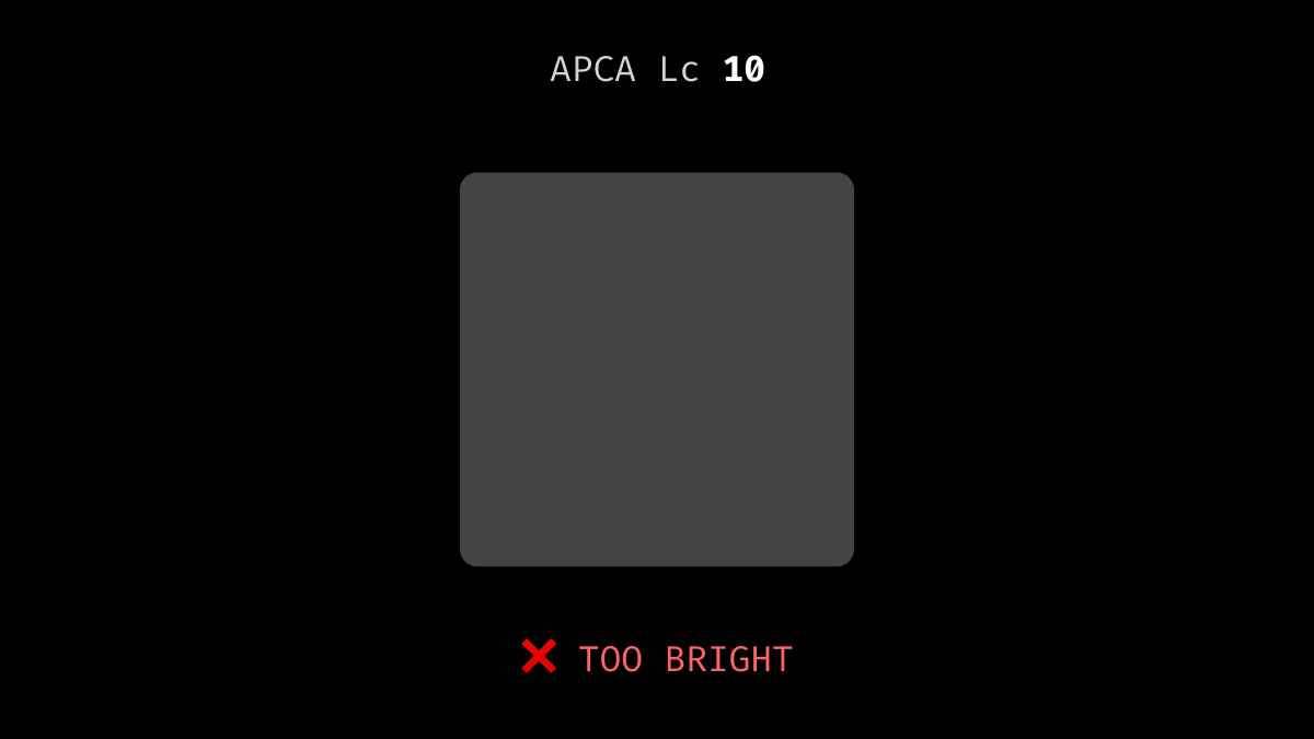
That sounds good let’s try the new APCA algorithm!
Aaaand it’s too bright. We don’t need that much contrast here.
Knowing the contrast between the background and the card we can recreate it in the dark theme.
That sounds good let’s try the new APCA algorithm!
Aaaand it’s too bright. We don’t need that much contrast here.
Ok, maybe the good old WCAG will do the job?
And it actually does! Finally, we have that nice subtle contrast in the dark theme.
And it actually does! Finally, we have that nice subtle contrast in the dark theme.


To be fair most of the methods work better when the background is not entirely black.
I also tried it with a brighter background and all of them (except APCA) worked fine.
Here is the full comparison table
I also tried it with a brighter background and all of them (except APCA) worked fine.
Here is the full comparison table

What's the moral? Never trust a color space completely it can fail in super simple tasks.
• • •
Missing some Tweet in this thread? You can try to
force a refresh


