A quick glance at "CSS Grid Container "
Thread🧵
Thread🧵
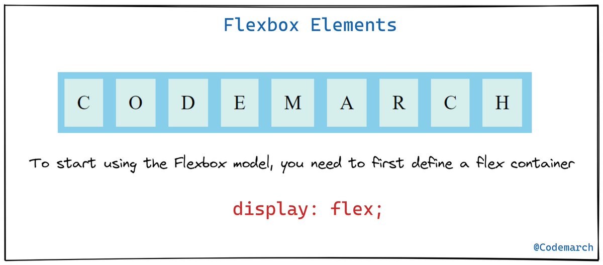
🔶 CSS Grid Container
To make an HTML element behave as a grid container, you have to set the `display`property to `grid` or `inline-grid`
To make an HTML element behave as a grid container, you have to set the `display`property to `grid` or `inline-grid`

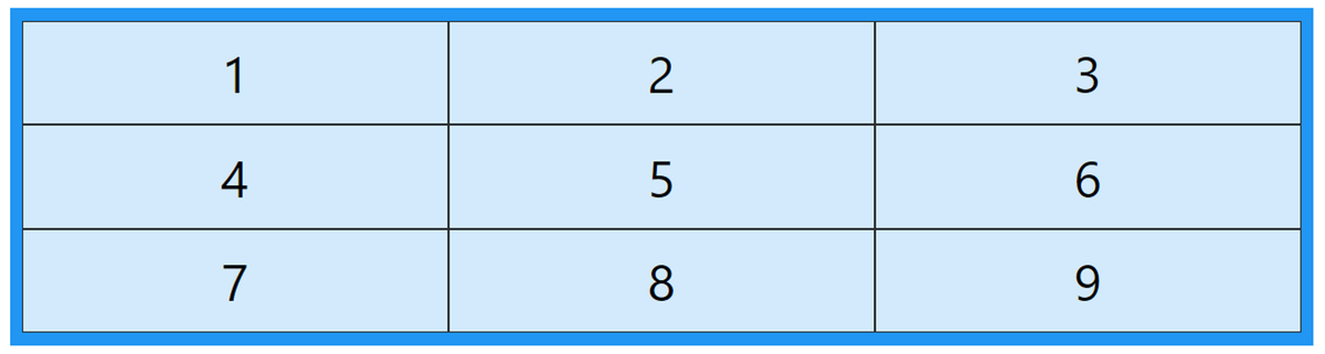
🔹 The grid-template-columns Property
The `grid-template-columns` property defines the number of columns in your grid layout, and it can define the width of each column.
The `grid-template-columns` property defines the number of columns in your grid layout, and it can define the width of each column.

Example👇

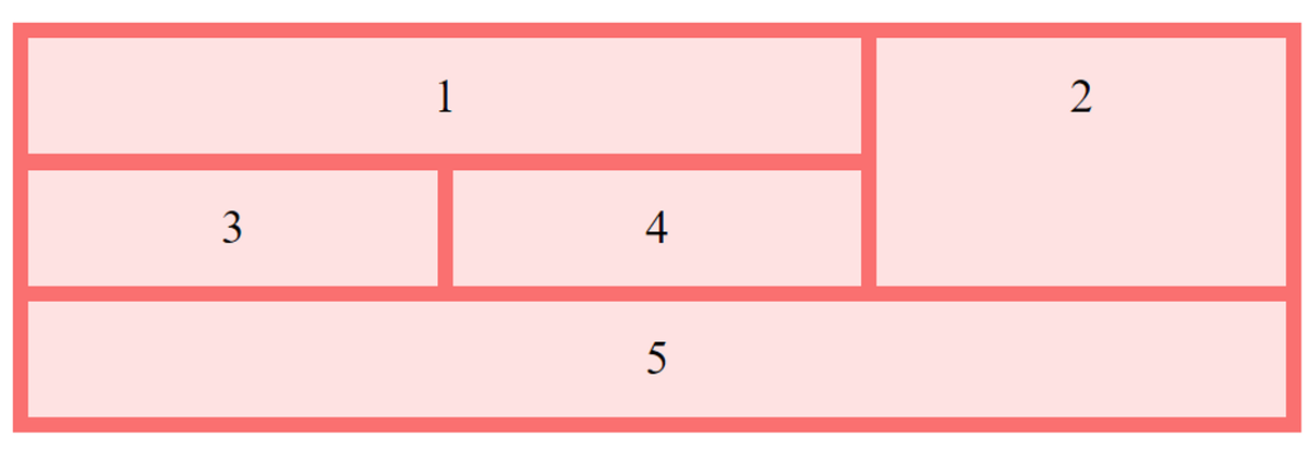
🔹The grid-template-rows Property
The `grid-template-rows` property defines the height of each row.
The `grid-template-rows` property defines the height of each row.

Example👇

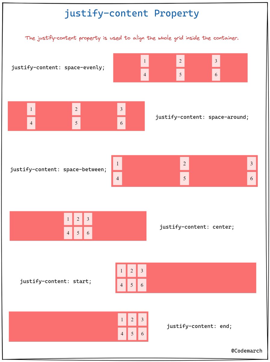
🔹 The justify-content Property
The `justify-content` property is used to align the whole grid inside the container.
The `justify-content` property is used to align the whole grid inside the container.
Example👇

🔹The align-content Property
The `align-content` property is used to *vertically* align the whole grid inside the container.
The `align-content` property is used to *vertically* align the whole grid inside the container.

Example👇

if you enjoyed this thread, please like, comment, and retweet the opening tweet.
🔹Follow @codemarch
🔹You can also check our HTML & CSS Visual Treat!😍for more!!!
codemarch.gumroad.com/l/hxazr
🔹Follow @codemarch
🔹You can also check our HTML & CSS Visual Treat!😍for more!!!
codemarch.gumroad.com/l/hxazr
• • •
Missing some Tweet in this thread? You can try to
force a refresh