🚨 Figma Master course update 🚨
All Figma Mastery course content is uploaded and ready for Launch 🫣
Here are a few things you need to know about the upcoming course👇
All Figma Mastery course content is uploaded and ready for Launch 🫣
Here are a few things you need to know about the upcoming course👇
Figma Mastery Curriculum
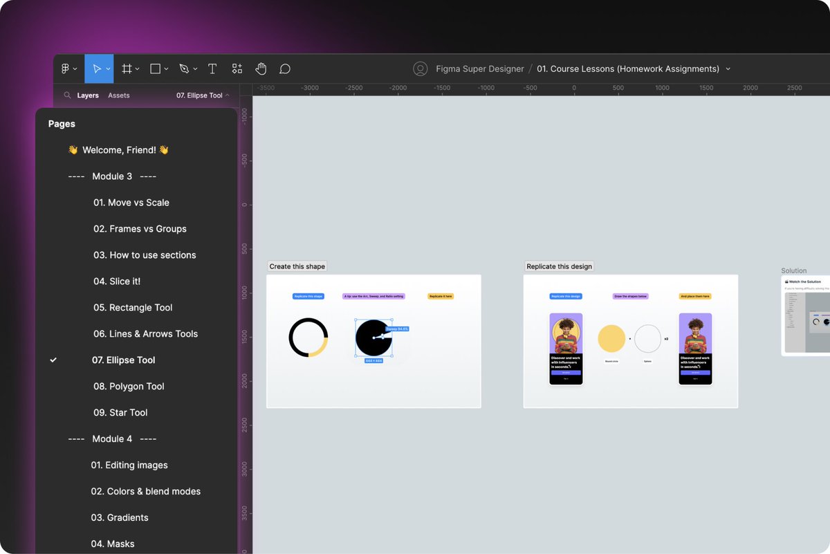
Full course contains 7 modules with 47 lessons that walk you step-by-step from fundamentals to more advanced features and handoff.
*and we’re learning how to name layers and files, so I hope I won’t be picked on by the community 😂
Full course contains 7 modules with 47 lessons that walk you step-by-step from fundamentals to more advanced features and handoff.
*and we’re learning how to name layers and files, so I hope I won’t be picked on by the community 😂
Here’s an overview of the modules:
M1: Course Intro
M2: Getting started
M3: Mastering Figma Basics
M4: Mastering the Editing Tools
M5: Intro to Advanced Features
M6: Collaborative Features
M7: Final Project
In total, it’s over 10 hours of content, as streamlined as possible
M1: Course Intro
M2: Getting started
M3: Mastering Figma Basics
M4: Mastering the Editing Tools
M5: Intro to Advanced Features
M6: Collaborative Features
M7: Final Project
In total, it’s over 10 hours of content, as streamlined as possible
Homework Assignments
It’s all about learning by doing so almost every core lesson comes with a separate homework and a recorded solution.
They are designed to help you apply your new knowledge in practice using real examples.
It’s all about learning by doing so almost every core lesson comes with a separate homework and a recorded solution.
They are designed to help you apply your new knowledge in practice using real examples.
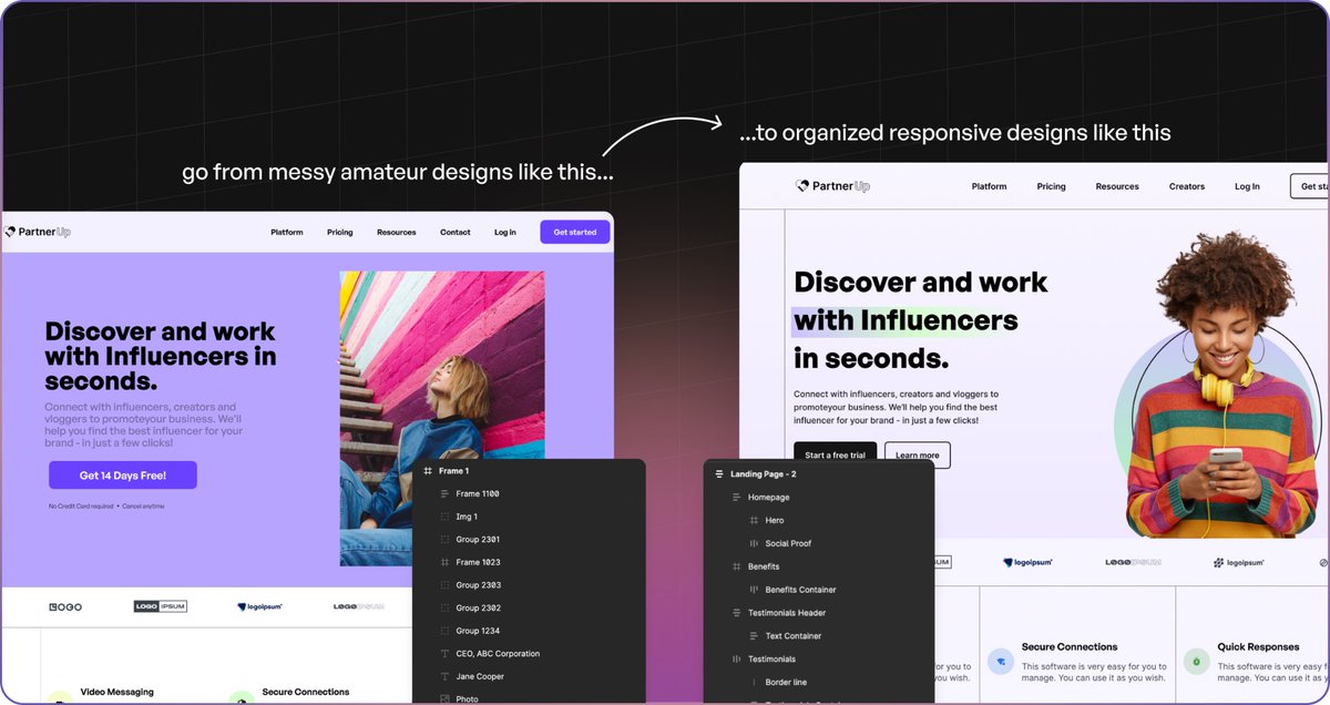
Your Final Project
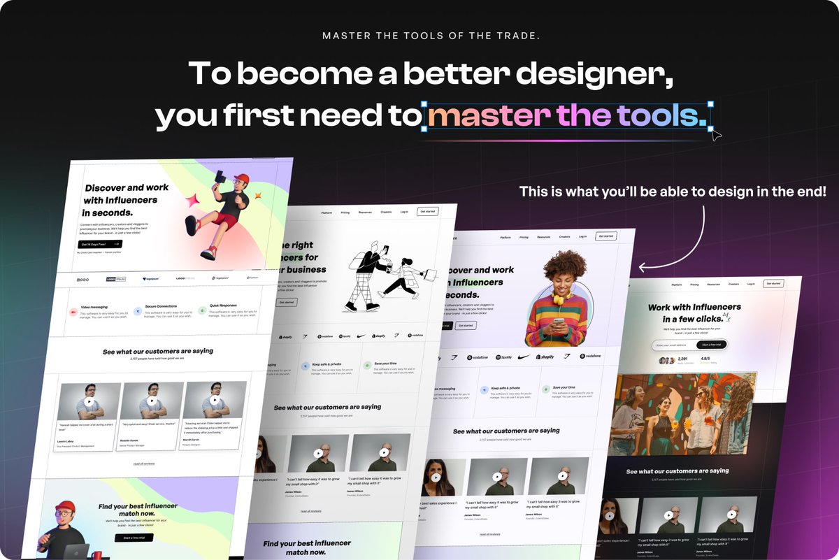
As a final assignment you’ll design a fully responsive landing page from start to design handoff.
This includes setting up global styles, style guide, grids, using auto layout, components and handing it off to developers.
Comes with a separate figma file.
As a final assignment you’ll design a fully responsive landing page from start to design handoff.
This includes setting up global styles, style guide, grids, using auto layout, components and handing it off to developers.
Comes with a separate figma file.
Bonus Prototyping Lesson
To help you master the basics, I’ve included a 40-minute long bonus lesson on prototyping the landing page and creating a sign-up flow.
This comes with a figma file also.
To help you master the basics, I’ve included a 40-minute long bonus lesson on prototyping the landing page and creating a sign-up flow.
This comes with a figma file also.

And a lot more freebies!
- Figma Starter Project Template
- Three mini-books
- My How to Design Better ebook
- Exclusive discounts on my favorite design resources
- Lifetime access to course material and future updates
+ 5 main course figma files
- Figma Starter Project Template
- Three mini-books
- My How to Design Better ebook
- Exclusive discounts on my favorite design resources
- Lifetime access to course material and future updates
+ 5 main course figma files

As you can see, we went a little crazy with all this 😅
But by the time you go through all the lessons, finish homework, and complete the final project…
Using Figma should feel like second nature to you and you’ll be much more confident working with clients and other designers
But by the time you go through all the lessons, finish homework, and complete the final project…
Using Figma should feel like second nature to you and you’ll be much more confident working with clients and other designers
We’re launching Figma Mastery this Wednesday at 11AM CET
Sale will last 5 days
If you bought my previous ebooks, you’ll receive an email with a coupon code to grab it for $75
After launch, price will go up to $150
Sale will last 5 days
If you bought my previous ebooks, you’ll receive an email with a coupon code to grab it for $75
After launch, price will go up to $150
To sum up - Figma Mastery is my answer to designers struggling with Figma and having a hard time using it effectively, let alone to its full potential
As Part I of II, it’s meant for beginner/intermediate designers.
If you’re a Figma pro you should better wait for Part II 😊
As Part I of II, it’s meant for beginner/intermediate designers.
If you’re a Figma pro you should better wait for Part II 😊
Which brings me to the last part 👇
If you’re interested in both my design ebooks and the upcoming course, you can still grab my ebooks at a 50% discount.
🚨 6 hours of promotion left 🚨
Design Manual will go up to $98 and Web Guide to $49👇👇👇
Uiadrian.gumroad.com
If you’re interested in both my design ebooks and the upcoming course, you can still grab my ebooks at a 50% discount.
🚨 6 hours of promotion left 🚨
Design Manual will go up to $98 and Web Guide to $49👇👇👇
Uiadrian.gumroad.com
• • •
Missing some Tweet in this thread? You can try to
force a refresh