
Here's some detail around how the new @trycampsite switch component was crafted and built. Will share some of the shadow/lighting detail as well as a little code used for the toggle animation: 

This 2x zoom better exposes the smaller highlights as well as the finer contrast shadows that create more environmental detail. White highlights on white backgrounds are difficult to show, but there are some little tricks you can use to make them visible. I'll call some out next:

There's the component gray/blue background and the background gradient on the switch thumb and then just box shadows for the rest. My personal fav trick is #1.
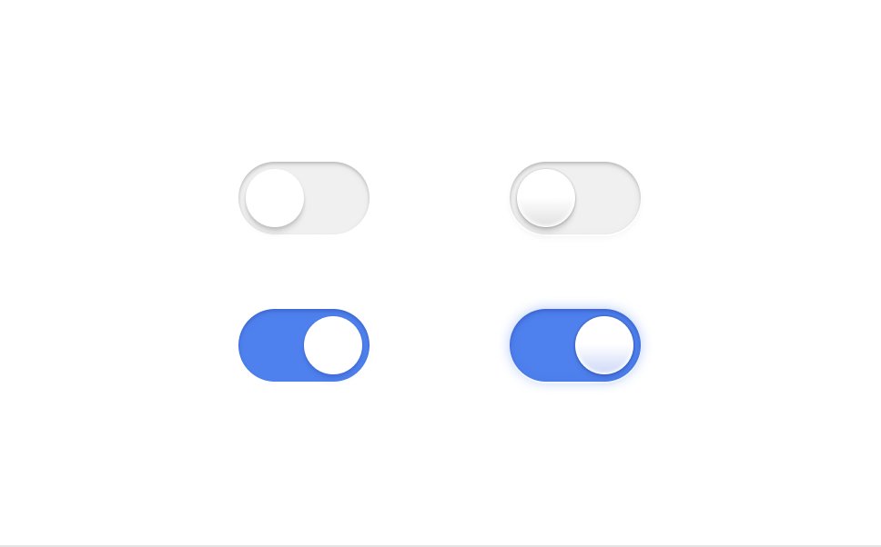
Next I'll show with and without this added detail so you can compare a more traditional switch style to these.
Next I'll show with and without this added detail so you can compare a more traditional switch style to these.

Here are flat switches next to the detailed ones. The side by side really shows off how the subtle little details create a stronger presence. Let's check out dark mode:
Once again, like with our buttons, dark mode gives us even more opportunity for details. With the switch thumb being white next to dark we can have it emit reflections on the sides of it too 💅
Next, lets animate.
Next, lets animate.

Rather than a single movement, this toggle uses a sequenced animation. When sequencing, you write the code steps just how it happens.
1. Idle state.
2. Thumb goes full width.
3. State changes that tells the toggle it's new state.
4. Thumb goes to final state.
You want the code?
1. Idle state.
2. Thumb goes full width.
3. State changes that tells the toggle it's new state.
4. Thumb goes to final state.
You want the code?

In motion you can write async functions to sequence animation.
The magic happens with a middle state swap. After going full width, the state change tells the parent to either flex-start or flex-end based on state, and once that's done, motion animates from `100%` to `auto`.
The magic happens with a middle state swap. After going full width, the state change tells the parent to either flex-start or flex-end based on state, and once that's done, motion animates from `100%` to `auto`.

Lastly: I don't name my layers 😅
Hope you enjoyed 🤙
Hope you enjoyed 🤙
PS: In case you missed it, here's the the animation in action:
https://twitter.com/PixelJanitor/status/1625162962422972418?s=20
• • •
Missing some Tweet in this thread? You can try to
force a refresh


