A Short History of Football Kits: 
When the first set of football rules was agreed on in an English pub in 1863 it was a very different sport to the one played around the world today.
It was entirely amateur and there were still no referees - players wore whatever clothes they could get their hands on.
It was entirely amateur and there were still no referees - players wore whatever clothes they could get their hands on.
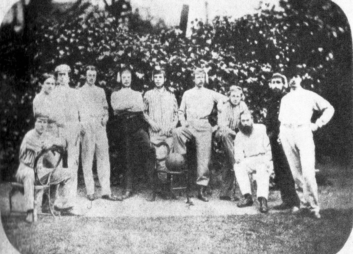
But as the decades rolled on football became an established sport, not only in Britain but in many other countries, more formal club uniforms were created.
They usually took the colours of the schools or organisations with which they were associated.
They usually took the colours of the schools or organisations with which they were associated.
Many of the world's most famous clubs were founded in the late 1800s or early 1900s.
Back then kits were simply a way to distinguish one team from another; neither fashion nor sports science were major considerations.
And yet the colours they chose have endured.
Back then kits were simply a way to distinguish one team from another; neither fashion nor sports science were major considerations.
And yet the colours they chose have endured.
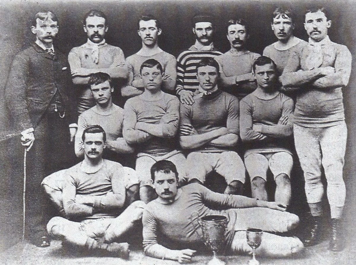
Rules were always changing in the early days, and teams were always trying new things.
Shinpads and boots with studs were important early innovations, along with the switch from trousers to shorts.
Through to the 1920s football was in a state of constant evolution.
Shinpads and boots with studs were important early innovations, along with the switch from trousers to shorts.
Through to the 1920s football was in a state of constant evolution.
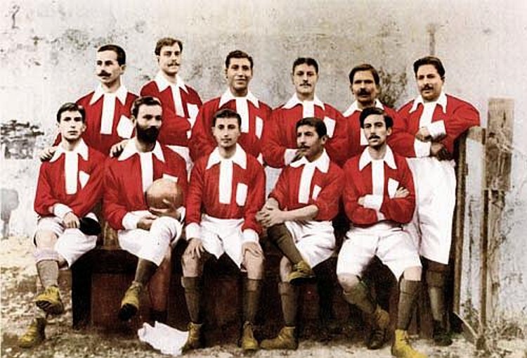
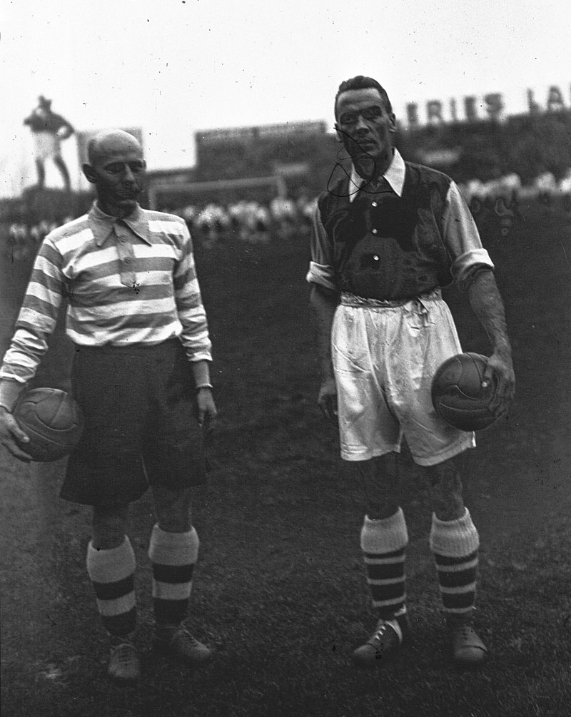
England's FA required clubs to have a spare white kit in case of a colour clash, in which case it was the home team who had to change.
In 1921 that flipped and the "away kit" was born. Squad numbers were also introduced in the 1920s, along with separate kits for goalkeepers.
In 1921 that flipped and the "away kit" was born. Squad numbers were also introduced in the 1920s, along with separate kits for goalkeepers.
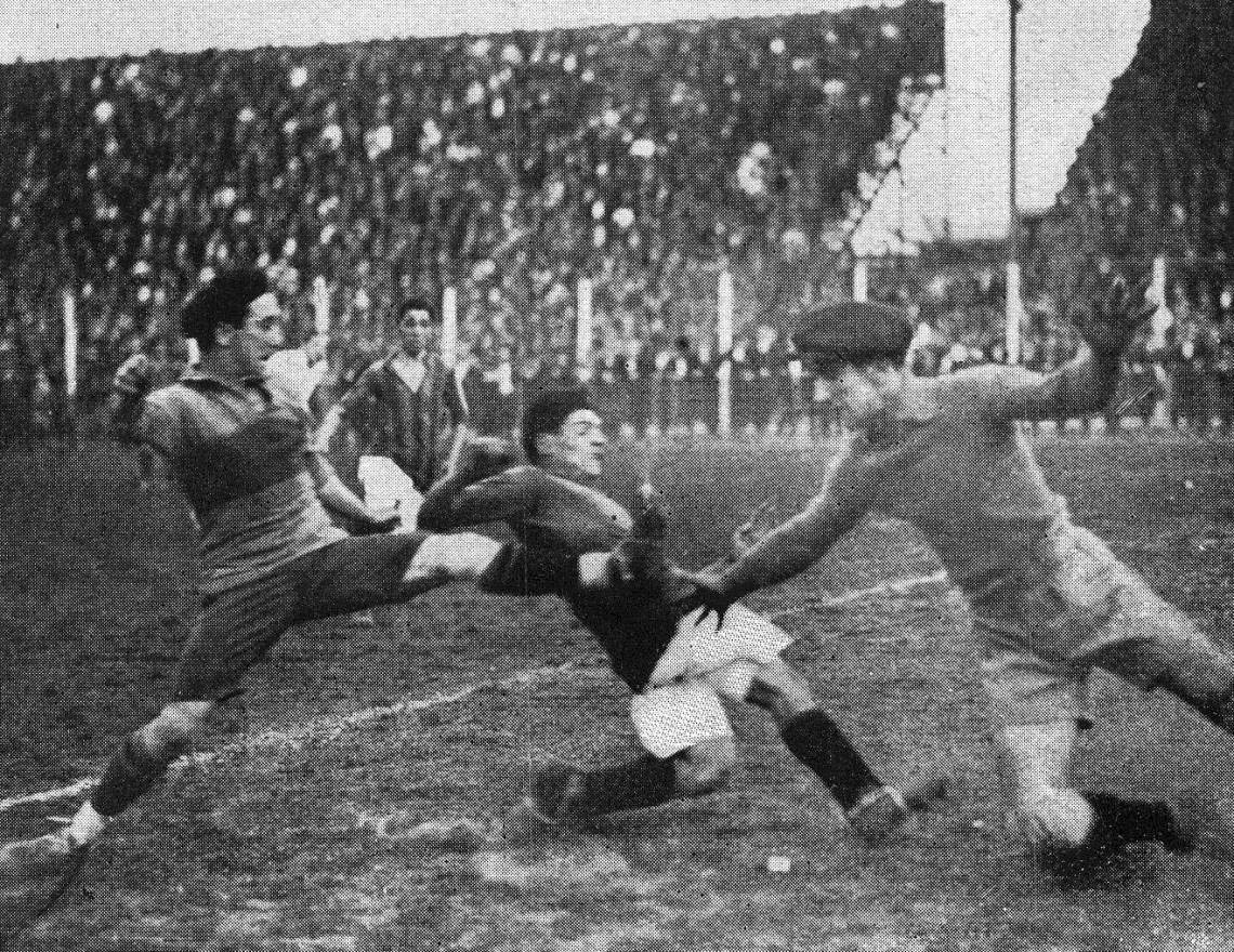
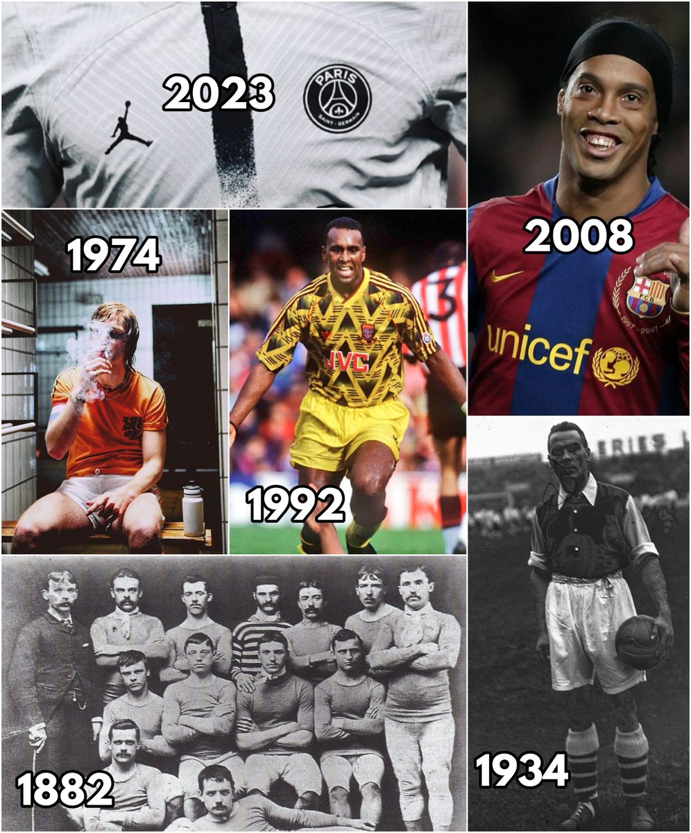
And so by the 1930s most of the elements of the football kit had been assembled: shinpads, shorts, numbers, boots, and team colours.
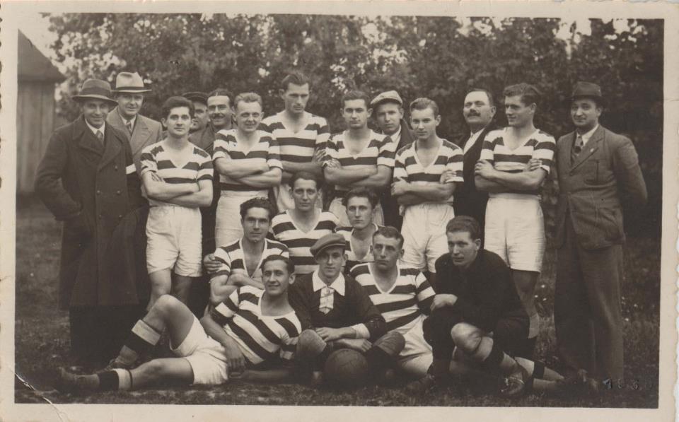
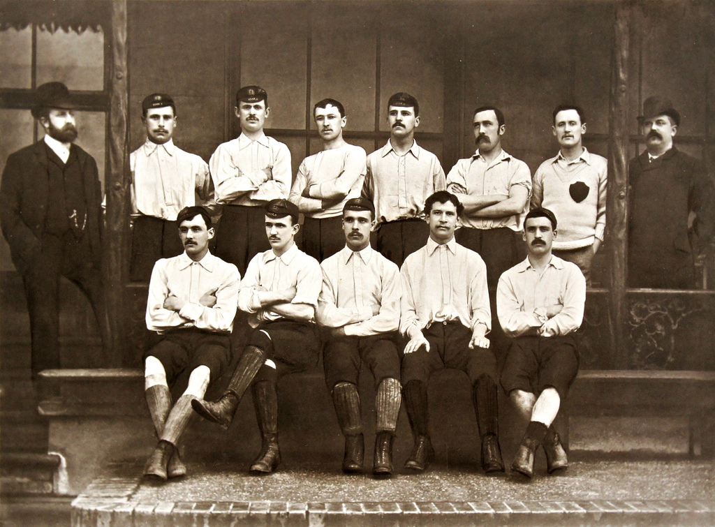
Still, there was a long way to go. With their stiff leather boots and heavy cotton shirts these footballers were from a different era entirely.
Still, there was a long way to go. With their stiff leather boots and heavy cotton shirts these footballers were from a different era entirely.
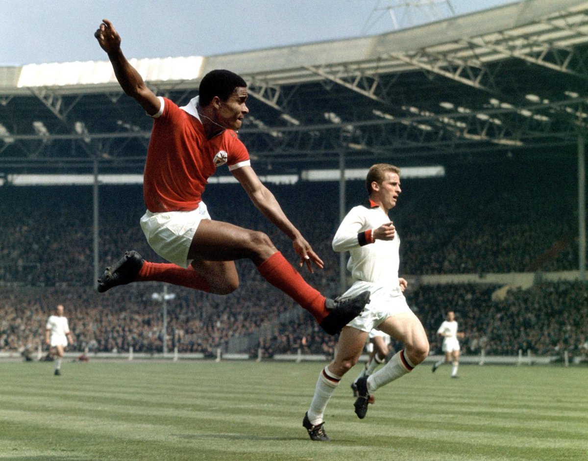
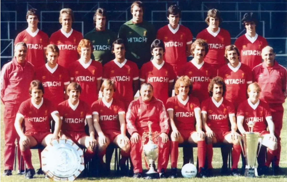
Things changed after the Second World War, as new lightweight materials - even synthetic fabrics - were introduced.
Throughout the 1950s and into the 1960s those once baggy football uniforms were slowly replaced by tighter shirts and ever shorter shorts.
Throughout the 1950s and into the 1960s those once baggy football uniforms were slowly replaced by tighter shirts and ever shorter shorts.
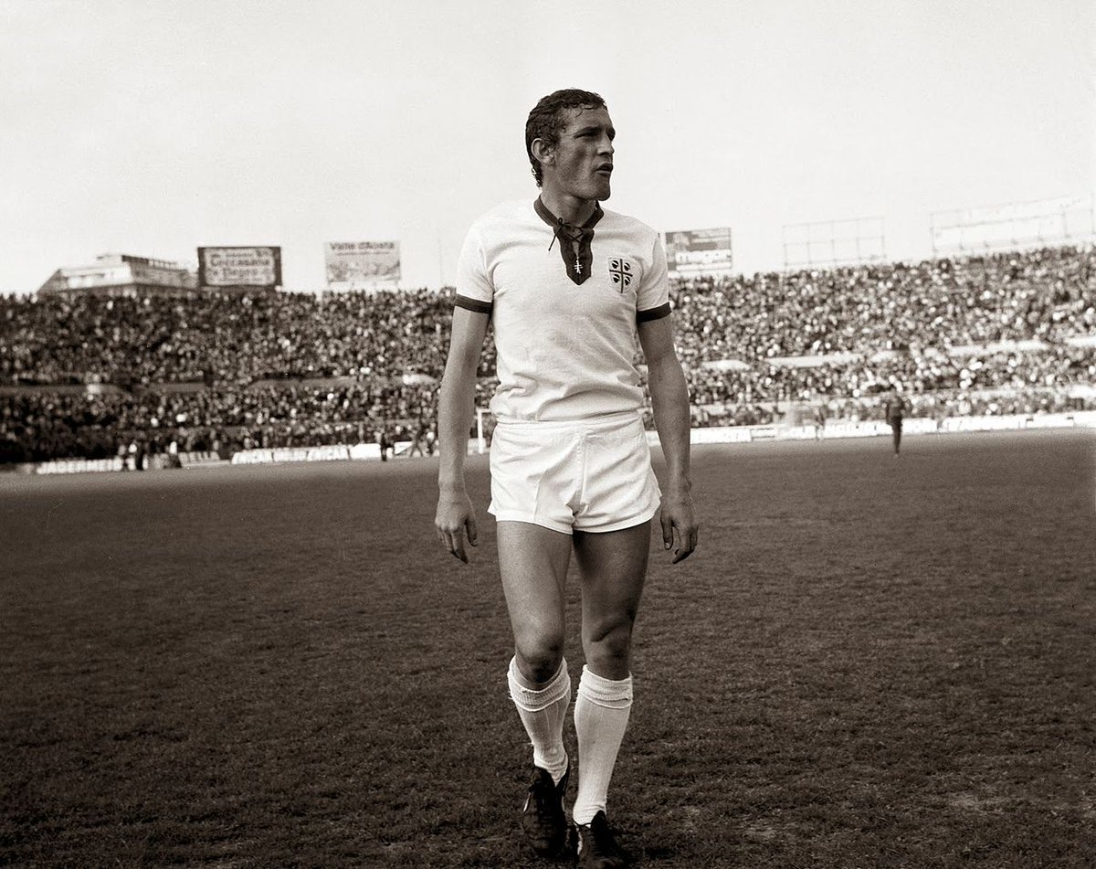
The kits of this era are some of the most beautiful ever produced, combining an uncommercialised purity with genuine sporting greatness and a wonderful simplicity of design.
Some of football's most enduring iconography.
Some of football's most enduring iconography.
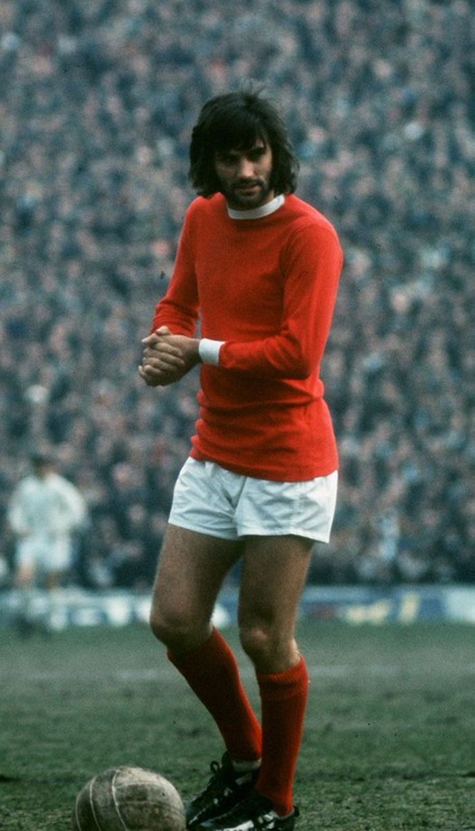
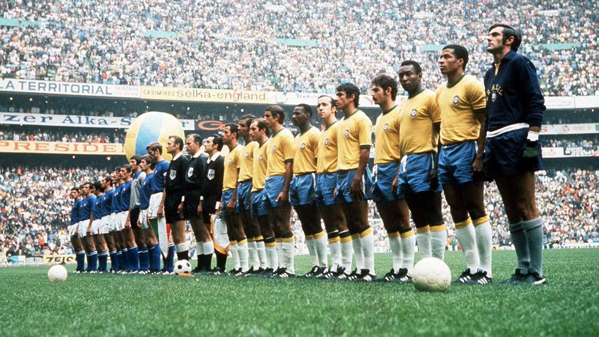
1970 turned out to be an important year, as the World Cup was broadcast around the globe in colour for the first time.
Brazil's famous yellow, green, and blue kit lit up the world and achieved mythological status, bringing home the potential power a jersey could have.
Brazil's famous yellow, green, and blue kit lit up the world and achieved mythological status, bringing home the potential power a jersey could have.
Since their inception football kits had been, ultimately, functional - they distinguished different teams.
That all changed in the 1970s.
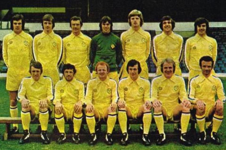
Specifically, it was in 1973 that Leeds' new kit manufacturer, Admiral, had the idea of creating replica kits to be sold to the fans.
That all changed in the 1970s.
Specifically, it was in 1973 that Leeds' new kit manufacturer, Admiral, had the idea of creating replica kits to be sold to the fans.
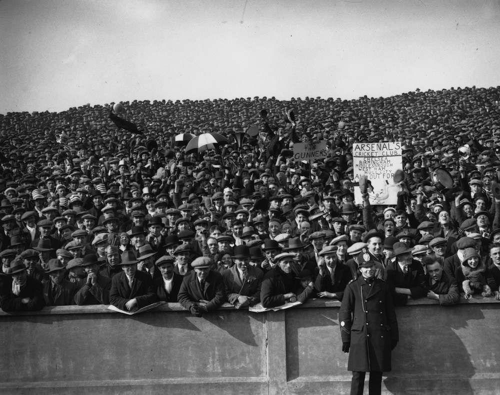
For most of football history fans at games were wearing suits, overcoats, and hats - or whatever happened to be the dominant clothing style of the day.
Now most of them wear club memorabilia, whether replica kits or otherwise; a change which can be traced back to 1973.
Now most of them wear club memorabilia, whether replica kits or otherwise; a change which can be traced back to 1973.
The 1970s were the dawn of football's commercial age, as clubs and companies realised the financial possibilities of this globally popular game.
Puma paid Pelé $120,000 to tie his boots at the beginning of the 1970 World Cup Final, and in 1974 they sponsored Johan Cruyff.
Puma paid Pelé $120,000 to tie his boots at the beginning of the 1970 World Cup Final, and in 1974 they sponsored Johan Cruyff.
Along with the invention of replica kits, another of the most important moments in modern footballing history took place in 1973.
German club Eintracht Braunschweig entered into a shirt sponsorship deal with Jaegermeister - the first such arrangement in footballing history.
German club Eintracht Braunschweig entered into a shirt sponsorship deal with Jaegermeister - the first such arrangement in footballing history.
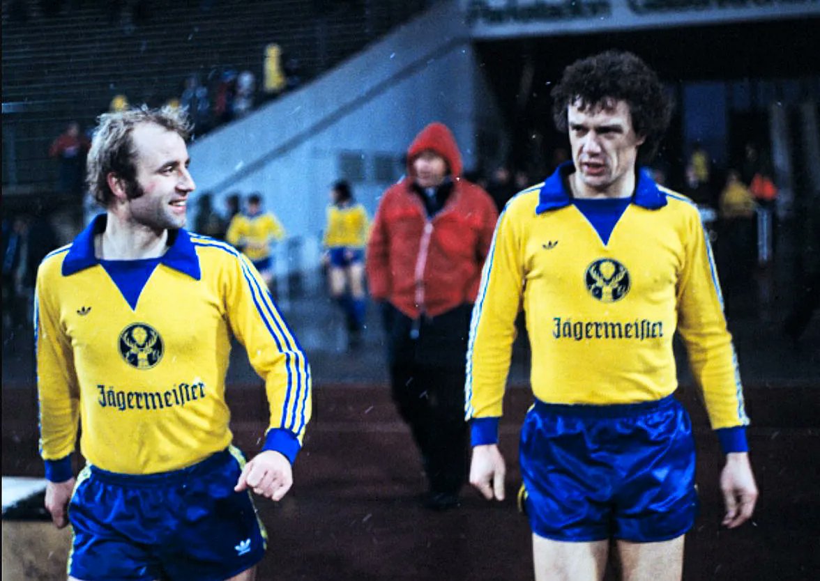
They got in trouble at first, but Braunschweig's sponsorship marked the beginning of a process which has revolutionised the game - and its kits.
It created a huge revenue stream, of course, but it also introduced a whole new aesthetic feature.
It created a huge revenue stream, of course, but it also introduced a whole new aesthetic feature.
Somehow a corporate sponsor and its logo could become just as much a part of the kit's aesthetic appeal as its crest, colours, and overall design.
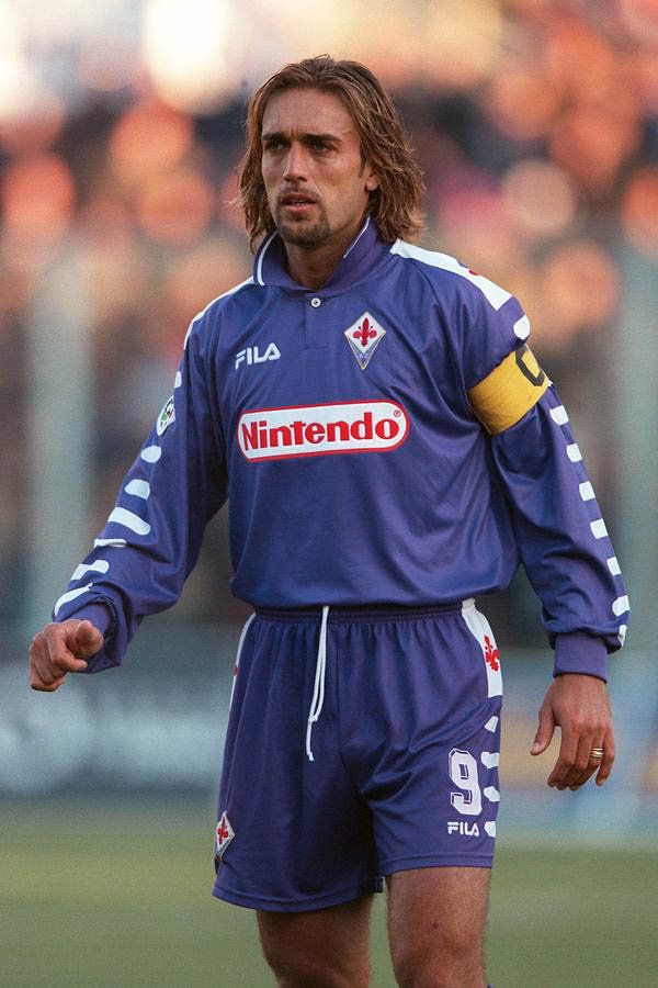
As with Fiorentina's famous 1998 Nintendo jersey, to give but one of many examples.
As with Fiorentina's famous 1998 Nintendo jersey, to give but one of many examples.
Everything changed again in the 1990s. One of the biggest developments - for kits, at least - was the decision of the breakaway Premier League to print players' names on their shirts.
A change also adopted by FIFA at the 1994 World Cup.
A change also adopted by FIFA at the 1994 World Cup.
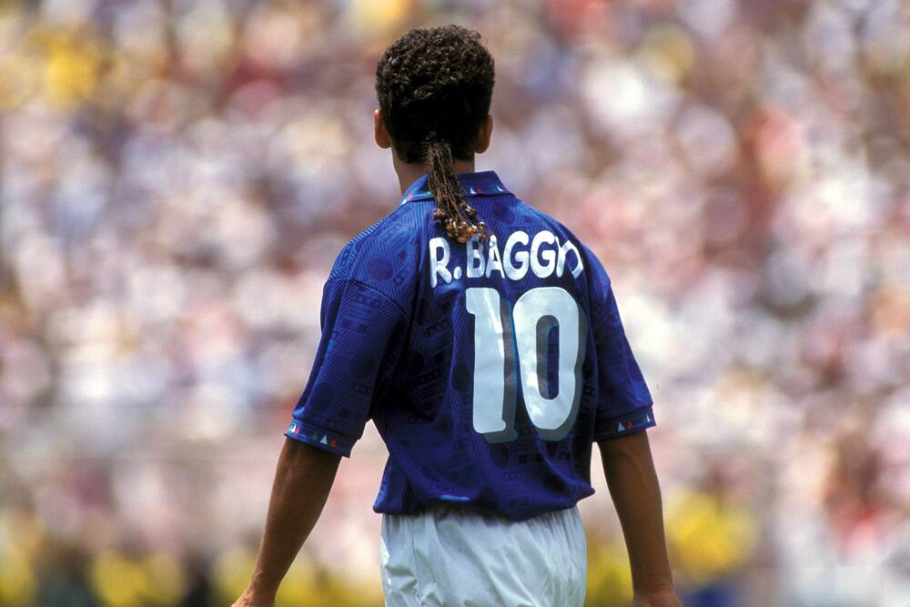
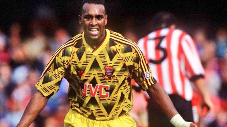
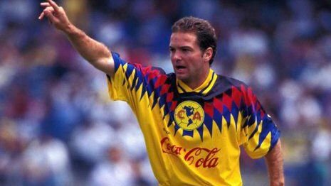
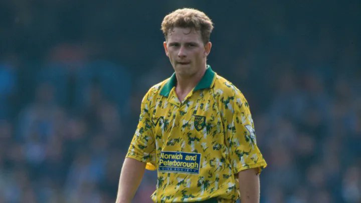
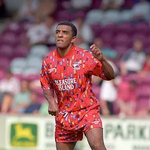
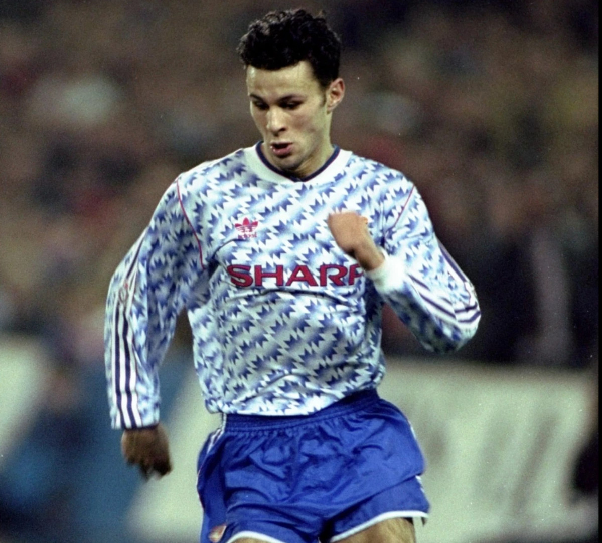
With the 1990s there also came some strange and rather short-lived trends.
Football kits became incredibly baggy again, almost as they had been six decades earlier, and there was a total embrace of eccentric, abstract, marvellously colourful shirt design.
Football kits became incredibly baggy again, almost as they had been six decades earlier, and there was a total embrace of eccentric, abstract, marvellously colourful shirt design.
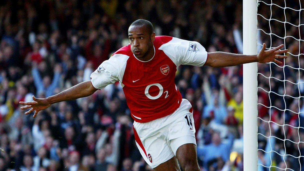
But as the 2000s wore on and the Digital Age rolled in, design in general became much more minimal.
Football kits reflected this shift, moving away from the garishness of the 90s and towards a sleek, clean, modern design philosophy.
One which has, broadly, endured.
Football kits reflected this shift, moving away from the garishness of the 90s and towards a sleek, clean, modern design philosophy.
One which has, broadly, endured.
A moment of profound symbolic importance came in 2011.
Barcelona were the last of Europe's biggest clubs not to have a shirt sponsor, but after five years supporting UNICEF they signed a deal with the Qatar Foundation.
The zenith of football's commercialisation.
Barcelona were the last of Europe's biggest clubs not to have a shirt sponsor, but after five years supporting UNICEF they signed a deal with the Qatar Foundation.
The zenith of football's commercialisation.
In recent years the "clean" kit design trend has seen some challenges.
Not least through a renewed interest in "retro" kits, part of a broder cultural nostalgia for the 80s and 90s, and the flurry of new kits inspired by the wild designs of yore.
Not least through a renewed interest in "retro" kits, part of a broder cultural nostalgia for the 80s and 90s, and the flurry of new kits inspired by the wild designs of yore.

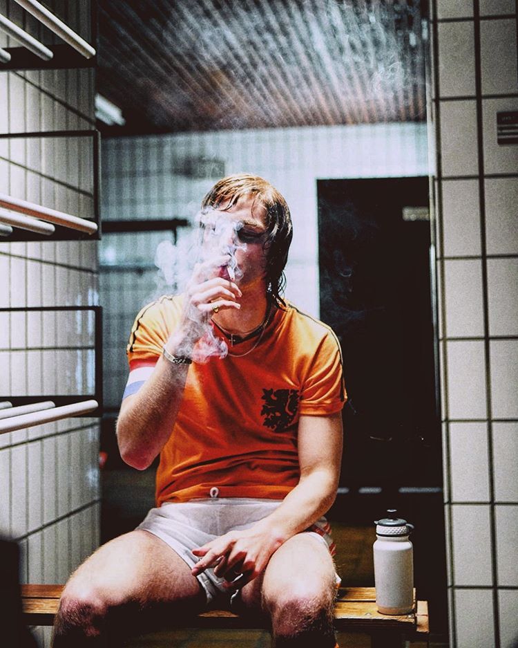
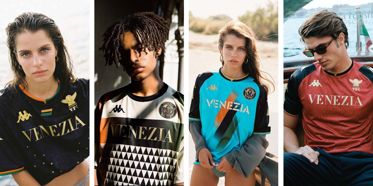
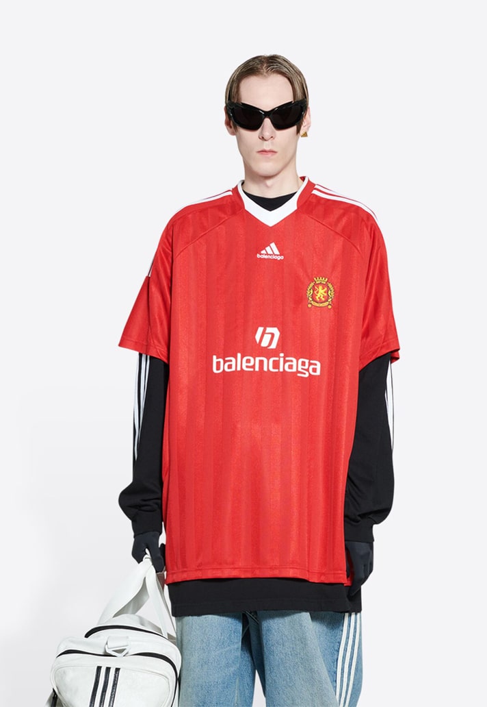
And football kits have now, definitively, entered the world of fashion, influencers, models, and celebrities.
Epitomised by PSG's kit deal with Jordan and by Italian second division side Venezia FC, famous entirely for their stylish kits rather than their sporting merit.
Epitomised by PSG's kit deal with Jordan and by Italian second division side Venezia FC, famous entirely for their stylish kits rather than their sporting merit.
Where will the football kit go next?
They've always been a sign of the times, whether influenced by structural and commercial changes to the sport or by broader aesthetic and cultural movements.
Well, safe to say, it's come a long way since the 19th century...
They've always been a sign of the times, whether influenced by structural and commercial changes to the sport or by broader aesthetic and cultural movements.
Well, safe to say, it's come a long way since the 19th century...
• • •
Missing some Tweet in this thread? You can try to
force a refresh