Devan Scott Profile picture
Feb 23, 2023 14 tweets 7 min read Read on X
The use of unexpected camera height choices in this scene from THE GRAY MAN (Russo Bros, 2022) reminded me of what I still insist is the finest scene in any MISSION IMPOSSIBLE movie...
...which is, of course, the restaurant scene in De Palma's entry. The whole scene can be found here. Give it a watch.
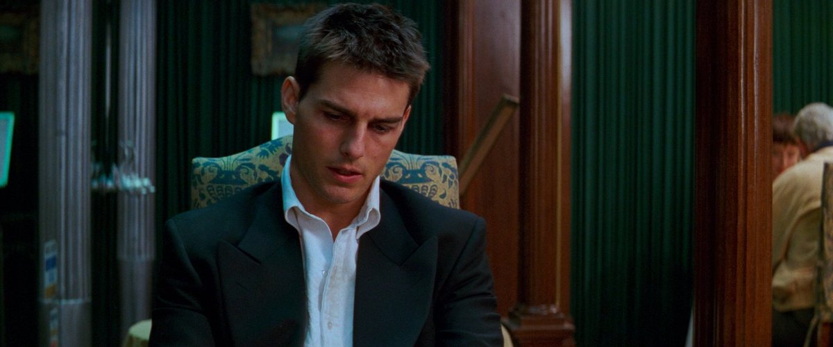
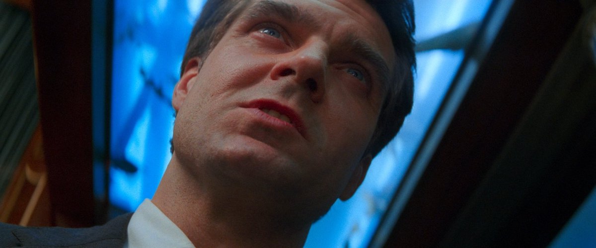
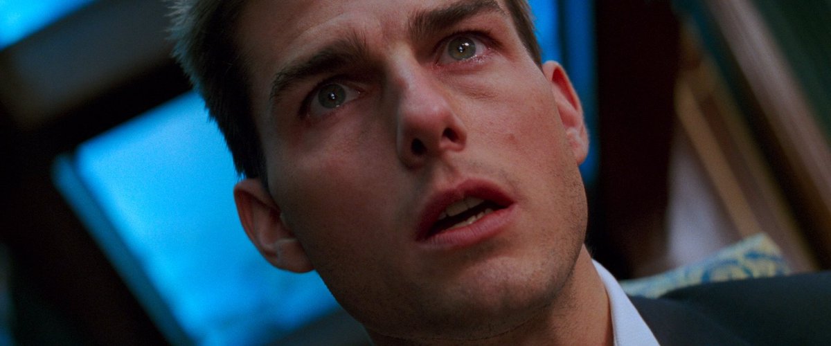
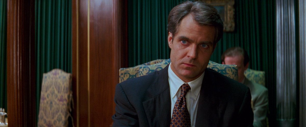
The scene is comprised mostly of two sets of coverage: fairly conventional eye-level shots and these extreme, call-all-attention-in-the-world-to-your-camera-placement type low-angle shots. ImageImageImageImage
The 'conventional' coverage, aside from being 'invisible' because we're used to stuff like this, uses vertical lines to emphasize a sort equilibrium. Medium-length lenses, medium shots. We'll call this coverage set 1. ImageImageImage
The low-angle De Palma coverage (set #2) is tense and off-putting for all the obvious reasons; notice how they're arranged to contrast with one another - the geometry of Cruise's single leans sharp left, while Czerny leans right. Immediate graphic opposition! The cuts are felt! ImageImage
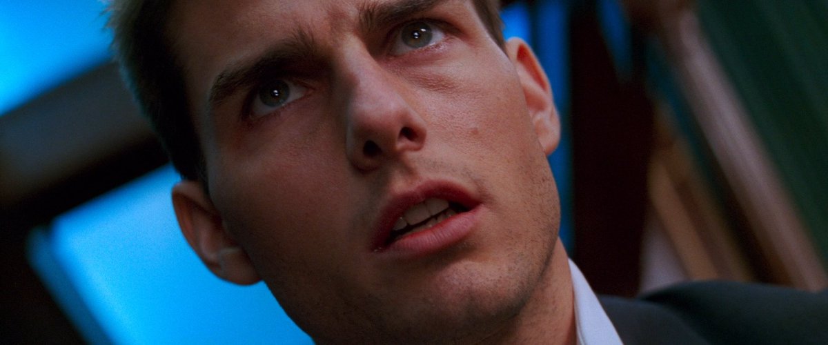
The way that De Palma and Hirsch structure the scene is the central reason why it works as well as it does, though.

First: Cruise and Czerny enter. Both appear (relatively...) at-ease, which, unbeknownst to us, is a mutual ruse. The coverage follows suit.
Cruise is the first to tip his hand: "follow me around the room" accompanies a jarring cut to coverage set #2. He's on the attack. Czerny is suddenly on alert, as evidenced by the coverage switch on his end.
Czerny makes the first of two de-escalation attempts as he explains himself. It works, this time: we're back to coverage set 1 as he leans into his chair.
Czerny can't help himself, of course: he's back in attack mode as we return to coverage set 2 as he gleefully twists the knife... Cruise briefly panics, the music swells, and Czerny thinks he's got him cornered.
Czerny again de-escalates, but Cruise is having none of it; notice how Cruise's coverage immediately returns to set 2 while Czerny's remains in set 1 until he finally loses his patience...
...at which point all the metaphorical cards are on the table and we return to the uber-tense coverage while bombs go off!
(Here's where I point out the lovely bit of set design that is the shark tank in the ceiling - communicate your angles to your art team, folks!)
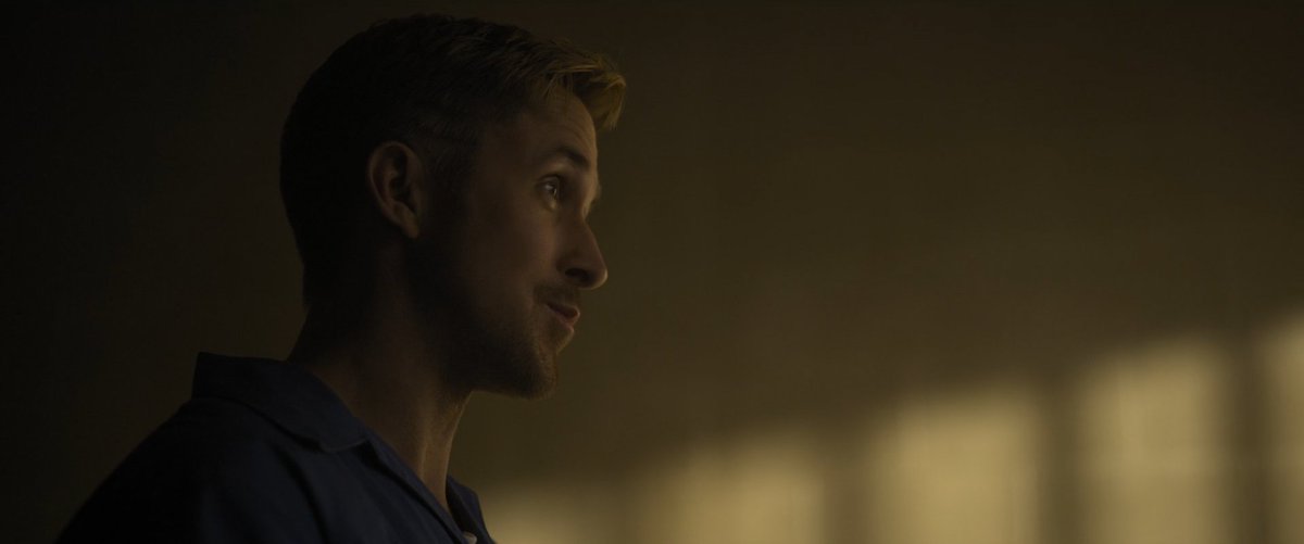
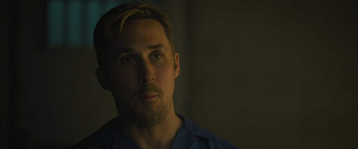
That was fun! Now, I wouldn't be very on-brand as a teacher if I did all the work here, so I invite anyone who's gotten this far to, with all this in mind, take a look at this scene from THE GRAY MAN again.
Why do the Russos move from medium frontal shots to profile medium close-ups to high-angle shots? Why do they immediately go back to frontal close-ups? Intent aside (author dead, etc), what is the aesthetic object we have in front of us and is it effective? ImageImageImageImage
These are of course (within the universe of spy movie reverse shots featuring dudes sitting down) two different scenes with two different purposes, and yet I cannot help but look at them and despair a little about the state of pop cinema's meat-and-potatoes scenes.

• • •

Missing some Tweet in this thread? You can try to force a refresh

 

Keep Current with Devan Scott

Devan Scott Profile picture

Stay in touch and get notified when new unrolls are available from this author!

Read all threads

This Thread may be Removed Anytime!

PDF

Twitter may remove this content at anytime! Save it as PDF for later use!

Try unrolling a thread yourself!

how to unroll video
  1. Follow @ThreadReaderApp to mention us!

  2. From a Twitter thread mention us with a keyword "unroll"
@threadreaderapp unroll

Practice here first or read more on our help page!

More from @SadHillDevan

Dec 8, 2023
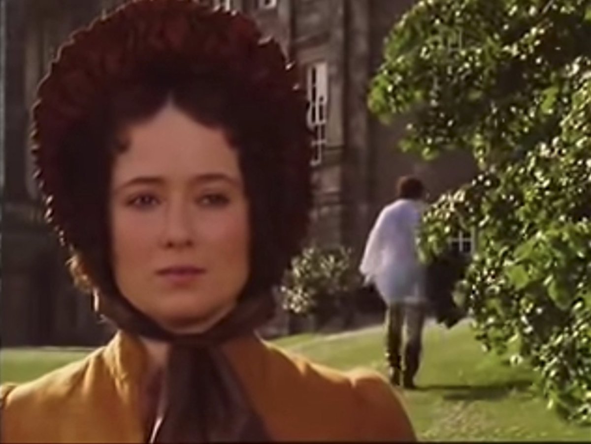
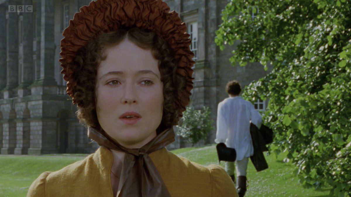
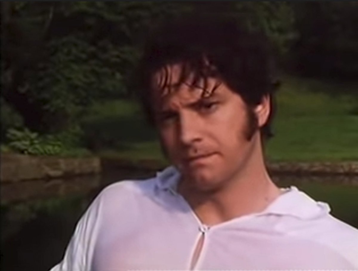
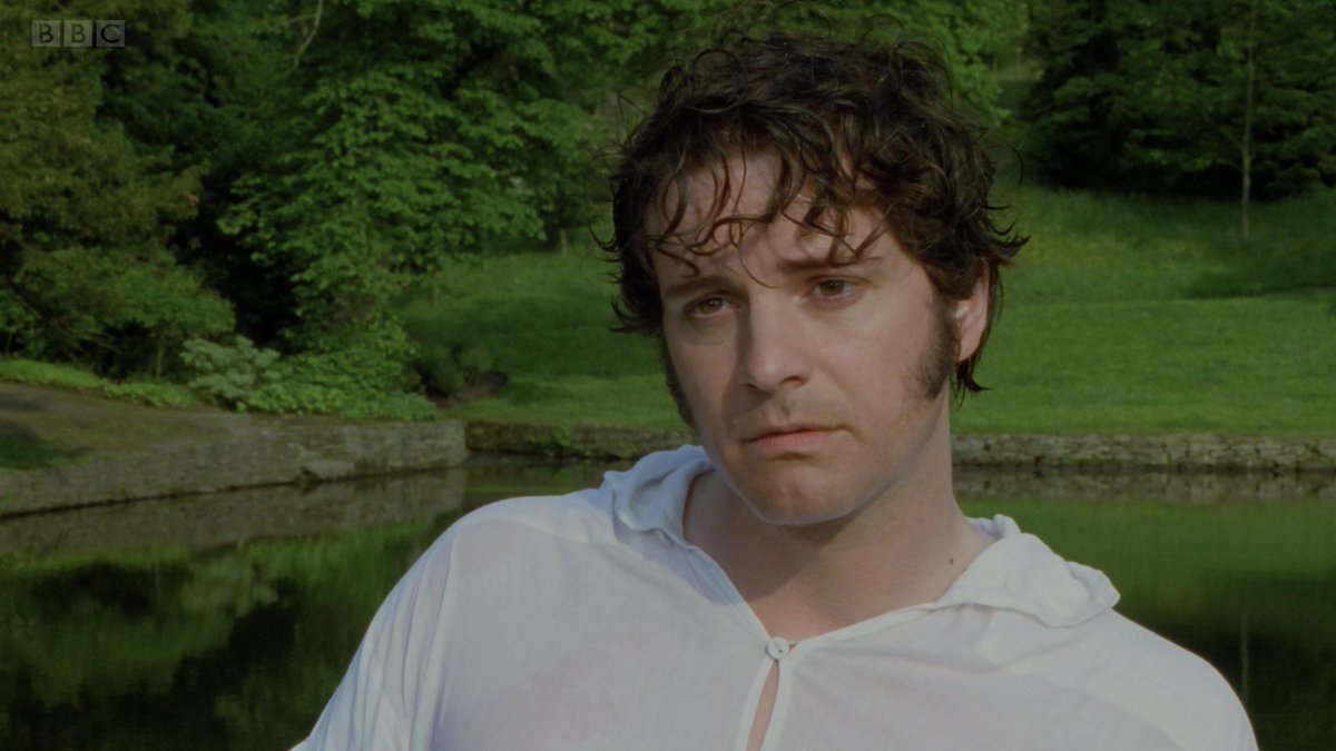
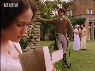
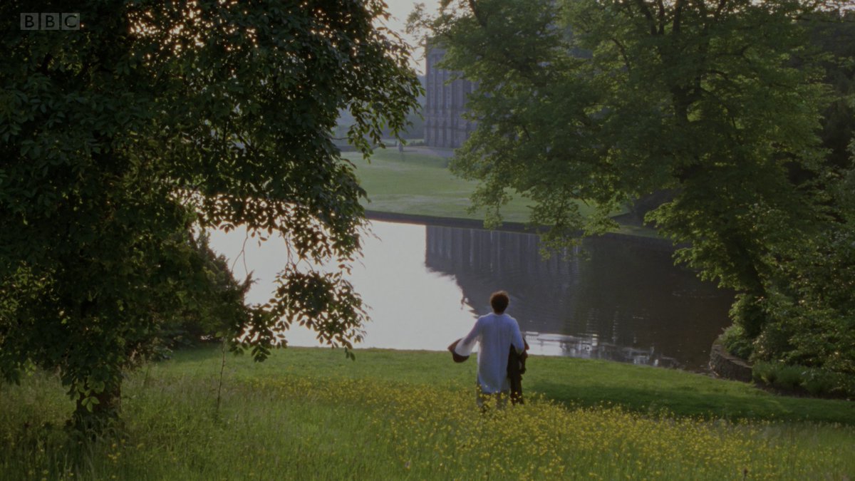
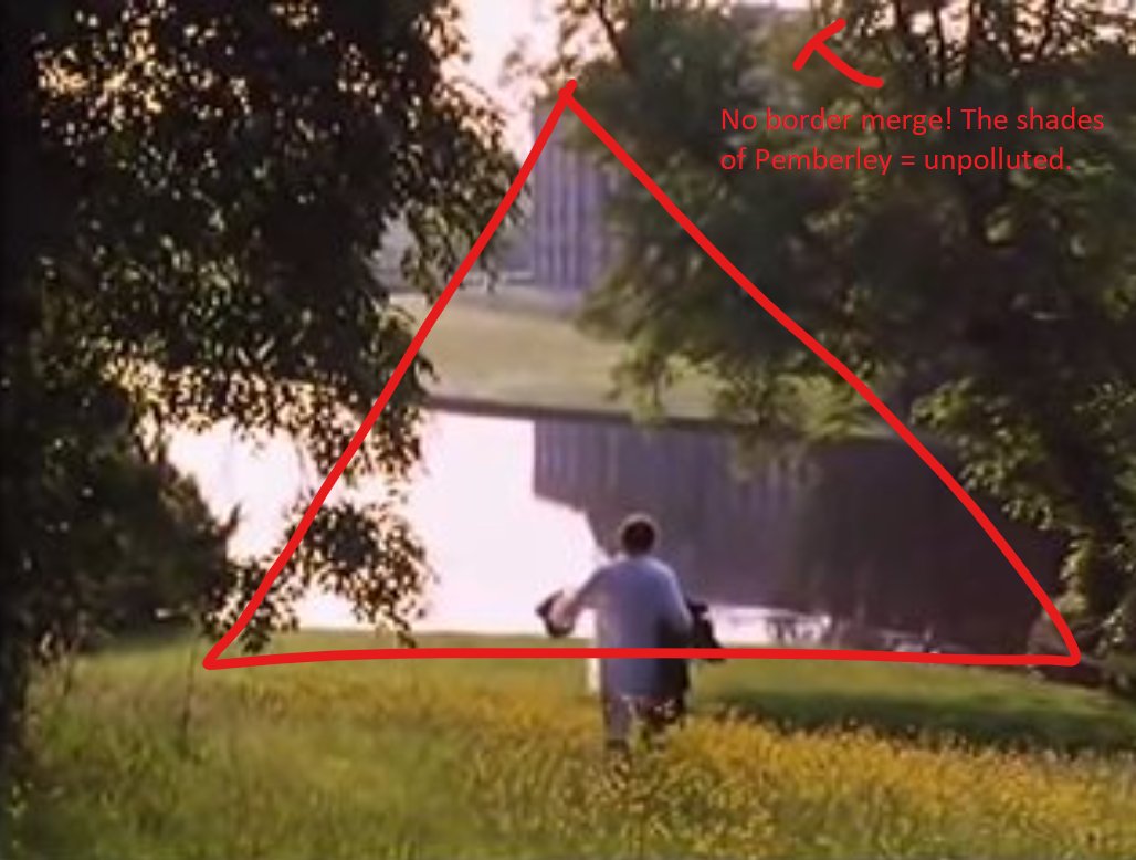
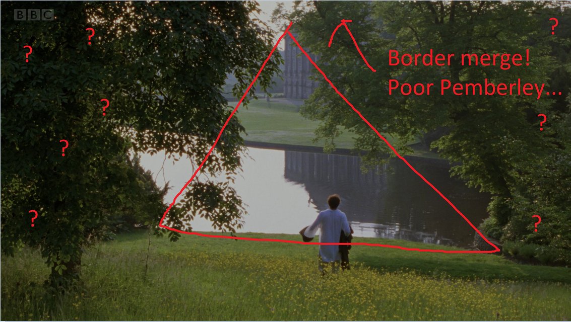
To the surprise of absolutely nobody, the BBC PRIDE AND PREJUDICE (1995) is significantly better-composed in its 1.33:1 originally-broadcast ratio than in its 1.78:1 form, which remains the only version available digitally.


Image
Image
Image
Image
It was shot on Super 16mm, which has a 1.66:1 aspect ratio, but almost certainly composed for 1.33:1. The 1.78:1 is typical of this type of horizontal extraction wherein they use the unintended extra info on the sides and crop the top and bottom somewhat.


Image
Image
Image
Image
An incredibly professional, industry-grade explanation, right here.
Image
Image
Read 4 tweets
Nov 4, 2023
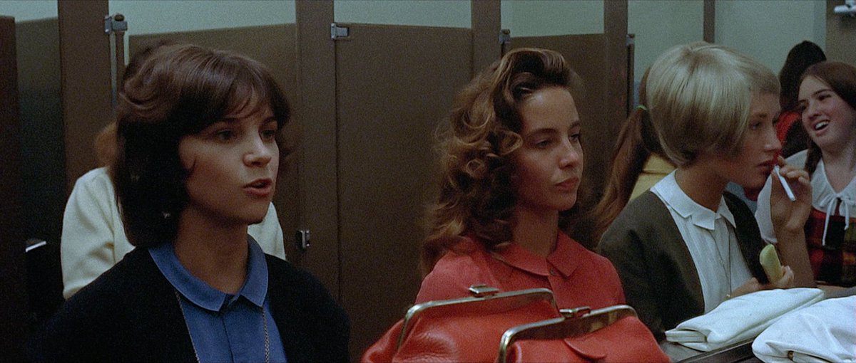
This is by no means a rigorous rundown of all the possible issues with the new AMERICAN GRAFFITI 4K release, but *yikes*.

First: possible the messiest power widow / local adjustment I've seen in a UHD release, in which the Mel's sign has been *very* clumsily adjusted.
The digital noise reduction is completely extreme, of course. Baffling choice for a film *shot on a film stock specifically because it was grainy.* Destroyed detail all over the place. Tons of artifacting in motion.

Image
Image
Image
Tons of shots like this, where detail has been obliterated and a paper-thin veneer of "35mm" grain has been applied overtop the totally destroyed image. Image
Read 8 tweets
Feb 23, 2023
Thirty five minutes into THE GRAY MAN and we've had eight location title cards. Who approved this.
Constantly resisting the urge to tweet through this.
Nine cards
Read 14 tweets
Feb 21, 2023
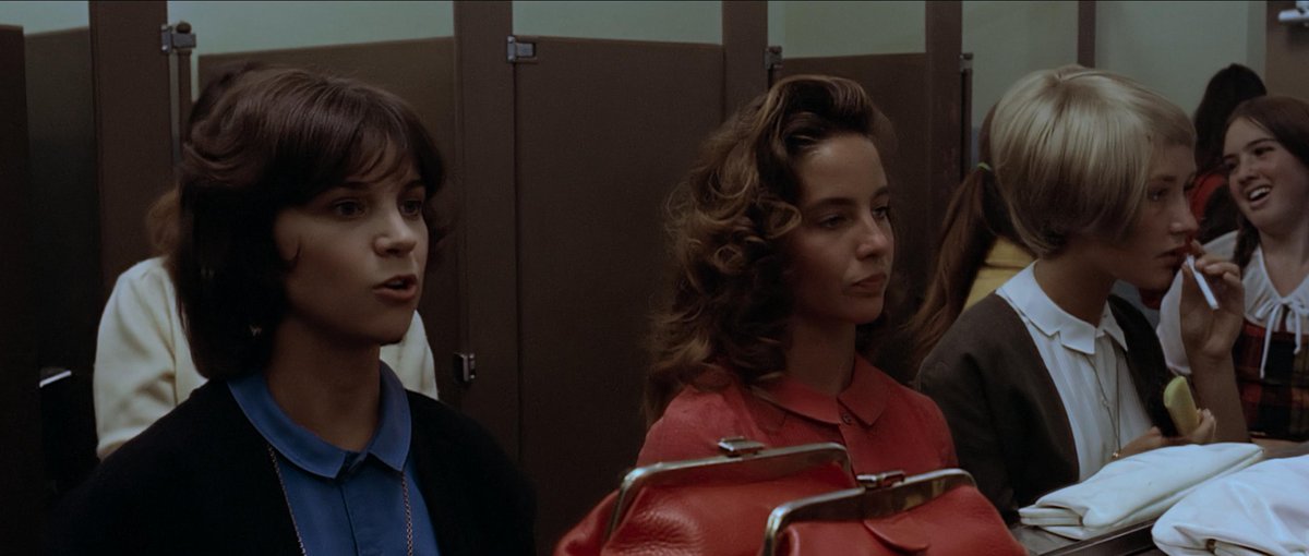
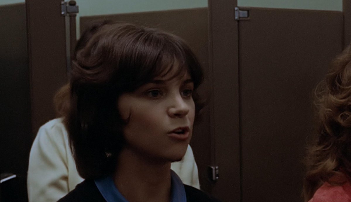
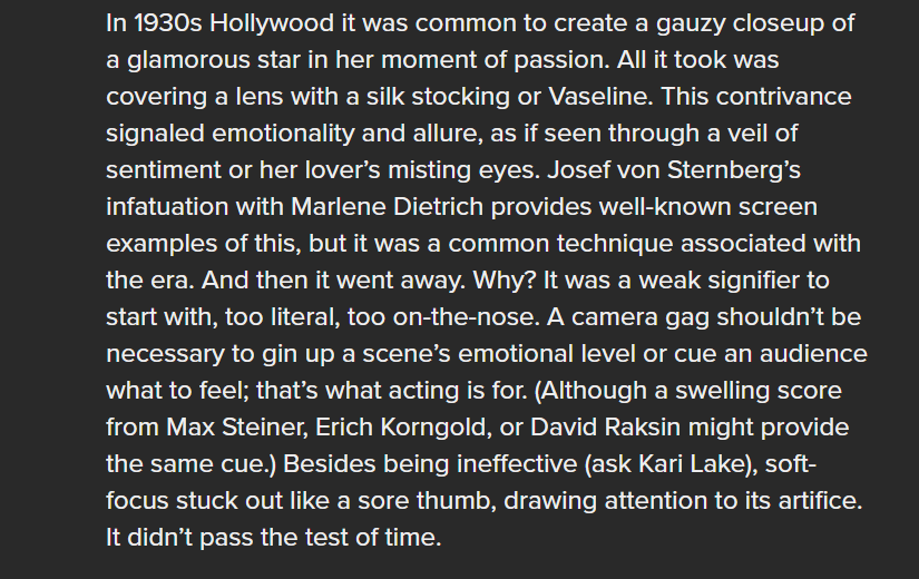
From an article I mostly liked, but I disagree with this framing of 'outdated' formal techniques. We've also got to consider the inverse: why were these techniques so popular in their time? What changed about the overall formal/industrial framework that led to their disuse? Image
It's similar to complaints about three-point lighting or 'stagey' acting in midcentury Hollywood films. Yes, a performance in that vein would stick out like a sore thumb in most any contemporary mainstream film, but what language were they contributing to at the time?
Isolating one element of a historical formal framework and declaring it dead of its own accord or obsolete is a common impulse, but all that's usually going on is that film language as a whole has shifted and the technique in question is but one small element.
Read 4 tweets
Oct 22, 2022
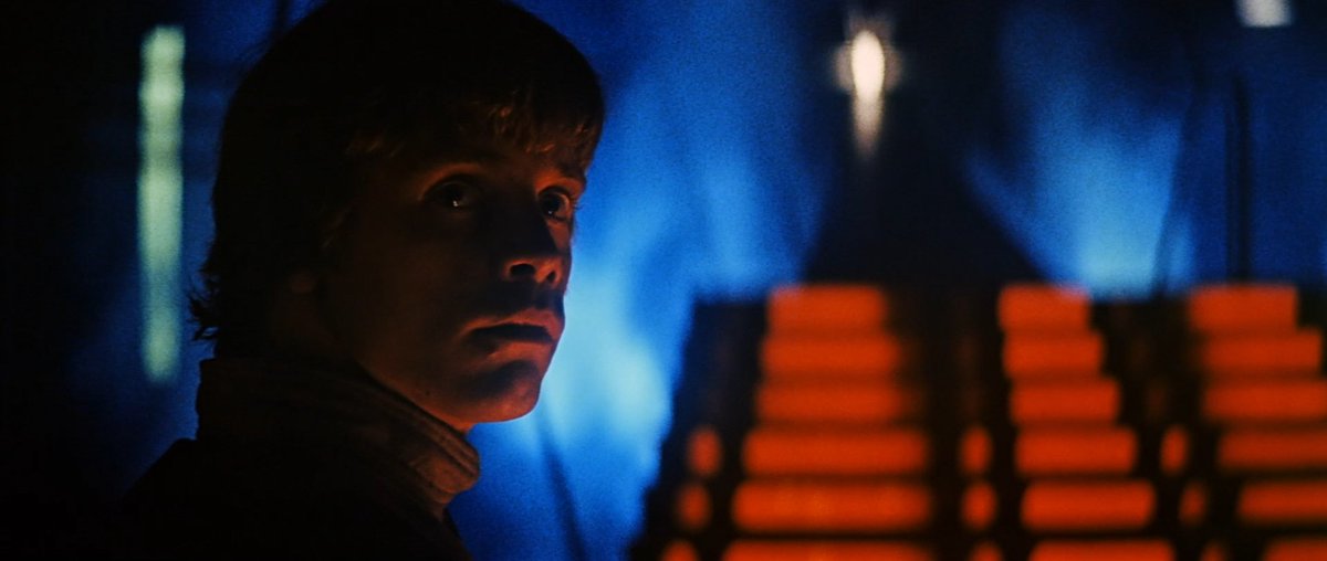
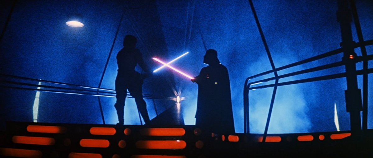
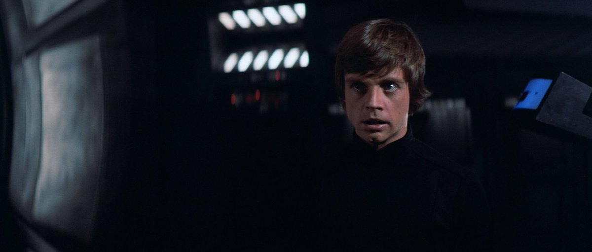
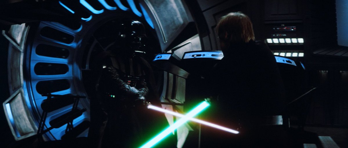
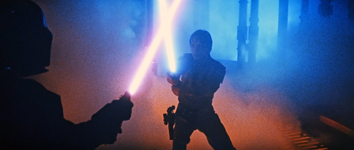
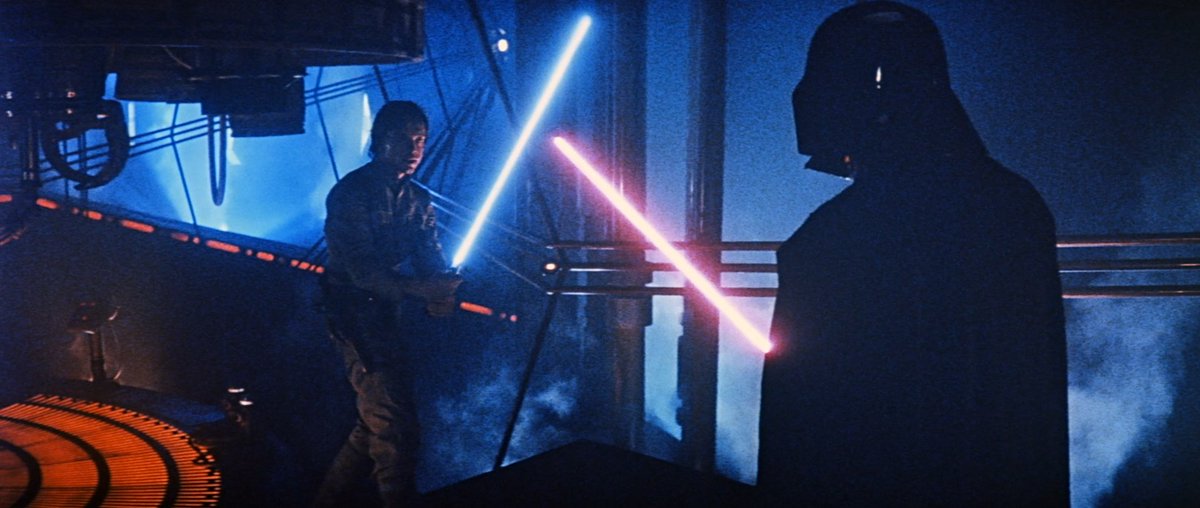
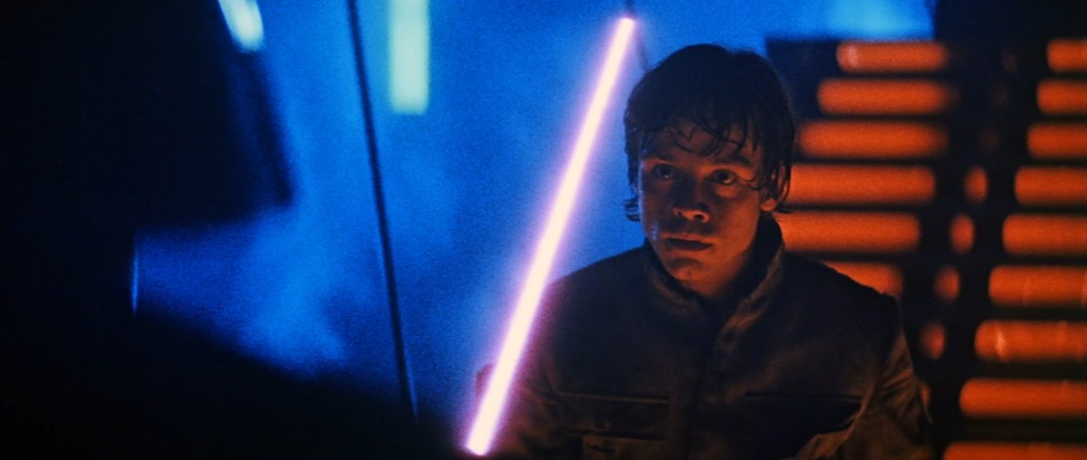
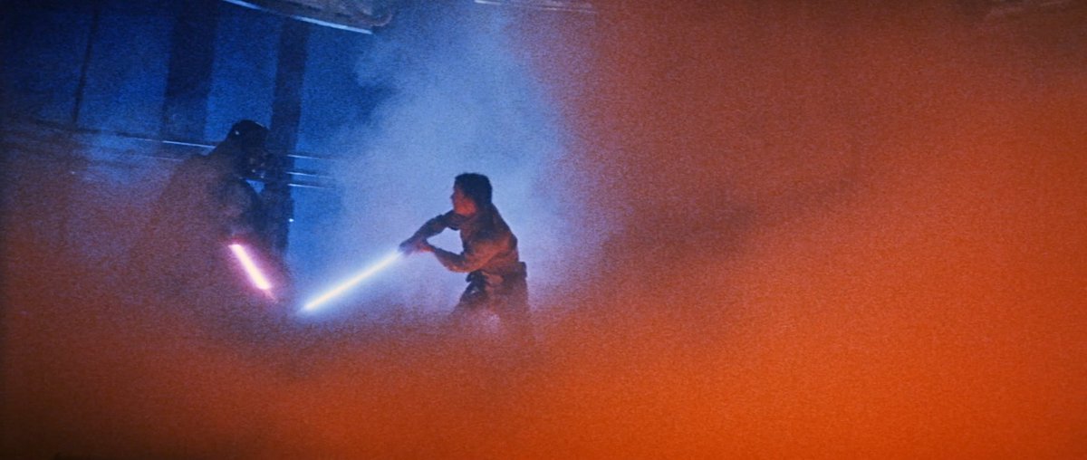
I don't have much to say on this that hasn't already been said a million times, but the contrast between the duels at the end of STAR WARS 2 and STAR WARS 3 is a good argument for why thinking of light as a compositional tool is, to say the least, handy.
It's a basic technique done -extraordinarily- well, but Suschitzky's separation of foreground and background using a complimentary palette of orange and blue allows him to construct geometrically effective frames from virtually any angle.
Not to mention, of course, the hellish expressiveness of it all: it's exquisitely-arranged hellish expressiveness, at that! Blue background, orange foreground, and every frame is clearly composed for the specific moment in the sequence in which it falls.
Read 14 tweets
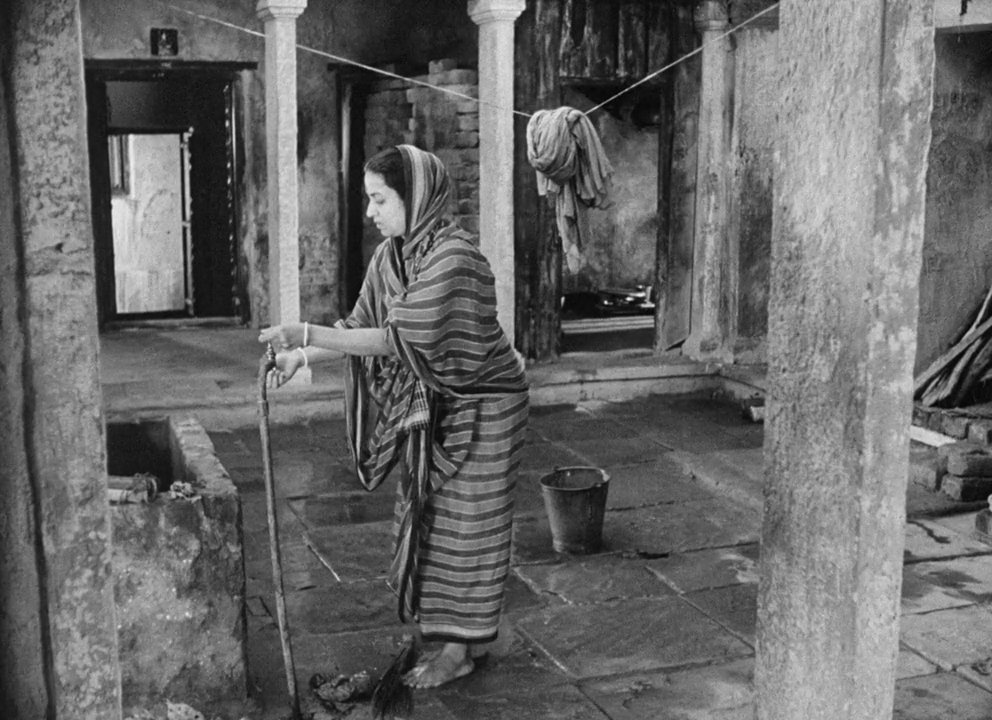
Oct 20, 2022
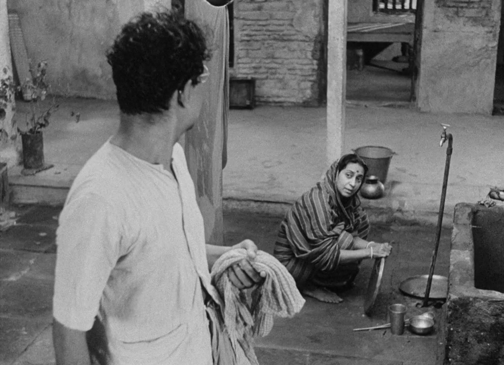
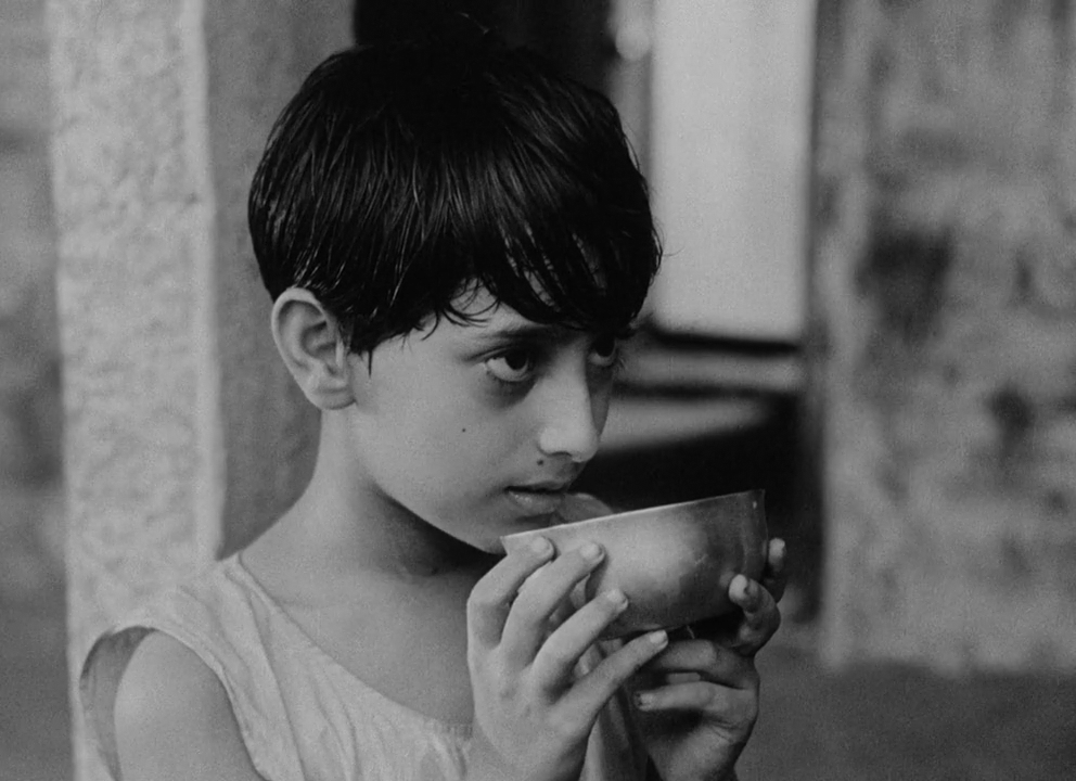
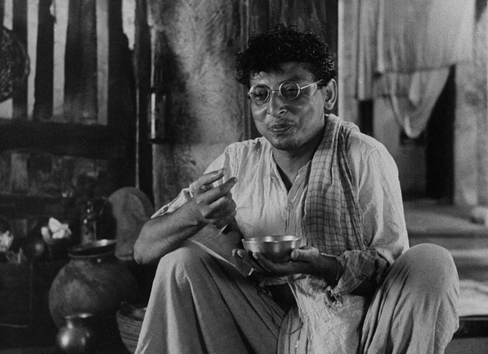
1956: ImageImageImageImage
It's striking to see a major studio (okay, *technically* ESB was an independent film but whatever) film from 1980 use these same techniques a quarter-century after Mitra pioneered them, and all because Suschitzky is a British realist guy (a la Menges) at heart. ImageImageImageImage
Read 12 tweets

Did Thread Reader help you today?

Support us! We are indie developers!


This site is made by just two indie developers on a laptop doing marketing, support and development! Read more about the story.

Become a Premium Member ($3/month or $30/year) and get exclusive features!

Become Premium

Don't want to be a Premium member but still want to support us?

Make a small donation by buying us coffee ($5) or help with server cost ($10)

Donate via Paypal

Or Donate anonymously using crypto!

Ethereum

0xfe58350B80634f60Fa6Dc149a72b4DFbc17D341E copy

Bitcoin

3ATGMxNzCUFzxpMCHL5sWSt4DVtS8UqXpi copy

Thank you for your support!

Follow Us!

:(