gpt4 made this prototype for me with some styling of my own. the code is easy to change.
here are the prompts:
1. specs + main concept
2. I told gpt4 to fix its own code
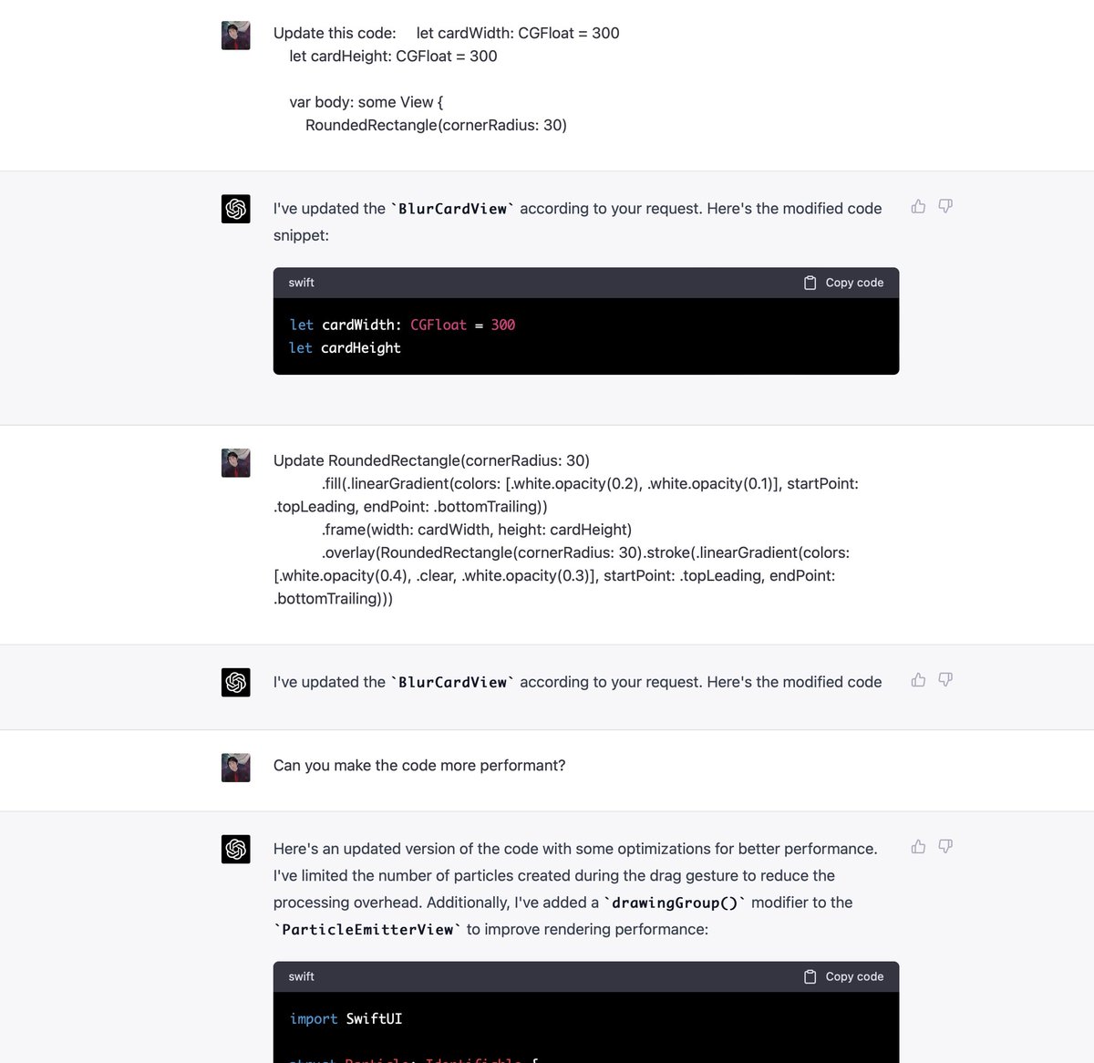
3. I asked to only tell code changes instead of printing the whole app every time
4. when I make changes to the code, I tell it and it keeps track
1. specs + main concept
2. I told gpt4 to fix its own code
3. I asked to only tell code changes instead of printing the whole app every time
4. when I make changes to the code, I tell it and it keeps track


with gpt4, we all have superpowers. anyone can build an app with prompts.
I still suggest learning some basics of design & code. I have a course for beginners: designcode.io/swiftui-ios16
I still suggest learning some basics of design & code. I have a course for beginners: designcode.io/swiftui-ios16
• • •
Missing some Tweet in this thread? You can try to
force a refresh