A few yards and 50 years apart. Two approaches to designing a high street in Leicester right next to each other.
The collapse in civic pride, ambition & delivery is profound and goes far beyond changing technology or economic pressures.
Leicester city centre seems to specialise in dramatic changes in facade quality from the polite to the delinquent. The city is doing great things on movement & active travel but most buildings from last 50 years are woeful. #BeautyAndTheBeast
One dreads to imagine what frightful cliches were coughed up to defend the “honesty” of this Ill-mannered attack upon the red bricks, gable ends and mullioned windows behind. A sad undermining of the wider excellent improvements to the city’s streets.
… in better news the city has oodles of lavishly Venetian Victorian jewels like this …
…. and even more early C20th neo-Georgian. More austere, constrained, withdrawn but quietly speaking of mercantile success and pride …
Sadly they are proposing to knock this fine early C20th building down as part of a reorganisation of the station which is well-intentioned but also risks creating big white spaces inside
… within the city centre there’s a real need to focus on ground floor shop front design which lets down the buildings above ..
… beyond the city core even more old buildings need love and investment - something which low values clearly make hard…
…the old dance hall is in a shocking state …
… suspect this hides an interesting history and could clearly be restored to glory …
… and lots of lumpen relics from the age of driving architecture as cities were being replanned for fast cars at their core and with the human life extracted …
…but on a more positive note, here’s a very respectable (residential?) addition to and conversion of an historic mill building (complete with ground floor parking!)….
… and while lots of streets still need love …
…the real story of the last decade is massive improvements to many others … (photo by @djjmilner )
…which are adding to the historic qualities of the city …
… and helping encourage walking & cycling…
… you can see here how network of “pedestrian priority” streets & ways has grown from 2011 (left) to today (right). Critically, making it easier to get to city centre as well as get about it.
… this has involved big interventions taking out flyovers …
And very palpably enhanced livability and walkability of the city centre.
The consequence? More people ARE living in the city centre. These circles show residential planning applications then and now. Good for vitality, prosperity & efficient provision of new homes.
Here are some by the riverside
So lots for Leicester to shout about. The next job is to find mechanisms to fund love into more of her historic buildings and stop erecting such utter monsters besides them which only undermine the good work and the city’s attractions as a place to live, work and play.
To return to the beginning, buildings matter as well as streets and it does undermine place quality (as well as value) if you think that faceless facades and sheer brick walls are an appropriate way to enclose what should be beloved city centre streets.
If you are curious, you can read more about how elements of place correlate with value, well-being and popularity in some of our research. For example: issuu.com/cadoganlondon/…
• • •
Missing some Tweet in this thread? You can try to
force a refresh
A little bit of West London in Düsseldorf. Perhaps a bit idiosyncratic but a clever response to mature plane trees. And with clever evolution of the pattern from …
… the penthouses in place of mansards on the top storey to …
… the artful evolution of the bay windows to loggias which must be fun to look out of …
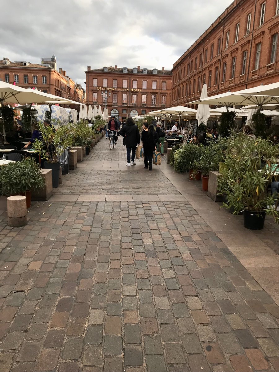
Ever heard of Toulouse as a city centre whose improved street design is revolutionising local prosperity?
It’s not normally lauded as a case study. But quality of the street design is staggering. The results are stunning. Literally no empty shops in town centre. How? A short 🧵
Well, it has to be admitted, they have a trick up their sleeve: the city centre’s buildings are almost uniformly beautiful, largely unscarred by war or traffic-modernism. Many …
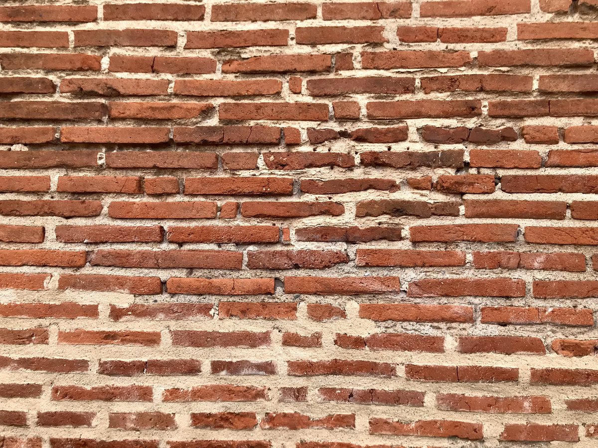
… are built from the region’s traditional "foraine" brick which is large and flat (like a Roman brick) and comes in a lovely range of ochres, reds, pinks and oranges. You can see why the French call it “La Ville Rose” …
The first half of this is clearly right. The second half misses the category we made in the C20th. Put simply, you cannot have infinitely free moving cars throughout a town centre without destroying the agglomeration & prosperity effects that create the town in the first place.
Revealingly it is normally poorer neighbourhoods that end up with "improved" traffic flow through them whilst richer somehow seem to avoid it. Among dozen lowest urban neighbourhoods in @ProsperityIndex ....
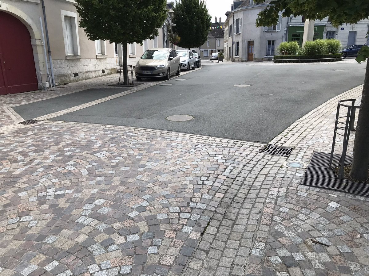
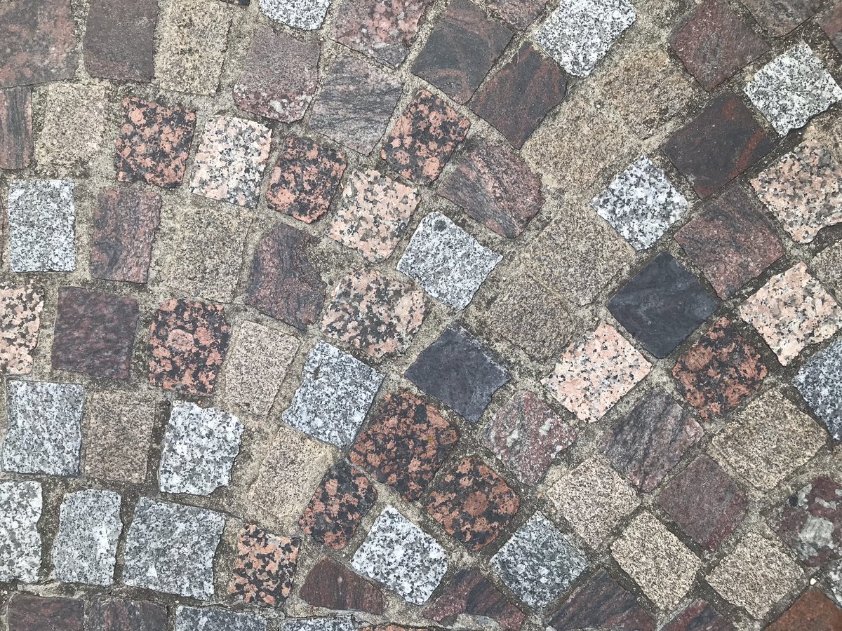
Small rural towns will always need parking but this need not ruin their squares with a judicious use of fine setts, street trees & urban re-greening to frame & control the parking …
… similarly it is possible to permit passing traffic whilst using street trees & at grade carriageways and pavements to demonstrate very clearly that “humans come first”…
… one simple trick every town should use is so-called “Copenhagen” or continuous crossings where a continuous pavement crosses the side street rather than vice versa. Cars are welcome but they are guests … and behave as such.
There are many paths to meeting our housing needs but one of them surely runs through South Tottenham. Our new paper, Learning from History - published today, by @bswud tells an important story …
… South Tottenham is one of the centres of Britain’s thriving Haredi community who tend to have large families & need to be within about 1km of their synagogue on the Sabbath. This put huge pressure on housing …
…the Neigbourhood has “good bones”, well-built Victorian homes in a good walkable block pattern. Collaborative work by neighbourhood with local councillors & planners led to a good local design code supporting upward extension by1.5 storeys in strict keeping with original homes
Many rightly extol virtues of Dutch improvements in street design but many French streets have improved hugely over last 15yrs. Here’s an almost random small town (Vallency) example with street trees elegantly narrowing carriageway & rendering whole street humane & safe …
… trees contain parked cars & level carriageway & pavements are neatly distinguished by shallow & well designed stone gutters. The street does not ban cars but it’s a people-first place with …