This animation shows how the polarisation of sunlight reflected by the #Dimorphos asteroid changed after the impact of NASA’s #DART spacecraft. At the beginning of the video, unpolarised sunlight, represented by wiggly blue lines oscillating in random directions, ... 1/
... is reflected off the surface of the asteroid. In so doing it becomes polarised, the reflected waves now oscillating along a preferred direction. The indicator on the lower right shows the degree of polarisation of the reflected sunlight. 2/
The DART impact ejected a cloud of debris, and after the collision the amount of polarisation dropped, as seen with the FORS2 instrument on ESO’s Very Large Telescope. This drop in polarisation could be due to the exposure of more pristine material from the interior of ... 3/
... Dimorphos, or the ejection of small particles produced during the impact. 4/4
Credit: ESO/M. Kornmesser
• • •
Missing some Tweet in this thread? You can try to
force a refresh
A giant hole has appeared on the Sun's surface, and it's 18-20 times the size of Earth. The coronal hole will soon blast solar wind at 800 km/s our way.
The solar storm could impact satellites orbiting Earth and lead to stunning auroras. 1/
(Img random gif)
The coronal hole is located close to the Sun's equator, which is interesting. These holes generally appear near the poles of the Sun.
However, as the Sun's activity increases in its 11-year cycle, these holes are expected to move close to the equator from the polar regions. 2/
Coronal holes represent some of the most dynamic events in the solar atmosphere. The Sun is a hot magnetized ball where plasma churns from the inside to its surface. This motion generates powerful magnetic fields that constantly fluctuate and flow in a complex dance that ... 3/
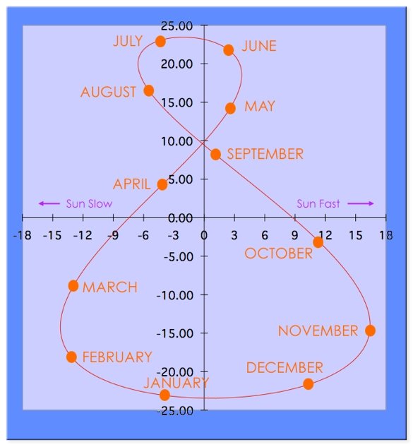
The analemma & the Equation-of-Time are a result of the sum of the effects of the Earth’s elliptical orbit around the sun & the tilt of the Earth’s axis in relation to the plane of its orbit around the sun. The following chart shows the effect of this summation. 1/
The following diagram shows the position of the true sun in the sky throughout the year. The y–axis on the chart represents the declination (Earth's tilt) of the sun in the sky for one year, going from –23.45° in the winter to +23.45° in the summer. 2/
The x–axis represents the difference in time from what your watch tells you what the position of the sun should be to the actual position of the sun in the sky. Note that the figure-8 is slightly skewed due to the effect of the apse angle. 3/