Adrian Profile picture
May 22, 2023 β€’ 10 tweets β€’ 3 min read β€’ Read on X
How to improve your UI designs πŸ‘‡ Image
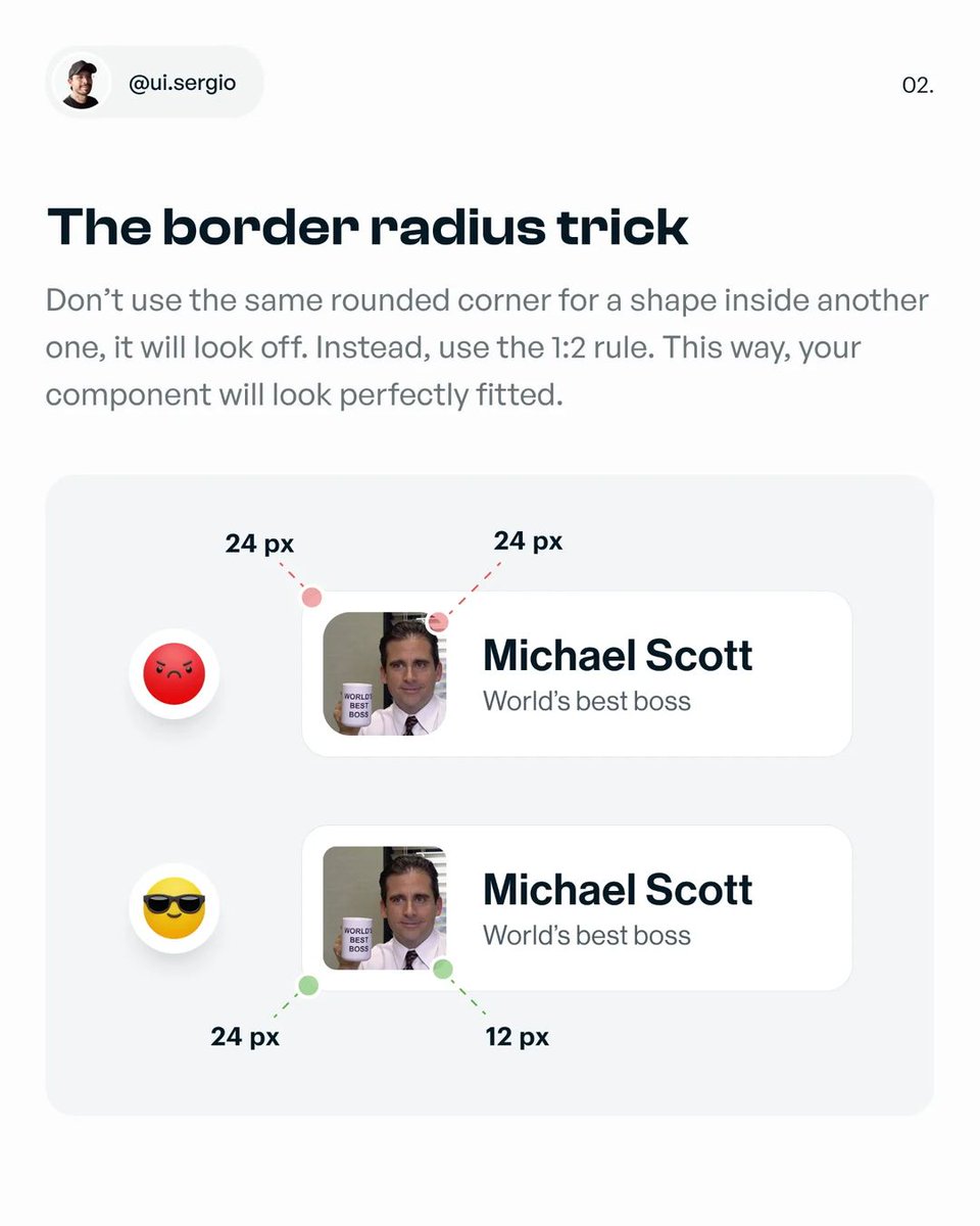
1. The border radius trick Image
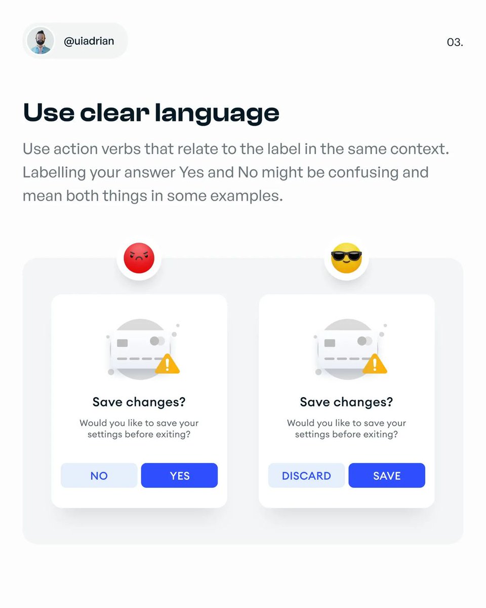
2. Use clear language Image
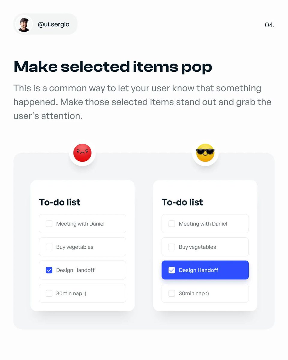
3. Make selected items pop Image
4. Touch targets Image
5. Don't use thin and light fonts Image
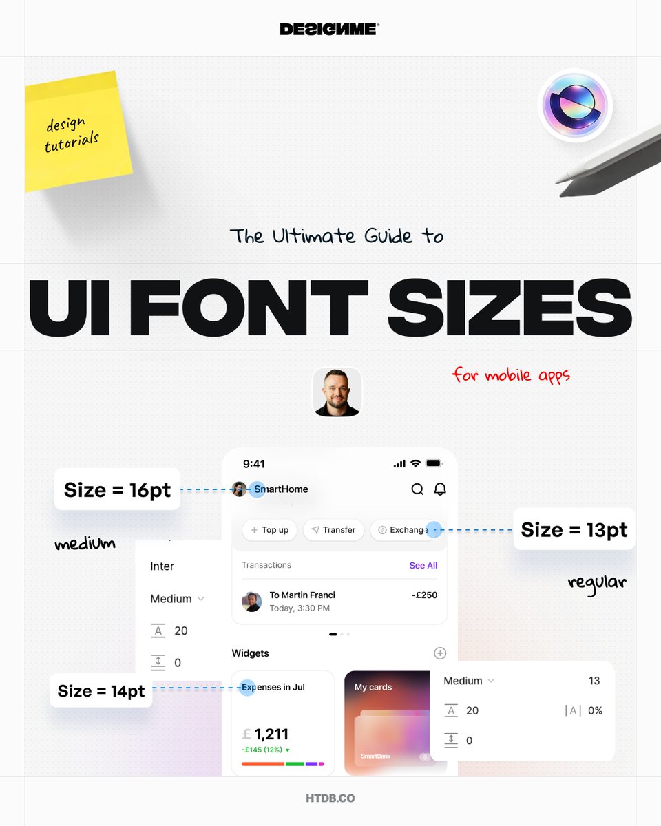
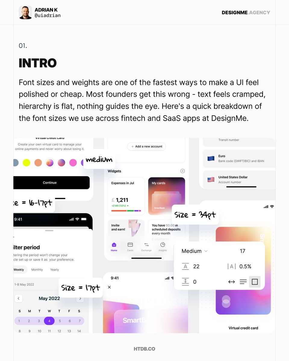
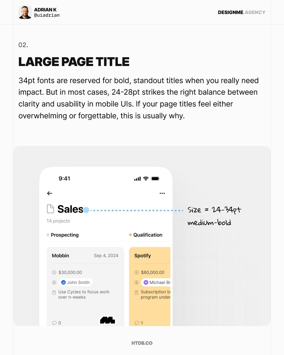
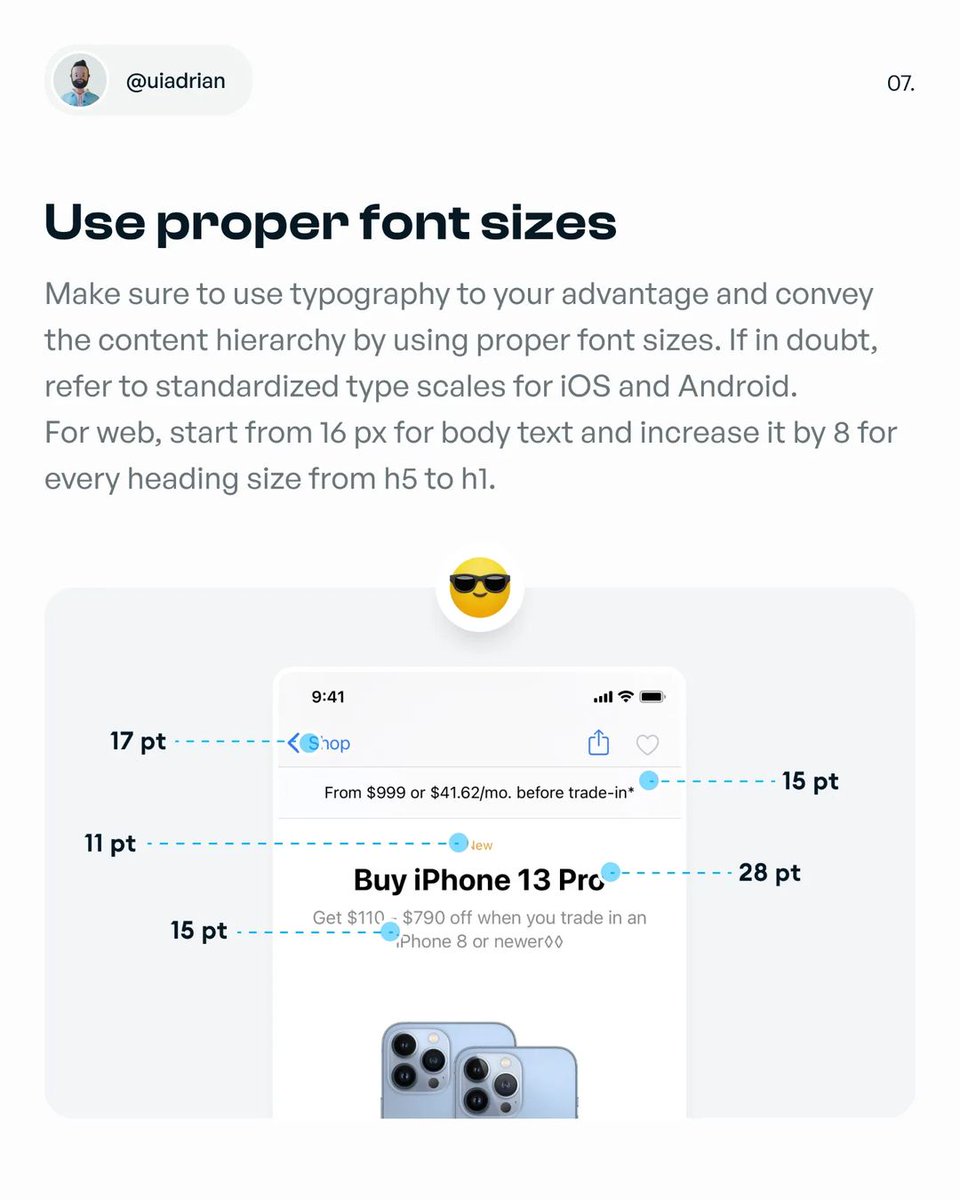
6. Use proper font sizes Image
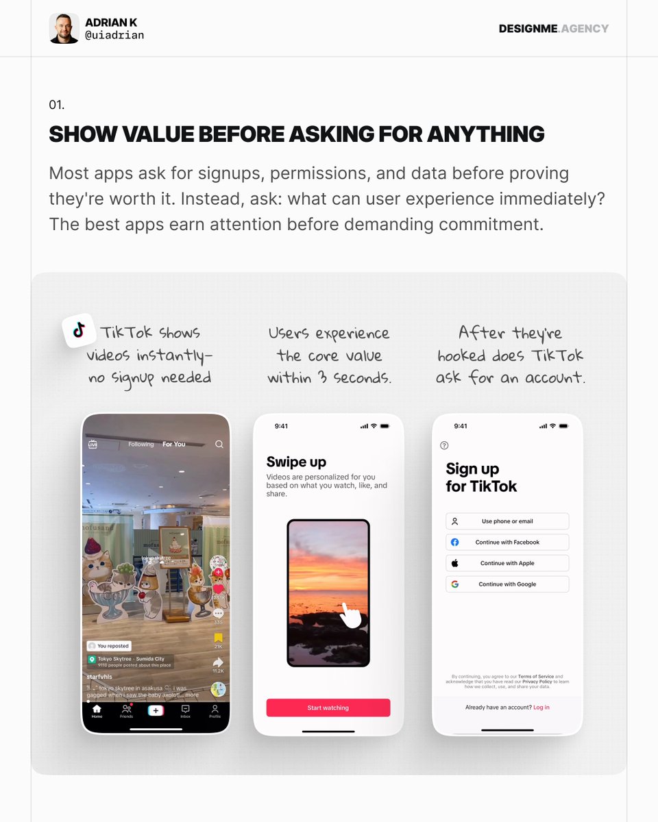
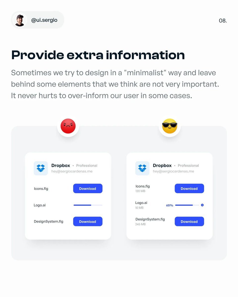
7. Provide extra information Image
That's it from me guys!

If you enjoyed this thread, consider to:

1. Follow me @uiuxadrian for more design-related threads and videos

2. RT the tweet below to share this thread with your audience πŸ’œ
Master mobile design with my top-rated Design Manual ebook

770 pages, 2 mobile apps, design templates, and much more! 🎁

Check it out at the link belowπŸ‘‡
https:/howtodesignbetter.com/design-manual

β€’ β€’ β€’

Missing some Tweet in this thread? You can try to force a refresh
γ€€

Keep Current with Adrian

Adrian Profile picture

Stay in touch and get notified when new unrolls are available from this author!

Read all threads

This Thread may be Removed Anytime!

PDF

Twitter may remove this content at anytime! Save it as PDF for later use!

Try unrolling a thread yourself!

how to unroll video
  1. Follow @ThreadReaderApp to mention us!

  2. From a Twitter thread mention us with a keyword "unroll"
@threadreaderapp unroll

Practice here first or read more on our help page!

More from @uiuxadrian

Jul 28
Your app settings shouldn't feel like a scavenger hunt.

Clear structure = confident users.

Here’s how to build that kind of UX πŸ‘‡ Image
1. Group settings Image
2. Use clear labels & descriptions Image
Read 11 tweets
May 29
How to design better mobile search UI πŸ‘‡ Image
Image
Image
Read 9 tweets
Apr 15
If your design feels off, check your spacing.

Here’s 8 quick tips to instantly improve your design with white space:
1. White space = breathing room

White space isn't wasted. It guides your users' eyes through your design.
It reduces overwhelm, clarifies hierarchy, and makes content easily digestible. Image
2. Group & separate with space.

Use tighter spacing to group related items. Increase space to clearly separate unrelated sections.

Good spacing naturally clarifies your design structure. Image
Image
Read 11 tweets
Mar 24
How to design better Forms in UI πŸ‘‡ Image
Image
Image
Read 10 tweets
Mar 21
How to design better app settings ✨ Image
1. Group settings Image
2. Use clear labels & descriptions Image
Read 11 tweets
Mar 17
Hands-on approach to mastering web design ✨

Click for more (🧡) Image
1. Introduction Image
2. Find a website to trace Image
Read 11 tweets

Did Thread Reader help you today?

Support us! We are indie developers!


This site is made by just two indie developers on a laptop doing marketing, support and development! Read more about the story.

Become a Premium Member ($3/month or $30/year) and get exclusive features!

Become Premium

Don't want to be a Premium member but still want to support us?

Make a small donation by buying us coffee ($5) or help with server cost ($10)

Donate via Paypal

Or Donate anonymously using crypto!

Ethereum

0xfe58350B80634f60Fa6Dc149a72b4DFbc17D341E copy

Bitcoin

3ATGMxNzCUFzxpMCHL5sWSt4DVtS8UqXpi copy

Thank you for your support!

Follow Us!

:(