📣 New working paper on residential segregation in India. We’ve been working for 5 years on this.
8 facts about residential segregation in India, from new administrative data. The situation is not great 🧵 1/N
8 facts about residential segregation in India, from new administrative data. The situation is not great 🧵 1/N
This is joint work with @thesamasher @kritarthjha @aadukia @brandonjoeltan
Summary: devdatalab.org/segregation
Media fact sheet: paulnovosad.com/pdf/segregatio…
Paper: paulnovosad.com/pdf/india-segr…
Let’s begin 2/N 👇
Summary: devdatalab.org/segregation
Media fact sheet: paulnovosad.com/pdf/segregatio…
Paper: paulnovosad.com/pdf/india-segr…
Let’s begin 2/N 👇
We built a national neighborhood-level dataset covering all India, 2011–13.
It’s super local. A neighborhood = ~700 people, 1.5m in the country.
Data are from ~2012, this is about historical patterns, not the current govt.
3/N
It’s super local. A neighborhood = ~700 people, 1.5m in the country.
Data are from ~2012, this is about historical patterns, not the current govt.
3/N
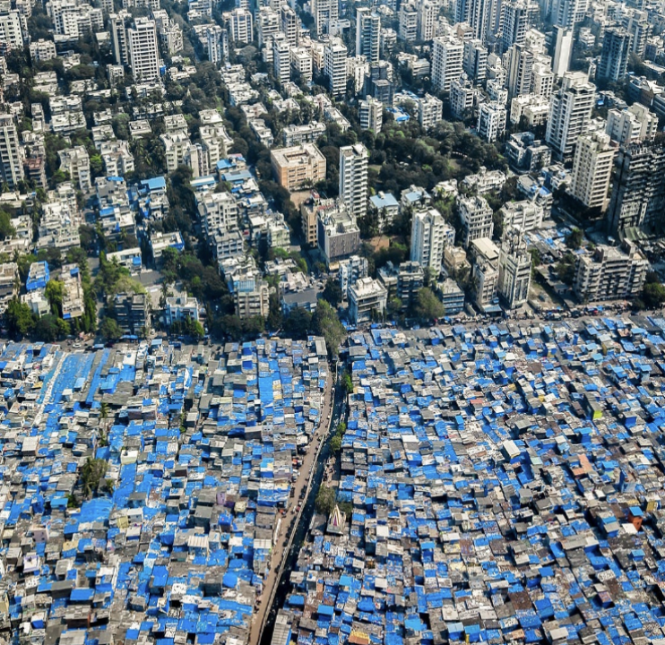
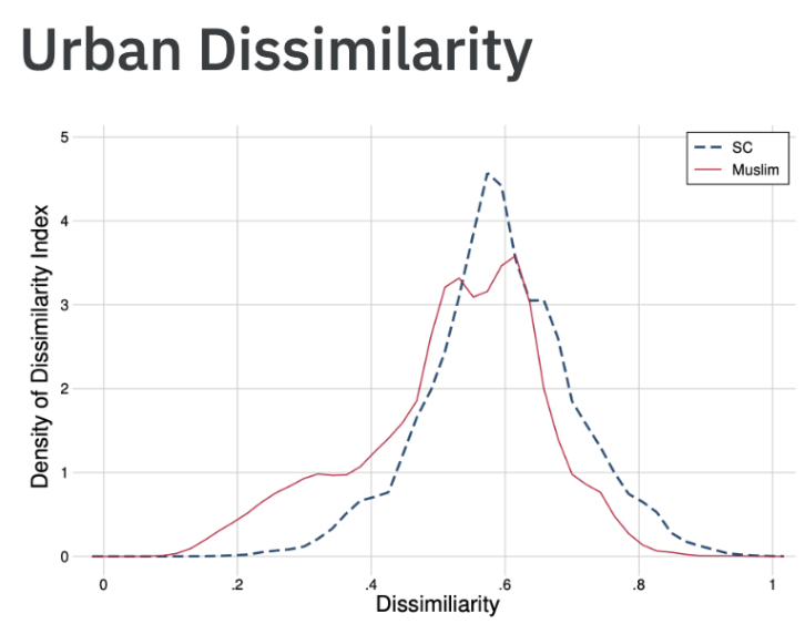
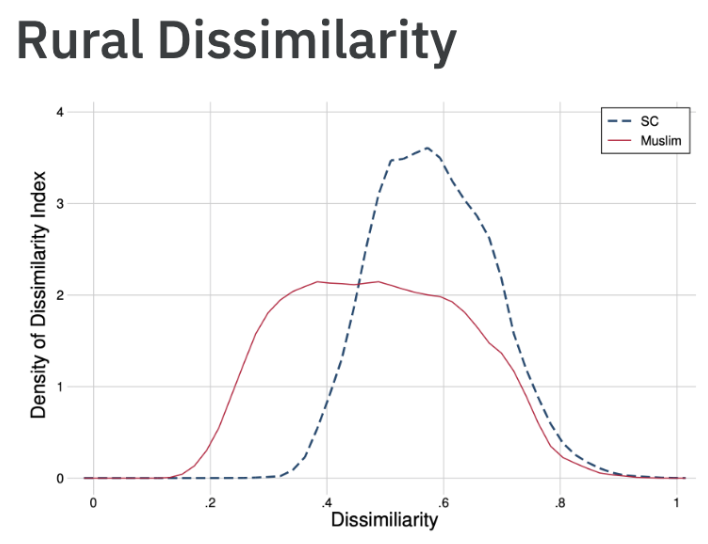
Fact 1: India is very segregated.
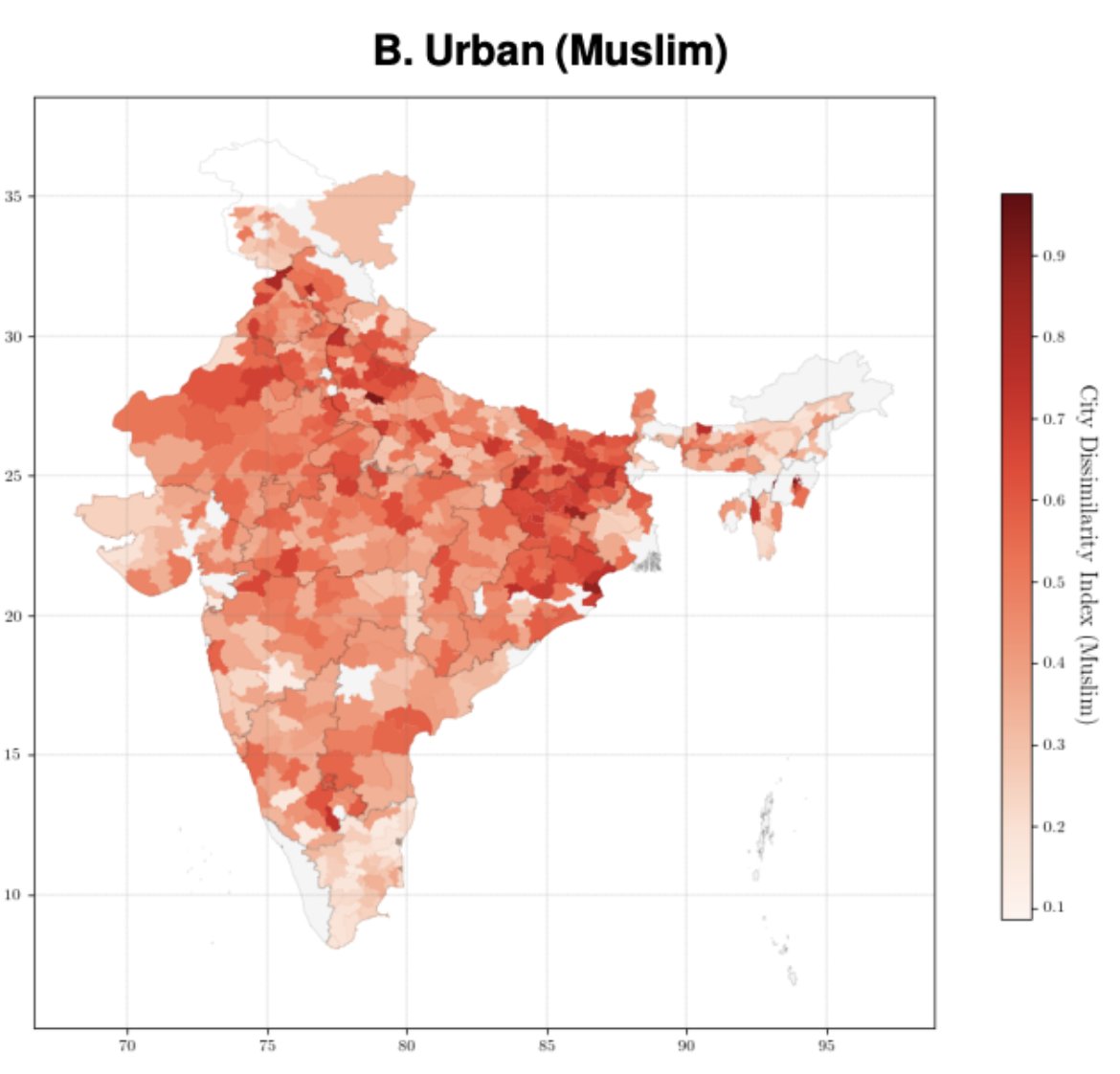
Urban places are about as segregated as rural places, for Scheduled Castes. For Muslims, segregation is worse in cities. The graph shows the Dissimilarity Index for cities and subdistricts.
Urban places are about as segregated as rural places, for Scheduled Castes. For Muslims, segregation is worse in cities. The graph shows the Dissimilarity Index for cities and subdistricts.
Fact 2: Scheduled Castes and Muslims are about as segregated as Black people in U.S. cities. Note this dissimilarity graph is slightly different from the prior, b/c we limit to cities >100k to match U.S. Census definitions. 5/N

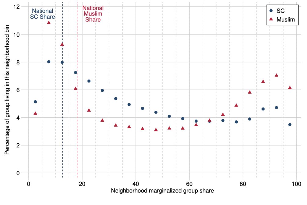
Fact 3: Muslims are more likely to live in highly segregated neighborhoods.
26% of urban Muslims live in neighborhoods that are >80% Muslim.
17% of urban SCs live in neighborhoods that are >80% SC.
Numbers in rural areas are similar. 6/N
26% of urban Muslims live in neighborhoods that are >80% Muslim.
17% of urban SCs live in neighborhoods that are >80% SC.
Numbers in rural areas are similar. 6/N
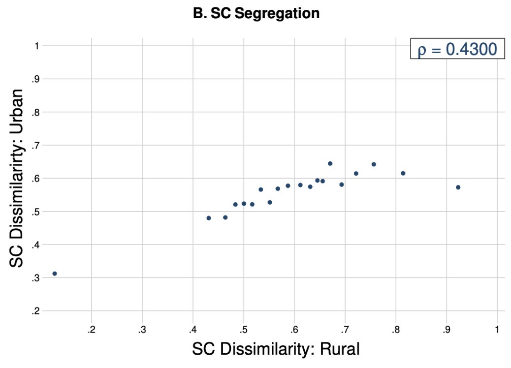
Fact 4: Cities replicate the social environments of their hinterlands. Districts with segregated villages have segregated cities. 7/N
The existence of segregation is not surprising to people who study and spend time in Indian cities.
Some of these descriptive facts have been noted by @RaphaelSusewind, @nav_bharathi, @deepak_malghan, among others. 8/N
Some of these descriptive facts have been noted by @RaphaelSusewind, @nav_bharathi, @deepak_malghan, among others. 8/N
But maybe groups choose to live together — does it matter?
Let’s look at service delivery in these neighborhoods, starting with secondary schools 👇 9/N
Let’s look at service delivery in these neighborhoods, starting with secondary schools 👇 9/N
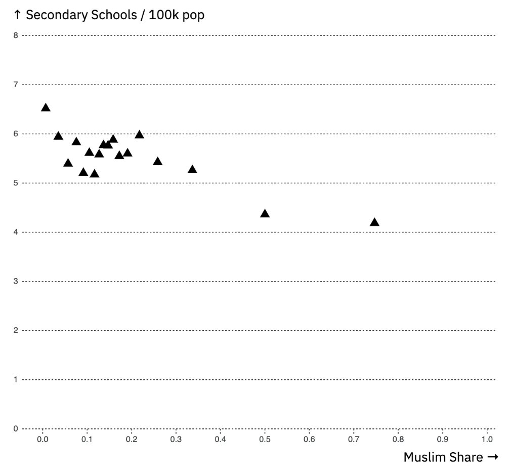
Fact 5: Public services in cities are less likely to be found in neighborhoods with many SCs and Muslims.
A 100% Muslim neighborhood is only half as likely to have a secondary school as a neighborhood with no Muslims. 10/N
A 100% Muslim neighborhood is only half as likely to have a secondary school as a neighborhood with no Muslims. 10/N
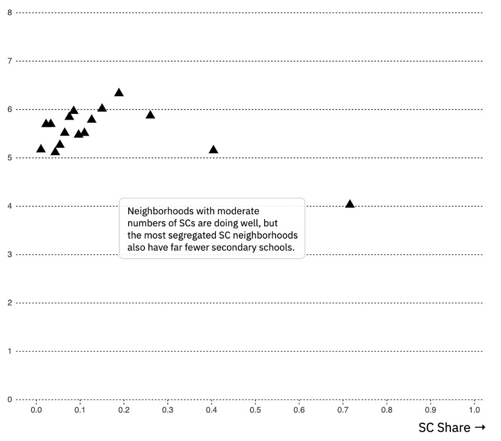
When we look at SCs, moderate SC neighborhoods are doing ok, but the most segregated neighborhoods again are less likely to have secondary schools. 11/N
We are comparing SC, Muslim, and integrated neighborhoods, *within the same city*.
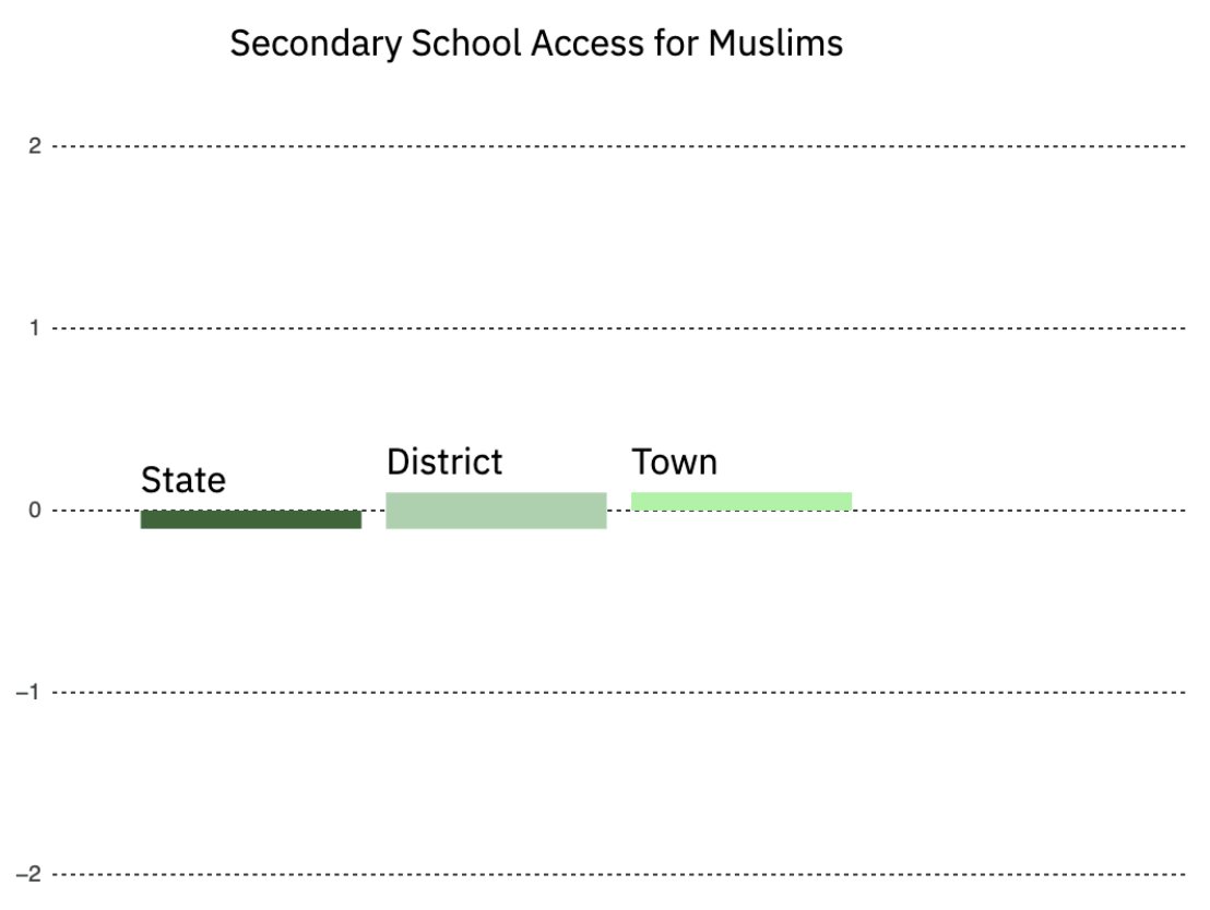
This kind of granular data has not been available before. If you look at geographic aggregates, like districts, you will find a different (misleading) story. 12/N
This kind of granular data has not been available before. If you look at geographic aggregates, like districts, you will find a different (misleading) story. 12/N
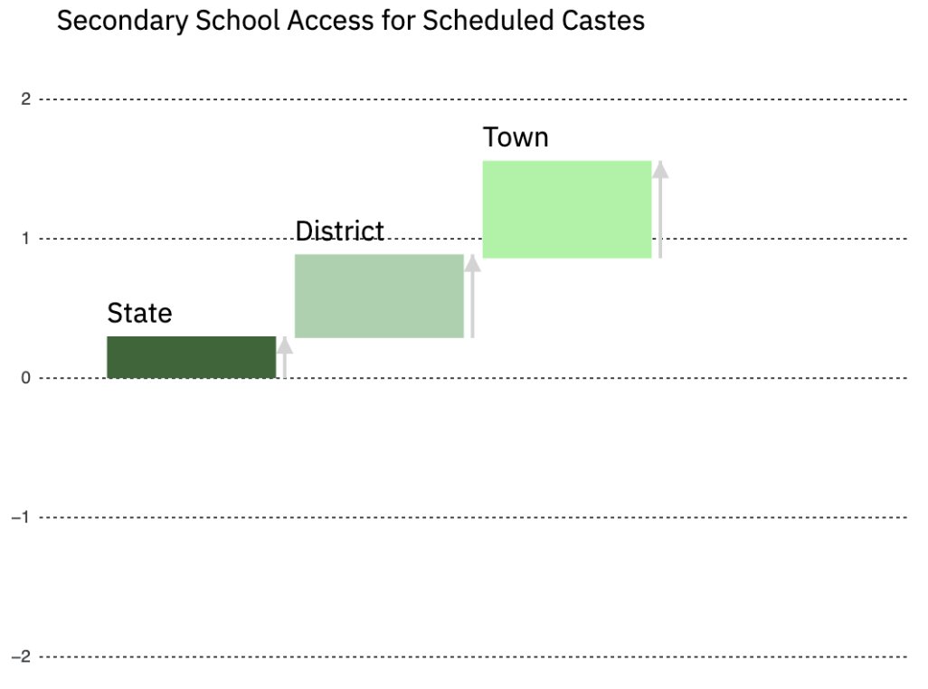
This graph shows school access vs. SC share at aggregate levels.
The story is positive for SCs: states, districts, and towns with more SCs all have more secondary schools, maybe because policies have targeted schools to high-SC regions.
But …
The story is positive for SCs: states, districts, and towns with more SCs all have more secondary schools, maybe because policies have targeted schools to high-SC regions.
But …
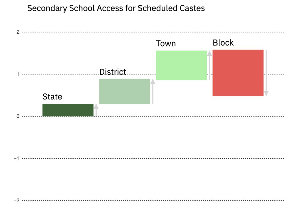
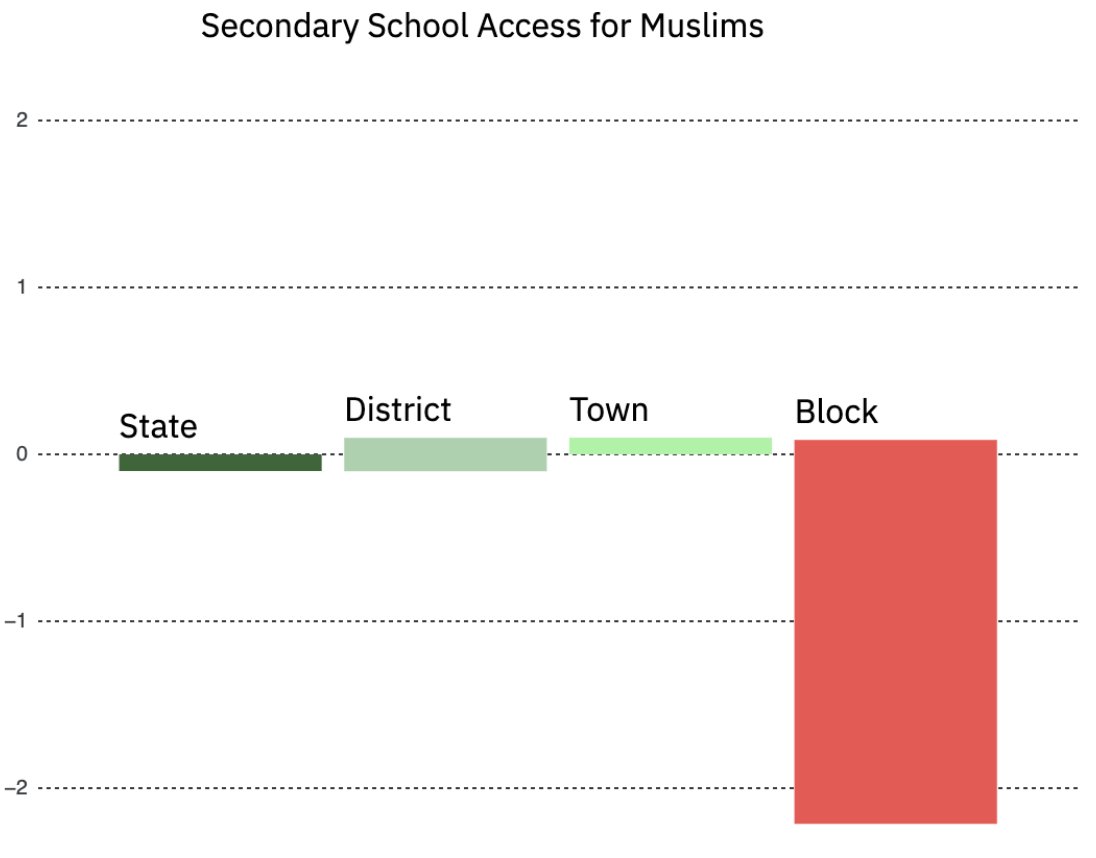
Once you look at school allocation *across* blocks/neighborhoods *within* towns, most of that advantage disappears.
For whatever reason, within cities and towns, the most segregated SC neighborhoods have the fewest secondary schools. 14/N
For whatever reason, within cities and towns, the most segregated SC neighborhoods have the fewest secondary schools. 14/N
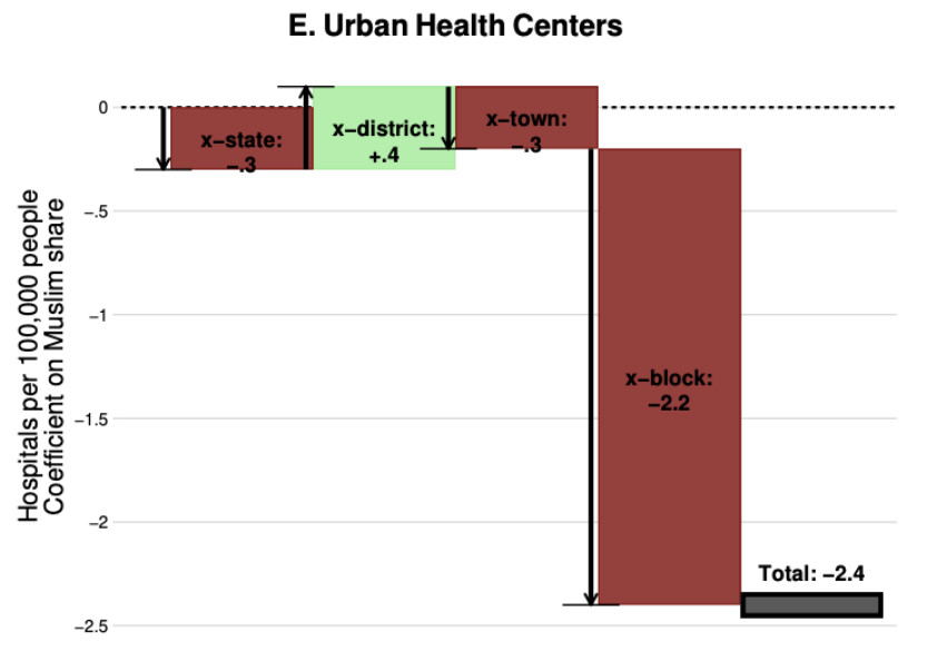
Let’s look at the same analysis for Muslims.
States, districts, and towns with high Muslim shares do not have any particular advantage or disadvantage when it comes to school access. 15/N
States, districts, and towns with high Muslim shares do not have any particular advantage or disadvantage when it comes to school access. 15/N
But across neighborhoods, the results are stark. Muslim neighborhoods are *much less likely* to have public secondary schools. 16/N
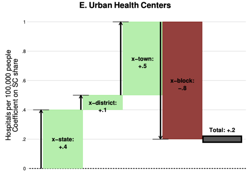
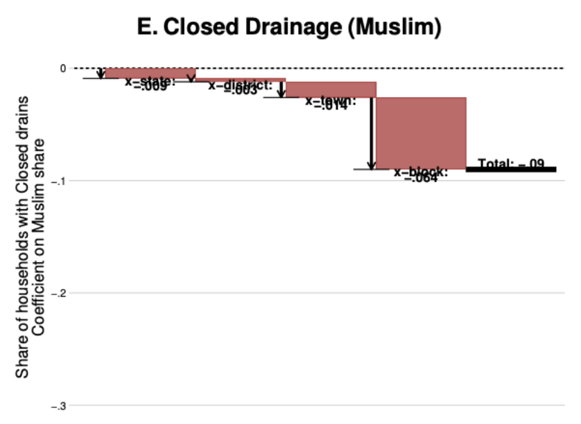
We ran the same analysis for a wide range of public services: primary schools, health clinics, water and electricity infrastructure, closed drainage. 18/N
The result is systematic: within cities, neighborhoods with high SC and Muslim shares have much worse public services—look at the rightmost red bar. The other services are in Figs 5–7 of the paper. paulnovosad.com/pdf/india-segr…

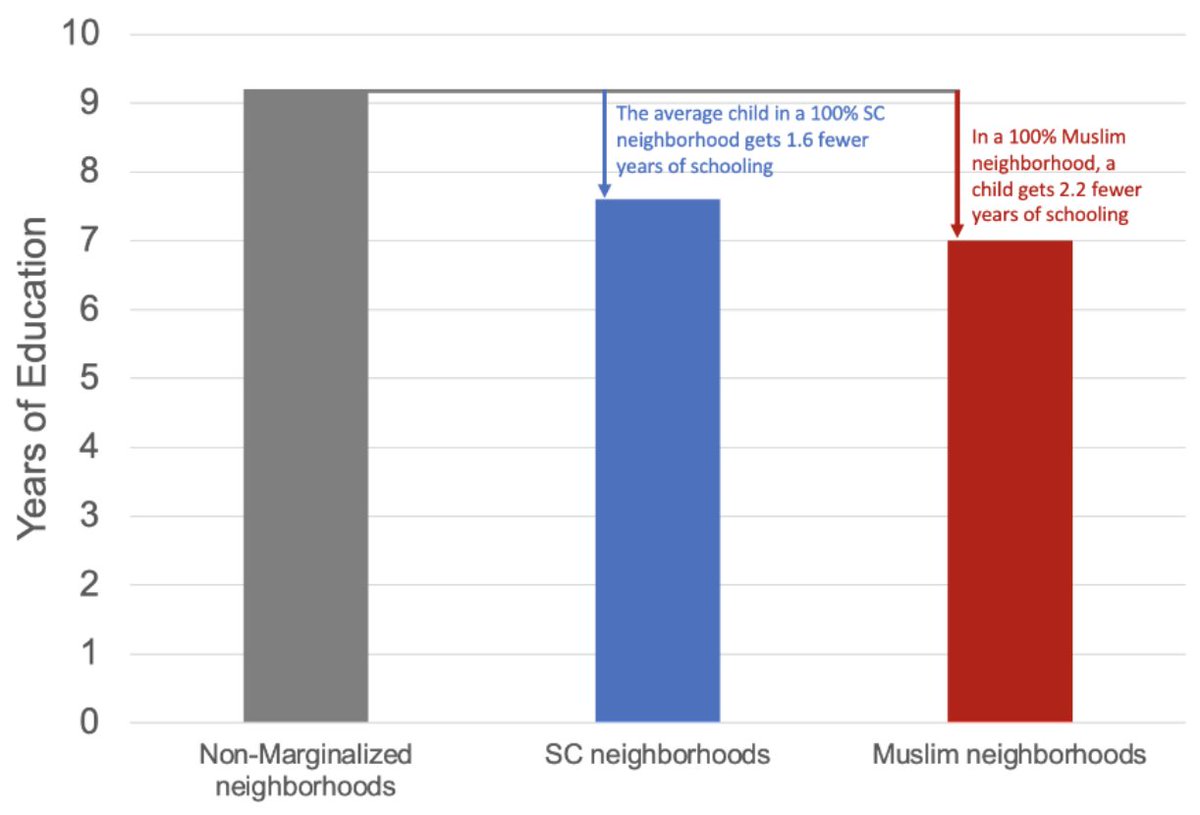
Fact 5: Kids are worse off in segregated neighborhoods.
Young people have over a full year less education in fully segregated SC and Muslim neighborhoods. The graph shows outcomes for 17–18 year olds. 20/N
Young people have over a full year less education in fully segregated SC and Muslim neighborhoods. The graph shows outcomes for 17–18 year olds. 20/N
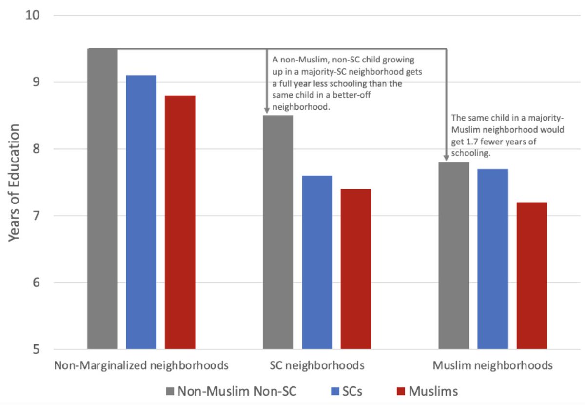
Fact 6: Kids from *all social groups* are worse off in segregated neighborhoods.
The neighborhood effect explains about half of the group disadvantage. In predicting your education, where you live is just as important as your social group.
The neighborhood effect explains about half of the group disadvantage. In predicting your education, where you live is just as important as your social group.
Fact 7: The broad regional patterns do not stand out. Segregated and integrated cities appear throughout the country. 22/N

Fact 8: Things might be getting better over time (but we’re not sure).
Younger cities are less segregated, even taking into account their size. 23/N
Younger cities are less segregated, even taking into account their size. 23/N
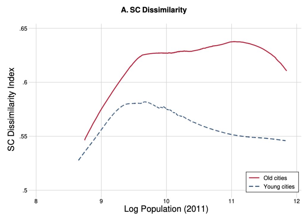

This could mean (a) modern settlement patterns are less segregated (good news, we conjecture); or (b) cities get more segregated over time.
It’s hard to tell, without time series data. 24/N
It’s hard to tell, without time series data. 24/N
Ellie Baker and @tobylunt made a fantastic NYT-style visualization of the key results of the paper: devdatalab.org/segregation
We wrote a fact sheet for the media: paulnovosad.com/pdf/segregatio…
More details in the full paper: paulnovosad.com/pdf/india-segr…
25/N
We wrote a fact sheet for the media: paulnovosad.com/pdf/segregatio…
More details in the full paper: paulnovosad.com/pdf/india-segr…
25/N
We’re working on a big data release from this paper, which will be posted soon.
26/N
26/N
Some additional details:
Core data are from SECC (2012) and Economic Census (2013), linked at enumeration block level.
The EC records public facilities, the SECC social group, infrastructure, wealth, and education.
27/N
Core data are from SECC (2012) and Economic Census (2013), linked at enumeration block level.
The EC records public facilities, the SECC social group, infrastructure, wealth, and education.
27/N
This is a descriptive paper and we do not take a stand on the causes of segregation and unequal service access.
Sorting across neighborhoods and unequal service allocation choices are both likely to play roles.
28/N
Sorting across neighborhoods and unequal service allocation choices are both likely to play roles.
28/N
We don't study Scheduled Tribes, because the paper is focused on cities, and only 4% of members of Scheduled Tribes live in cities.
Given the data available to us, it was not possible to identify neighborhoods that are predominantly OBC. 29/N
Given the data available to us, it was not possible to identify neighborhoods that are predominantly OBC. 29/N
While it would be nice to think that Kerala has zero segregation, in fact we don't have neighborhood SECC data for Kerala, so we can't measure segregation.
We made a bad color choice for missing! 30/N
We made a bad color choice for missing! 30/N
https://twitter.com/paulnovosad/status/1669373579731845122
• • •
Missing some Tweet in this thread? You can try to
force a refresh