Aleks Profile picture
Jun 16 8 tweets 3 min read Twitter logo Read on Twitter
Quick Tutorial + Figma file ✨

Super easy way to add a chromatic aberration effect to any layer in your Figma project. Legggo ↓
This first part will break down the fundamentals behind the effect. This will work on simple shapes & text layers. For this example, I will use this really round rectangle Image
Duplicate your layer 3 times, and fill each one with RGB Image
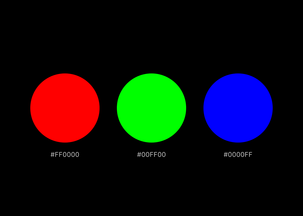
Select all layers, stack them on top of one another, and set the blend mode to "Screen"
Nudge the top and bottom layers around until you achieve an effect you're looking for. You're pretty much done, and can stop here (or not 🤨)
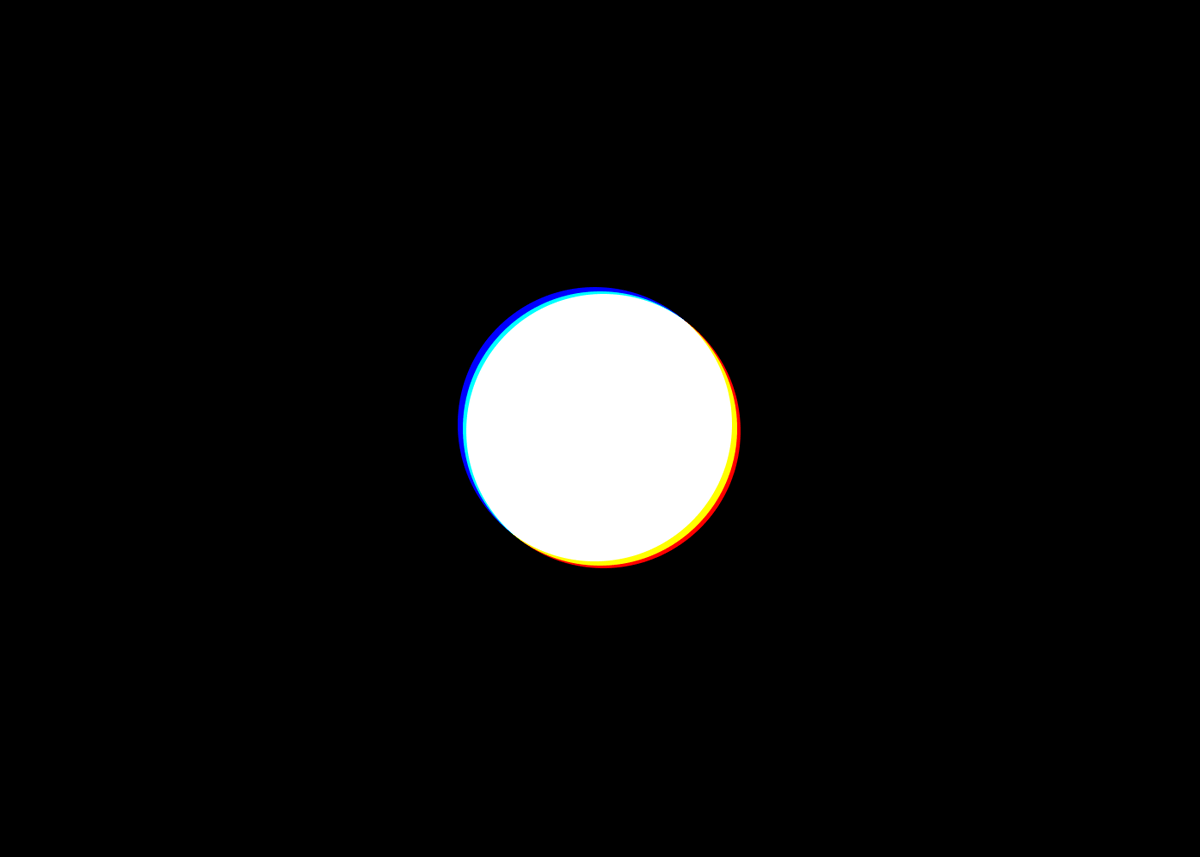
 Image
👨🏻‍🍳 Pro tip: If you want to create a smoother transition, you can select all layers and apply a layer blur (I'm using a value of 5 for this example)
The process of adding this effect to an image is very similar:

- select your image, add a fill (one of the RGBs) & set the fill's blend mode to "Multiply".
- duplicate the image & repeat this process for next RGB color
- stack layers, set blend to screen, displace, & add a blur
Hope this was helpful! If you need more help, you can grab the Figma file here → dub.sh/chromatic

• • •

Missing some Tweet in this thread? You can try to force a refresh
 

Keep Current with Aleks

Aleks Profile picture

Stay in touch and get notified when new unrolls are available from this author!

Read all threads

This Thread may be Removed Anytime!

PDF

Twitter may remove this content at anytime! Save it as PDF for later use!

Try unrolling a thread yourself!

how to unroll video
  1. Follow @ThreadReaderApp to mention us!

  2. From a Twitter thread mention us with a keyword "unroll"
@threadreaderapp unroll

Practice here first or read more on our help page!

More from @aleksliving

Jun 15
Framer's "Start with AI" has been out for a couple of days now & I've seen a lot of discourse surrounding the release.

I've gotten so many DMs asking for my thoughts about it and where I think it's going, so I decided to put it all together here ↓ Image
To preface - I want to give kudos to @jornvandijk & the whole Framer team for pulling this off. This release is a huge achievement and a major milestone for nocode website builders. That said, this is obviously just the beginning
1️⃣ I think most people will agree that watching a blank canvas transform into a website based on a few lines of text is not only impressive, but also really fun. This part is really exciting 👨🏻‍🍳
Read 12 tweets
Mar 24
Hey! It's Framer Friday 🤩

Let's add some sweet parallax to our project in under 5 minutes using the underrated "Scroll Speed" effect ↓
This was my initial setup → just a bunch of rows with content stacks. You can start with whatever layout you want, depending on the effect you're trying to achieve 👩‍🎨
Begin by selecting your first content stack (image/text/frame, whatever it may be) & apply a "Scroll Speed" effect to it.

Keep the position set to "current," and bump up the speed. For my first row, I used a value of 150%
Read 5 tweets
Mar 17
It's Framer Friday! 🥳

Let's make this fun card reveal animation (complete with automatic light & dark modes). Legggo ↓
👩‍🎨 Begin by designing your card. When you're satisfied with the vibes, select it & create a new component (⌘ + ⌥ + K)

If you're following along, we'll also create 2 variables (for the image, and the counter). That way, we can easily update them later.
😮‍💨 Some initial set up:

• add a vertical stack layout to the page & set the gap to 0
• set the page height to "fit"
• select your card & create a stack (set its width to 100% and it's height to 100vh)
• Duplicate this section, delete the card, and rename it to "top"
Read 9 tweets
Mar 13
Let's make this super fun 3D button in @framer
Before we begin, make sure you have some 3D shapes (PNGs are fine).

🧊 These can be whatever you want, here are mine↓
👨🏻‍🍳 Start by creating the hover state for your button. Just move & rotate your shapes around until the vibes tell you to stop (try adding some subtle layer blurs to create additional depth)

Then, select everything & create a component.
Read 7 tweets
Mar 8
I've been seeing a lot of talk about @framer's new video button. I think it's pretty dope, let's make it! ✨
Begin by drawing a frame → this will be the background of your button. Resize it & round the corners. Then:

• Insert a video, scale it up to the width of your button, & drag it into your frame
• upload your video (duh)
Add your text & icon and style it however you want. With both items selected, hit ⌥ +⌘+ ⏎ to add a stack. Drag it into the frame.

💡 To make my text more readable, I lowered the video's opacity a little bit
Read 6 tweets
Feb 28
Framer February → Day 28 ✨

A super quick way to display your current visitor's location in @framer. Legggo ↓
👨🏻‍🎨 Begin by designing your location display. You can do whatever you want, just keep in mind that this override provides 2 properties:

1. City, Region, Country
2. Emoji Flag
Once you're happy with your design🚶🏻 head over to GitHub, and grab all of this code ↓
bit.ly/41vO4tQ
Read 7 tweets

Did Thread Reader help you today?

Support us! We are indie developers!


This site is made by just two indie developers on a laptop doing marketing, support and development! Read more about the story.

Become a Premium Member ($3/month or $30/year) and get exclusive features!

Become Premium

Don't want to be a Premium member but still want to support us?

Make a small donation by buying us coffee ($5) or help with server cost ($10)

Donate via Paypal

Or Donate anonymously using crypto!

Ethereum

0xfe58350B80634f60Fa6Dc149a72b4DFbc17D341E copy

Bitcoin

3ATGMxNzCUFzxpMCHL5sWSt4DVtS8UqXpi copy

Thank you for your support!

Follow Us on Twitter!

:(