Namya @ Supafast Profile picture
Jun 23, 2023 β€’ 16 tweets β€’ 5 min read β€’ Read on X
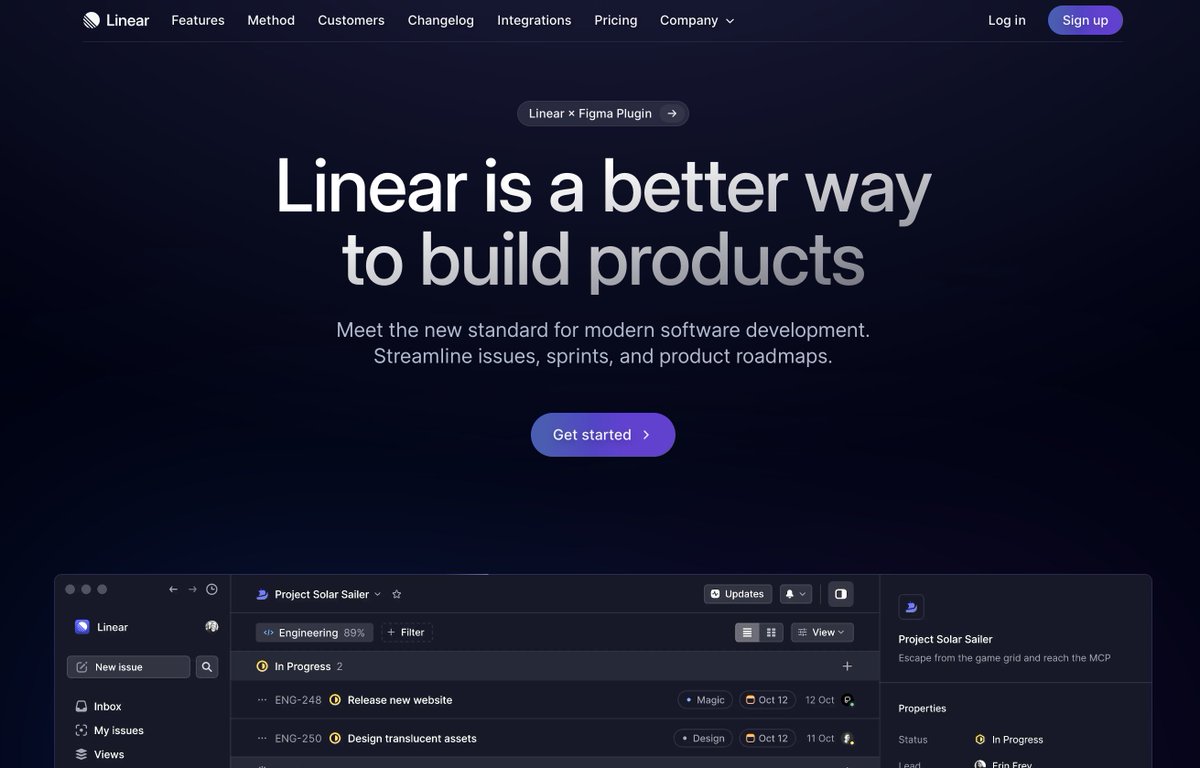
Linear's design is a perfect blend of UI/UX and engineering.

Here're 8 websites inspired by Linear for your next project:
1/ Raycast [ @raycastapp ]

πŸ”— https://t.co/BVfOjHWcLHraycast.com
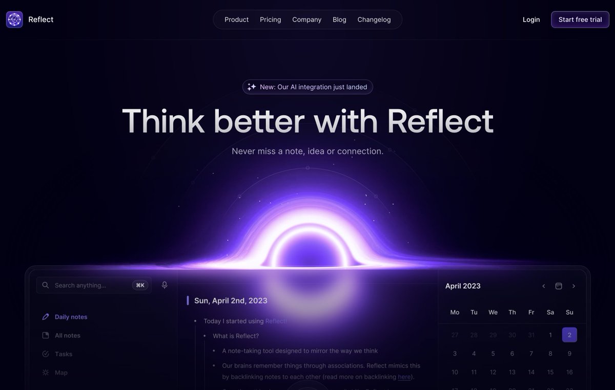
2/ Reflect [ @reflectnotes ]

πŸ”— https://t.co/wX5hNvTMRgreflect.app
3/ Fig [ @fig ]

πŸ”— https://t.co/sEPKHsJGVgfig.io
4/ Twingate [ @TwingateHQ ]

πŸ”— https://t.co/Vp17qs9oHMtwingate.com
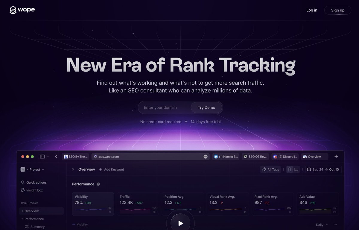
5/ Wope [ @wopehq ]

πŸ”— https://t.co/mrAOehKEHdwope.com
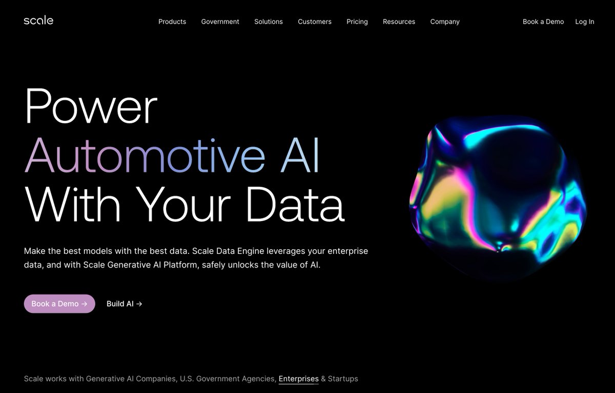
6/ Scale [ @scale_AI ]

πŸ”— https://t.co/biS9Ujw9Nxscale.com
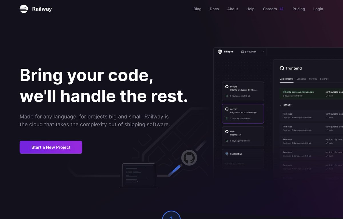
7/ Railway [ @Railway ]

πŸ”— https://t.co/HeUAy1wtOfrailway.app
8/ Linear [ @linear ]

πŸ”— https://t.co/aTMzvR9Sv9linear.app
That's it for today! If you enjoyed this thread:

β†’ Follow me @namyakhann for more.
β†’ RT the first tweet to share with others.
@krish_iyyer Agreed! It looks stunning🀩
@_PixelPrism AGREEED!πŸ”₯
@faizanafzal πŸ™
@Kanojiyaaakash1 Thanks!
@al3rez Glad you like it, AliπŸ™Œ
@BelebSolutions ✊🏼

β€’ β€’ β€’

Missing some Tweet in this thread? You can try to force a refresh
γ€€

Keep Current with Namya @ Supafast

Namya @ Supafast Profile picture

Stay in touch and get notified when new unrolls are available from this author!

Read all threads

This Thread may be Removed Anytime!

PDF

Twitter may remove this content at anytime! Save it as PDF for later use!

Try unrolling a thread yourself!

how to unroll video
  1. Follow @ThreadReaderApp to mention us!

  2. From a Twitter thread mention us with a keyword "unroll"
@threadreaderapp unroll

Practice here first or read more on our help page!

More from @namyakhann

Oct 1, 2024
Your fancy website design is killing your conversions!

The main goal? Visitors β†’ Customers

But most sites let complex designs destroy this.

Here are 7 modern design trends for MAX conversions:
1. Animations

Problem:

Distracting animations take focus from your message and slow load times.

Fix:

Use subtle animations. Think of hover effects on buttons, smooth scroll transitions, or quick loading indicators.

Keep it light to maintain fast load times.
2. Dark Mode

Problem:

Hard to read, especially outdoors. Can hurt accessibility and conversions.

Fix:

Use dark backgrounds to highlight key sections.

Keep 70-80% of pages light for better readability.

If using 100% dark, use bright colors for contrast.
Read 8 tweets
Jul 2, 2024
Your website gets tons of traffic, but NO sales?

The problem isn't traffic - it's CONVERSION.

Most businesses struggle to turn visitors into customers.

7 must-have sections for a high-converting landing page:
Main Fold

β€’ Navigation Bar: key links, sticky CTA

β€’ Heading: USP with clear benefits

β€’ Subheading: expand on heading

β€’ Visual: short product demo

β€’ CTA: clear next step

Pro tip: Make it eye-catching and communicate your value proposition in seconds.
Benefits > Features

Features tell, but benefits sell. People want solutions, not just products.

Focus on how your product/service:

β€’ Solves problems
β€’ Improves wealth
β€’ Enhances health
β€’ Strengthens relationships

Pro tip: Use visuals to make benefits scan and stand out: bullet points, bento, grids, custom illustrations and icons.
Read 9 tweets
Jun 27, 2024
Copying your competitor's website is KILLING your business!

The main goal? A website that makes you stand out.

But most entrepreneurs copy-paste.

Here's my 5-step formula to create a site that STANDS OUT:
Define your USP

A unique selling proposition shows what you offer and why customers should choose you.

1. What are you selling?
Be specific about your product/service.

2. Who is your target audience?
Know exactly who you're talking to.

3. Attention-grabbing headline
Make it impossible to ignore.

4. What are you doing better than your competitors? Highlight your key differentiators.

Goal: Instantly communicate your value to customers.

Pro Tip: Test different USPs with your audience.
Build a Unique Brand Identity

1. Define your brand personality.

2. Create a consistent color palette & typography.

3. Design a memorable logo.

4. Use unique imagery that tells your story.

Goal: Make your site a brand experience they can't forget!

Pro Tip: Consistency across all pages strengthens your brand.
Read 7 tweets
Jun 26, 2024
Landing pages are getting too complex.

But, humans have an 8-second attention span.

Here’s my secret recipe for a high-converting landing page (in 6 easy steps): Image
1. Navigation Bar:

β€’ Only main links and sticky CTA.

2. Heading:

β€’ What is your USP?
β€’ What are you selling?
β€’ Use benefit-driven languageβ€”no vague, clever words.
3. Subheading:

β€’ Explain the heading's claim in detail with product features.

4. CTV>CTA:

β€’ CTA = "Do this"
β€’ CTV = "Here's WHY you should"
β€’ What's the next step you want visitors to take?
Read 5 tweets
Jun 25, 2024
Your fancy website design is killing your conversions!

The main goal? Visitors β†’ Customers

But most sites let complex designs destroy this.

Here are 9 modern design trends for MAX conversions:
Animations

Problem: Distracting animations take focus from your message and slow load times.

Fix: Use subtle animations. Think of hover effects on buttons, smooth scroll transitions, or quick loading indicators.

Keep it light to maintain fast load times.
Dark Mode

Problem: Hard to read, especially outdoors. Can hurt accessibility and conversions.

Fix: Use dark backgrounds to highlight key sections.

Keep 70-80% of pages light for better readability.

If using 100% dark, use bright colors for contrast.
Read 10 tweets
Jun 21, 2024
Your website is the gateway to making millions in 2024.

But if it's outdated, you're leaving money on the table.

Here are 9 signs your website is holding your business back (and how to fix it for more revenue):
Your layout is more confusing than solving a Rubik's Cube blindfolded.

If navigating your site feels like solving a blindfolded Rubik's cube, you have a UX issue.

Confusing navigation and clutter drive visitors away.

Fix: Simplify navigation, use clear CTAs, and prioritize key information.
Your design is older than the Mona Lisa's smile

An outdated design can make your business appear out of touch with current trends and customer expectations.

Fix: Update to match current web trends and your brand identity.
Read 11 tweets

Did Thread Reader help you today?

Support us! We are indie developers!


This site is made by just two indie developers on a laptop doing marketing, support and development! Read more about the story.

Become a Premium Member ($3/month or $30/year) and get exclusive features!

Become Premium

Don't want to be a Premium member but still want to support us?

Make a small donation by buying us coffee ($5) or help with server cost ($10)

Donate via Paypal

Or Donate anonymously using crypto!

Ethereum

0xfe58350B80634f60Fa6Dc149a72b4DFbc17D341E copy

Bitcoin

3ATGMxNzCUFzxpMCHL5sWSt4DVtS8UqXpi copy

Thank you for your support!

Follow Us!

:(