When skyscrapers were first invented nobody knew what they should look like.
But then, in the 1920s, an architect called Raymond Hood designed the American Radiator Building and the Tribune Tower.
Should Art Deco and Neo-Gothic skyscrapers make a comeback?
But then, in the 1920s, an architect called Raymond Hood designed the American Radiator Building and the Tribune Tower.
Should Art Deco and Neo-Gothic skyscrapers make a comeback?

When skyscrapers first became possible in the late 19th century it wasn't obvious how to actually design them.
Other than cathedrals, minarets, and pagodas, nothing of this size or shape had ever been built before — and the purpose, materials, and context were totally different.
Other than cathedrals, minarets, and pagodas, nothing of this size or shape had ever been built before — and the purpose, materials, and context were totally different.


Although there were precursors in Britain, the modern skyscraper was born in the US, in the 1880s.
But they looked rather odd at first; nobody had figured out how to design them yet.
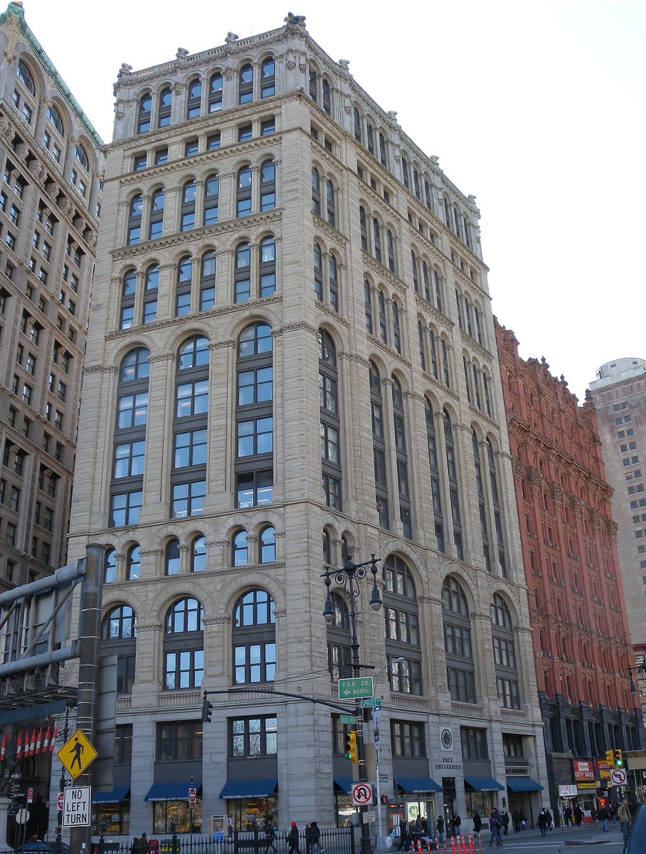
Take something like the original NYT Building; notice how it seems almost jumbled.
But they looked rather odd at first; nobody had figured out how to design them yet.
Take something like the original NYT Building; notice how it seems almost jumbled.
Enter Louis Sullivan.
He was the first architect to figure out how skyscrapers could work, and his ideas were dominant for decades.
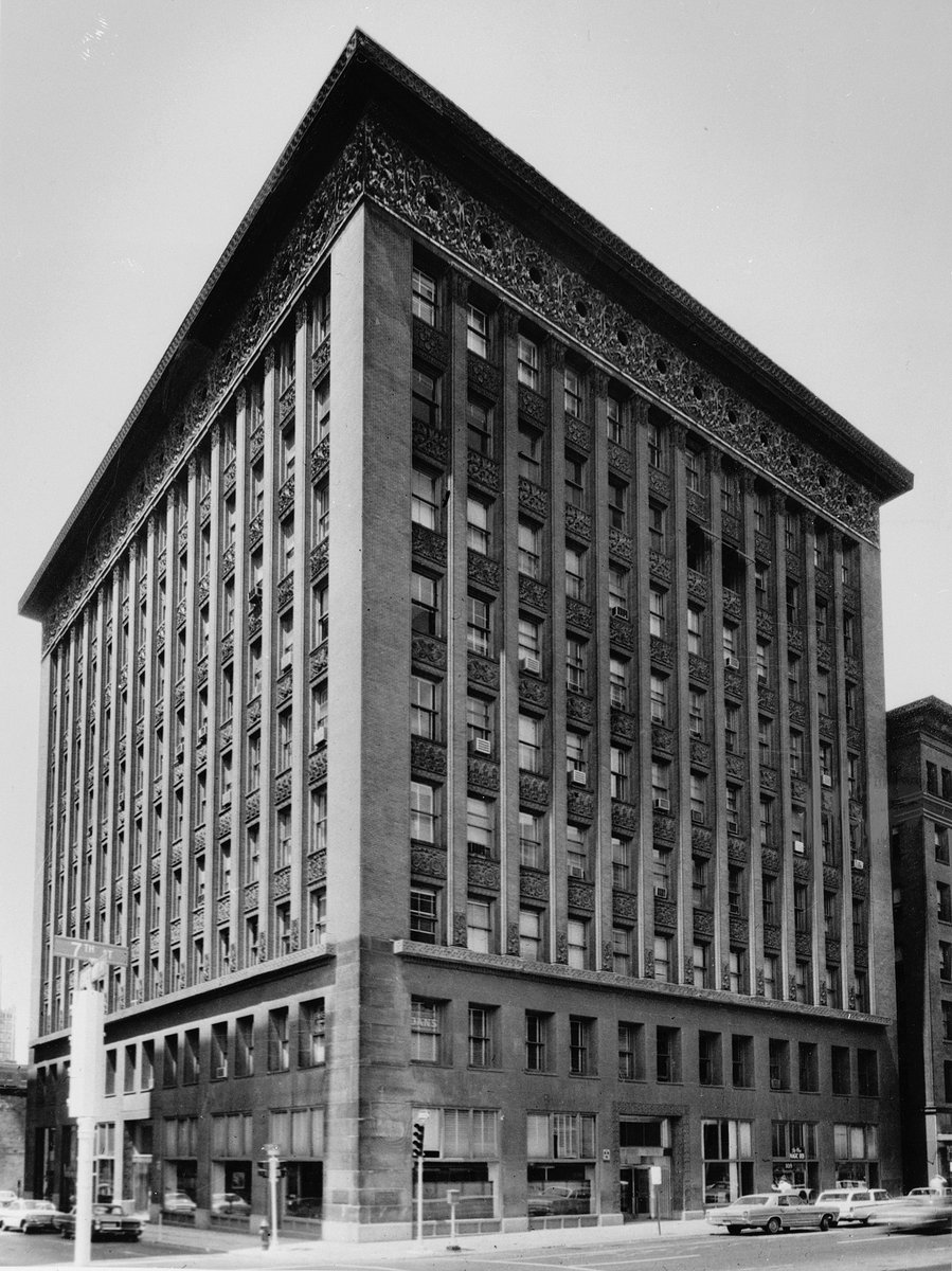
How does Sullivan's Wainwright Building (left) compare to another early skyscraper, the Home Insurance Building (right)?
He was the first architect to figure out how skyscrapers could work, and his ideas were dominant for decades.
How does Sullivan's Wainwright Building (left) compare to another early skyscraper, the Home Insurance Building (right)?

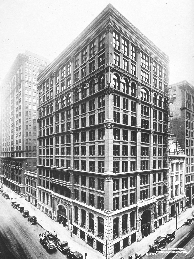
Notice how the vertical elements of the Wainwright Building are brought forward into unbroken lines stretching from top to bottom, while the horizontal elements are made secondary.
The opposite is true of the Home Insurance Building; its horizontal lines are emphasised instead.
The opposite is true of the Home Insurance Building; its horizontal lines are emphasised instead.

What Sullivan realised is that "loftiness" was the defining quality of a skyscraper — so he emphasised verticality and subdued all else.
Suddenly the skyscraper made sense; it looked right.
He explained this in an article called The Tall Office Building Artistically Considered:
Suddenly the skyscraper made sense; it looked right.
He explained this in an article called The Tall Office Building Artistically Considered:

It was also here that Sullivan made his much-misunderstood (and misquoted) "form (ever) follows function" statement.
That has been taken to mean ornament has no place in architecture. But Sullivan obviously did not quite mean this; just look at the Wainwright Building.
That has been taken to mean ornament has no place in architecture. But Sullivan obviously did not quite mean this; just look at the Wainwright Building.


In any case, Sullivan had made an architectural breakthrough, and skyscrapers all around the US were soon designed according to his ideas.
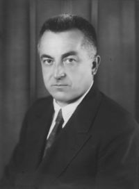
At which point... enter Raymond Hood, born in 1881, who would become Sullivan's heir as the master architect of the skyscraper.
At which point... enter Raymond Hood, born in 1881, who would become Sullivan's heir as the master architect of the skyscraper.
Hood rose to international fame after he won the highly publicised competition to design Chicago's Tribune Tower in 1922.
Architects from around the world entered, including radical Europeans like Loos, Gropius, and Taut, whose submissions have since proven prophectic.
Architects from around the world entered, including radical Europeans like Loos, Gropius, and Taut, whose submissions have since proven prophectic.

But Hood's neo-Gothic design, made in partnership with John Mead Howells and inspired by Rouen Cathedral, won first place.
Its ornate pinnacle catches the eye, but look at the rest of the tower — simple and lofty.
A perfect balance of form, decoration, and function?
Its ornate pinnacle catches the eye, but look at the rest of the tower — simple and lofty.
A perfect balance of form, decoration, and function?

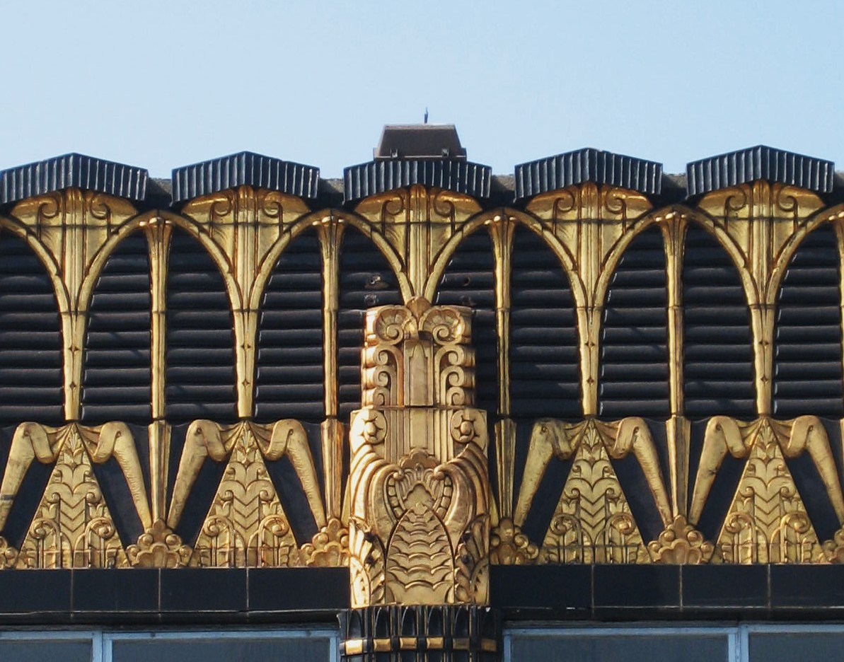
This was soon followed by Hood's design for the American Radiator Building, built in 1924.
Though it predates Art Deco, this remarkable tower seems to encapsulate the style entirely: bold, geometric, abstract, vigorous, decadent, futuristic, monumental...
Though it predates Art Deco, this remarkable tower seems to encapsulate the style entirely: bold, geometric, abstract, vigorous, decadent, futuristic, monumental...

It includes gilded ornamentation and sculptures by Rene Paul Chambellan (who also worked on Tribune Tower) in vivid contrast with the black, lacquer-like bricks.
Was this the birth and apotheosis of Art Deco all at once?
Was this the birth and apotheosis of Art Deco all at once?

The Radiator Building caused a huge stir — then again, so did all of Hood's skyscrapers.
He broke with conventional ideas time and time again, and his businessman-like, irreverent attitude played into his reputation as an architectural upstart.
From an article written in 1924:
He broke with conventional ideas time and time again, and his businessman-like, irreverent attitude played into his reputation as an architectural upstart.
From an article written in 1924:

One of the defining qualities of Art Deco skyscrapers is their use of set-backs.
But this wasn't really a design choice — it was necessitated by New York's 1916 Zoning Resolution, introduced after the construction of the Equitable Building, an extraordinary Sullivanian edifice.
But this wasn't really a design choice — it was necessitated by New York's 1916 Zoning Resolution, introduced after the construction of the Equitable Building, an extraordinary Sullivanian edifice.

Authorities thought the Equitable Building dominated its surroundings too much, preventing air and light from reaching street level.
The Zoning Resolution limited the size of buildings at certain heights, in relation to their plot size, thus making setbacks a necessity.
The Zoning Resolution limited the size of buildings at certain heights, in relation to their plot size, thus making setbacks a necessity.

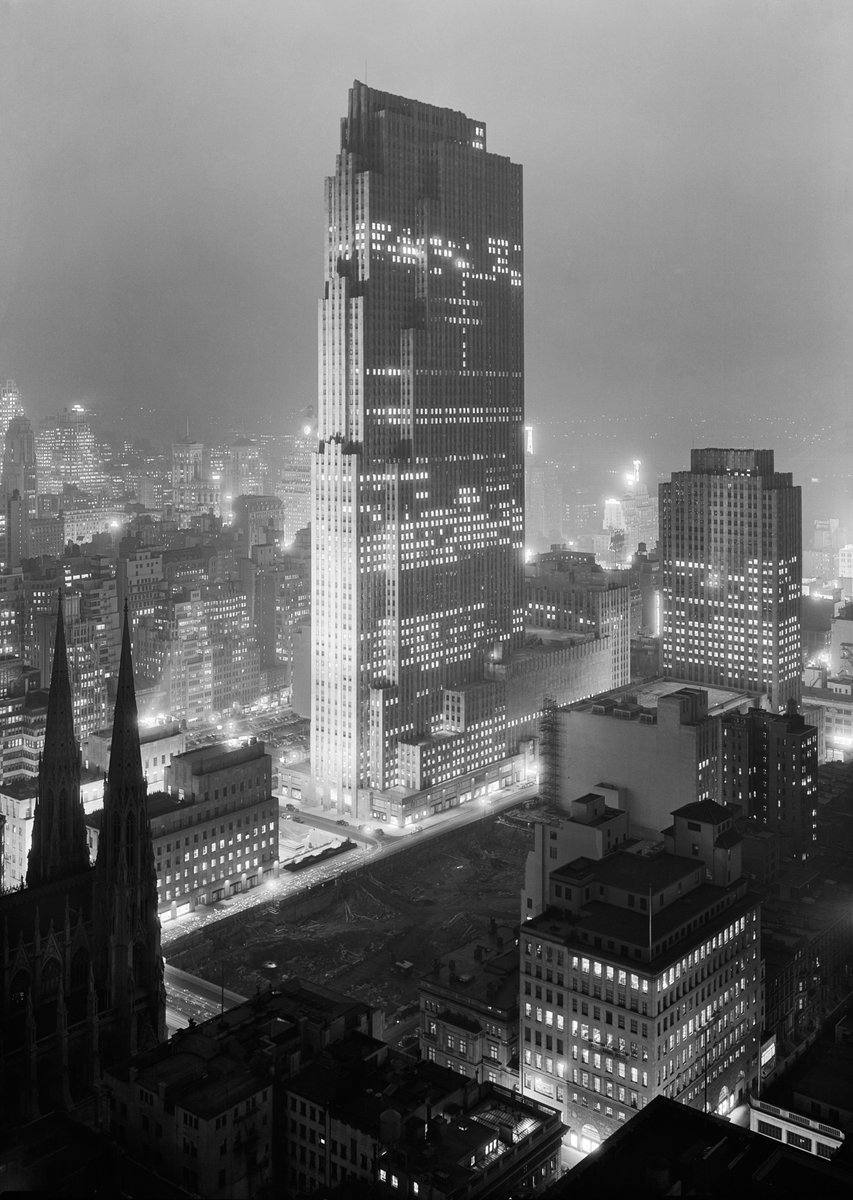
And it was according to these regulations that Hood designed something like the Rockefeller Center.
Hood never lost sight of Sullivan's discovery — that loftiness was a skyscraper's chief quality — and successfully used setbacks without harming the verticality of his towers.
Hood never lost sight of Sullivan's discovery — that loftiness was a skyscraper's chief quality — and successfully used setbacks without harming the verticality of his towers.
Nor, like Sullivan, did he shy away from decoration — though Hood's eventual preference was for colour and pattern rather than ornament, as in the brickwork of the Daily News Building.
And his style grew even more simplified; Art Deco was being supplanted by nascent Modernism.
And his style grew even more simplified; Art Deco was being supplanted by nascent Modernism.

Hood's final skyscraper, the McGraw-Hill Building, from 1931, was incredibly modern — it had much in common with the radical architecture of the Bauhaus in Europe.
This went beyond Sullivanism. But Hood had always been a moderniser; the McGraw-Hill was simply the next step.
This went beyond Sullivanism. But Hood had always been a moderniser; the McGraw-Hill was simply the next step.

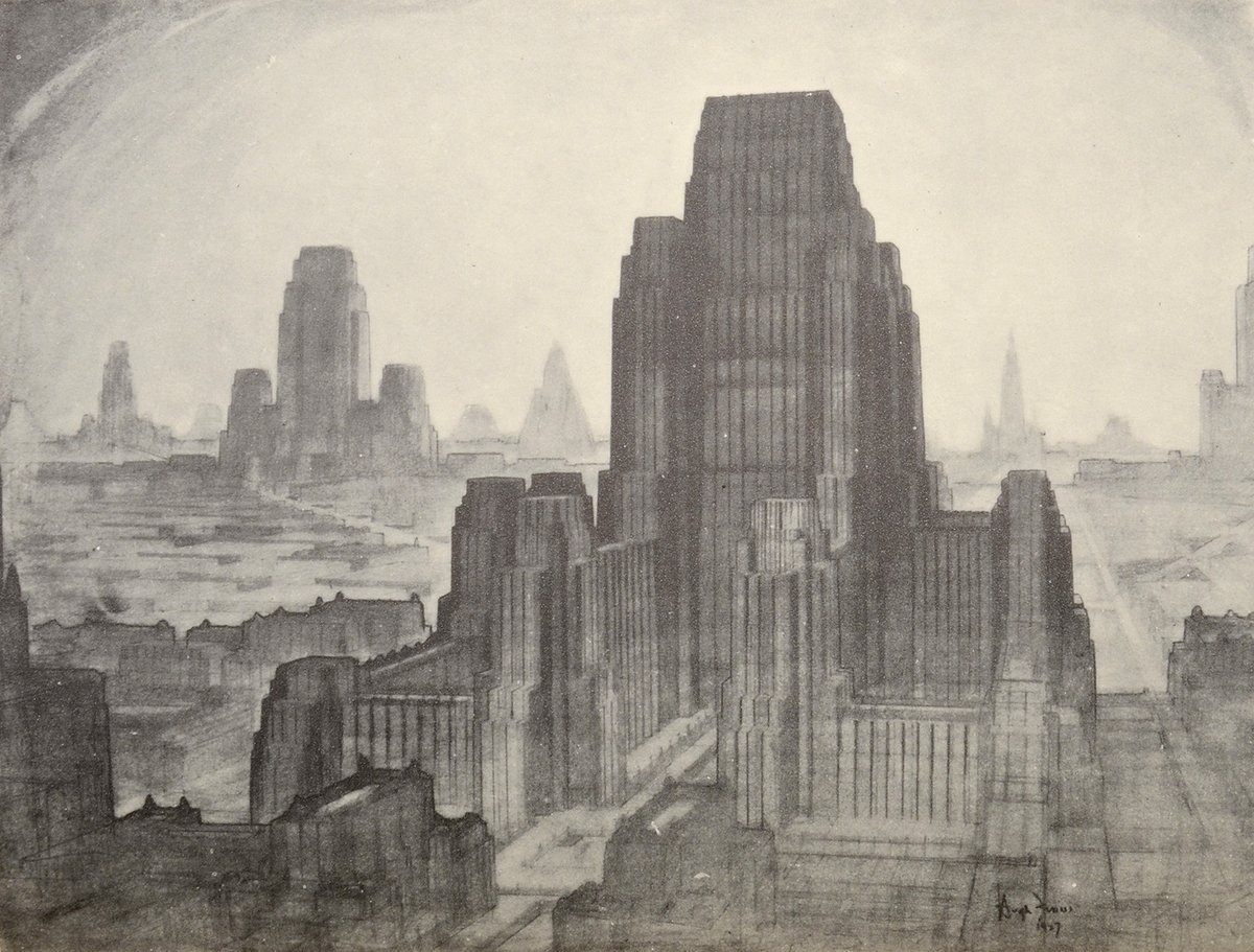
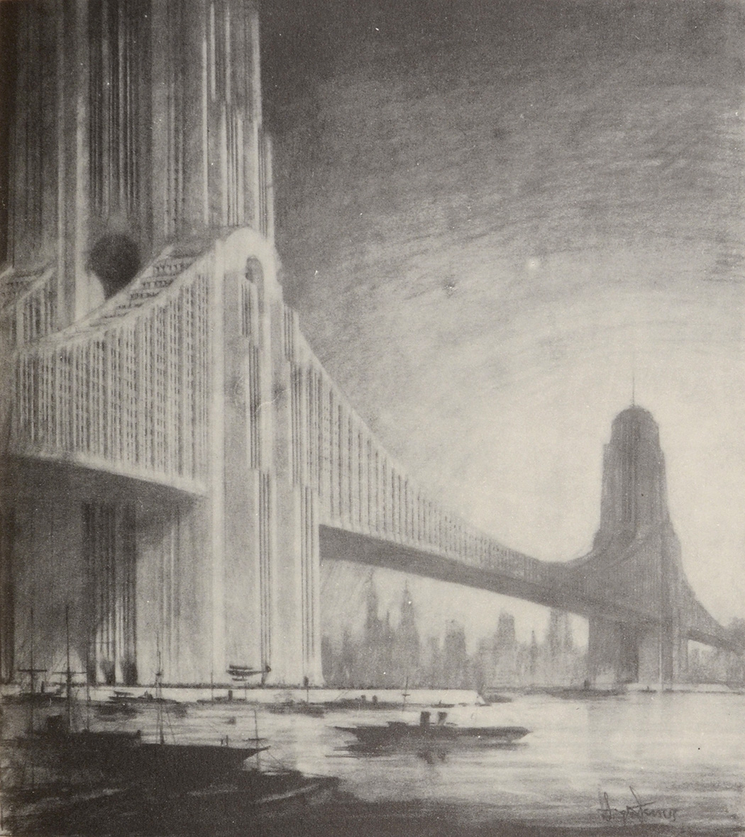
It's also worth mentioning that Hood worked with a visionary architectural illustrator called Hugh Ferriss — one of the most influential illustrators of his day.
Ferriss was fascinated by urban design and its impact on emotion and psychology; his illustrations are works of art.
Ferriss was fascinated by urban design and its impact on emotion and psychology; his illustrations are works of art.
Raymond Hood died in 1934, which roughly coincided with the halt in US skyscraper construction that lasted until the postwar boom and the rise of Modernism, or the International Style.
Striking, impressive, sometimes beautiful — but Hood's 1920s style was long gone by then.
Striking, impressive, sometimes beautiful — but Hood's 1920s style was long gone by then.
There's no single way to build anything, of course, but the skyscrapers designed by Raymond Hood during his brief but electric career, especially in the 1920s, offer a model which many people would like to see emulated in the 21st century.
An architectural icon worth reviving?
An architectural icon worth reviving?

• • •
Missing some Tweet in this thread? You can try to
force a refresh