Today we say goodbye to this great blue bird
This logo was designed in 2012 by a team of three. @toddwaterbury, @angyche and myself,
The logo was designed to be simple, balanced, and legible at very small sizes, almost like a lowercase "e", a 🧵


This logo was designed in 2012 by a team of three. @toddwaterbury, @angyche and myself,
The logo was designed to be simple, balanced, and legible at very small sizes, almost like a lowercase "e", a 🧵

There was essentially no brief, other than we want a new bird, and it should be as good as the Apple and Nike logo. Twitter had made some sort of flying goose - but Jack wanted something simpler


So, I just started drawing birds.
Drawing is one of the quickest ways to understand how the shapes can work together


Drawing is one of the quickest ways to understand how the shapes can work together


I was also trying to capture the motion of birds, and the shape that profile created led us to play with that round belly in the 3rd and 4th sketches


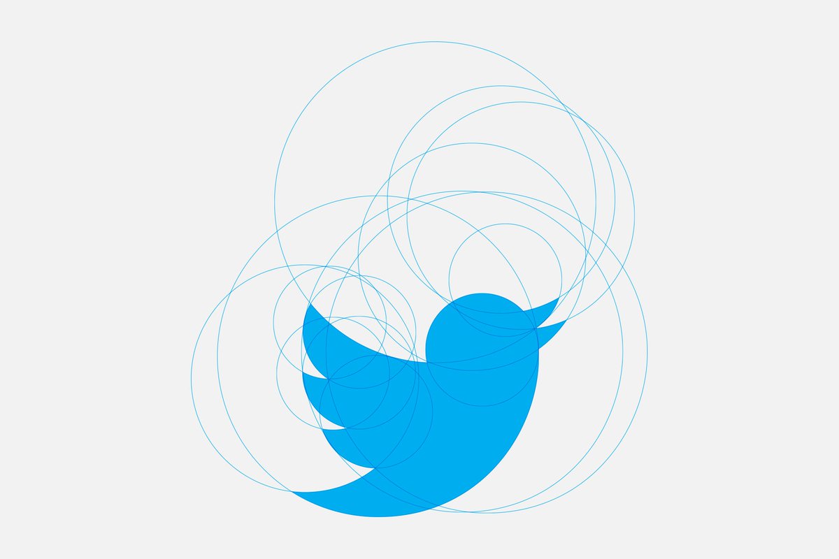
We liked using a circles to construct our drawings, it felt like the bird should have an underlying neutrality and simplicity about it



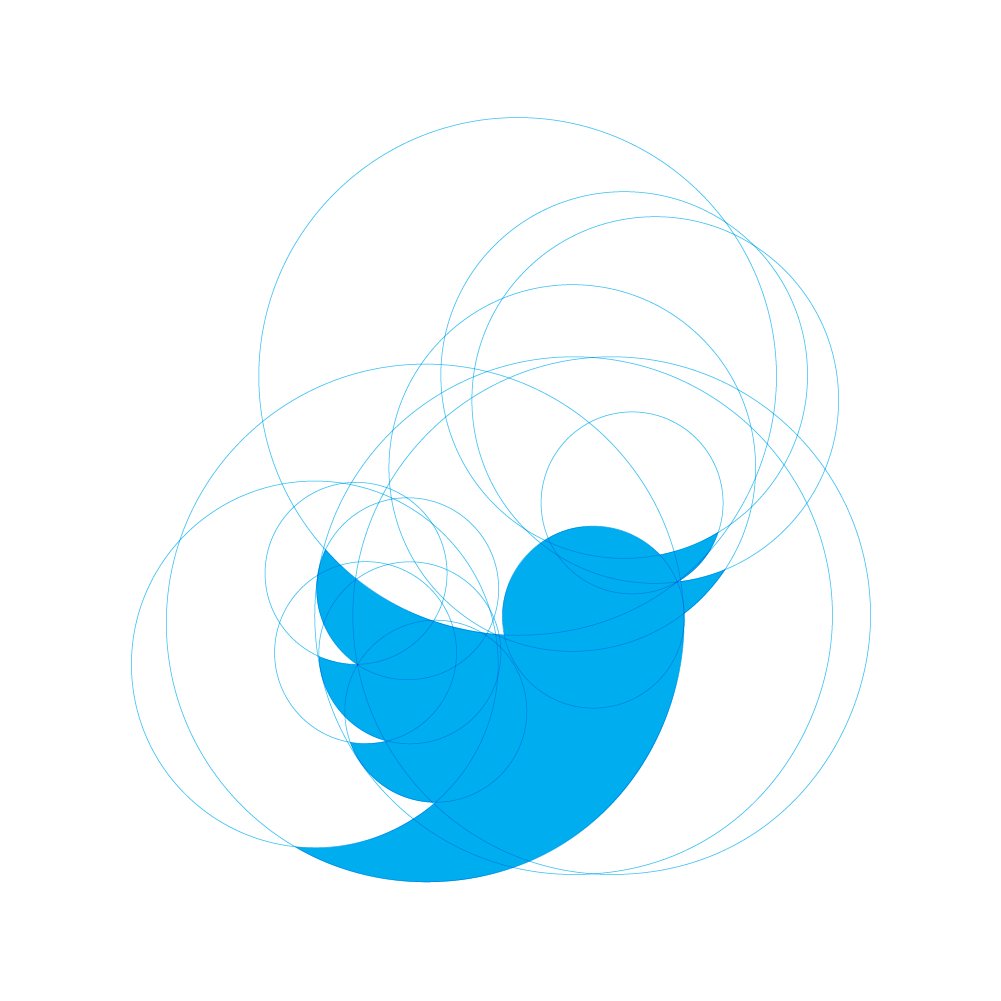
From that point on we really spent our time perfecting every little detail... so that it felt balanced, and visible as a bird at the smallest of sizes.


Sometime in March we had an approved bird and it launched in May of 2012.
This little blue bird did so much over the last 11 years, 🫡


This little blue bird did so much over the last 11 years, 🫡


• • •
Missing some Tweet in this thread? You can try to
force a refresh

