“The Power Of Three,” also known as the “AMD” pattern.
What is it, and how to trade it?
A thread 🧵
What is it, and how to trade it?
A thread 🧵
AMD stands for three phases that occur in the pattern:
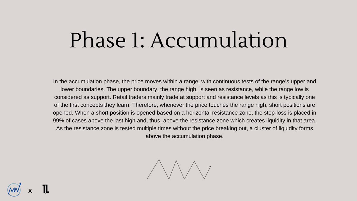
[A]ccumulation — This refers to a phase where ‘smart money’ takes positions and gradually accumulate assets at favorable prices. This phase is often characterized by sideways movement of the price.
[A]ccumulation — This refers to a phase where ‘smart money’ takes positions and gradually accumulate assets at favorable prices. This phase is often characterized by sideways movement of the price.
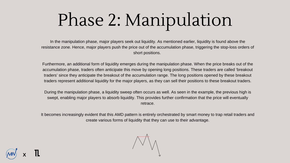
[M]anipulation — Manipulation refers to the activity of certain market participants who try to influence prices to fill their orders, or to get rid of their positions. These can be large players trying to affect sentiment and deceive other traders into selling or buying.
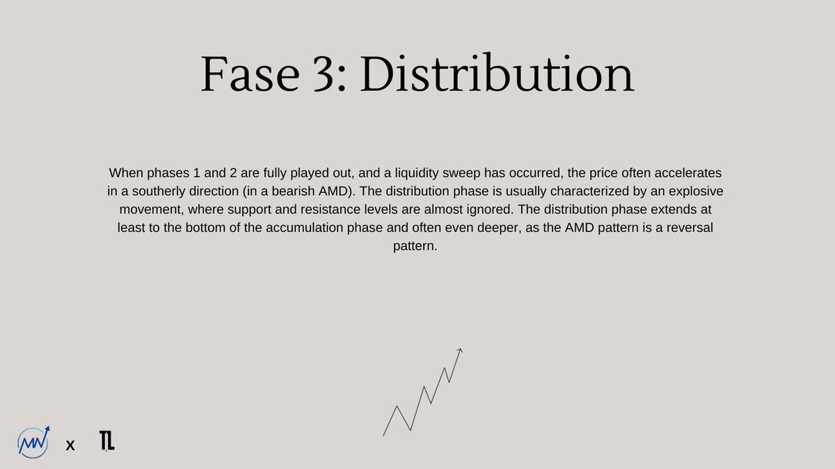
[D]istribution — This is the opposite of accumulation. In this phase, smart traders gradually sell or buy their positions, attracting less novice traders to purchase assets at higher prices, or sell at lower prices. This often leads to a downward/upward expansion move.
In the image below, we see the three phases of the AMD model depicted.
Note that this is a bearish AMD, but the model can also appear in a bullish form.
What is important to remember is that the accumulation phase often lasts the longest.
Note that this is a bearish AMD, but the model can also appear in a bullish form.
What is important to remember is that the accumulation phase often lasts the longest.
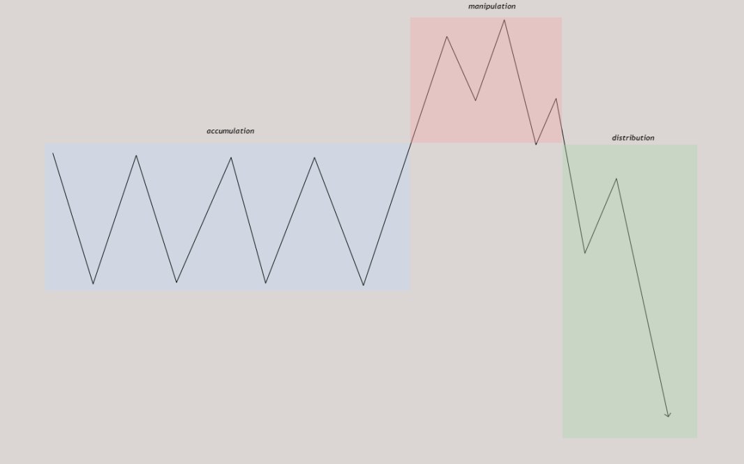
The manipulation phase is usually relatively short, and liquidity is almost always removed at the top in case of a bearish AMD pattern. The distribution phase is characterized by a rapid and forceful movement, where support and resistance levels are largely ignored.
Let’s delve deeper into the psychology behind this model. It’s good to observe price action moving up and down, and candles forming in both directions, but you must always remember that every price movement tells a story.

What you see on the chart is essentially a result of human behavior and emotions. Understanding this human behavior can be advantageous. A bearish AMD model is created by smart money to sell their current positions.
A bullish AMD model is created by smart money to fill their positions, and thus, to buy. The AMD model ensures that major players have sufficient liquidity to trade their positions.
Let’s go through the phases of the model step by step and see how liquidity is formed and how major players use this liquidity to their advantage. We use the image below to explain the three phases.

Phase 1: Accumulation
Phase 2: Manipulation
Phase 3: Distribution
Now that we know how to spot an AMD pattern, the next step is, of course, to capitalize on it and take advantage. As I always say, “when you trade, think like a major player, not like a retail trader.” This also applies in this situation.
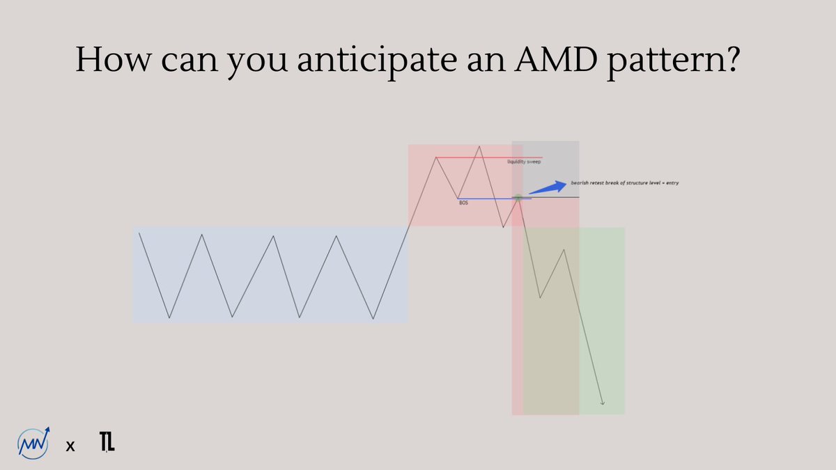
It’s essential to understand that you shouldn’t anticipate the accumulation phase but rather strike during the manipulation phase since this is also when major players strike.
So, we let the accumulation phase form, and as soon as the price breaks above the accumulation phase, we start looking for shorts. We often see in the manipulation phase, after the sweep of the high, that a break of structure (BOS) forms, which you can anticipate by going short.
Personally, I usually open a short position on a bearish retest of the break of structure level, which we also call ‘the breaker’. I often place my stop-loss above the high of the manipulation phase, and my target depends on how the price action has formed.
The setup looks as follows (see image).
This pattern can be applied to any timeframe and any asset since manipulation by major players occurs everywhere. Additionally, this pattern can be used for both short and long positions.
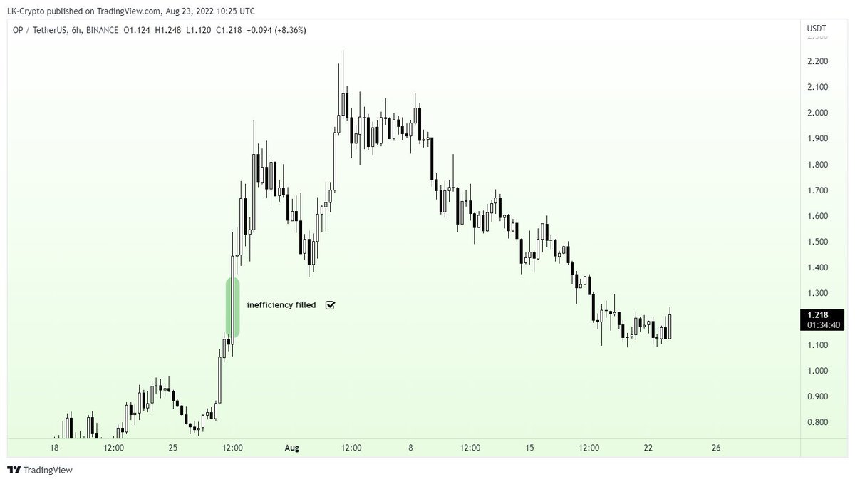
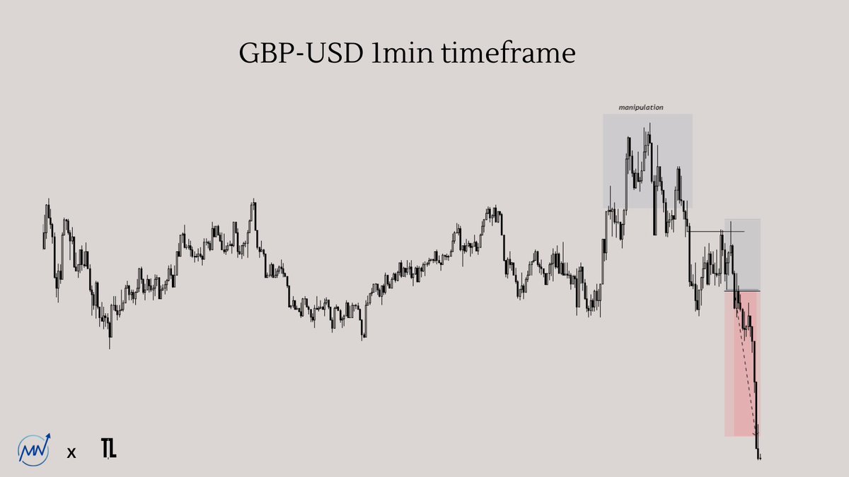
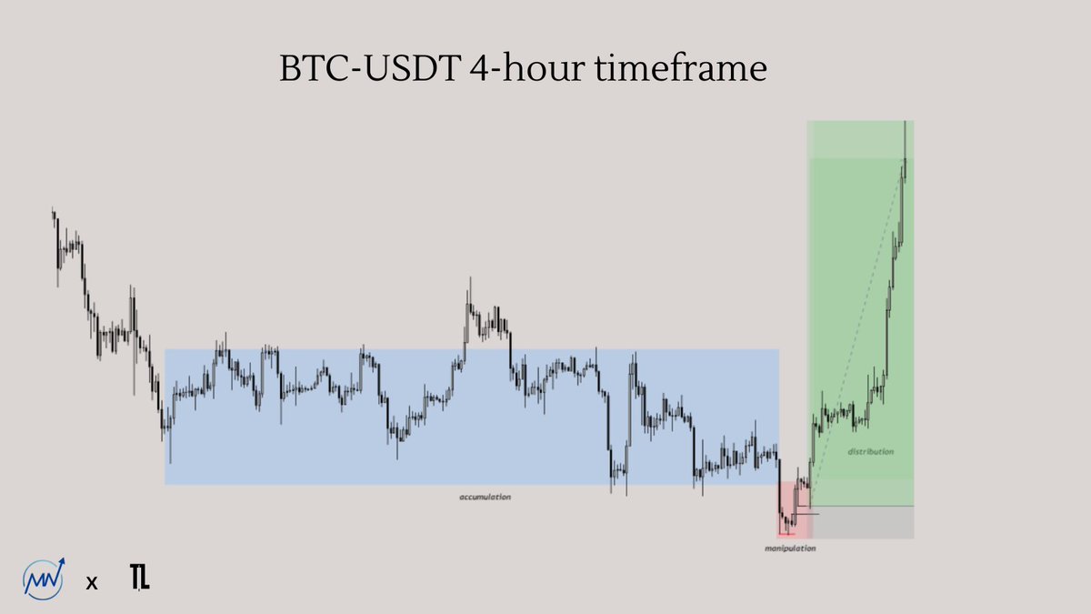
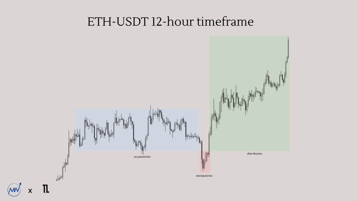
Here are some examples:
$GU 1min timeframe
Here are some examples:
$GU 1min timeframe
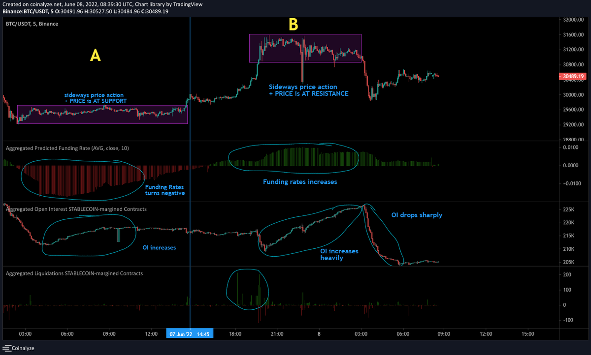
$BTC 4-hour timeframe
$ETH 4-hour timeframe

$ETH 12-hour timeframe
The full document has been shared in the @MNTrading_ discord, where we share educational documents like this on a weekly basis!
Join the discord via the link: discord.com/invite/Evbns6H…
Join the discord via the link: discord.com/invite/Evbns6H…
Thanks for reading this thread, and hopefully everything is clear now. If you have any questions, please let me know in the comments 🫡
Likes and retweets are very much appreciated, as always 🩷
Likes and retweets are very much appreciated, as always 🩷
Source: @RektProof & @I_Am_The_ICT
However, I want to emphasize that I have never watched a video from ICT or RektProof about this model, so everything described in this thread is based on my own observations and experience.
However, I want to emphasize that I have never watched a video from ICT or RektProof about this model, so everything described in this thread is based on my own observations and experience.
• • •
Missing some Tweet in this thread? You can try to
force a refresh