NEW: it’s become popular to say that supply and demand simply don’t apply when it comes to housing, but the evidence is clear:
When you build lots of homes — affordable or market-rate — prices and rents flatten and even fall 😃
My latest
And a thread:on.ft.com/3EMJpcE
When you build lots of homes — affordable or market-rate — prices and rents flatten and even fall 😃
My latest
And a thread:on.ft.com/3EMJpcE
A great study by @ClaytonNall and co found that people have a good understanding that if the supply of a product or service increases, its price will decrease, and vice versa...
Except when it comes to housing 🤔
papers.ssrn.com/sol3/Delivery.…

Except when it comes to housing 🤔
papers.ssrn.com/sol3/Delivery.…

We’re used to Nimbys opposing housebuilding because it lowers their property values, but they’ve found unexpected allies on the left, who argue against new market-rate housing on the basis that it *increases* rents and prices — harming those on low incomes.
But is this true?
But is this true?
No.
As noted by @1finaleffort, the recent evidence on the impact of supply on prices is compelling.
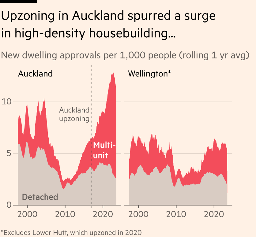
In 2016 much of Auckland was rezoned to allow for higher-density building. The results were threefold:
1) A boom in construction of dense housing, predominantly at market rates
As noted by @1finaleffort, the recent evidence on the impact of supply on prices is compelling.
In 2016 much of Auckland was rezoned to allow for higher-density building. The results were threefold:
1) A boom in construction of dense housing, predominantly at market rates

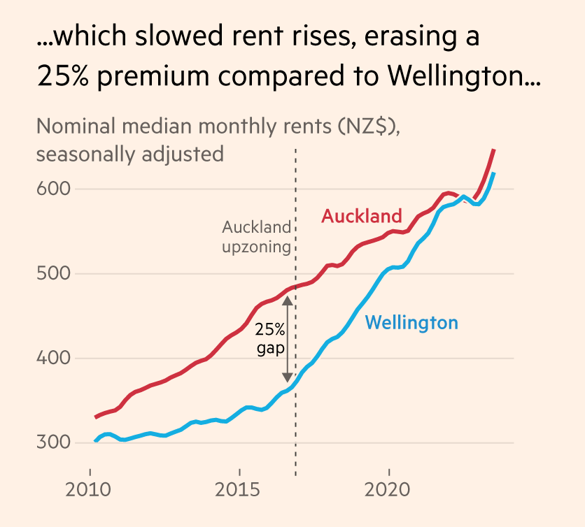
2) That caused nominal rent rises to slow in Auckland, erasing a 25% gap vs the capital, Wellington, where supply did not surge and nominal rents therefore increased much faster. 

3) In fact, once you adjust for inflation, rents in Auckland today are at the same level as they were 7 years ago before rezoning and the surge in supply.
Meanwhile in Wellington renting is now 25% more expensive in real terms.
Build more houses!
Meanwhile in Wellington renting is now 25% more expensive in real terms.
Build more houses!

It’s a similar story in the US Midwest, where Minneapolis has been building more housing than any other large city in the region for years, and has completely abolished all zones that limited construction to single-family housing.
The result?
Rents have fallen in real terms 😃
The result?
Rents have fallen in real terms 😃

The same is true right across the region.
From Minneapolis (surge in housing supply) and Milwaukee (shrinking population, i.e falling housing demand), to Indianapolis and Columbus (housing not keeping pace with population), supply and demand are working just as we’d expect.
From Minneapolis (surge in housing supply) and Milwaukee (shrinking population, i.e falling housing demand), to Indianapolis and Columbus (housing not keeping pace with population), supply and demand are working just as we’d expect.

With the headline supply, demand and price issue addressed, we can get into some of the more nuanced counterpoints that are sometimes raised.
@geographyjim has an research note summarising the evidence here, but I’ll zoom in on a couple of key points data.london.gov.uk/housing/resear…
@geographyjim has an research note summarising the evidence here, but I’ll zoom in on a couple of key points data.london.gov.uk/housing/resear…
One view especially prevalent among affordable housing advocates is that only by building subsidised housing can you increase affordability. That market-rate dwellings will simply go to people on higher incomes, leaving lower earners high and dry.
The evidence says otherwise.
The evidence says otherwise.
Studies from the US, Sweden & Finland all show that although most people who move *directly into* new unsubsidised housing come from the top half of earners, the chain of moves triggered by their purchase frees up housing in the same cities for people on lower incomes. 

The US study found that building 100 new market-rate homes ultimately leads to ~70 people moving out of below-median income neighbourhoods, and ~40 moving out of the poorest fifth.
This holds even if the new housing is priced towards the top end of the market.
This holds even if the new housing is priced towards the top end of the market.
NB if you’re wondering why market-rate housing seems to help low-income people more in Europe than the US, the researchers have a theory:
It’s not because of anything to do with the housing; it’s because income inequality and segregation are higher in the US than Europe.
It’s not because of anything to do with the housing; it’s because income inequality and segregation are higher in the US than Europe.

Another argument is that building market-rate housing in a lower-income area leads to gentrification, with higher earners moving into a lower-income area and displacing the incumbents.
But the latest research suggests this is almost exactly backwards.
But the latest research suggests this is almost exactly backwards.
It’s not that rich people merrily choose to move to low income areas, and end up pushing out poorer residents.
Studies show there’s little if any displacement out of the new areas, but it’s the supposed gentrifiers who were displaced out of their own areas due to lack of supply.


Studies show there’s little if any displacement out of the new areas, but it’s the supposed gentrifiers who were displaced out of their own areas due to lack of supply.


In other words, even if you think it’s inherently bad if high earners move into poorer neighbourhoods, the answer is to build more market-rate housing in higher-income areas so those people are not forced out of the areas they currently live in.
To conclude:
If you want to improve housing availability and affordability for all, the good news is that any new housing will help.
Subsidised housing? Excellent. Market-rate homes? Also great.
Here’s the full piece on.ft.com/3EMJpcE
If you want to improve housing availability and affordability for all, the good news is that any new housing will help.
Subsidised housing? Excellent. Market-rate homes? Also great.
Here’s the full piece on.ft.com/3EMJpcE
And @geographyjim’s thread and report are worth reading in full to capture all the nuances
https://twitter.com/geographyjim/status/1692116503536029733
• • •
Missing some Tweet in this thread? You can try to
force a refresh

 Read on Twitter


