Josh (Your CFO Guy) Profile picture
Oct 15, 2023 13 tweets 5 min read Read on X
Charts are one of the most powerful features that Excel offers…

and each one has their own time & place for when you should use them.

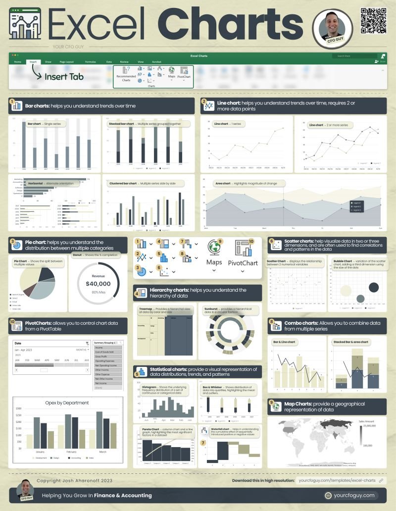
Here's Every Excel Chart, and When to Use it

Let’s do a walk through of each chart: Image
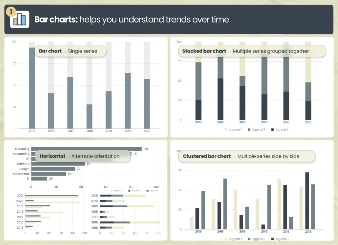
𝟭. 📊Bar charts → helps you understand trends over time.

• Bar chart → single series

• Stacked bar chart → multiple series grouped together

• Clustered bar chart → multiple series side by side

• Horizontal → alternate orientation Image
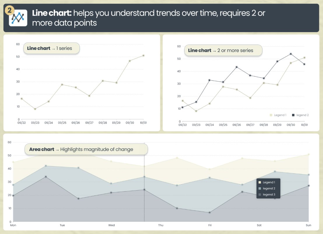
𝟮. 📈 Line chart → helps you understand trends over time, with a line

• Line chart → can show 1 or multiple series. I like to utilize 2 series when I’m trying to understand the intersection

• Area chart → highlights magnitude of change by shading the bottom Image
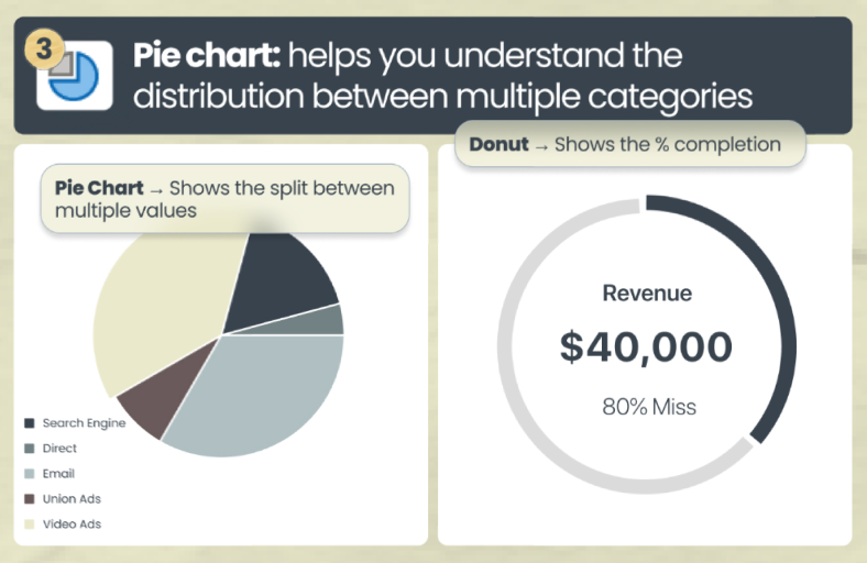
𝟯. 🟡 Pie chart → helps you understand the distribution between multiple categories

• Pie Chart → shows the split / distribution between multiple categories

• Donut → shows the % completion. This is in essence a hollow pie chart (my favorite for budget vs actuals) Image
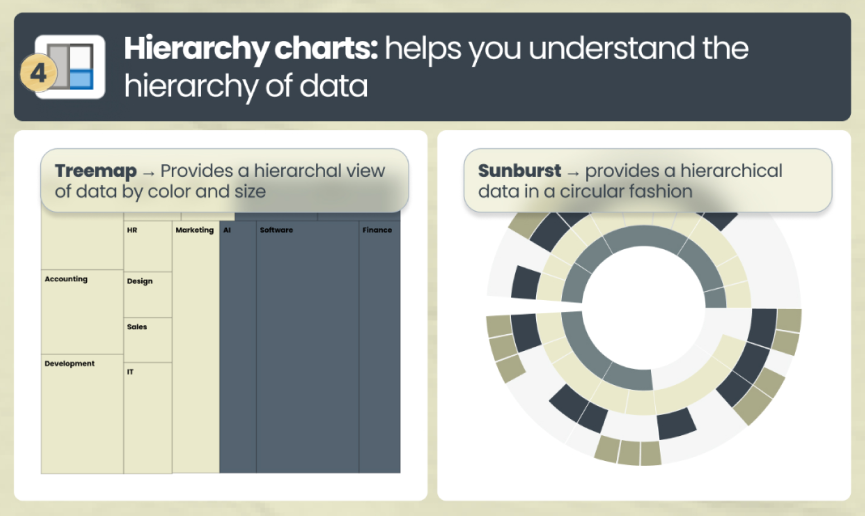
𝟰. Hierarchy charts → helps you understand the hierarchy of data

• Treemap → provides a hierarchal view of data by color and size

• Sunburst → provides a hierarchical data in a circular fashion Image
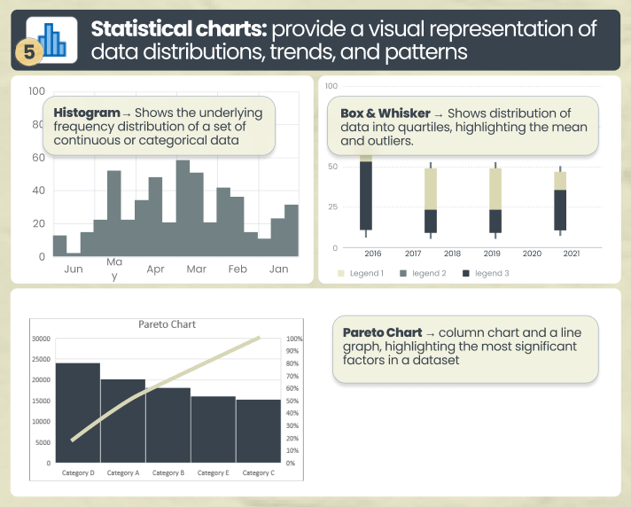
𝟱. 🔢 Statistical charts → provide a visual representation of data distributions, trends, and patterns

• Histogram → Shows the underlying frequency distribution
• Box & Whisker → Shows distribution of data into quartiles, highlighting the mean and outliers.

• Pareto Chart → displays both the individual and cumulative frequencies Image
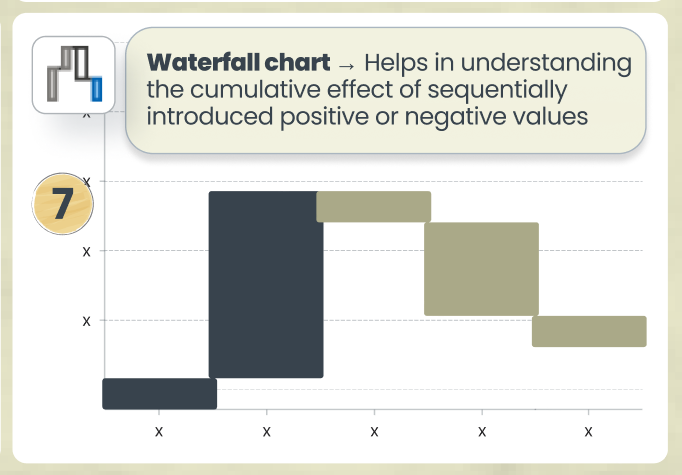
𝟲. Waterfall chart → Helps in understanding the cumulative effect of sequentially introduced positive or negative values

This is especially relevant when showcasing MRR and ARR Image
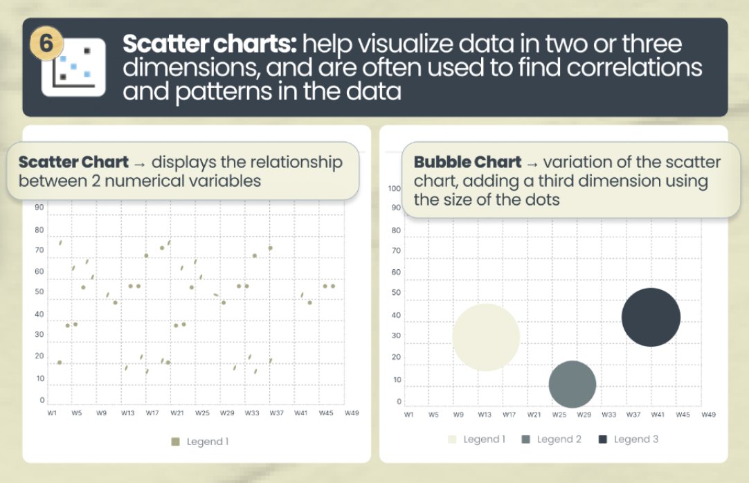
𝟳. Scatter charts → often used to find correlations and patterns in the data

• Scatter Chart → displays the relationship between 2 numerical variables

• Bubble Chart → variation of the scatter chart, adding a third dimension using the size of the dots. Image
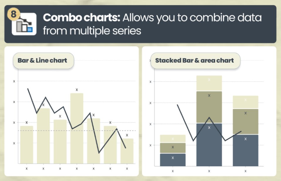
𝟴. Combo charts → allows you to combine data from multiple series

Helpful when you have information across 2 distinct series (like Revenue and Gross Margin) Image
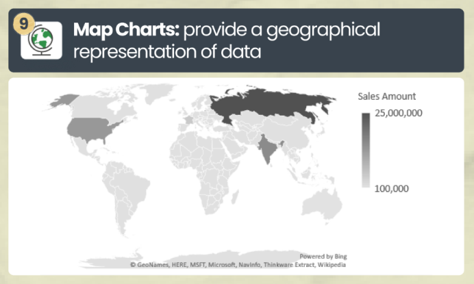
𝟵. 🗺️ Map Charts → provide a geographical representation of data Image
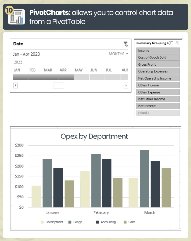
𝟭𝟬. PivotCharts → allows you to control chart data from a PivotTable Image
What are some other ways that you present financial data?

Let me know your thoughts in the comments

🚩PS: Level up your career and get Finance & Accounting tips like this delivered right to your inbox:
yourcfoguy.com/newsletter
Image

• • •

Missing some Tweet in this thread? You can try to force a refresh
 

Keep Current with Josh (Your CFO Guy)

Josh (Your CFO Guy) Profile picture

Stay in touch and get notified when new unrolls are available from this author!

Read all threads

This Thread may be Removed Anytime!

PDF

Twitter may remove this content at anytime! Save it as PDF for later use!

Try unrolling a thread yourself!

how to unroll video
  1. Follow @ThreadReaderApp to mention us!

  2. From a Twitter thread mention us with a keyword "unroll"
@threadreaderapp unroll

Practice here first or read more on our help page!

More from @YourCFOGuy

Jun 22
Two elements can fund your business...

but each has their tradeoffs

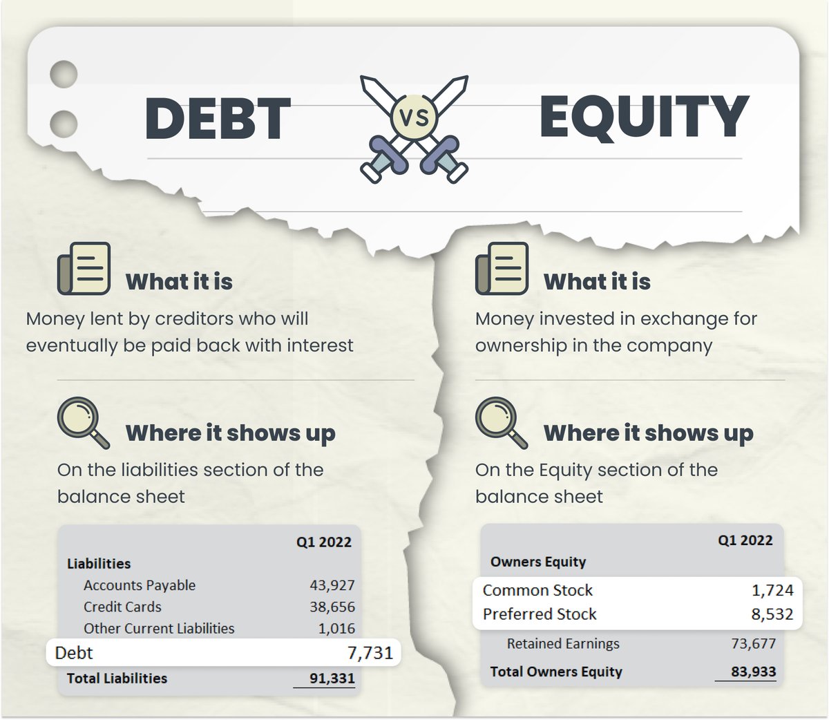
𝗗𝗲𝗯𝘁 𝘃𝘀 𝗘𝗾𝘂𝗶𝘁𝘆

Learn more about them here... Image
𝗪𝗵𝗮𝘁 𝗮𝗿𝗲 𝘁𝗵𝗲𝘆?

𝗗𝗲𝗯𝘁 ➡️ Money lent by creditors who will eventually be paid back with interest

𝗘𝗾𝘂𝗶𝘁𝘆 ➡️Money invested in exchange for ownership in the company Image
𝗪𝗵𝗲𝗿𝗲 𝗱𝗼 𝘁𝗵𝗲𝘆 𝘀𝗵𝗼𝘄 𝘂𝗽?

𝗗𝗲𝗯𝘁 ➡️ On the liabilities section of the balance sheet

𝗘𝗾𝘂𝗶𝘁𝘆 ➡️On the Equity section of the balance sheet Image
Read 8 tweets
May 25
Dashboards are my favorite thing to create in Microsoft Excel...

and when set up correctly, they add a ton of value to a presentation

Here is how I build Dashboards using just 8 steps... Image
Step 1: Import your data

This can be anything...

but most commonly, it involves your:

1. Profit & Loss
2. Balance Sheet

from there you can get your cash flows via the indirect method

other areas to import can be revenue, headcount, and other KPIs Image
Step 2: Clean with Power Query

Before you can work with your data in a flexible & dynamic way…

it needs to be structured correctly.

That’s where Power Query comes in.

If you haven’t used Power Query….oh boy…you are missing out. Image
Read 10 tweets
May 24
This post contains EVERYTHING you can do in excel 😱👇

Excel continues to be the #1 tool used for Finance & Accounting professionals…

and for good reason.

With excel, there are pretty much no limits to what you can accomplish.

Let’s do a walk through it all 👀 : Image
📁 File → access & manage key areas of your workbook

This is where most people start out when they open an excel file…

here you can create a new file…open an existing file..

access a template…or access key options. Image
🏠 Home → access your clipboard, font, alignment, number format, cell styles, and filters

My favorite tools here are:

• Set paste options

• Control cell aesthetics

• Change cell format

• Formatting cells Image
Read 12 tweets
May 10
Learn about the 3 financial statements, and how they are all connected

In just a few minutes, I'm going to teach you the most important concepts behind the Financial Statements...

and we're going to have a TON of fun along the way... Image
The 3 financial statements are:

1. The Profit & Loss
2. The Balance Sheet
3. The Statement of Cash Flows

You may also hear of the Statement of Changes in Equity, and Notes to the financial statements, but those aren't as commonly included
Before we dive into each statement...

It's important to understand the difference between:

the CASH basis
→ treats money in as income
→ money out as expenses

the ACCRUAL basis
→ treats amounts EARNED as income
→ amounts INCURRED as expenses Image
Read 22 tweets
Apr 18
The ABCs of Excel 🔠

Sing along with me and learn Excel... 🎶 Image
A
Alt
Press "Alt" to access Excel's Ribbon shortcuts for quick navigation and task execution.

B
Bar Chart
One of the most popular ways to display data via a chat with an X and Y-axis

C
Conditional Formatting
Automatically formats cells based on specified criteria Image
D
Donut chart
A popular chart showing proportionate parts of a whole, with a center cutout

E
Excel
The most powerful tool on the planet

F
Function
Predefined formula that performs calculations using arguments Image
Read 12 tweets
Mar 7
This is the MOST POPULAR function in Excel 😱

In fact…it’s probably the most popular function in all of computer programming 🤯

Ofc,I’m talking about the IF Function…

And today we’re going to do a deep dive on how it works…

(stick till the end to get my free worksheet) Image
=IF

This one is really simple to understand…

IF this condition is True…

return the first argument…

ELSE…

Return the 2nd argument Image
=IFERROR

Here you add a condition to your formula to return a value…

if it would otherwise return an ERROR.

I especially like to use this one when dividing one item by another (in case there’s a 0 in the denominator). Image
Read 11 tweets

Did Thread Reader help you today?

Support us! We are indie developers!


This site is made by just two indie developers on a laptop doing marketing, support and development! Read more about the story.

Become a Premium Member ($3/month or $30/year) and get exclusive features!

Become Premium

Don't want to be a Premium member but still want to support us?

Make a small donation by buying us coffee ($5) or help with server cost ($10)

Donate via Paypal

Or Donate anonymously using crypto!

Ethereum

0xfe58350B80634f60Fa6Dc149a72b4DFbc17D341E copy

Bitcoin

3ATGMxNzCUFzxpMCHL5sWSt4DVtS8UqXpi copy

Thank you for your support!

Follow Us!

:(