
Landing page design advice to convert warm and cold traffic 2-3x better (that has nothing to do with colors):


High-converting landing pages always have a few things in common... no matter the industry.
We’re going to explore:
• overall design
• emotion
• color
• headlines
• CTA’s
• trust
• images
• scan-ability
• structure
You ready?
Let’s get started…
We’re going to explore:
• overall design
• emotion
• color
• headlines
• CTA’s
• trust
• images
• scan-ability
• structure
You ready?
Let’s get started…
1. Overall Structure & Design
The best landing pages have:
• specific headline
• intriguing hook
• amazing offer
• tons of social proof
• urgency & scarcity
• a clear CTA
• bonuses
• client/customer wins
• no off-page navigation
And one more big one…
The best landing pages have:
• specific headline
• intriguing hook
• amazing offer
• tons of social proof
• urgency & scarcity
• a clear CTA
• bonuses
• client/customer wins
• no off-page navigation
And one more big one…
A simple design that flows together without being crowded.
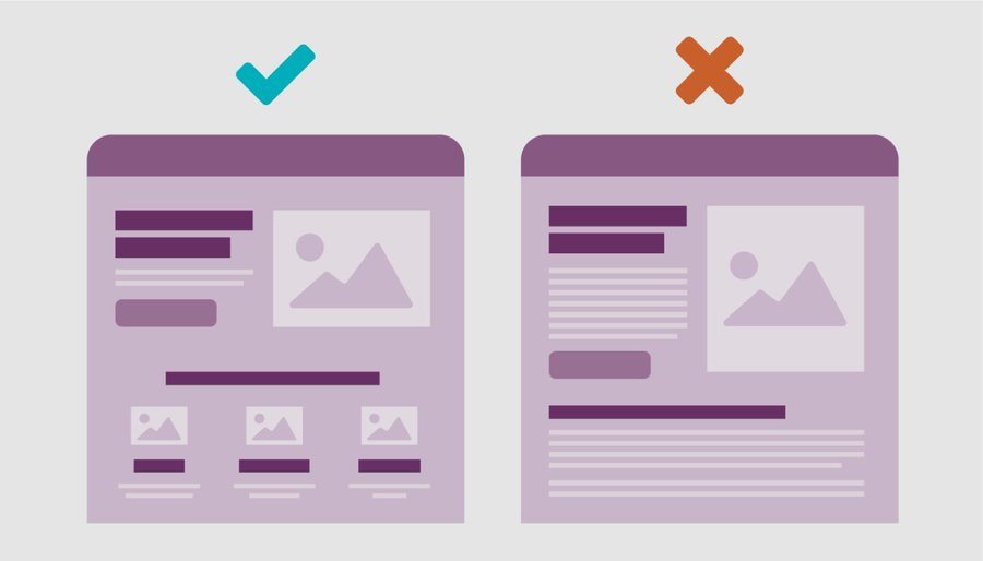
Crowded landing pages:
• don’t highlight important information
• make you read everything on the page
• lose the reader & reduce conversions
Here’s an example of a page that is too crowded and has poor readability:
Crowded landing pages:
• don’t highlight important information
• make you read everything on the page
• lose the reader & reduce conversions
Here’s an example of a page that is too crowded and has poor readability:

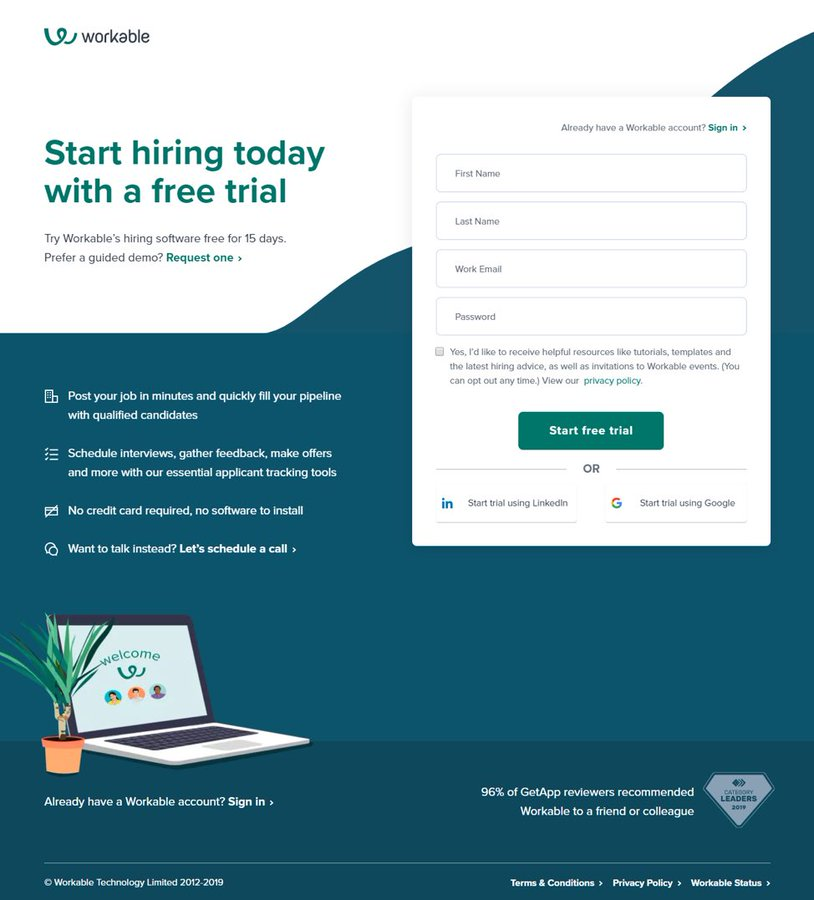
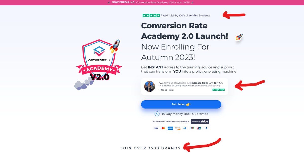
To avoid crowded pages, you want to provide enough space between different sections and elements.
Cutting out any fluff in your wording also allows for better flow and higher conversions.
Here’s a page that breaks up their sections better while also including fewer words:
Cutting out any fluff in your wording also allows for better flow and higher conversions.
Here’s a page that breaks up their sections better while also including fewer words:
2. Emotion
There are a number of ways to provoke emotion on your landing page:
• color
• pain points
• solutions
• more humans
Everyone and their mother has heard of different colors meaning different things but…
You don’t need to memorize that.
Here’s why…
There are a number of ways to provoke emotion on your landing page:
• color
• pain points
• solutions
• more humans
Everyone and their mother has heard of different colors meaning different things but…
You don’t need to memorize that.
Here’s why…
You should pick colors that match your brand and product.
Most of you don’t have million-dollar companies so why are you thinking like one?
If you want to use red - use it.
Just don’t be silly with crazy colors (use common sense here).
Go to for help.coolors.co
Most of you don’t have million-dollar companies so why are you thinking like one?
If you want to use red - use it.
Just don’t be silly with crazy colors (use common sense here).
Go to for help.coolors.co
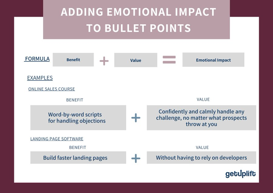
I don’t want to dive too deep into this but…
Your ideal customer’s pain points and solutions to those problems should be all over the page.
Research their problems.
Paint your offer as the solution to them.
(tip below in the picture)
And to make it feel MORE personal…
Your ideal customer’s pain points and solutions to those problems should be all over the page.
Research their problems.
Paint your offer as the solution to them.
(tip below in the picture)
And to make it feel MORE personal…
Add some pictures of people smiling.
Try and avoid basic stock photos as well.
People can sniff out the real stuff.
Take the time to take your own pictures or use ones that aren’t so “fake”.
It’ll increase conversions I promise.
Doesn’t this make you feel happy?
Try and avoid basic stock photos as well.
People can sniff out the real stuff.
Take the time to take your own pictures or use ones that aren’t so “fake”.
It’ll increase conversions I promise.
Doesn’t this make you feel happy?
3. Designing Your Headlines
Everyone always talks about writing great headlines but no one mentions their layout.
Like the first picture I showed you, it’s important that you mix up the font size.
You’ll be able to capture your reader’s attention whenever you want.
So...
Everyone always talks about writing great headlines but no one mentions their layout.
Like the first picture I showed you, it’s important that you mix up the font size.
You’ll be able to capture your reader’s attention whenever you want.
So...
I like following the order of:
• small text (10pt font)
• large text (20pt font)
• medium text (14pt font)
Small text - introduction/callout
Large text - main headline + attention-grabbing
Medium text - how they can benefit
Here’s a great example:
• small text (10pt font)
• large text (20pt font)
• medium text (14pt font)
Small text - introduction/callout
Large text - main headline + attention-grabbing
Medium text - how they can benefit
Here’s a great example:

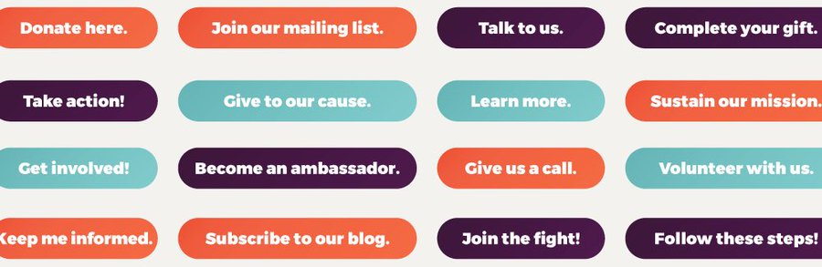
4. Easy To Click CTA’s
Pushing “Buy Now” is much harder to click than “Join The Challenge Now!”
How can you make the next step sound fun and exciting?
When you’re creating your buttons keep this in mind.
Here are some great examples:
Pushing “Buy Now” is much harder to click than “Join The Challenge Now!”
How can you make the next step sound fun and exciting?
When you’re creating your buttons keep this in mind.
Here are some great examples:
5. Building Trust & Showing Authority
Trust is one of the hardest things to build up on a page. People don’t trust anything anymore.
To prove to your readers that you’re worthy of their time you need other people to tell them.
How can you do this?
Well…
Trust is one of the hardest things to build up on a page. People don’t trust anything anymore.
To prove to your readers that you’re worthy of their time you need other people to tell them.
How can you do this?
Well…
The best way to display trust is through:
• logos of companies you’ve worked with
• written & video testimonials
• case studies of actual statistics
• a short “about us” section
• be transparent about everything you do & your product/company goals
Example above the fold:
• logos of companies you’ve worked with
• written & video testimonials
• case studies of actual statistics
• a short “about us” section
• be transparent about everything you do & your product/company goals
Example above the fold:
Social proof should handle objections.
Is your product/service expensive?
Then highlight a testimonial like this:
“I was worried about the price before I bought but within a week I had made $1000!”
Make a list of possible objections readers might have and answer them like this.
Is your product/service expensive?
Then highlight a testimonial like this:
“I was worried about the price before I bought but within a week I had made $1000!”
Make a list of possible objections readers might have and answer them like this.
Here are some questions you can ask your previous customers/clients to answer:
• what obstacle/objection would have prevented you from buying
• what did you get out of this (result-wise)?
• would you recommend this product/service? Why?
These usually handle most objections.
• what obstacle/objection would have prevented you from buying
• what did you get out of this (result-wise)?
• would you recommend this product/service? Why?
These usually handle most objections.
I'll never forget the time I booked a call with a trainer and was prepared to pay whatever his prices were.
It was all because I saw a video testimonial of a person with my exact injury experience a full recovery.
I ended up paying $5000 on that call just because of that video.
It was all because I saw a video testimonial of a person with my exact injury experience a full recovery.
I ended up paying $5000 on that call just because of that video.
6. Images Throughout The Page
I have nothing against having some images and graphics around the page.
I do have something against them when they slow your site down though.
Conversions begin to drop off after a site takes longer than 3 seconds to load. So…
I have nothing against having some images and graphics around the page.
I do have something against them when they slow your site down though.
Conversions begin to drop off after a site takes longer than 3 seconds to load. So…
Here’s what you can do to speed up your site:
• shrink images with
• enable lazy loading
• test site speed with and go through their suggestions
Site speed is often reduced once you take away all the fancy stuff.
A good rule…tinypng.com
gmetrix.com
• shrink images with
• enable lazy loading
• test site speed with and go through their suggestions
Site speed is often reduced once you take away all the fancy stuff.
A good rule…tinypng.com
gmetrix.com
75%< of your site’s images/graphics should be helpful to the reader.
This includes:
• social proof
• product images
• pictures for emotion (humans)
• arrows
25% can be elements to make the page look nicer.
I say only 25% because more simple sites convert better. I promise.
This includes:
• social proof
• product images
• pictures for emotion (humans)
• arrows
25% can be elements to make the page look nicer.
I say only 25% because more simple sites convert better. I promise.
7. Scanability
One of the most overlooked elements on a landing page.
Only 10% of people will actually read every word on your landing page. You need to play off this stat.
The best thing you can do is include a headline/subheading over every paragraph of text…
One of the most overlooked elements on a landing page.
Only 10% of people will actually read every word on your landing page. You need to play off this stat.
The best thing you can do is include a headline/subheading over every paragraph of text…
What do I mean by this?
If someone scrolls a little further down your page they should see one of these things:
• a new section w/headline
• a subheading inside a paragraph
You need to break up long chunks of text as much as possible. Even long sales letters have subheadings.
If someone scrolls a little further down your page they should see one of these things:
• a new section w/headline
• a subheading inside a paragraph
You need to break up long chunks of text as much as possible. Even long sales letters have subheadings.
Another great way of doing this is by using:
• bold
• underlined
• italicized
Here’s how I use them all:
Bold - for words like FREE and crazy statistics
Underline - for big claims that I’m making for my product/service
Italics - to put emphasis on certain points or words
Ex:
• bold
• underlined
• italicized
Here’s how I use them all:
Bold - for words like FREE and crazy statistics
Underline - for big claims that I’m making for my product/service
Italics - to put emphasis on certain points or words
Ex:
At the bottom of some pages I even use a section that says:
“Did you scroll to the bottom? Well here’s what you missed…”
I use 3-6 sentences to say:
• what the offer is
• what the bonuses are
• what they should do now
I usually include a picture of the creator as well.
Ex:
“Did you scroll to the bottom? Well here’s what you missed…”
I use 3-6 sentences to say:
• what the offer is
• what the bonuses are
• what they should do now
I usually include a picture of the creator as well.
Ex:
Now you’ve learned everything that I put inside my landing pages and why I do it.
Here are sites I use:
figma(.)com → design
pngtree(.)com → pngs
lordicon(.)com → icons
gtmetrix(.)com → site speed
thriveCart(.)com → checkout
facebook(.)com/ads/library → competitors
And...
Here are sites I use:
figma(.)com → design
pngtree(.)com → pngs
lordicon(.)com → icons
gtmetrix(.)com → site speed
thriveCart(.)com → checkout
facebook(.)com/ads/library → competitors
And...
If you'd like help with your landing page?
DM me and I'll give you a couple of tips. I've worked on over 200 landing pages across 13+ different industries.
And one more thing...
I don't share everything here.
Client updates and free stuff goes here:
swiftlanding.co/sunday-marketer
DM me and I'll give you a couple of tips. I've worked on over 200 landing pages across 13+ different industries.
And one more thing...
I don't share everything here.
Client updates and free stuff goes here:
swiftlanding.co/sunday-marketer
• • •
Missing some Tweet in this thread? You can try to
force a refresh


