Why replacing orange street lights is an aesthetic downgrade — and bad for our health: 

Street lighting has been around for a long time — thousands of years. And, for most of history, it was provided by flames, whether oil lamps or people simply carrying burning torches.
After that came gas lamps in the 19th century:
After that came gas lamps in the 19th century:

The first electric street lighting came in the form of "arc lights" in the late 19th century. Then, in the 1920s, sodium-vapour lamps were invented, which were more efficient and had a longer lifetime.
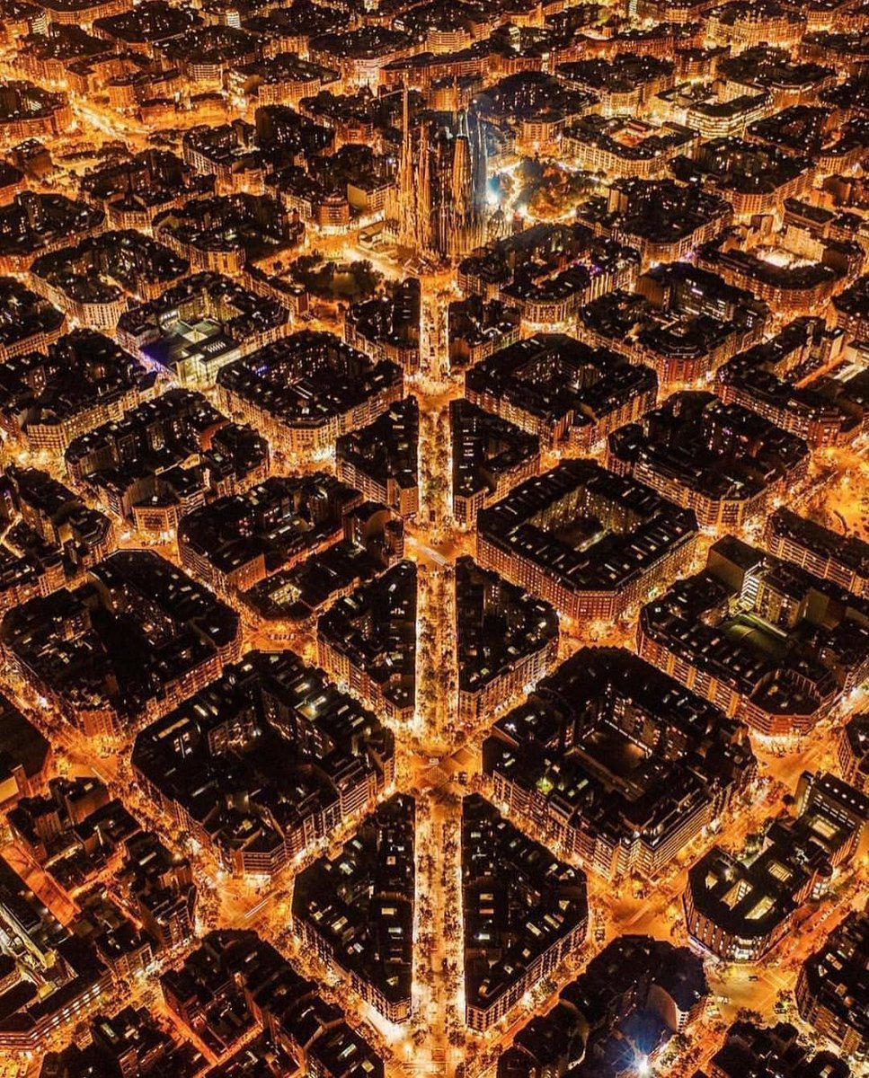
Soon enough they were everywhere, with their famous orange glow.
Soon enough they were everywhere, with their famous orange glow.

There was something skeuomorphic about these sodium lamps.
A "skeumorph" is a new invention which is designed to imitate what it has replaced, even when it doesn't need to.
Think of digital cameras making a shutter sound, or the Gmail logo being an envelope.
A "skeumorph" is a new invention which is designed to imitate what it has replaced, even when it doesn't need to.
Think of digital cameras making a shutter sound, or the Gmail logo being an envelope.

Given that for all of human history we had been lighting our homes and cities with fire of some sort, people expected street lighting at night to be orange, red, and yellow.
Sodium lamps, by a strange coincidence, just felt "right" to people.
Sodium lamps, by a strange coincidence, just felt "right" to people.

But with the invention of LEDs this has changed.
They are far more energy efficient, powerful, and long-lasting than sodium lamps.
Thus, in recent years, the old sodium street lighting has been slowly but surely replaced with LEDs, most of which are white rather than orange.
They are far more energy efficient, powerful, and long-lasting than sodium lamps.
Thus, in recent years, the old sodium street lighting has been slowly but surely replaced with LEDs, most of which are white rather than orange.

The most important thing is that street lights work, making towns and cities safer places: function must come first.
But the shift away from sodium lamps does feel like an aesthetic loss. There was something romantic and atmospheric about them — they suited the night.
But the shift away from sodium lamps does feel like an aesthetic loss. There was something romantic and atmospheric about them — they suited the night.

The world has bigger problems than the aesthetics of street lighting.
But this isn't only about aesthetics. See, the intensity of a light's colour is known as "colour temperature", measured in kelvins.
More intense colours are known as "cold", and less intense as "warm".
But this isn't only about aesthetics. See, the intensity of a light's colour is known as "colour temperature", measured in kelvins.
More intense colours are known as "cold", and less intense as "warm".

Orange has a much lower "colour temperature" than white — it is warmer.
And the intensity of light colour has a profound impact on our psychology and physiology.
We evolved to be awake during the day — when light is most intense, or "cold" — and sleep at night.
And the intensity of light colour has a profound impact on our psychology and physiology.
We evolved to be awake during the day — when light is most intense, or "cold" — and sleep at night.

And so the notion that orange sodium lamps simply "feel" different isn't an illusion — they literally produce a different psychological, physiological, and emotional reaction in us.
Their "aesthetic" is attuned to the lighting of the natural world, and to our biology.
Their "aesthetic" is attuned to the lighting of the natural world, and to our biology.
But, more to the point, intense colour temperatures keep us awake — because they are similar to daylight, and so our body tells us to stay awake.
Hence doctors have warned that white LEDs will disrupt our circadian rhythms and our ability to sleep — and even damage our eyesight.
Hence doctors have warned that white LEDs will disrupt our circadian rhythms and our ability to sleep — and even damage our eyesight.

Wildlife also suffers from more intense light at night — it is fundamentally confusing for all creatures to be exposed to daylight after sunset.
Not to forget light pollution in general. Sodium lamps were already bad in this regard, but LED lighting has only made things worse.
Not to forget light pollution in general. Sodium lamps were already bad in this regard, but LED lighting has only made things worse.

Still, the technology is evolving.
There are LED street lights which have an adaptive brightness, although the trouble is that we can only get rid of the harmful intensity of white light by making it extremely dim...
...which defeats the point of street lighting.
There are LED street lights which have an adaptive brightness, although the trouble is that we can only get rid of the harmful intensity of white light by making it extremely dim...
...which defeats the point of street lighting.

But there's no reason why we can't change the colour of the light LEDs emit.
Why shouldn't they be skeuomorphic too?
Why shouldn't they be skeuomorphic too?

The most important thing about street lighting is that it does its job — that it functions.
But, all being said and done, it seems that orange street lighting is actually better for us and, in a scientific way, more aesthetically appropriate.
Orange is the light of the night.
But, all being said and done, it seems that orange street lighting is actually better for us and, in a scientific way, more aesthetically appropriate.
Orange is the light of the night.
• • •
Missing some Tweet in this thread? You can try to
force a refresh